Navigation
Install the app
How to install the app on iOS
Follow along with the video below to see how to install our site as a web app on your home screen.
Note: This feature may not be available in some browsers.
More options
You are using an out of date browser. It may not display this or other websites correctly.
You should upgrade or use an alternative browser.
You should upgrade or use an alternative browser.
my first comic
- Thread starter yoshster
- Start date
[ohgodpleasedelete]
Shine Sprite
Not readable and there is WAY too much space.
crystalking
King Bowser
not readable
[ohgodpleasedelete]
Shine Sprite
yoshster said: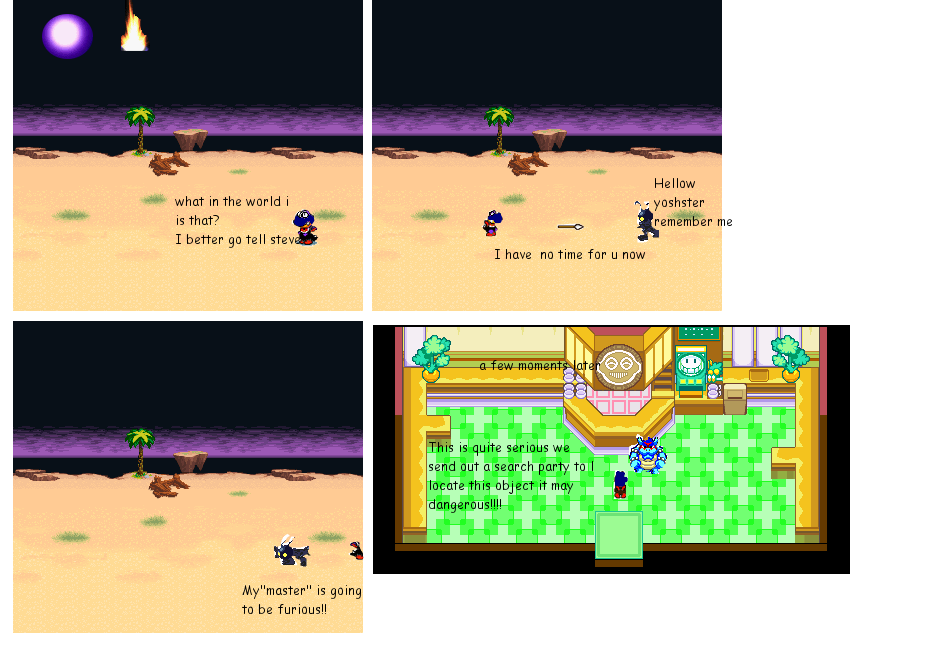
Fixed it
Pretty bad.
You practically stole Peachypie 3.14's sprites. >_>
And the outlines are REALLY bad...
And the plot makes no sense...
No speech bubbles...
So pretty good for a first comic. XD
Just kidding.
Not very good.
crystalking
King Bowser
I agree with CNChaosNinji said:yoshster said:
Fixed it
Pretty bad.
You practically stole Peachypie 3.14's sprites. >_>
And the outlines are REALLY bad...
And the plot makes no sense...
No speech bubbles...
So pretty good for a first comic. XD
Just kidding.
Not very good.
no offense
[ohgodpleasedelete]
Shine Sprite
yoshster said:I wanted to make the "thing" that fell and the"master" a mystery so the plot may not make total sense and well i'll just add speech bubbles nxt time but if
u guys think it stunk so bad then i guess there won't b a nxt time
It can be mysterious and still make sense.
Take the Shadow Chronicles for an example.
crystalking
King Bowser
At least I said no offense
Storm Yoshi
Cyclone Microsoft, it'll make your windows crash
ChaosNinji said:yoshster said:I wanted to make the "thing" that fell and the"master" a mystery so the plot may not make total sense and well i'll just add speech bubbles nxt time but if
u guys think it stunk so bad then i guess there won't b a nxt time
It can be mysterious and still make sense.
Take the Shadow Chronicles for an example.
That is true CN.
yoshster
Whomp
- Thread starter
- #13
UMM i made some changes even though i doubt it would be but is it even little better
Here is the direct link http://i210.photobucket.com/albums/bb44/yoshster_photos/tobepostedv1.png
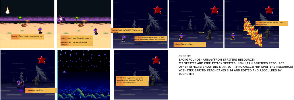
Here is the direct link http://i210.photobucket.com/albums/bb44/yoshster_photos/tobepostedv1.png

[ohgodpleasedelete]
Shine Sprite
Not readable. >_>
yoshster
Whomp
- Thread starter
- #15
here r the links to them it is in 3 parts
Part one-http://i210.photobucket.com/albums/bb44/yoshster_photos/hfhffhffhdfh.png
Part 2-http://i210.photobucket.com/albums/bb44/yoshster_photos/cchcjjggjd.jpg
Part3-http://i210.photobucket.com/albums/bb44/yoshster_photos/cgnjgkfkk.jpg
Part one-http://i210.photobucket.com/albums/bb44/yoshster_photos/hfhffhffhdfh.png
Part 2-http://i210.photobucket.com/albums/bb44/yoshster_photos/cchcjjggjd.jpg
Part3-http://i210.photobucket.com/albums/bb44/yoshster_photos/cgnjgkfkk.jpg
[ohgodpleasedelete]
Shine Sprite
Pretty bad still.
And the outlines are REALLY bad...
And the plot makes more sense, but still isn't very understandable...
Bad grammer, too.
Keep trying.
And the outlines are REALLY bad...
And the plot makes more sense, but still isn't very understandable...
Bad grammer, too.
Keep trying.
Storm Yoshi
Cyclone Microsoft, it'll make your windows crash
#1 Get better sprites
#2 Spelling and Grammar
#3 Get a better story line I have got no idea whatsoever of whats going on
#4 If its about the wiki then maybe use official wiki backgrounds
#5 Take your time don't rush
#6 Like with #1 get some sprites (good ones) that aren't copied off other peoples!
#2 Spelling and Grammar
#3 Get a better story line I have got no idea whatsoever of whats going on
#4 If its about the wiki then maybe use official wiki backgrounds
#5 Take your time don't rush
#6 Like with #1 get some sprites (good ones) that aren't copied off other peoples!
yoshster
Whomp
- Thread starter
- #20
R these sprites any better to use
http://i210.photobucket.com/albums/bb44/yoshster_photos/ssheet10.png
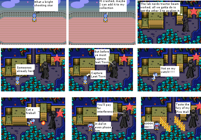
http://i210.photobucket.com/albums/bb44/yoshster_photos/ssheet10.png

Storm Yoshi
Cyclone Microsoft, it'll make your windows crash
You've got my permission...remember my real username is Storm Yoshi

