Change the Super Mario Wiki Logo

Which better this logo or the current one?


  • Total voters
    31

Dardy

King Bowser
Since I saw that image I have been thinking of it very much as our logo. I didn't think much of making a proposal or something like that until some discussion first.. So here we are! How likes that Image to be our logo.

Of course before doing this we will make it transparent.

You Can Support, Oppose. but when opposing please say why.
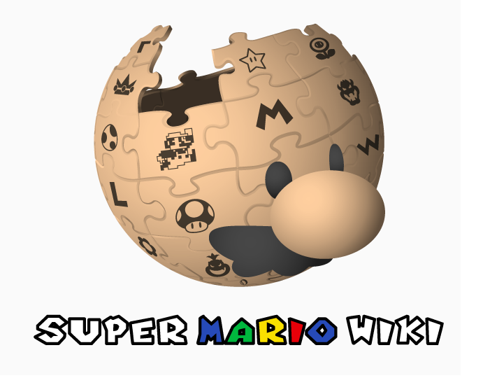
Super_Mario_Wiki_Logo.png
 
it looks pretty good

but if there is something that can be done

it's to fill in the "super" and "wiki" parts
 
I like it better than what's curently used, but some may not like having a Wikipedia-spired logo. You might also want to ask permission to the guy who made it.

http://www.mariowiki.com/images/archive/4/4c/20081205230249!Mariowiki.png <---- only logo worth mentioning.
 
It looks really good, actually.
Are you really good at these kind of stuff?
Because you can come in handy for my Wiki.
 
You can always change the logo via CSS
 
Baby Luigi, or by changing the name of the current Logo, and naming the new Logo by the old one, which is what I usually do.
 
I would like to suggest a logo update, keeping the same logo but changing some of the pictures I it.

Replace the Mario Baseball photo with Mario Kart
Replace the NSMB photo with NSMBW or NSMBU

I'm still trying to figure out what's behind the middle left and middle middle.
 
Lakitu, Baby Luigi is a she.
 
Why this
Code:
#p-logo a { background: url(http://www.mariowiki.com/images/7/7a/Mario64creep.jpg) 35% 50%
 no-repeat !important; }
not working
 
That logo was first proposed back in 2010 (MarioWiki:Proposals/Archive_21#Replace_Super_Mario_Wiki.27s_Logo) (not by Jjrapper100, but by some other guy), and I still agree with all those who originally opposed making our logo an ugly rip-off of wikipedia. Also, at the time, Porplemontage himself said he didn't want to change the logo (User:Porplemontage/talk_archive_601-700#New_Logo). He might feel differently now, but it's something to keep in mind, since he's still gonna have the final say even if you manage to pass a proposal.


Megadardery said:
Why this
Code:
#p-logo a { background: url(http://www.mariowiki.com/images/7/7a/Mario64creep.jpg) 35% 50%
 no-repeat !important; }
not working
Maybe lose the "/7/7a" part? I'm just guessing based on Porple's post near the bottom of this proposal (MarioWiki:Proposals/Archive_22#Change_Our_Wiki_Logo).
 
Are you sure you're using "/monobook.css" after your Username?
If that still doesn't work, click here, and click "Custom CSS".

Edit:
Walkazo, the URL is okay, nothing wrong with that.
 
NSY said:
I would like to suggest a logo update, keeping the same logo but changing some of the pictures I it.

Replace the Mario Baseball photo with Mario Kart
Replace the NSMB photo with NSMBW or NSMBU
Per.
 
Sorry.. I was busy yesterday and forget to tell you that I solved the problem.. anyway.. Since it was refused before.. I'll still wait for some votes before thinking of making a proposal
 
I say keep the current logo. I've seen this logo before, and I don't really like it. I don't like Mario's face on a globe with puzzle pieces flying out.

If you want to replace the logo, create a CSS page like this: User:Yourname/monobook.css.

Then place this into your page:

Code:
#p-logo a { background: url(http://www.mariowiki.com/images/f/f1/Super_Mario_Wiki_Logo.png) 35% 50% no-repeat !important; }

Preview the page to see if it's okay. The problem: the logo is too big, so resize it, reupload it, etc., until it fits the way you want.

I currently have this for my "logo", so the logo should be around that size.

Mario_Face_7.png
 
Then it should be more like this:
Code:
#p-logo a { 
	background-image: url(http://www.mariowiki.com/images/f/f1/Super_Mario_Wiki_Logo.png);
	background-repeat: no-repeat;
	background-size: 132px 120px;
}

It's untested, though.
 
I don't really like this logo. Super Mario Wiki is independent of Wikipedia, and I think we should try to set ourselves apart from them.
 
I still think the current logo is good enough, but I wouldn't mind a change of some of the pictures (like NSY suggested).
 
Back