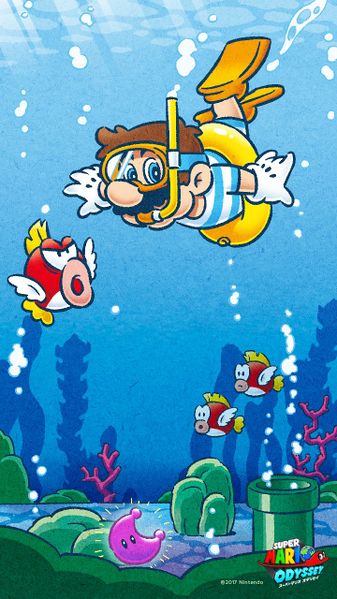
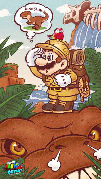
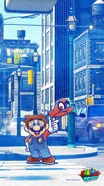
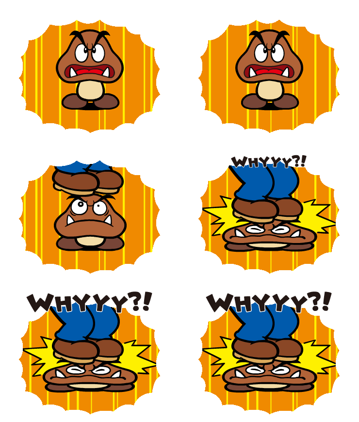
Before we go on, we want to be clear on something: this is what Yoichi Kotabe's Mario art style look like:
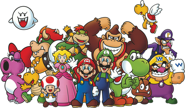
Although Yoichi Kotabe's Mario art style has been used since Super Mario Bros., the games has never really used them. In fact, his artwork is most present in the official art, including the box art of the older games. At one point, 3D models of Mario and co. are used, and while they never seem to make Mario look out of place, they can also be viewed as "unspectacular" for being the standard look over the years.
The first notable game that started using this art style in the games is Super Mario 3D Land, which the man himself was involved in (check out Peach's letters to get what I mean). It is since Super Mario 3D Land that we see games starting to implement them in some manner, such as Super Mario 3D World, Mario Kart 8 and even Mario Party: Star Rush, so it can be deduced that the developers loved this art style. In addition to this, marketing material is also making use of this art style more frequently, such as Super Mario Odyssey.
Most recently, there is a Shigeru Miyamoto interview with GameInformer, in which the guys asked a question regarding this:
Essentially, while Kotabe's artstyle is well-liked in some parts of the development team, there are also some people in the development team that want to create other styles. The second question is likely alluding that they're investigating the ways in which Kotabe's art style could evolve. From my understanding, it means that the Kotabe artstyle isn't necessarily the standard art style in Mario games, but rather, it would occasionally be used if the developers need to. If going by past examples, we have had Paper Mario's clever use of paper as a thematic style, Mario Strikers' rough and sketchy style, along with Mario & Luigi's lighthearted and bold art style.
I have quite a few thoughts on this matter. Firstly, I would want to see a game that is fully composed in Kotabe's art style because it's a very clean look that is basically synonymous with Mario, and while there were some glimpses in the games, it's not the fully-playable kind. I can see a 2D Super Mario go in this direction because it made the most sense, but I would also like to see this style experimented on another genre, like perhaps an adventure.
As a bold idea, I hope that the developers could convert Kotabe's art style into full 3D, with shaders that would mimic that art style, and while I am guessing that it would likely be used in a mainline Mario game to showcase this, I would personally like to see it used in Mario Party games since they not only used this art style, but also incorporate a wider variety of character expressions within it (as seen in Star Rush, for one).
Another thought I have on this is, I kind of agree with letting the other developers experiment different art styles. The fact that there are many different art styles in the Mario series is one of the reasons I appreciate Mario (as well as being the first topic since I joined Marioboards, a good starting point). The fact that people still appreciate Paper Mario's art style is a shining example of this, which is borne out of an experiment in putting 2D sprites in a 3D world for Mario's next RPG. Essentially, giving Mario a different style is a viable way of making a game memorable. It's not just games that have its own style, but Super Mario-Kun's big-eyed characters made the characters cuter and expressive, which is a strength for a comic.
A Mario animated series that makes extensive use of this art style is something that I think would make sense as a starting point, but I am not certain if the art style could be used for long, because the animation effort might be a huge undertaking. I feel that a series of shorts should be used to get accustomed to the idea of animating Kotabe's art style, because unless the developers could make it work, it feels like they need to work out on how to properly convert the animation aspects. I might be the minority here, but I appreciate the Super Mario Bros. Super Show art style despite having a budget that is lower-than-standard and their distinctive take on Mario.
With that said, I am all right with not using Kotabe's art style in every single Mario promotional material, because I feel that the 3D ones work just fine in some instances like food packaging, but that doesn't mean I am against it, because we have some greats, like the one with Mario relaxing on a beach with his shorts while Yoshi's buried in sand and Toad's chasing a crab. I adored this art style so much that it's the only Nintendo Badge Arcade badges ("Mario & Friends") that I am willing to spend money to collect.
Well, it looks like this post has gotten long. Sorry about the lengthiness of this topic! Anyway, what's your take on this topic?
Thank you for reading.

Although Yoichi Kotabe's Mario art style has been used since Super Mario Bros., the games has never really used them. In fact, his artwork is most present in the official art, including the box art of the older games. At one point, 3D models of Mario and co. are used, and while they never seem to make Mario look out of place, they can also be viewed as "unspectacular" for being the standard look over the years.
The first notable game that started using this art style in the games is Super Mario 3D Land, which the man himself was involved in (check out Peach's letters to get what I mean). It is since Super Mario 3D Land that we see games starting to implement them in some manner, such as Super Mario 3D World, Mario Kart 8 and even Mario Party: Star Rush, so it can be deduced that the developers loved this art style. In addition to this, marketing material is also making use of this art style more frequently, such as Super Mario Odyssey.
Most recently, there is a Shigeru Miyamoto interview with GameInformer, in which the guys asked a question regarding this:
GI: We've been seeing more of Yoichi Kotabes classic Mario art lately in marketing and other places, like the character select screen in Super Mario 3D World. Will we ever see a 2D game made entirely of Kotabes art?
SM: Were at almost like a turning point. When you look at Mickey Mouse there is the classic Mickey Mouse, and then there is the modern Mickey Mouse and the classic one has a lot of flavor to it and the modern Mickey Mouse looks really great, but it is losing a little bit of the flavor, and thats something we discuss to make sure we keep that intact as were creating characters. And of course the development team for any Mario game may want to use Kotabes art, but there is also a character-development team thats really working hard to create new styles and new work. Once they get more work done, I think more and more of that will be reflected into games.
We did a collaboration recently with Uniqlo where it was a contest for people to send in drawings, and like that we want to continue create and evolve new art styles.
GI: And you feel like the pristine, perfect flavor for 2D Mario is that beautiful, clean Kotabe art?
SM: I do believe that Mr Kotabes art has become kind of a standard within Nintendo, but we definitely want to continue to see if we can evolve that as time goes by.
Essentially, while Kotabe's artstyle is well-liked in some parts of the development team, there are also some people in the development team that want to create other styles. The second question is likely alluding that they're investigating the ways in which Kotabe's art style could evolve. From my understanding, it means that the Kotabe artstyle isn't necessarily the standard art style in Mario games, but rather, it would occasionally be used if the developers need to. If going by past examples, we have had Paper Mario's clever use of paper as a thematic style, Mario Strikers' rough and sketchy style, along with Mario & Luigi's lighthearted and bold art style.
I have quite a few thoughts on this matter. Firstly, I would want to see a game that is fully composed in Kotabe's art style because it's a very clean look that is basically synonymous with Mario, and while there were some glimpses in the games, it's not the fully-playable kind. I can see a 2D Super Mario go in this direction because it made the most sense, but I would also like to see this style experimented on another genre, like perhaps an adventure.
As a bold idea, I hope that the developers could convert Kotabe's art style into full 3D, with shaders that would mimic that art style, and while I am guessing that it would likely be used in a mainline Mario game to showcase this, I would personally like to see it used in Mario Party games since they not only used this art style, but also incorporate a wider variety of character expressions within it (as seen in Star Rush, for one).
Another thought I have on this is, I kind of agree with letting the other developers experiment different art styles. The fact that there are many different art styles in the Mario series is one of the reasons I appreciate Mario (as well as being the first topic since I joined Marioboards, a good starting point). The fact that people still appreciate Paper Mario's art style is a shining example of this, which is borne out of an experiment in putting 2D sprites in a 3D world for Mario's next RPG. Essentially, giving Mario a different style is a viable way of making a game memorable. It's not just games that have its own style, but Super Mario-Kun's big-eyed characters made the characters cuter and expressive, which is a strength for a comic.
A Mario animated series that makes extensive use of this art style is something that I think would make sense as a starting point, but I am not certain if the art style could be used for long, because the animation effort might be a huge undertaking. I feel that a series of shorts should be used to get accustomed to the idea of animating Kotabe's art style, because unless the developers could make it work, it feels like they need to work out on how to properly convert the animation aspects. I might be the minority here, but I appreciate the Super Mario Bros. Super Show art style despite having a budget that is lower-than-standard and their distinctive take on Mario.
With that said, I am all right with not using Kotabe's art style in every single Mario promotional material, because I feel that the 3D ones work just fine in some instances like food packaging, but that doesn't mean I am against it, because we have some greats, like the one with Mario relaxing on a beach with his shorts while Yoshi's buried in sand and Toad's chasing a crab. I adored this art style so much that it's the only Nintendo Badge Arcade badges ("Mario & Friends") that I am willing to spend money to collect.
Well, it looks like this post has gotten long. Sorry about the lengthiness of this topic! Anyway, what's your take on this topic?
Thank you for reading.

