Koopa con Carne
call me Hot Lips, 'cause i'm a one-shot wonder
- MarioWiki
- Koopa con Carne
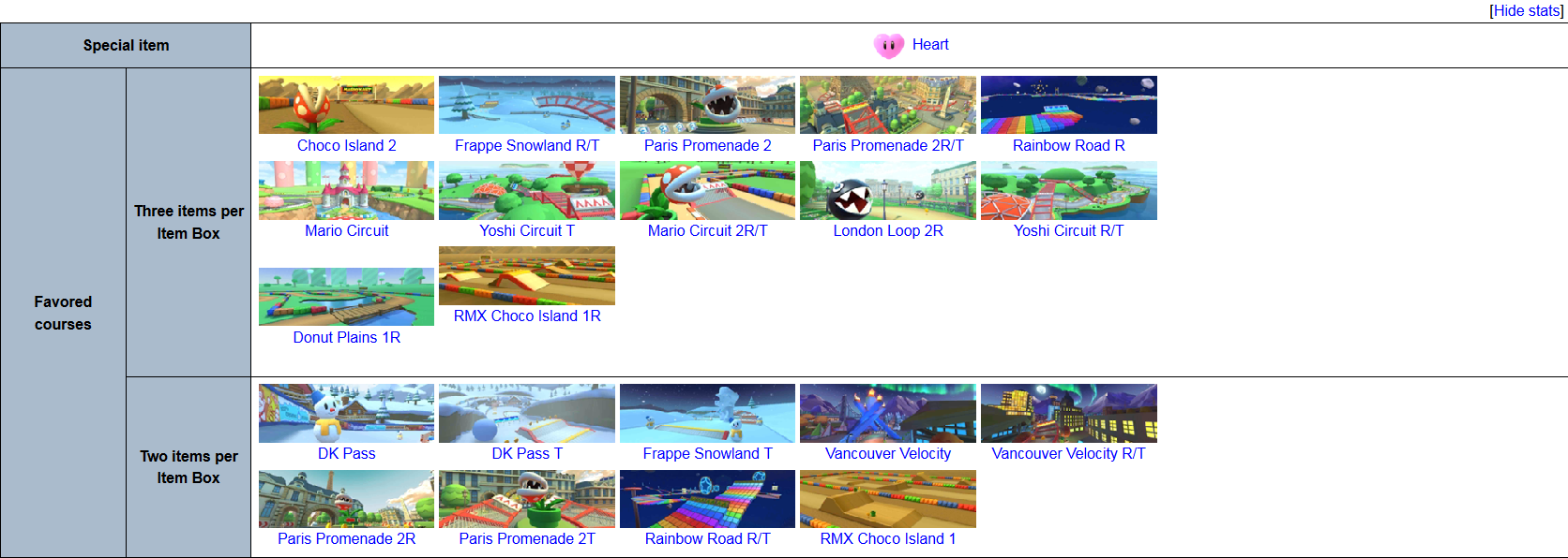
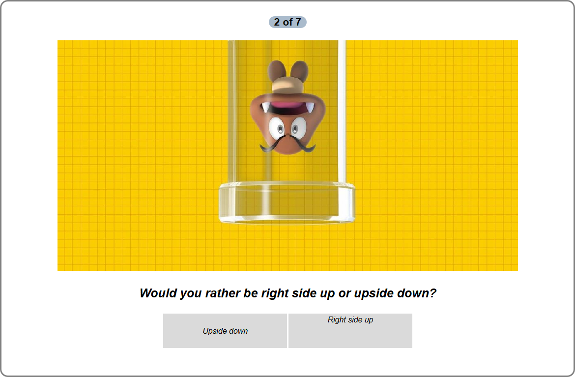
In templates that feature a table within a table, such as Template:MKTProfile and Template:PlayNintendoQuiz, the second entry on a row with only two entries is always aligned unusually higher than its partners. Take a look here:


In the first example, you can see how RMX Choco Island 1R is placed slightly higher than Donut Plains 1R. The same occurs in the second example, where "Right side up" is oddly placed at the top of its cell. If I were to add another entry afterwards, this would be fixed. I should mention that I am the creator of both templates and the bug doesn't seem to be a coding fault, as all entries are defined in the same way apart from featuring different parameters.
Does anyone else have this problem? For me, it's present on both mobile and desktop browsers. What do you think is causing it?
Last edited: