Bad box arts

Ray Trace

The fastest, strongest, and kindest Protector
Wiki Administrator
Poll Committee
Pronouns
She/her
MarioWiki
Ray Trace
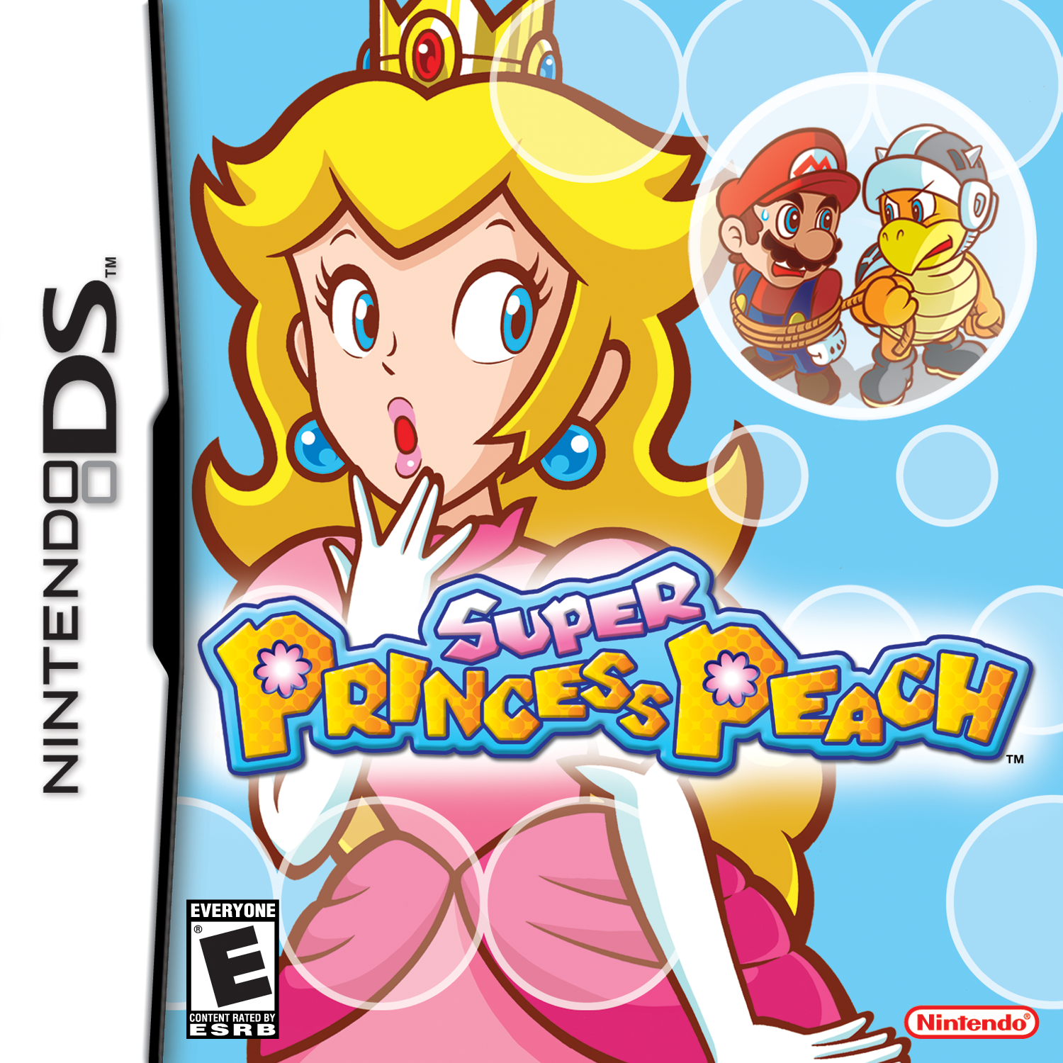
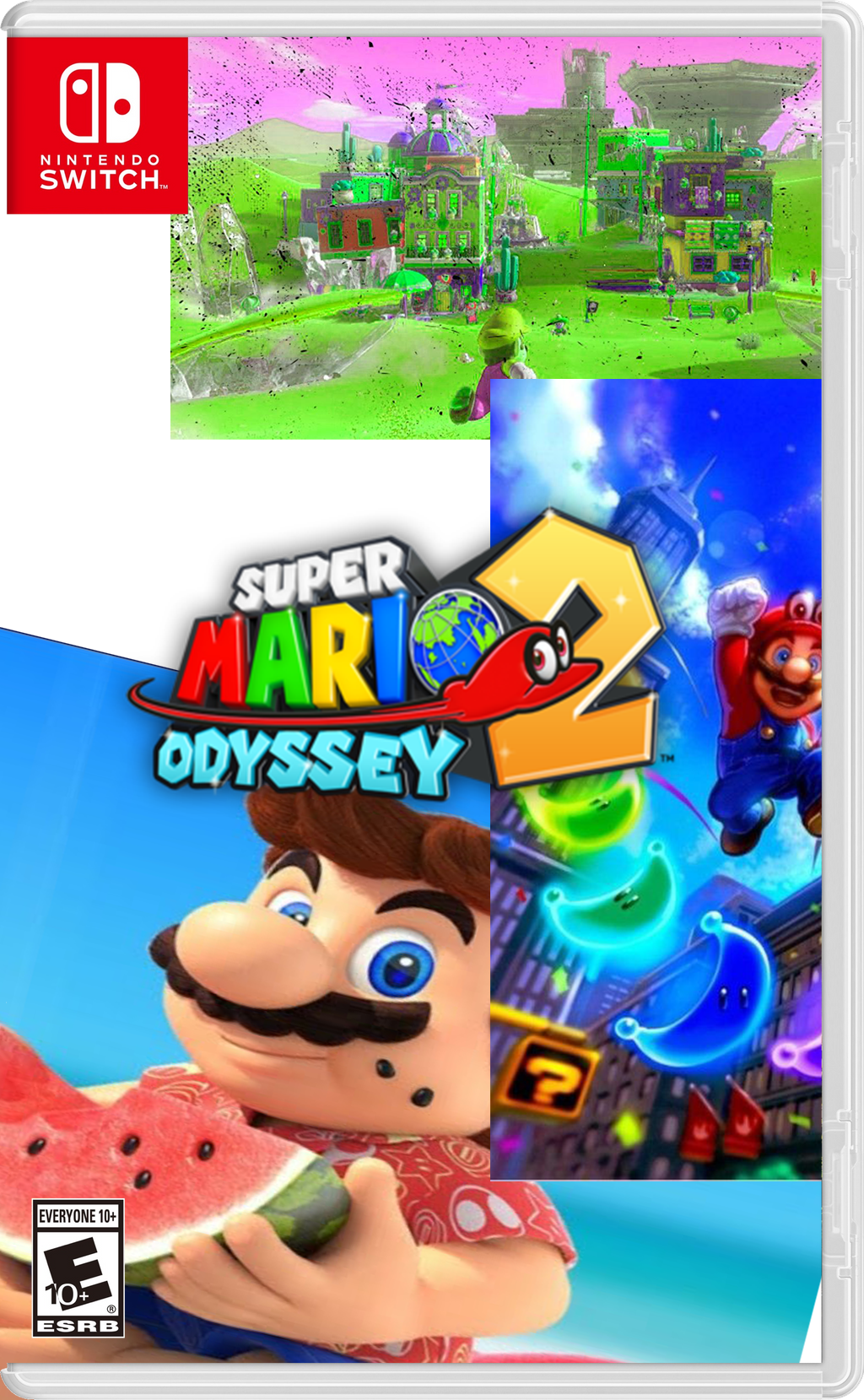
In our large world of video games, we have plenty of decent, well-designed box arts, but there's also a world of hilariously terrible, hideous box arts. This thread is the place to post your finds and write about the ugliest and worst-put-together boxes.

konamis-best-castlevania-dawn-of-sorrow-1505508166.jpg


Nothing screams like meta box-art material than putting a stock picture of a box as the boxart for the box. They could have simply edited the image to include the "Konami's Best" banner but nope. I think this is one of the most incompetently put together boxes a major publisher like Konami has ever made lol.

What is the instruction booklet gonna be like inside? Instructions on how to read the instruction booklet?
 
8bf0886f859e1d4181c12f66fb44af6e.jpg


Look, do I really need to actually say anything here? I mean this is so damn bad that on the cartridge, which usually on NES games just has the box art again, instead it has a bit of info of the rules of the game you're going to be playing instead.

image_085bda0c-265a-404c-810a-e6dbbbed56b7_1024x1024.jpg
 
ive always known of how bad that castlevania boxart was but looking closer... god. they really wanna make sure to let everyone know it is a ds game that was made by konami and has a t rating, also with whatever that "ntr-acve-usa" thing is lmao
 
This one's infamous for way too much information

images (26).jpeg

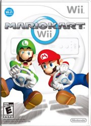
Also I want to point out Mario Kart Wii for having too little information. White background. Mario and Luigi flying in space. It doesn't stand out on a shelf at all like New Super Mario Bros Wii or the earlier Mario Karts. Shows only the wheel feature and makes no mention of the bikes.

images (27).jpeg
 
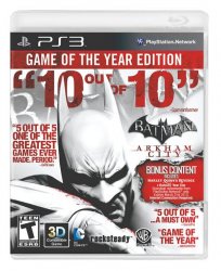
This one's infamous for way too much information

View attachment 6180

I was thinking about posting this one, lol. Looks like WB had too much of an ego trip to help themselves here.

Though I don't hate Mario Kart Wii's box too much. It has a minimalist approach sure, but I think the composition is pretty decent. Unlike this one.

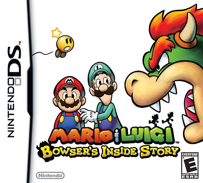
667px-Bowsersinsidestorycover.jpg


This one has a very jank composition and I don't think the minimalist approach saves it: the negative space looks really bad here, and there's a copious amount of unbalanced white space on the top areas, which doesn't balance out the giant Bowser taking up the right area of the box. It's a very boring box-art that doesn't tell much about the game aside from Bowser roaring at Mario and Luigi. At least future Mario & Luigi box-arts tell more about the game and balance out the giant amount of white space on the upper left area of the box. Even the first game's Japanese box-art, while minimalist, still look decently composed with attention paid to negative space around Mario and Luigi.

Mario Kart DS, on the other hand, has a much worse boxart. It's literally just artwork of Mario breakdancing on his dumb car.
 
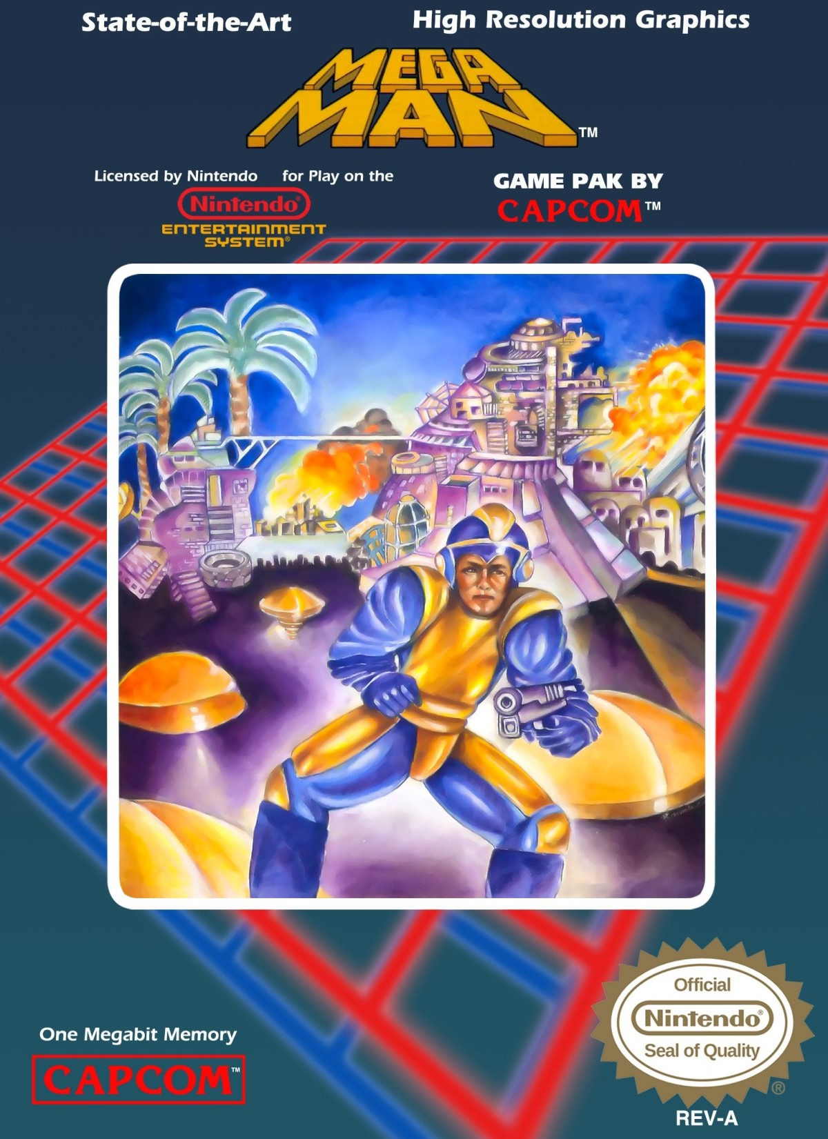
This is the most infamous box art of them all on the NES.

na.original.jpg

He looks nothing like the Blue Bomber in the game and the Japanese boxarts and other depictions of him.
 
EdkmMuBXsAMId-g


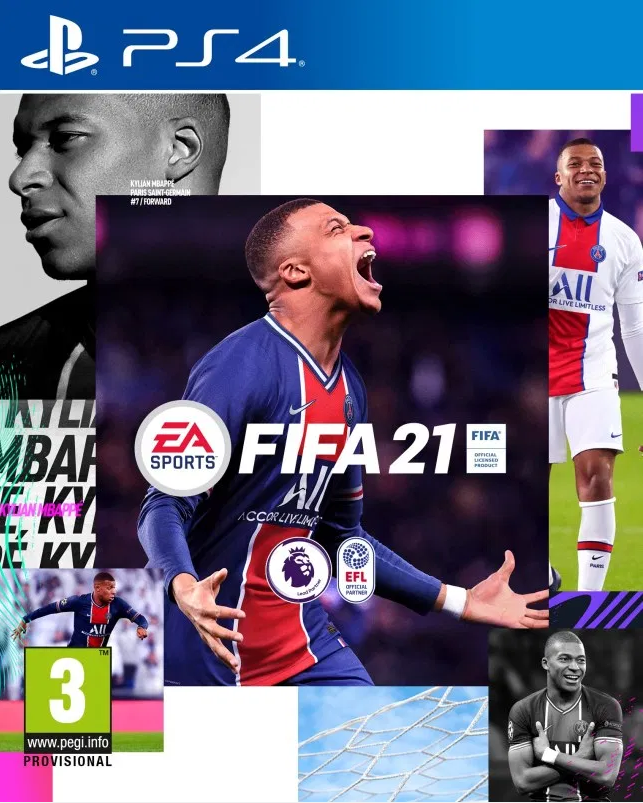
This one is just a bunch of text and mashed together square images with some filters applied. I guess they're trying to go for minimalist loose collage but it looks more like loose vomit of pasted posters and some pink text on top.

It inspired some pretty funny knock-offs (see replies)
EdkmNxxWoAUBl7P


EdksbguWkAY00Cc


EdnxE8NXgAQMVUo


Edk5CISWkAANk9O

Oh and this is for 2021. Sports games are, well, on a bit of a rut. It's a good box art to really sum things up. Cheap, annual, easily cobbled together, "modern", powered by branding, not much of video game.
 
Here's to more bad box arts, starting with WarioWare!

Wwt.jpg


WWDS.jpg


Smooth_moves_cover.jpg


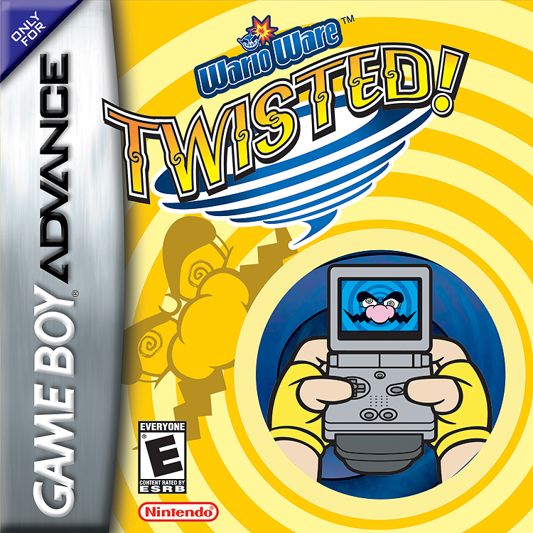
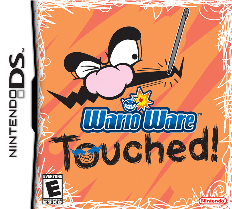
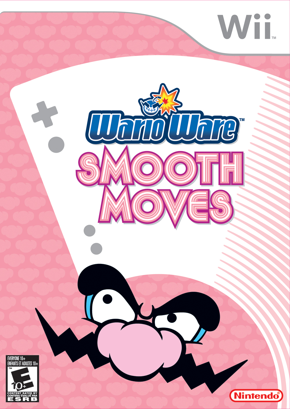
All 3 of these take the minimalist route, and while yes, all 3 do manage to show their main gimmick, they just look super lazy. Out of the 3, Smooth Moves just has to be the laziest in design. They could've added a whole lot more to these than just the bare minimum.
 
I don't have a problem with any of the WarioWare boxarts. Sure, they're minimalist, but their color palette is very pleasant and invoke the mood for each of the themes of the game. For instance, Touched has some aggressive colors and stripe patterning to complement the scribbly nature of the game. The logo of the game is invokes crude hand drawing. The borders are scratched off. There's a simple action that conveys a lot, you use your stylus to manipulate things, and it's just Wario's eyes to show you it's a weird, wacky WarioWare game.

WarioWare Twisted has a rather gentle color scheme for a discordant box, though I think yellow is a good fit for dizzyness, and it goes well with the blues (also yellow is an invert of blue), which helps contrast the blue and draws your eye to the GBA and also draws out the tornado. I think there's quite a bit going on, but, again, it's pretty clear to know what the game is selling you on: using your GBA and its peripheral to spin it around. The dizziness isn't there to tell players they'll be dizzy, it's just a cartoonish appeal saying "look how crazy, but fun we are!"

Smooth Moves has a weird patterning of Wario's nose going on (maybe it invokes orderly marquee effect or the effect of a scrolling background, think the background for the menu of Mario Kart Double Dash) but the color palette is ideal to fill the entire box, nonobstrusive. Similar to the name, "Smooth Moves", a calming name (also think about the zen theme of the game when you are introduced to new ways to beat a microgame with the Form Baton). But the logo's great. I think the uneven lines running along the logo, while artificial, mimic the illusion movement, trying to invoke a blur, especially with S. The Wii Controller is simple and easily read, and it has a trailing line that mimics movement and resembles the lines in the logo. Wario's face is placed fine, with his eyes directing to the Wii Remote, but it's a trademark indicator of a WarioWare game. I like the color scheme for this one a lot, a gentle pink, a wash of white and gray that complements the Wii labeling that's on every Wii box. Wario also is great contrast. His mustache and eyebrows are bold and black which help stand out against the pastels here.

So yeah, they aren't busy and super colorful, but the color schemes work and I think the minimalist design works pretty well here. I don't have much complaints for that and I can't suggest any improvement. I say I like Smooth Moves the most of the boxes, and Twisted's a bit busy, like maybe the area with the GBA SP shouldn't have a small spiral pattern going on as opposed to a solid color
 
Last edited:
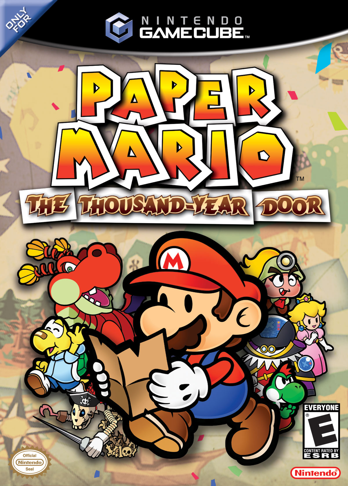
I'll go ahead and cite Paper Mario boxarts, because some of its boxarts are either really bland or really bad.

PMTTYD.jpg

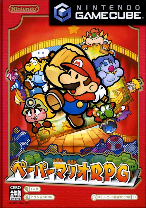
This just looks...really bland. Like, I get it's trying to depict a treasure hunt scene, but aside from Mario holding a map it just looks like a bunch of character artwork pasted randomly without rhyme or reason. But what I really don't like is the background, an ancient map is just too dull and doesn't properly convey the lighthearted Mario charm. I like the Japanese art a lot more:

Paper_Mario_RPG_cover.png

This has more action, more characters, a beautiful background that conveys the main gimmick of the game--and the map is still here! Why on earth did the localization teams change this.
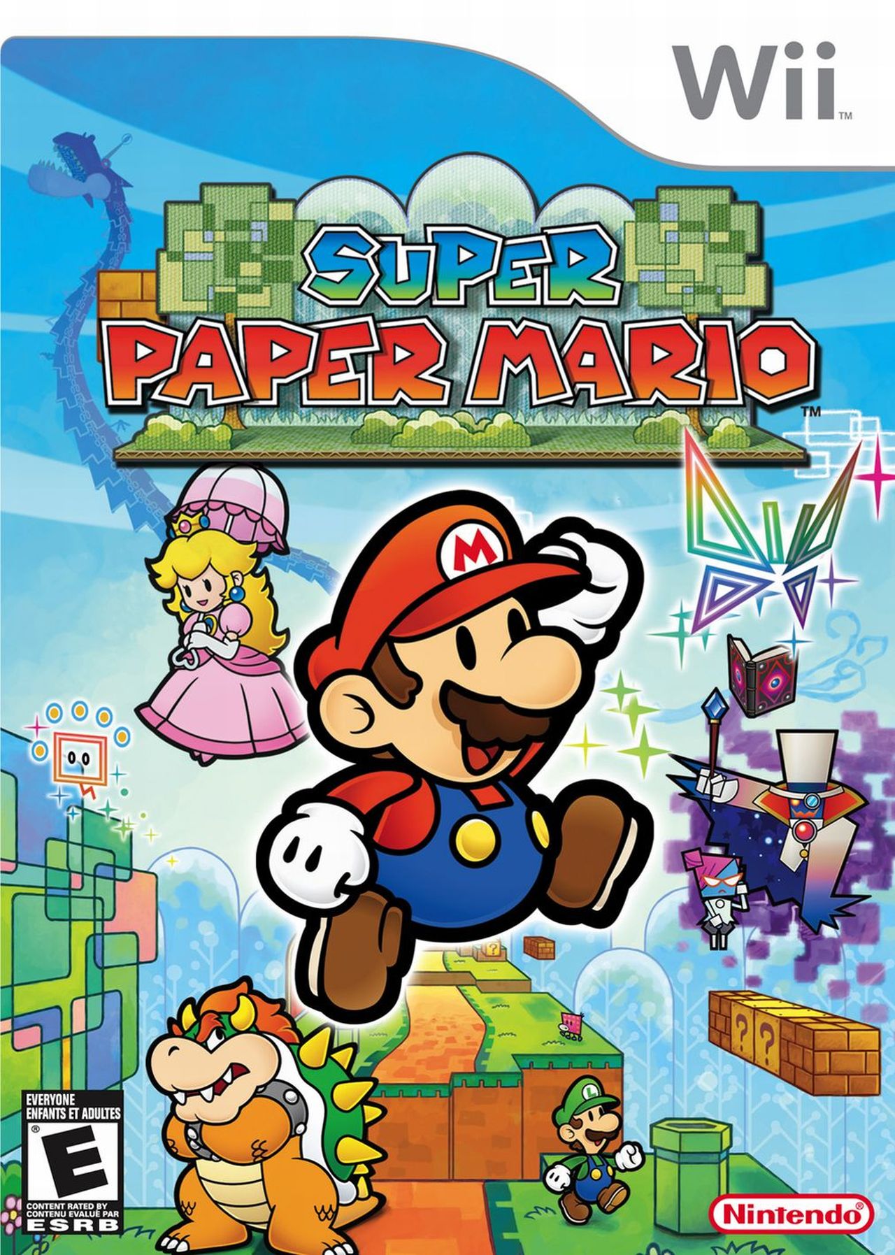
SuperPaperMarioBoxart.jpg

This is a beautiful boxart that conveys all the selling points of the game very well.

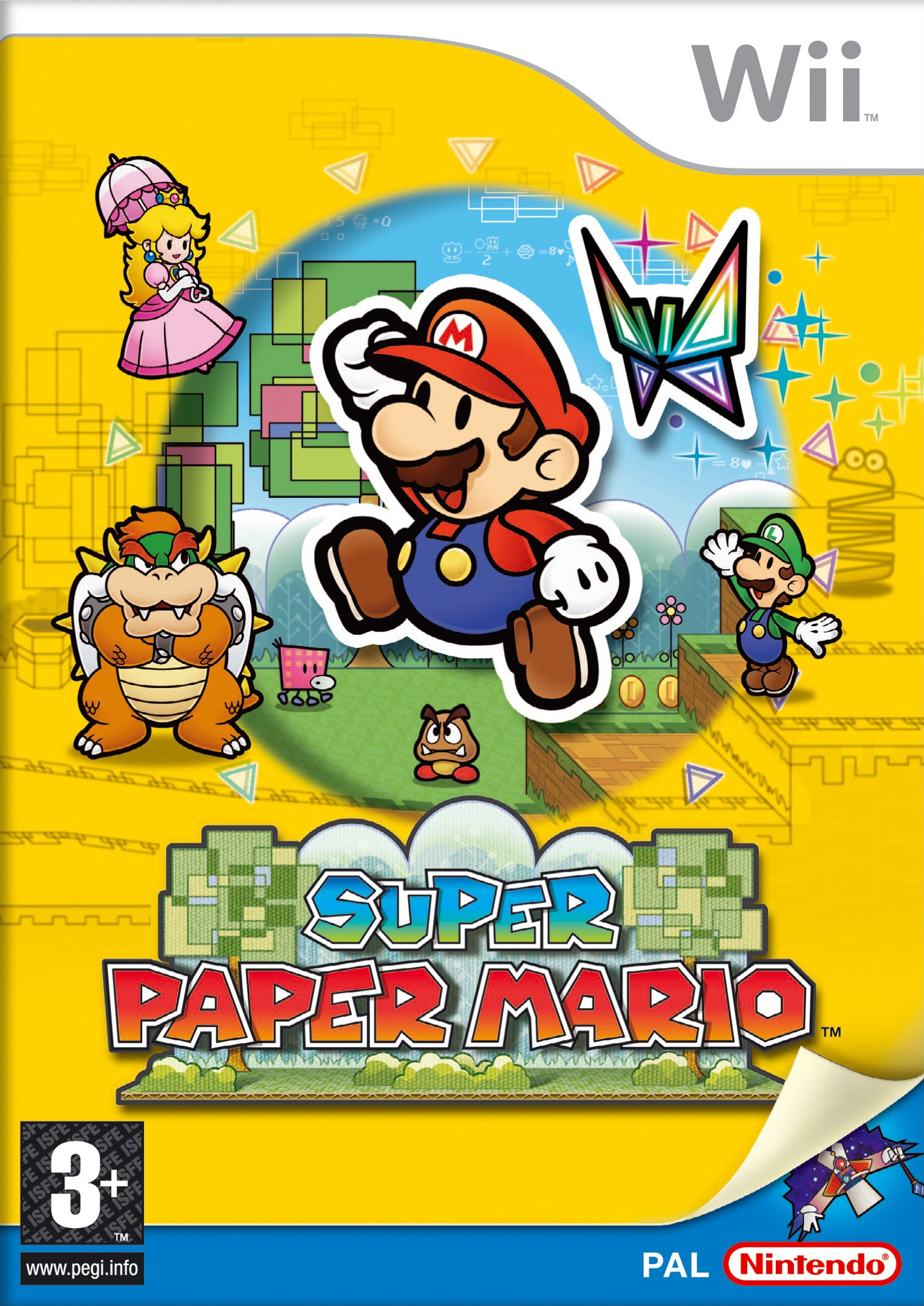
Super_Paper_Mario_EUR_cover.jpg

Poor European and Japanese folks whose boxart was marred by this ugly and entirely unnecessary yellow border. A shame because this would otherwise be a fine alternative boxart.
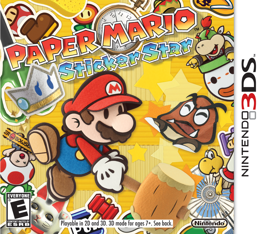
Paper_mario_sticker_star_box-art.png

Where do I even begin? This boxart is so bad in so many ways I can't believe this passed quality control! There's just way too much unnecessary clutter on this art, like they were trying to emulate the more simplistic scrapbook-like PM64 art but failed miserably. That droopy-looking Mario image doesn't help either and makes it look even less appealing.

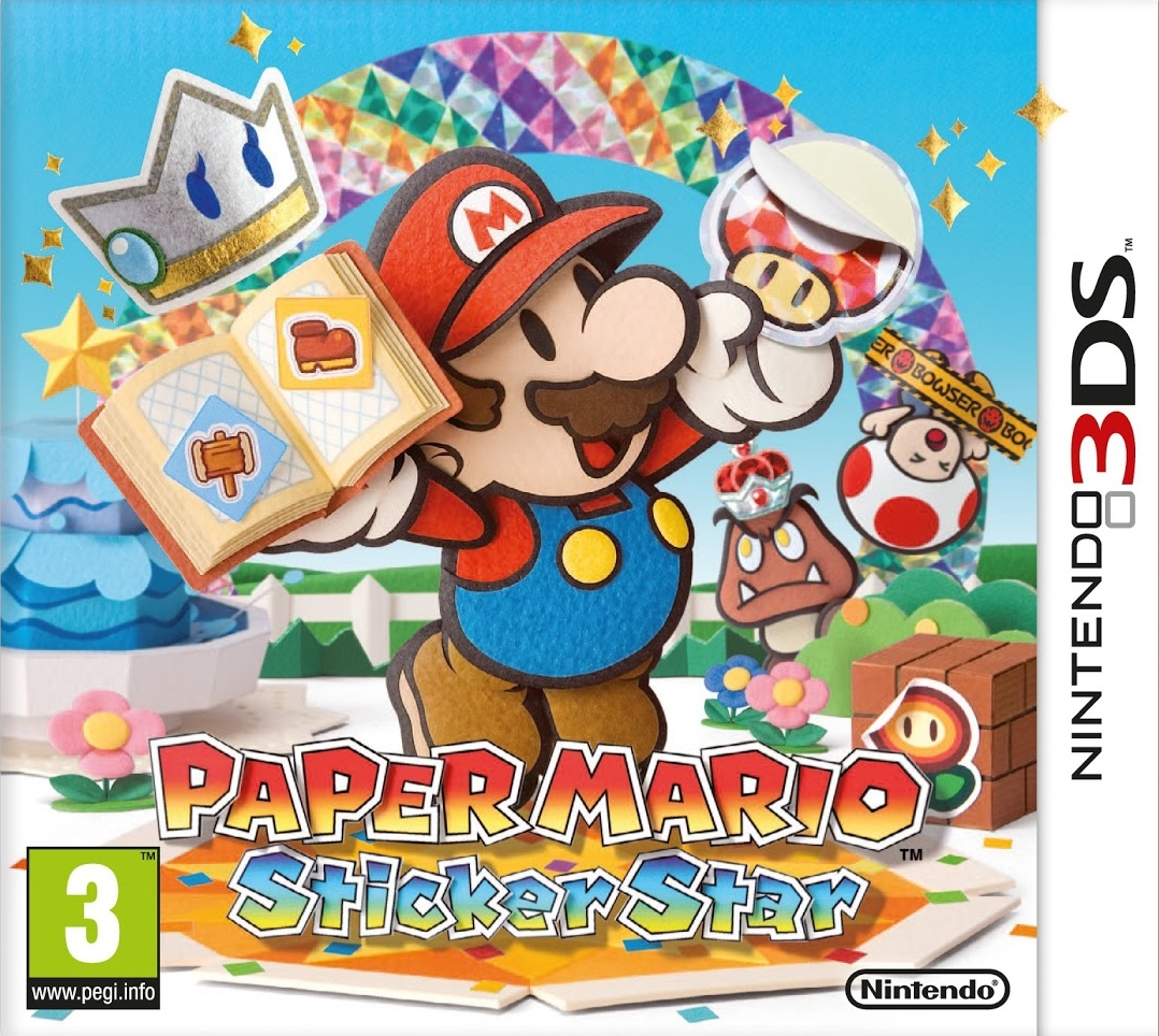
PMSSEUboxcover.png

European and Japanese folks got this much better version that has beautiful scenery and isn't full of unnecessary clutter. It's like the American boxart was trying to go over-the-top on the sticker theme, but this does a fine job at conveying that while still looking decent. Why change this NoA.
 
hey the flight rising thread about bad boxarts resurfaced too and so heres these from my post on there, when i was tryin to find the worst mario boxart
none of them are plain bad but here we have this clutter that doesnt explain the game that well (and the na boxart is perfectly fine too!!!)
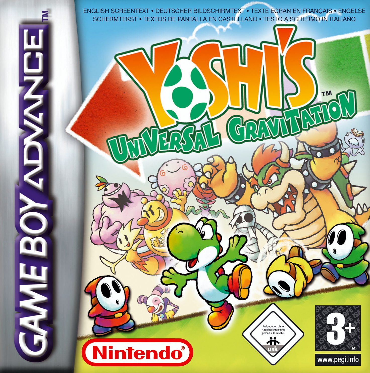
Yoshi_Universal_Gravitation_Germany_box.jpg

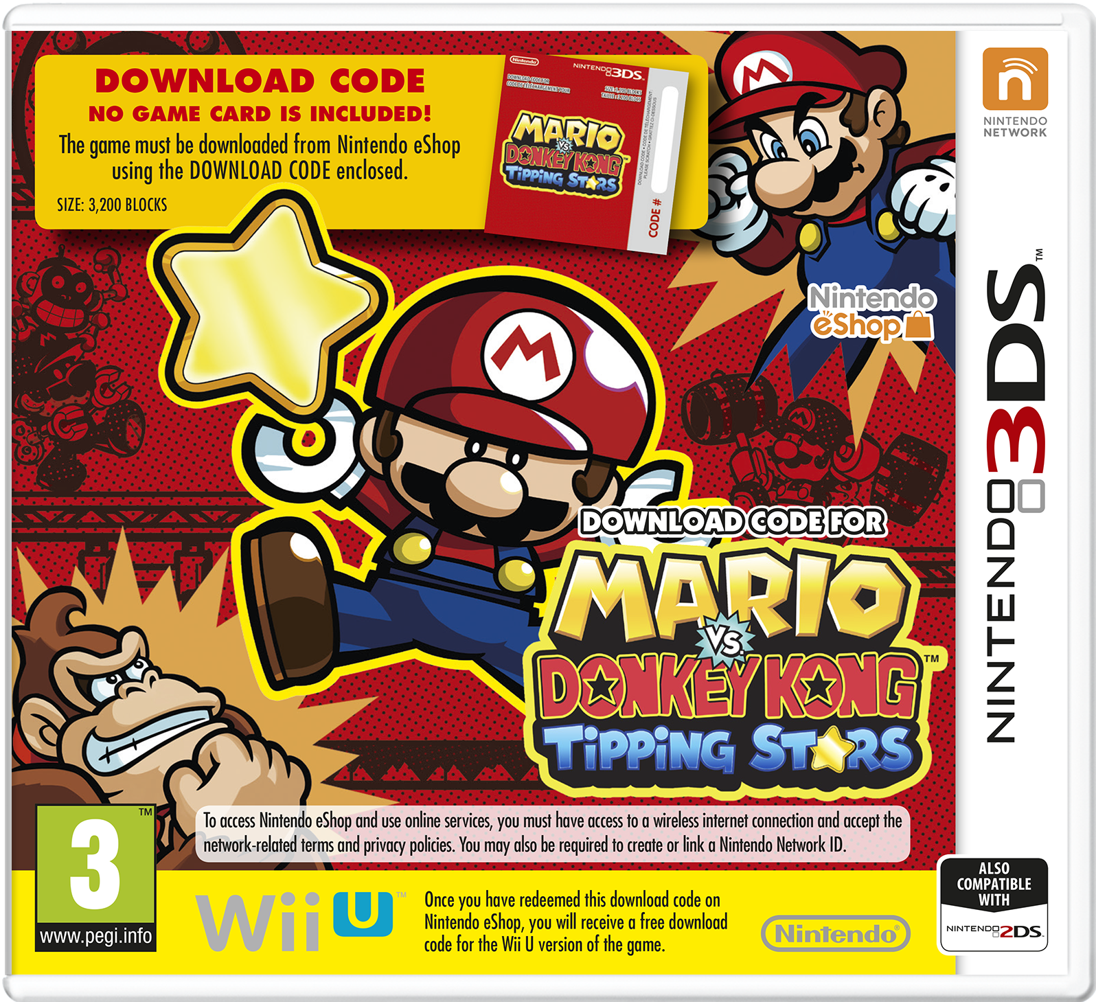
we have something even MORE cluttered (and a shame seems like itd be pretty dam cool without all the download code stuff)
Mario_vs_DK_Tipping_Stars_EU_box_3DS.png

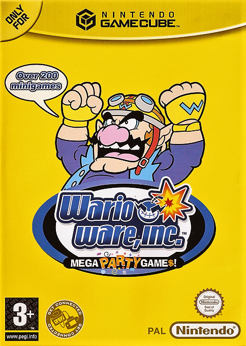
and then, wario in the piss void telling you about the amount of microgames in this video game (once again the na boxart is perfectly fine)
MegapartygamesEU.jpg
 
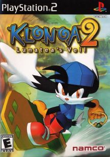
Here's some bad box art from more kid-friendly series, starting with Klonoa 2's PAL boxart.

s-l300.jpg


It's just Klonoa on a white background. This tells me nothing about what the game is, and just looks very boring. The American and Japanese boxart at least had something going on, but the European box looks like an afterthought in comparison.

5.jpg


OIP.CodBeKdnjCX6Iii7T2b2zwHaKr
 
and then, wario in the piss void telling you about the amount of microgames in this video game (once again the na boxart is perfectly fine)
MegapartygamesEU.jpg
That Wario gives me "I caught a fish and it was this big" vibes.

Or perhaps he's enraged at the amount of mingames there are. Could he instead be angry at the piss void, and shouting how many mingames his game has to calm himself down? I'm not quite sure.
 
  • Like
Reactions: zel
Have some Bust-A-Move.

ps2_super_bustamove-110214.jpg
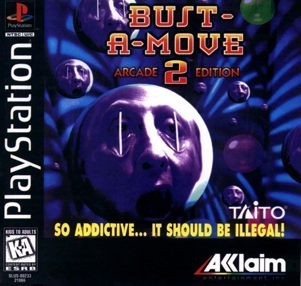
bust-a-move%202%20-%20arcade%20edition%20playstaion.jpg

Oh man, I remember playing Super Bust-a-Move. It was a very cute puzzle game, but why oh why did they put an incredibly off-setting up-close image of a baby on there? It didn't make me want to play the game because it was an embarrassing, creepy boxart.

The second image is just horrible. Why did they thought putting an image of someone's creepy disembodied head getting tortured was a good idea for an otherwise cute puzzle game series?
 
For boxarts that are bad but not in an obvious or funny way.

1597669420288.png


This is just a graphic's designer nightmare. What's basically the protagonist is not even fully in the frame, the alien is positioned in a way that's difficult to understand what it even is, the action and setting is unclear (presumably the two entities are fighting but what is the power loader doing to the alien? stomping on it?), having the cave background but not colouring the space background looks terrible (presumably it was to follow the lead of other early Saturn boxes that had similarly minimalist backgrounds, but not all of them did and it looks terrible here), the planet looks bad, etc etc. I'm convinced the terrible box is why Ghen War is so obscure even among Saturn owners despite being a very competent and high-effort exclusive for the system (albeit one somewhat at odd with why someone would buy a Saturn in 2020).

1597698239630.png

Normally I'd just call it lazy, but they already had much better artwork produced for the arcade flyer so they spent additional effort producing something terrible.
 
and then, wario in the piss void telling you about the amount of microgames in this video game (once again the na boxart is perfectly fine)
MegapartygamesEU.jpg
Yeah, this one's actually bad. The colors here are too intense for a background, and it ends up hurting your eyes. Also, this is just a logo with stock art of Wario. Unlike the other boxes, this one doesn't have abstract elements indicating what you're getting. The logo itself also doesn't seem all great, pretty tacky. The subtext is too small IMO, more like a side note, but it's not like there's much room allowed for it since the stock art takes up such a big part of the space. Also, there's a very tacky speech bubble, and it doesn't even sound like Wario's saying it.
 
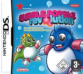
what is with that franchise and terrible box arts
 
Back