Wayoshi
PM Pro
I wonder why I never announced this here before. :P
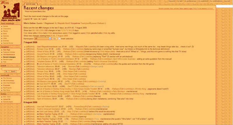
Those who have used my skins may notice what I call "glaze", glow, and other image effects I've always used are gone this time - because in my upgrade of Photoshop Elements from 2.0 to 7.0 doesn't have those. Finally breaking tradition, I found a really epic other one: "Graphic Pen". It takes the two saved hexadecimals that Photoshop can store and recolors parts of it one way or the other, but in a natural, smooth way, I think by checking major color changes pixel-by-pixel:
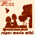
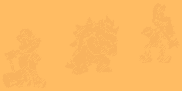
I didn't play around with the settings of it this time, but I did cycle through all image effects, and this was by far the best (of only few that were good for Monobooks). I can do it for every skin thanks to the variable colors it uses, so I hope to play around next time.
Remember to go to User:Wayoshi/monobook.css if you want this or any past skin...I left Wario on about twice as long as I should have, so this was well overdue...

Those who have used my skins may notice what I call "glaze", glow, and other image effects I've always used are gone this time - because in my upgrade of Photoshop Elements from 2.0 to 7.0 doesn't have those. Finally breaking tradition, I found a really epic other one: "Graphic Pen". It takes the two saved hexadecimals that Photoshop can store and recolors parts of it one way or the other, but in a natural, smooth way, I think by checking major color changes pixel-by-pixel:


I didn't play around with the settings of it this time, but I did cycle through all image effects, and this was by far the best (of only few that were good for Monobooks). I can do it for every skin thanks to the variable colors it uses, so I hope to play around next time.
Remember to go to User:Wayoshi/monobook.css if you want this or any past skin...I left Wario on about twice as long as I should have, so this was well overdue...
