Navigation
Install the app
How to install the app on iOS
Follow along with the video below to see how to install our site as a web app on your home screen.
Note: This feature may not be available in some browsers.
More options
You are using an out of date browser. It may not display this or other websites correctly.
You should upgrade or use an alternative browser.
You should upgrade or use an alternative browser.
-
So my Twitter was locked because I wasn't 13. But I am. Now they're like "We can unlock your account now" and I'm just like I never needed my account locked beforeeeeeeI am so proud with this pose uwu
 Caption this
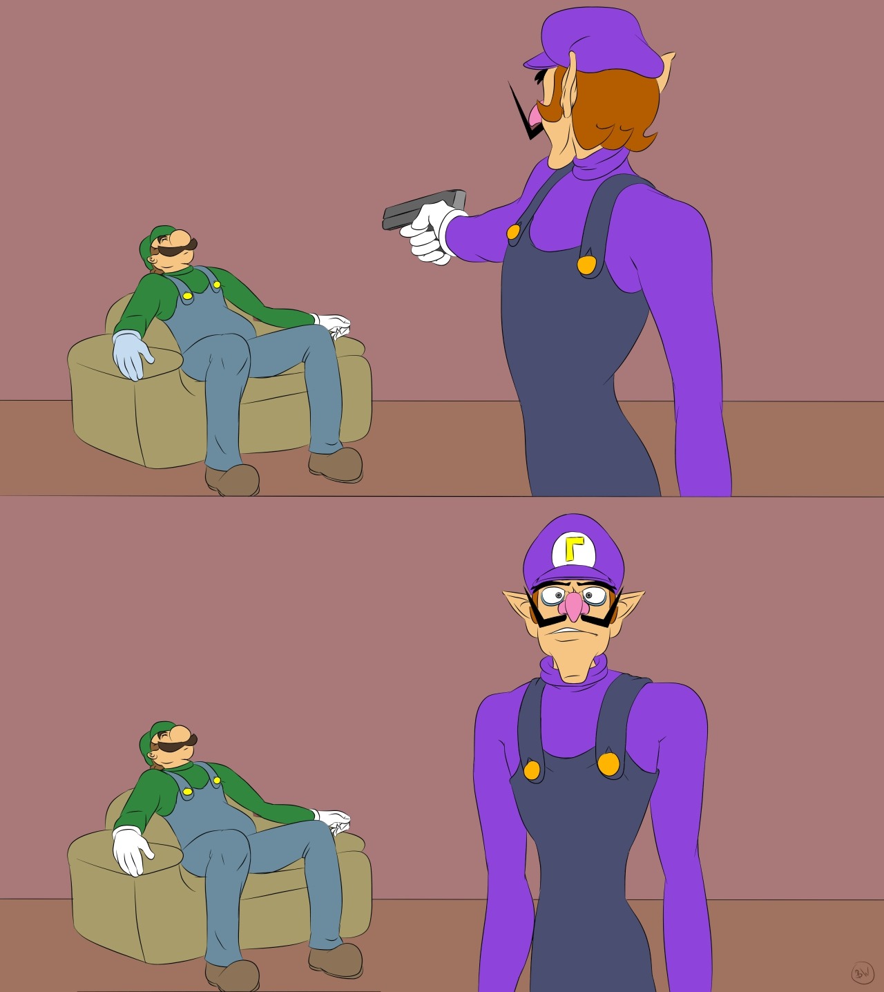
 Unijuwaluigi's figure
 Xiahou DunPanel 1: (ascending pitch) Wa-eya-ya-ya-ya-ya-ya-ya
Panel 2: WAAAAAHH!!Do you know why Mario's face is so different in the reflection in one of the Mario Kart Double Dash renders? My guess is it that it's from a rendering technique that requires a 2D image. Metals require something to reflect off of to look good in a rendering environment. This requires use of an environment map, a 2D image placed around the model (to save time making a complete scene). I think what happened is that they were using an environment map meant for another render and maybe they decided to change the facial expression at the last second. But this is my best guess, but it makes more sense to me than anything else.
BTW if you look at this render closely, particularly in the shell's reflection, it doesn't seem like Mario and Luigi are even on the kart. I'm pretty sure it's another environment map thing. Xiahou BaHey, I was the one who taught LGM that metals needed something to reflect off to look good! I've discovered that after trial and error, rendering a heavily metallic character and realizing that, oh my god the metals look awful and very flat looking. After looking it up online about why my metals look flat and lifeless, that's when I discovered it, so I slapped a huge dome with a generic texture (I think it was a texture envmap from Electrodrome) encompassing the render and the result was far better. That's one method of doing it: the other is to apply an environment map material on the model.
It was this render that made me realize metal properties.
Also, if you know about Metal Mario's trophy from Super Smash Bros. Melee, you can see what LGM is talking about. Metal Mario's trophy uses the Super Mario World stage as its envmap, even though the stage itself isn't present in the background. I think that's really interesting choice of envmap for the trophy, honestly, and I remember it intrigued LGM and I when we were younger and didn't know modeling stuff. This is the envmap in question
 I-I'm just watching random Mario videos on YouTube and I keep getting Mr. L-ed and I'm crying from laughing. This is what I get. F-3 of my ginger tabbys are laying with my Tanooki Mario plush and he blends right in haha!~I don't know what went wrong with my precious Luigi tag on tumblr! After years of no mariocest there is now mariocest aHHH
 Tenyes it's #mariocest but to block it i have to click on it and see all the nasty images they've posted oof.
 zelsee if you can like. block your eyes from the actual nasty pics and only see the part where you can hide it. if its possible?
 TenI was blessed for the only things to pop up were text posts :3
now it's blocked without incident~I had an amazing dream about All Might.
*throws him to the list of baes* Rolla Koopaneat owo
hey i was just playing him in Jump Force.. he lost to an average boy with a gun (played by my friend/owner of the game)Is it just me or is season two of bnha boring.
Like I'm on this phone more than the tv. Rolla Koopawait it's oonly on s2? ir your only on s2? either way thanks for reminding me i need to watch the new season
 Rolla Koopaand tha jus be the curse of long running battle shounen anime. yes, the curse, of time filling.
 TenI'm just on season two. I believe there's 4 to 5 seasons.
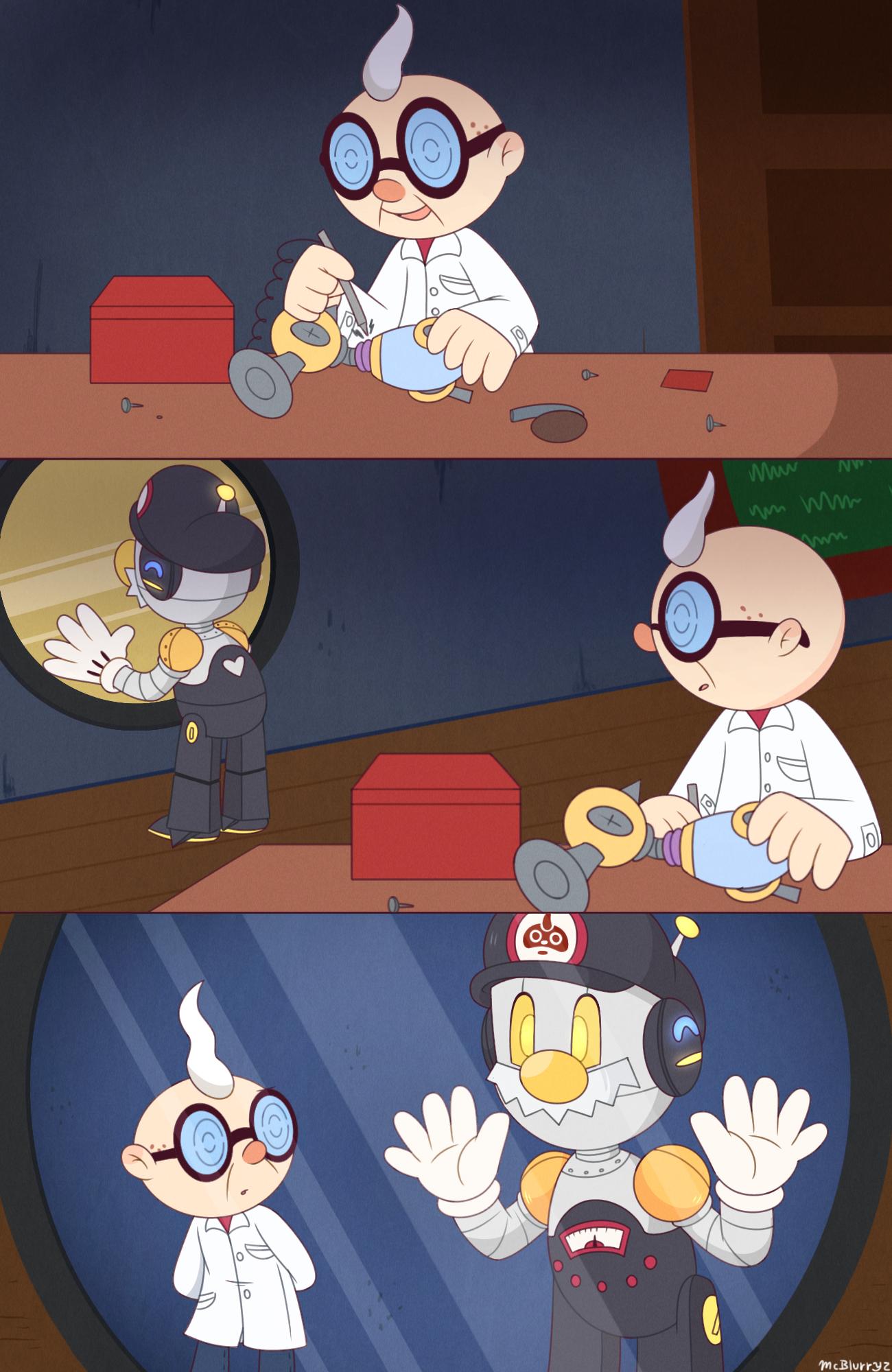
this tweet made me think of you
also that twitter account is a darned drug to me, help TenHaha, I follow her too~
Wholesome as hecc. Xiahou Dunthat was a perfectly fine knife....
help i can't stop listening to this songWhat do you get if you cross between Luigi and a pretty dress?
Fabulouigi!Have some gifs i made
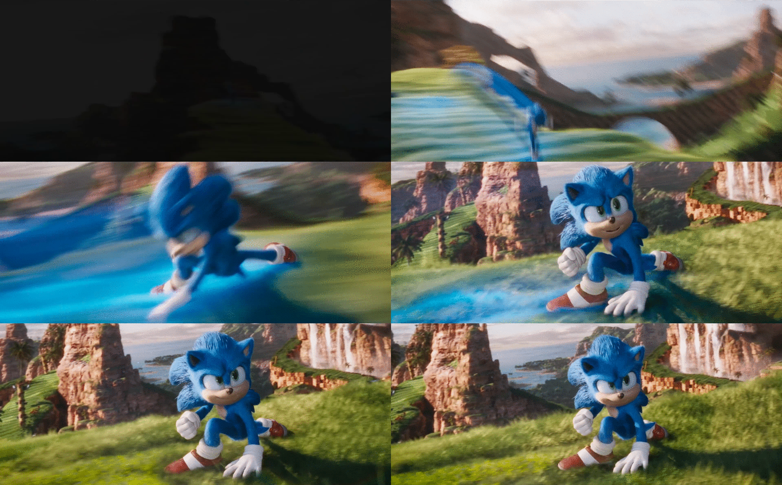
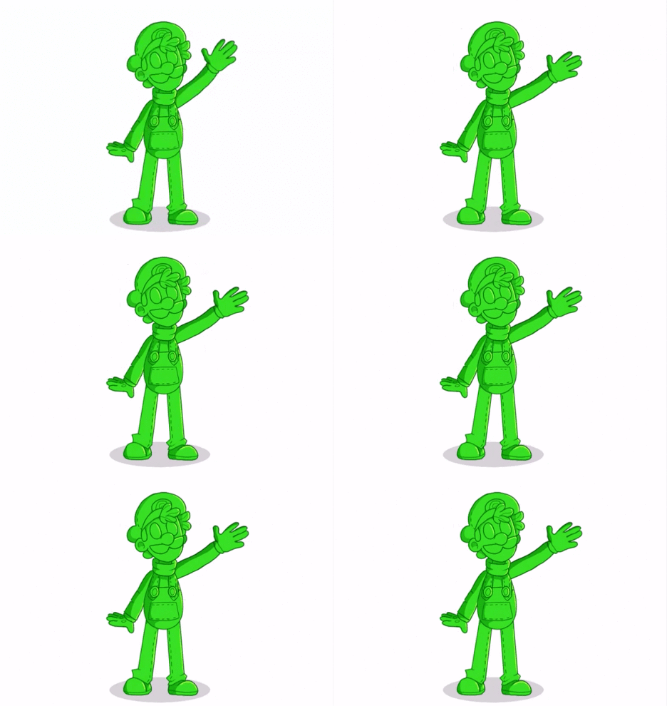
(art isn't mine but was in individual frames on pixiv~) Connor McKoopaCool!Emotes that don't pop up in the Mario group!


 Rolla Koopabuh why they be hiding
 TenWe need a way to pin messages on our profile now.
 Xiahou Dun
 CHECKERED BWANKIE FO WEEGEE WHOOHO!!!
 TenpRECIOUS SON
 Xiahou DunMario got the weed crystal.
 TenI can't tell if this is a happy Luigi or an upset Luigi...
 Rolla KoopaLooks like Luigi's bestowing upon Mario with his great elder wisdoms.
 Rolla KoopaThe ways of a the bros, Mario, they are a a sacred pathI'm going through old forum posts and I've already seen two people with Mr. L as a profile pic.
I'm getting nostalgia~
AlsoLuigi is a pimp.I feel like more and more people are playing SPM just for Dimentio and/or Mr. L. It makes me a little sad... CocoaThen again, the whole entire game is surprisingly deep and dark for a Mario game.
 Xiahou BaI'd strongly argue that its story is not deep. Its story is as shallow as a puddle.
Having a more developed plot with twists and all of that doesn't mean it's deep. I'd argue something like Tales of Symphonia having a deeper plot, as it dives into racism, two countries that have their power dynamic thrown out of whack, and questioning the typical prophecy plot. Or something like Final Fantasy 7 having anti-capitalist stuff. Xiahou DunWait that's a bad thing that people play Super Paper Mario just for the stylish Luigi that wants to have "@you"?
 -
Loading…
-
Loading…
-
Loading…


