Unpopular opinions about the Mario series

I do not like Crafted World's artstyle that much. A world made entirely out of wool was a lot more creative. Paper Mario already does all this crafted thing too.

Yoshi also doesn't look good in it. Just regular Yosh but with an ugly looking texture slapped on him.
 
I agree. If they want to go through the plush style, actually fucking model a plush toy, don't just slap a plush filter and keep the eyes and mouth and body form intact when they're practically impossible to 100% replicate in real life. The Switch isn't even powerful enough to render something that looks decently plush-y, so why bother??
 
3247920-yoshihead.jpg


A plush? I didn't even know it was supposed be a plush lol. The texture is that bad. Skin aside it's just regular Yoshi.


If the 3DS can make Yoshi look like wool then I'm sure a Switch can make him look like a plush in some way.
 
It looks more of laziness than adapting Yoshi to a particular style. Anyone can multiply that effect onto any texture they like. Even first-time newbs of Substance Painter can do that.
 
Saltman said:
A plush? I didn't even know it was supposed be a plush lol. The texture is that bad. Skin aside it's just regular Yoshi.


If the 3DS can make Yoshi look like wool then I'm sure a Switch can make him look like a plush in some way.
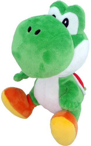
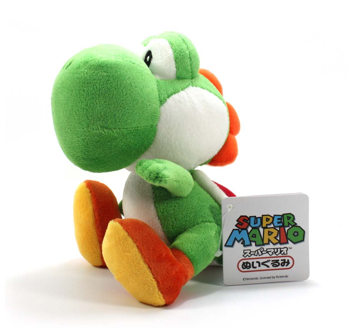
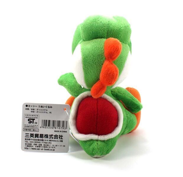
And having it be regular is the problem. Have you ever seen a Yoshi plush?

YoshiPlush.jpg


YoshiPlushSide.jpg


620px-YoshiPlushBack.jpg

You notice that they don't quite exactly resemble Yoshi? It's just the nature of plushies, limitations of fabric color, limitations of material, and you can't achieve exact dimensions and proportions because they have to be stuffed AND they have to hold up from sitting. What they should've done is used these plushies as references, tried modeling these plushies, and you'd have a far more convincing plush.

In Yoshi's Woolly World, they actually did this, and the results are actually decent.... in game art.

481px-ND1abril28.jpg


Soo... what happened? Did they get cocky to thinking that, "Well, we can just change Yoshi to plush fabric and it'll look convincing" or were they just lazy or were they afraid they'll stray too far from Yoshi's original design (as if it's soooo fantastic to begin with; it's not)? Or maybe they thought about promoting their stupid game so they made it so you can easily make a horrendous alt of it in Smash and therefore advertise the game?
 
I'll donate them myself if I freaking have to!
 
Yoshi looks fine.
 
It's weird that you dislike Ashley for being generic waif crap or something when Yoshi is generic cute dinosaur that's not that cute and has a voice that can be ear piercing at times, but I'm not complaining.
 
There's a lot of things I can say about Yoshi, but "generic" isn't one of them. Sadly.

I think he's referring to Yoshi from Yoshi's Crappy World which is weird because it's undisputed fact that Yoshi looks crafty I mean crappy.
 
Saltman said:
It's weird that you dislike Ashley for being generic waif crap or something when Yoshi is generic cute dinosaur that's not that cute and has a voice that can be ear piercing at times, but I'm not complaining.

I mean at large I find yoshi to be acceptable. I'm not a diehard fan of him or anything.

But I was mostly referring to his look in crafted world. I think it's fine.

However I'm not a plush connoisseur so what do I know?
 
Mcmadness said:
However I'm not a plush connoisseur so what do I know?
You should know to submit your opinion under mine.
 
Snow J said:
*img*
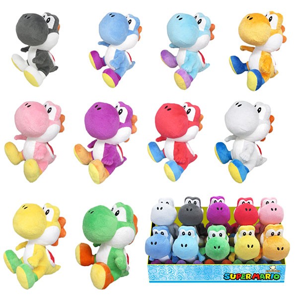
If they just used these boys as the in-game models, I'd totally be behind it.

I own all of these.
 
Except the white one.

We have a small white one instead.
 
I only have a green one (but the one pictured seems to have different spines than the others and the one I have).
For some reason MarioWiki's merchandise gallery didn't have it available.
 
Is the green one from a newer print than the ones pictured?
 
I really don't know how to feel about MK64. I played it today and it isn't as good as I remember.

Karts control well enough (not perfectly) and the game has great music, and multiplayer is the best part. I remember playing this game a lot in birthday parties elsewhere. Battle mode + Block Fort = so good.

But at the same time it's really barren in content and it lacks polish. Graphics are REALLY dated with those muddy, blurry sprites (still better than those Mario Kart DS models lol). Paper Mario 64 had way better sprites for some reason. They look even muddier than SMRPG sprites and I don't know how is that even possible.

It's like without the multiplayer this game is just an uglier Super Mario Kart 2.0 that hasn't aged as horribly but still aged a lot.
 
block fort sucks. I repeat.

you should really try playing expert mode and come back to me saying this game controls good
 
I don't see people singing praises for Double Decker
 
That one is bland but big donut is still worse and emptier. I just like battle arenas where I can hide tbh.
 
double decker seems to be a good place to hide around too.... compared to block fort with its bright colored landmarks and also green shell hell if the battle lasts long enough
 
I love green shell hells.


especially when the other guy is the one who gets hit


Big donut doesn't allow green shell helling.
 
LeftyGreenMario said:
I don't see people singing praises for Double Decker
That one's the favorite in my family. Block Fort is overrated.
 
Back