Navigation
Install the app
How to install the app on iOS
Follow along with the video below to see how to install our site as a web app on your home screen.
Note: This feature may not be available in some browsers.
More options
You are using an out of date browser. It may not display this or other websites correctly.
You should upgrade or use an alternative browser.
You should upgrade or use an alternative browser.
Why do people hate Paper Mario: Sticker Star?
- Thread starter A Paragoomba and the Koopa Bros.
- Start date
Koopa con Carne
call me Hot Lips, 'cause i'm a one-shot wonder
- MarioWiki
- Koopa con Carne
I'm not familiar with that one but I think both designs of Sonic work in different scenarios.
Like classic Sonic wouldn't fit in an edgy Shadow the Hedgehog-esque rampage lol.
Like classic Sonic wouldn't fit in an edgy Shadow the Hedgehog-esque rampage lol.
Koopa con Carne
call me Hot Lips, 'cause i'm a one-shot wonder
- MarioWiki
- Koopa con Carne
But what do you mean by "a hill to die on"? So far I've tried to point out why the older style works better in the Paper Mario series while the dissenting opinions have largely been unexplained and this claim in particular:
is just not true, having debunked it simply with a couple of picture comparisons.90% of pre-sticker star designs are just taken from what was at the time the current designs so to accuse the modern designs of being "soulless" is frankly ridiculous.
Mcmadness
The idiot who puts things in the wrong board.
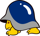
yes, because the TTYD Buzzy Beetle looked identical to its Super Mario Bros. precursor.

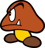
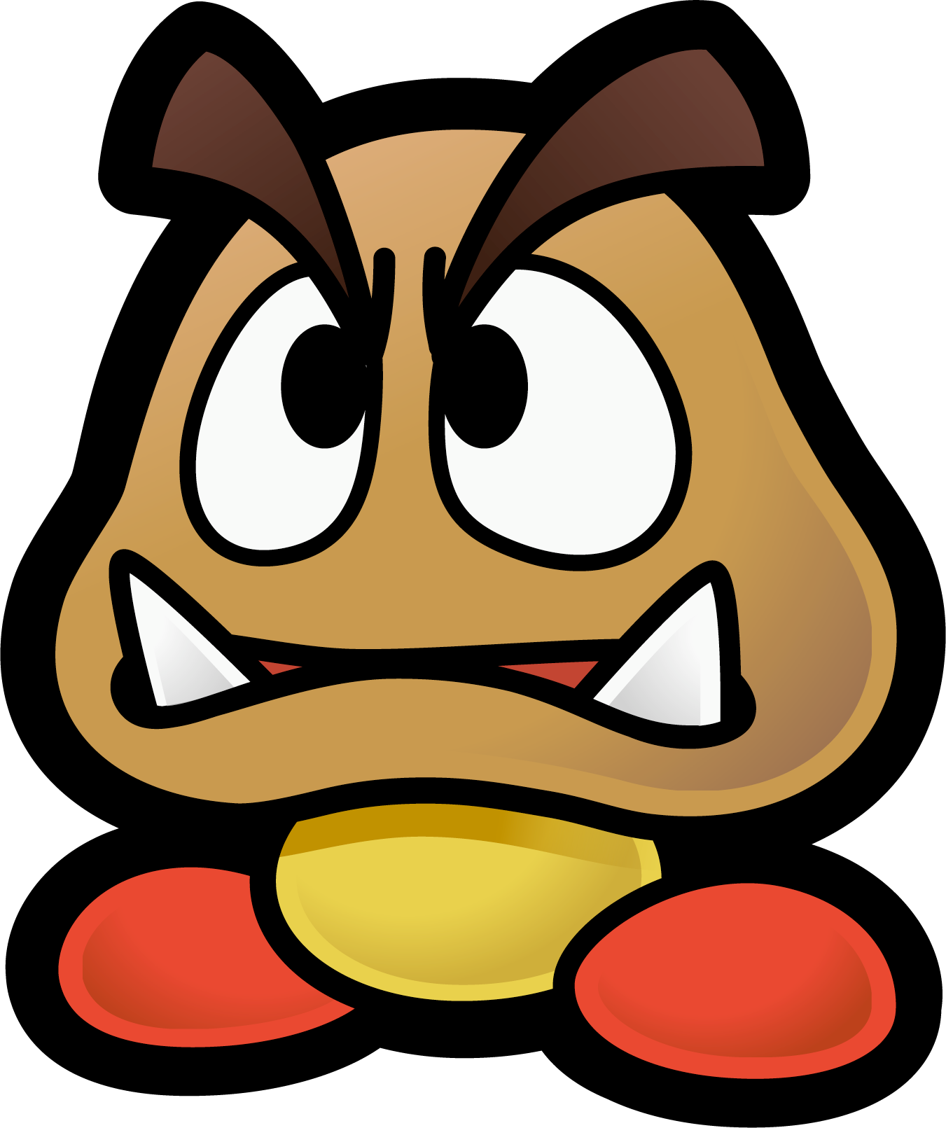
and the mainline Goomba definitely had red shoes and overgrown eyebrows that the YI/PM counterpart borrowed.
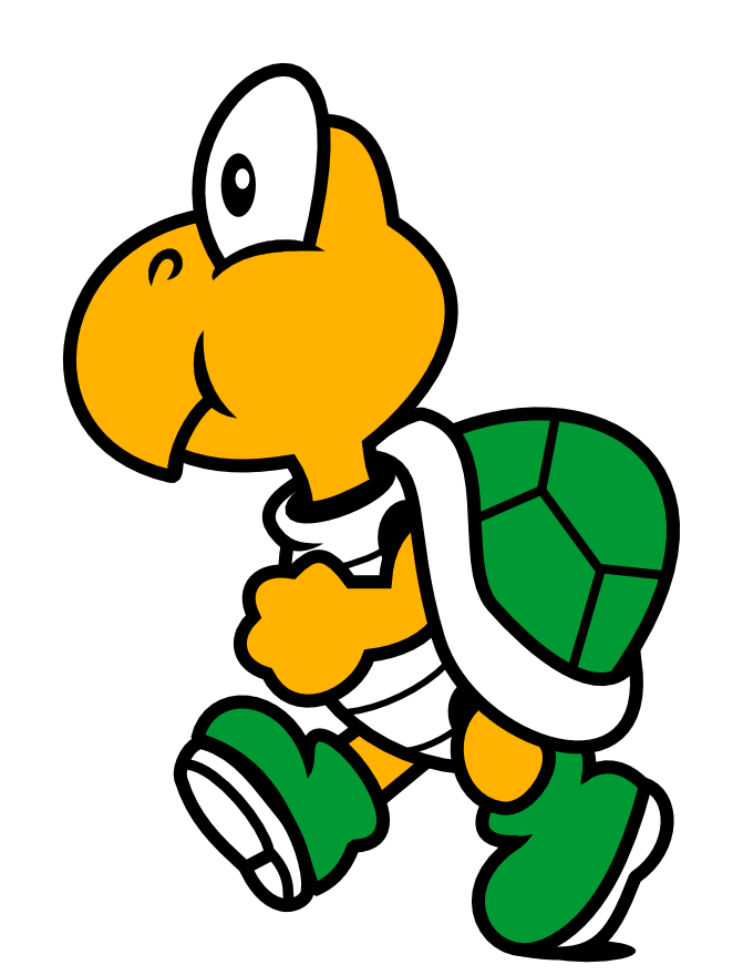
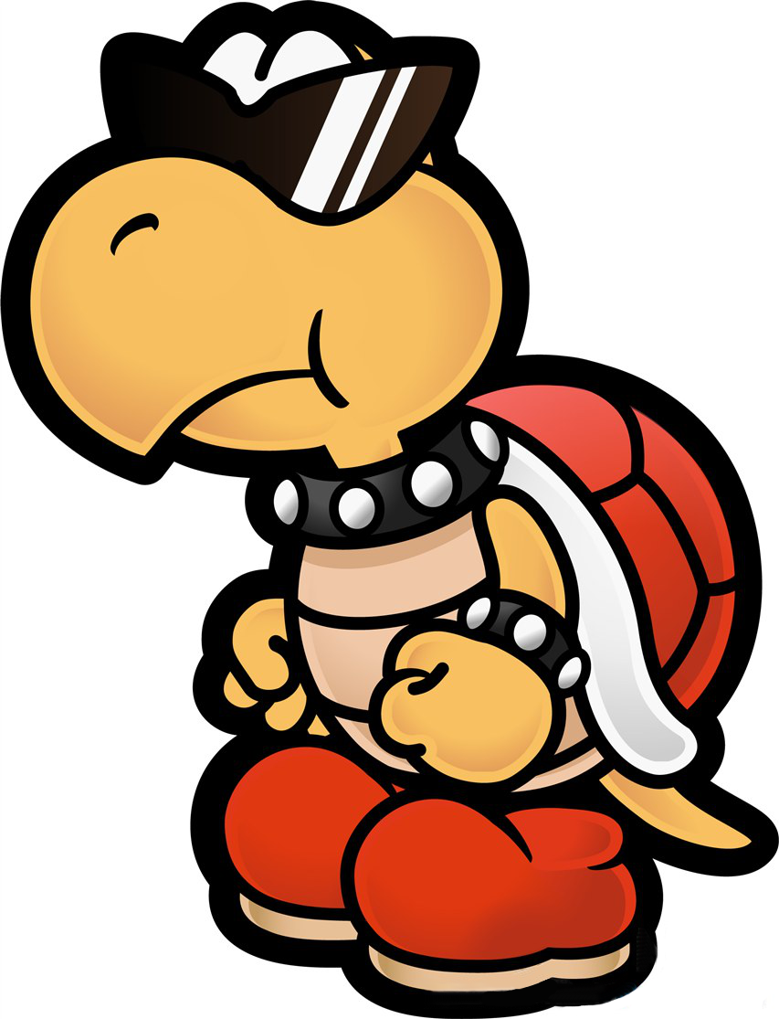
And Koopa Troopas were very much wearing punk attire before Paper Mario.
Buzzy Beetle's design is taken directly from SMW.
Goomba's design is taken directly from Yoshi's Island.
Koopa Troopa is one of the few exceptions but even then thats more due to there being friendly non-enemy ones in the game.
You can like the older ones all you want, nothing wrong with that but don't try and act like they have some kind of soul or were created specifically for that series because the simple fact is that they aren't.
Koopa con Carne
call me Hot Lips, 'cause i'm a one-shot wonder
- MarioWiki
- Koopa con Carne
Buzzy Beetle's design is taken directly from SMW.


No? lol. They're just as similar to each other as they both are to the modern design.
Goomba's design is taken directly from Yoshi's Island.
I have recognized this, read my message again. YI and old PM share a lot in character design and are distinct from the rest of the Mario franchise, which you seem to have referred to mainly.
Koopa Troopa is one of the few exceptions but even then thats more due to there being friendly non-enemy ones in the game.
I suppose friendly Koopas in TTYD and non-friendly ones post SS are very similar in design, yes.
You can like the older ones all you want, nothing wrong with that but don't try and act like they have some kind of soul or were created specifically for that series because the simple fact is that they aren't.
you've done nothing to explain why you consider them soulless, so treating this as a simple fact is just not right.
- Pronouns
- She/her
- MarioWiki
- Ray Trace
But what do you mean by "a hill to die on"? So far I've tried to point out why the older style works better in the Paper Mario series while the dissenting opinions have largely been unexplained and this claim in particular:
It's really just a matter of taste. Personally, I prefer the sleeker and more established designs of the "modern" variants. That's really just it. I think the only one where I prefer the PM design is the Buzzy Beetle as it's cuter rather than creepy.
No one really makes a fuss when other stylized games such as Mario & Luigi stick with the established designs anyway. It's only when Paper Mario does it when it becomes a problem, and it's compounded with how cookie-cutter Sticker Star felt. I don't think Paper Mario is all that of an expressive title anyway when it comes down to physical descriptors, Koopas in Mario & Luigi showcase a lot more personality in how they react in Superstar Saga's opening alone than any Koopa did, Paper Mario has always been more of a dialogue and situation heavy game than one that showcases how expressive their characters are.
I rest my case with a sprite of a dead Koopa.
- Pronouns
- He/him
I think you're getting too hung up on the idea of the original designs somehow possessing a literal soul, which obviously no one is arguing here...Buzzy Beetle's design is taken directly from SMW.
Goomba's design is taken directly from Yoshi's Island.
Koopa Troopa is one of the few exceptions but even then thats more due to there being friendly non-enemy ones in the game.
You can like the older ones all you want, nothing wrong with that but don't try and act like they have some kind of soul or were created specifically for that series because the simple fact is that they aren't.
Mcmadness
The idiot who puts things in the wrong board.


No? lol. They're just as similar to each other as they both are to the modern design.
I have recognized this, read my message again. YI and old PM share a lot in character design and are distinct from the rest of the Mario franchise, which you seem to have referred to mainly.
I suppose friendly Koopas in TTYD and non-friendly ones post SS are very similar in design, yes.
you've done nothing to explain why you consider them soulless, so treating this as a simple fact is just not right.
For Buzzy Beetles, limitations of the platform, their artwork makes it more clear. The only real difference is the eye.
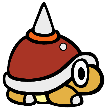
And I said 90% of PM is just taken from other games, exceptions exist of course but the vast majority are taken from prior sources and games
And I neither consider them soulless nor do they have any "soul" put behind them as they are simply character designs for a video game, unless you are equating soul with effort to which neither of us are in any position to say how much effort they put into the games because if life has taught me anything it's that a person can pour their goddamn heart into something and still have it be referred as bland or uninspired by somebody else.
- Pronouns
- she/her
- MarioWiki
- Mario
btw Paratroopa (the wings) looks closer to Yoshi's Island than Super Mario WorldKoopa Troopa is one of the few exceptions but even then thats more due to there being friendly non-enemy ones in the game.


Yoshi! Yoshi!
Melon Inspector
- Pronouns
- He/him
A good reason to hate it is there is no direction or sense of where and what to do next, and glitched impend some players from getting far in the game, like myself.
Mcmadness
The idiot who puts things in the wrong board.
A good reason to hate it is there is no direction or sense of where and what to do next, and glitched impend some players from getting far in the game, like myself.
What glitches?
Rolla Koopa
...
- Pronouns
- She/They/Fae
Sticker Mario should become its own Digital TCG series with more playable characters/decks.
Yoshi! Yoshi!
Melon Inspector
- Pronouns
- He/him
What glitches?
I was in a castle and it wouldn't let me complete the last area.
Mcmadness
The idiot who puts things in the wrong board.
I was in a castle and it wouldn't let me complete the last area.
How so?
THE END
I am infinite, I am nothing
Let me burn down SS to its last remains.
1. There's no character progression.
2. Stickers don't encourage the player to fight enemies and instead make them want to avoid battles because they won't win anything (EXP) and waste their stickers.
3. The story is lame and stupid. WHY IS THERE A STICKER FESTIVAL?!
4. The only 5 characters are Mario, Peach, Kersti, Bowser and Toad.
5. Dialogues overall aren't as wacky and charismatic as the older games or even Origami King.
6. Instead of Chapters there are NSMB-style levels.