Navigation
Install the app
How to install the app on iOS
Follow along with the video below to see how to install our site as a web app on your home screen.
Note: This feature may not be available in some browsers.
More options
You are using an out of date browser. It may not display this or other websites correctly.
You should upgrade or use an alternative browser.
You should upgrade or use an alternative browser.
Galaxy 1 or 2
- Thread starter Im Yoshi
- Start date
Kingbowser99 said:Uhhh, I guess Galaxy 1, mainly because of the fact that you get a second little luma to help you if you choose player 2
That's Galaxy 2.
Galaxy 1 was just a second cursor.
The Shy Guy
The News Shy Guy
Both of them
Specific Neptune
how're you doin'
- Pronouns
- Any
that's right, of course. I haven't played them in a while.Toa 95 said:Kingbowser99 said:Uhhh, I guess Galaxy 1, mainly because of the fact that you get a second little luma to help you if you choose player 2
That's Galaxy 2.
Galaxy 1 was just a second cursor.
Unknown Entity
The Lost Soul
*sees topic title; hoping for "Both" option*
SUCCESS! Both are so vibrant and awesome games IMO. The first is a bit dull to me but otherwise nothing to complain about.
SUCCESS! Both are so vibrant and awesome games IMO. The first is a bit dull to me but otherwise nothing to complain about.
Specific Neptune
how're you doin'
- Pronouns
- Any
>calls both games vibrant
>"the first is a bit dull IMO"

>"the first is a bit dull IMO"

Unknown Entity
The Lost Soul
Kingbowser99 said:>calls both games vibrant
>"the first is a bit dull IMO"

I figured I would need to explain myself.
Yes. Both games have very vibrant graphics.
The dull bit was directed toward how Galaxy 1 has you replay the same crap twice just to get all 242 stars. I dunno about anyone else but I always hated that. It's fine playing as Mario... But when it comes Luigi time, I just can't get myself to do that anymore.(feels like a chore)
So, yeah. I guess that's my complaint despite "NO COMPLAINTS ABOUT EITHER".
- Pronouns
- she/her
- MarioWiki
- Mario
The first galaxy game has a slight edge in graphics because it feels new and fresh, though. And, the models aren't that bad. They're high-poly, especially compared to those abominations in Mario Kart Wii. I'd say that the Mario & Sonic games and the Mario Party games had even higher quality models, though.
- Pronouns
- She/her
- MarioWiki
- Ray Trace
Well I think the reason people think the Galaxy games have good graphics is that it looks so flashy and shiny and majestic coupled with grand orchestrated music. If you removed the shinyness and stuff it's pretty butt ugly. Especially with the poorly anti-aliased plants.
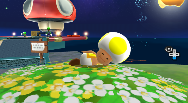
I mean if you even looked at the Toads close-up, they're really horrible.
I mean if you even looked at the Toads close-up, they're really horrible.
Baby Luigi said:Well I think the reason people think the Galaxy games have good graphics is that it looks so flashy and shiny and majestic coupled with grand orchestrated music. If you removed the shinyness and stuff it's pretty butt ugly. Especially with the poorly anti-aliased plants.
I mean if you even looked at the Toads close-up, they're really horrible.
hell the graphics dont really look all that different from sunshines if you removes all that shiny and glowy stuff style.
I'd say its wii lack of graphical power but there are some pretty sexy looking games for wii so thats really out of the window there.
- Pronouns
- she/her
- MarioWiki
- Mario
Yeah, they do look like low-end Gamecube models. They don't even have a mouth; it's only a texture.
But, Galaxy 2 didn't even improve it slightly, and reviewers are hailing it as a "graphical triumph" and that other crap.
But, Galaxy 2 didn't even improve it slightly, and reviewers are hailing it as a "graphical triumph" and that other crap.
- Pronouns
- She/her
- MarioWiki
- Ray Trace
Mario Party X said:But, Galaxy 2 didn't even improve it slightly, and reviewers are hailing it as a "graphical triumph" and that other crap.
What's funny is that Mario Party and Mario Super Sluggers had a far better model quality than the Galaxy games. I'm certain all the reviewers are praising are those pretty space skies and the supernatural glow as if the characters emitted their own light.
The sets (I mean, you know, the level design) is nice-looking for some levels, I admit (I have Melty Molten in mind), but the character model quality just sucks.
Dr. Javelin
Nathan Latsk
are you serious
practically every single graphic in existence looks terrible when you zoom in
as long as it looks great from the third person camera, what's the problem?
On that matter, why do the graphics even matter than much?
practically every single graphic in existence looks terrible when you zoom in
as long as it looks great from the third person camera, what's the problem?
On that matter, why do the graphics even matter than much?
Toad Eightyfive
used to be here but peaced out
- Pronouns
- Anything
- MarioWiki
- Toad85
Baby Luigi said:
half his body is sinking into the ground
Dr. Javelin said:are you serious
practically every single graphic in existence looks terrible when you zoom in
as long as it looks great from the third person camera, what's the problem?
On that matter, why do the graphics even matter than much?
beauty, style, atmosphere, and quite a few things really.
graphics can also make or break a game for some people as im sure no one wants to go back to atari graphics which only cosnsisted of black and white and such.
pixelated graphics are also pretty irritating.
probably why im generally not interested in playing some games that use that kind of style.
Dr. Javelin
Nathan Latsk
well, as long as the graphics don't get in the way of playing, it's not really a problem for me
i guess it's because i was raised on the N64?
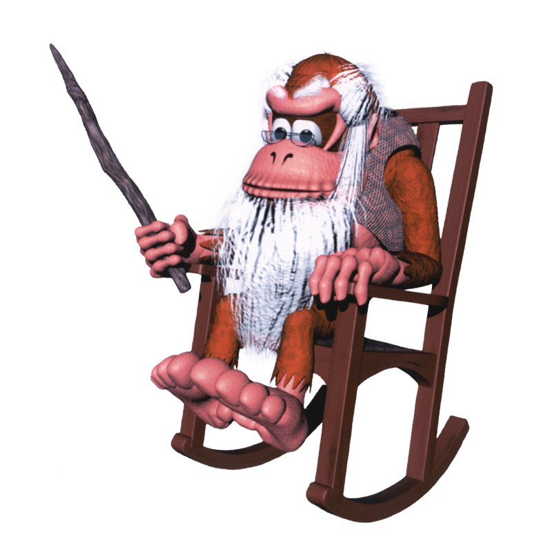 you kids don't know how good you've got it
i guess it's because i was raised on the N64?

Dr. Javelin said:well, as long as the graphics don't get in the way of playing, it's not really a problem for me
i guess it's because i was raised on the N64?
you kids don't know how good you've got it
um... i was raised on a nes
hell im probably older than you.
- Pronouns
- she/her
- MarioWiki
- Mario
I'm 18. :/ I know graphics isn't everything, but it's the polish that's the difference between a good game and a great game, especially a high-budget one.
- Pronouns
- She/her
- MarioWiki
- Ray Trace
Dr. Javelin said:are you serious
practically every single graphic in existence looks terrible when you zoom in
Not really, you don't necessarily have to zoom in into the flowers and characters to see how bad it is. It's just that the glowy stuff kinda distracts you from the atrocity of the graphics.
Dr. Javelin
Nathan Latsk
well if you're older than seventeen, then i guessZae said:Dr. Javelin said:well, as long as the graphics don't get in the way of playing, it's not really a problem for me
i guess it's because i was raised on the N64?
you kids don't know how good you've got it
um... i was raised on a nes
hell im probably older than you.
i'm kinda in the middle of the age group here, there's a lot of younger users and also a bunch of college-age people
i mean, i also played on an SNES and Game Boy Color when i was younger
- Pronouns
- she/her
- MarioWiki
- Mario
Baby Luigi said:Dr. Javelin said:are you serious
practically every single graphic in existence looks terrible when you zoom in
Not really, you don't necessarily have to zoom in into the flowers and characters to see how bad it is. It's just that the glowy stuff kinda distracts you from the atrocity of the graphics.
And besides, the hi-poly graphics in game like Super Sluggers and Mario & Sonic look much better. For instance, the Toads have actual mouths. Oh, and the bad Galaxy graphics can sometimes make a scene from that game laughable *ahem* that scene where Mario's lying in a bunch of flowers in the starting Gateway planet, and the badly anti-aliased flowers are close up.
And for selfish reasons, I prefer Super Slugger models over Galaxy models for rigging, posing, and rendering in 3DS Max.
Dr. Javelin
Nathan Latsk
Okay, that's a fair example.Mario Party X said:Oh, and the bad Galaxy graphics can sometimes make a scene from that game laughable *ahem* that scene where Mario's lying in a bunch of flowers in the starting Gateway planet, and the badly anti-aliased flowers are close up.
Dr. Javelin said:well if you're older than seventeen, then i guessZae said:Dr. Javelin said:well, as long as the graphics don't get in the way of playing, it's not really a problem for me
i guess it's because i was raised on the N64?
you kids don't know how good you've got it
um... i was raised on a nes
hell im probably older than you.
i'm kinda in the middle of the age group here, there's a lot of younger users and also a bunch of college-age people
i mean, i also played on an SNES and Game Boy Color when i was younger
oh yeah, im way older than you haha
