General Discussion

Shaggy said:
Also, was there a particular reason that {{edit}} requires the user to enter the template name? I tested out this code, and it didn't fail:
Code:
<div style="float:left;width:3.4em;text-align:left;padding:0 0 0 0.3em">[<span class="plainlinks">[{{fullurl:{{{1|{{FULLPAGENAMEE}}}}}|action=edit}} edit]</span>]</div>
but eh... It's too minor now.
Because it returns the URL of the page you are viewing, not the template it is located in.
 
Yeah, exactly: once the template got transposed, it all broke down since then it'd use whatever page it was on as the page name. I tried for quite a while to get it to automate properly, but in the end, manually adding the names was unavoidable.

Lakituthequick said:
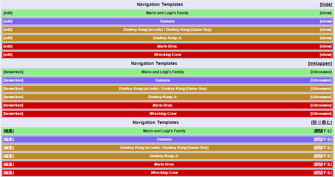
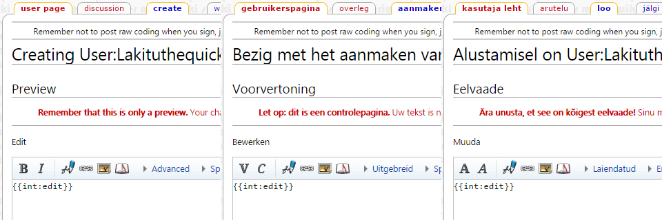
Digging this up because there is a neat function in MediaWiki that may get this consistent; using "{{int:edit}}" in place of the word "edit" in {{Template:Edit}} will transclude the word in the language of the viewing user, just like how show/hide does.

int-edit.png


It does capitalize the word "edit" though, though consistency between languages tends to be funny. "text-transform: lowercase" could fix that though.

Whether you use this is up to you, it's there.
Very nifty: I'm all for adding that (with the "text-transform: lowercase").
 
Walkazo said:
Yeah, exactly: once the template got transposed, it all broke down since then it'd use whatever page it was on as the page name. I tried for quite a while to get it to automate properly, but in the end, manually adding the names was unavoidable.

Lakituthequick said:
Digging this up because there is a neat function in MediaWiki that may get this consistent; using "{{int:edit}}" in place of the word "edit" in {{Template:Edit}} will transclude the word in the language of the viewing user, just like how show/hide does.

int-edit.png


It does capitalize the word "edit" though, though consistency between languages tends to be funny. "text-transform: lowercase" could fix that though.

Whether you use this is up to you, it's there.
Very nifty: I'm all for adding that (with the "text-transform: lowercase").
Neat.

Also, the toggle switch is capitalized in every language except for English (because MediaWiki:Collapsible-collapse exists somewhy, original is at /en (MediaWiki:Collapsible-collapse/en)), you'll probably want to lowercase that as well (CSS class is "mw-collapsible-toggle").
 
Actually, some other languages have it lowercase already (e.g. French (including French-Canadian), Hungarian, Bokmål, Russian), while Canadian/British English weirdly have it uppercase "Expand"/"Collapse" instead of "show"/"hide".

Pretty weird, and a pain, but I don't want to have to change the classes of over 400 nav templates (plus dozens more infoboxes) for such a superfluous reason. Taking a simple measure to make the {{edit}} capitalization consistent with the majority of users' preferences, and with the capitalization of "edit" in the tabs and headers, makes sense, but for the toggle, I feel like most folks probably don't notice or care anyway, so it's not worth us bending over backwards for it (it helps that there's a lot of space and more writing between them, minimizing the impact, whereas if they were side-by-side, there'd probably be more attention given).
 
Walkazo said:
Actually, some other languages have it lowercase already (e.g. French (including French-Canadian), Hungarian, Bokmål, Russian), while Canadian/British English weirdly have it uppercase "Expand"/"Collapse" instead of "show"/"hide".
Oh hey, yeah, it is inconsistent. The Expand vs. show is explained by this page (MediaWiki:Collapsible-collapse), Porplemontage has edited it to say 'show' instead of 'Expand'.

Walkazo said:
Pretty weird, and a pain, but I don't want to have to change the classes of over 400 nav templates (plus dozens more infoboxes) for such a superfluous reason. Taking a simple measure to make the {{edit}} capitalization consistent with the majority of users' preferences, and with the capitalization of "edit" in the tabs and headers, makes sense, but for the toggle, I feel like most folks probably don't notice or care anyway, so it's not worth us bending over backwards for it (it helps that there's a lot of space and more writing between them, minimizing the impact, whereas if they were side-by-side, there'd probably be more attention given).
That's not what I meant at all, actually. What I mean is that the toggle has a CSS class of "mw-collapsible-toggle", which can be targeted at with the lowercase rule from CSS. The toggle is inserted via JavaScript anyway, so its code is not editable on any of the templates.
 
Niiue said:
Time Turner said:
Niiue said:
Can someone with one of the English SMW2/SMA3 guides tell me if this is mentioned at all?
Any ideas on which levels it appears in?

There's one at the end of Watch Out For Lakitu, right before the goal roulette.

There's also an underground area full of them in GO! GO! MARIO!!.
In those levels, neither guide mentions them in any capacity, not even with "a Shy Guy" or "that enemy". It also isn't listed in SMW2's comprehensive list of enemies (126 (File:SMW2 Guide 126.jpg), 127 (File:SMW2 Guide 127.jpg), 128 (File:SMW2 Guide 128.jpg)) as far as I can tell, though perhaps I glossed over it.
 
If anyone wants to start writing CTTT articles While I'm uploading images, that would help me a lot.
 
Lakituthequick said:
Walkazo said:
Actually, some other languages have it lowercase already (e.g. French (including French-Canadian), Hungarian, Bokmål, Russian), while Canadian/British English weirdly have it uppercase "Expand"/"Collapse" instead of "show"/"hide".
Oh hey, yeah, it is inconsistent. The Expand vs. show is explained by this page (MediaWiki:Collapsible-collapse), Porplemontage has edited it to say 'show' instead of 'Expand'.

Walkazo said:
Pretty weird, and a pain, but I don't want to have to change the classes of over 400 nav templates (plus dozens more infoboxes) for such a superfluous reason. Taking a simple measure to make the {{edit}} capitalization consistent with the majority of users' preferences, and with the capitalization of "edit" in the tabs and headers, makes sense, but for the toggle, I feel like most folks probably don't notice or care anyway, so it's not worth us bending over backwards for it (it helps that there's a lot of space and more writing between them, minimizing the impact, whereas if they were side-by-side, there'd probably be more attention given).
That's not what I meant at all, actually. What I mean is that the toggle has a CSS class of "mw-collapsible-toggle", which can be targeted at with the lowercase rule from CSS. The toggle is inserted via JavaScript anyway, so its code is not editable on any of the templates.
Well anyway, I added the stuff to {{edit}}, but messing around with the css is beyond the lengths of what I am willing and knowledgeable enough to do over the toggle business, sorry.
 
Could someone with more know-how turn the tables used for the drop rates on the Paper Mario Badges (example one (Defend Plus), example two (Happy Heart)) into a functioning template? It'd be nice to have for articles on games beyond Paper Mario, and it's probably not a good idea to leave all that code there.
 
Uhg, I hate those clunky tables. Anyway, I feel like the drop rates (converted to 1% and 0.33% because all that hover-over stuff is stupid) could just be combined with Template:Badge-infobox. I'll try to get around to it sometime this week - like Wed after work or something.
 
If the article doesn't have an applicable infobox (say, the recent RPG consumables I'm in the process of splitting), having a drop rate template would sort the info neatly.
 
Maybe they should get their own infobox, then.

But I guess it depends on how many separate entries would have to go in a given page. If you can get dozens of things, a separate template may indeed be the only way. But different games also work different ways, so even then, multiple templates may be needed. I.e. TTYD has hold rates as well as drop rates, but afaik, M&L games will only have drop rates.
 
Superstar Saga also has the rate in which an item can be stolen from an enemy, which more-or-less matches TTYD's hold rate. Don't know about the other games, tho.
 
Walkazo said:
Uhg, I hate those clunky tables. Anyway, I feel like the drop rates (converted to 1% and 0.33% because all that hover-over stuff is stupid) could just be combined with Template:Badge-infobox. I'll try to get around to it sometime this week - like Wed after work or something.
Exactly my thoughts. I dislike this table's layout too, no offense to Zootalo.
 
So, minor thing, but I noticed this on the page for Yoshi's Island DS:

the wiki said:
In one level, there is a bush near the goal roulette containing a Shy Guy. If Yoshi passes through the bush, without defeating the Shy Guy first, a Bandit will swap it out for Baby Mario, whom he tries to run off with. The Shy Guy will stay on Yoshi's back until he grabs Baby Mario back from the Bandit.

Anyone know what level this enemy appears in? I'd find it myself, but I don't have the game (and my computer seems to hate DS emulators).
 
Some articles have a creation and development in one section prior to History, as in Princess Peach, Princess Daisy, Luigi, andWaluigi, while others have simply a creation section prior to history, but the development may be discussed within the history section or in general appearance, such as in Mario, Toad, and Bowser. Yoshi has both. What's the best way to do this?

Also, should we fire a proposal to move film information back to the parent article? I'm really doubtful it should be the way it is right now. Why single out the film for being so incredibly different when entities within the Mario series, such as Skeeter also take on super drastic appearances?
 
My approach is that the first section toggles between "Creation" and "Creation and development" depending on whether or not there actually is development to talk about. (Sorta like how the last section of History can be "Other appearances, cameos and references", or just "Other appearances and cameos", or just "Other appearances", or "cameos", or any other sort o comvination, depending on the contents - so it's an existing precedent.)

For example, after Bowser's basic design was finalized, he hasn't really changed aside from minor detail here and there, which isn't worth talking about at the top of the page, but should be discussed in the "Physical description" section (really, noting this sorta stuff is the most worthwhile use of these sections). On the other hand, Princess Daisy and Yoshi both had major design changes, so it made sense to do a quick overview of them before getting into the game-by-game History that shows the conflicting appearances side-by-side - and then leaving more detailed discussion for the "Physical description" section (hence some pages seem to have two such sections). Same deal for personality, potentially, although most Mario characters haven't developed enough to really need an upfront discussion about it before getting into the history.

If there's nothing interesting to say about development beyond early installation weirdness that can still be chalked up to creation, my feeling is, don't say the section is something it isn't, or pad the section to justify a double-barrel header, and instead leave the "General info" with the nitty-gritty devo stuff, and the top of the page as just plain "Creation".
 
Time Turner said:
Could someone with more know-how turn the tables used for the drop rates on the Paper Mario Badges (example one (Defend Plus), example two (Happy Heart)) into a functioning template? It'd be nice to have for articles on games beyond Paper Mario, and it's probably not a good idea to leave all that code there.
Question: why is the probability shown in amounts of 1/200ths and then 1/300ths? Is this because the game calculates the probabilities this way?
 
Zootalo grabbed the rates from this guide, which states the following:

To estimate the chance that an enemy will be holding a certain item/badge, divide its hold rate by 200, and to estimate the chance that an enemy will drop a certain item/badge, divide its drop rate by 300.

It doesn't actually specify why, though according to this thread, they gotten their info by looking through the game's code.
 
So let's convert that into 1/600ths since then the values can be compared easier. For instance, (x/200, y/300) = (3x/600,2y/600), so the difference 3x-2y can easily be computed and understood. It's mathematics, no reason to not convert things into sensible units.
 
Zootalo's more well-versed in the stats than I am; I don't think he has a forum account, so you may want to ask him directly first before making any changes.
 
Back