General Discussion

Maintenance.png

This banner bothers me the most.

Mario's goddamn right arm.
 
So listing all of the banners I could find:
700px-FABanner.png

Size: 977 x 408
Features: Group artwork from Mario Party
Filters: None
Text: "Super Mario Wiki: Featured Articles" in a red and purple font similar to the Mario Logo's font
Criticism: The artwork is not only outdated by many years, it's also pretty much unrelated to the subject. The text is also one of those freebies you can get online by searching "mario font". It looks like it could have been done in MSPaint, it's so simple.

Proposals.png

Size: 556 x 126
Features: Mario, Yoshi, Wario and DK's solo artworks put together on a grey background (possibly a road?)
Filters: Likely Paint.NET's "ink sketch" filter, which adds thick black outlines to any detected borders, which can sometimes apply to messy backgrounds, as above.
Text: "Proposals" in a neon blue colour with an uncommon font.
Criticism: The artwork is from the modern design of Mario, but the filter it's gone through is so dark and gritty that it massively contrasts with the SMW's white-based background. And again, go-karting has little to do with voting and proposals. The background is also an incomprehensible mess. The text font is also inconsistent with the others, but at least "Featured Articles" had a Mario related font.

Maintenance.png

Size: 613 × 140
Features: MK64 artwork of Mario, Luigi and Wario, vaguely pointing in the direction of a MKDS artwork of DK.
Filters: That background looks like it's been through something. I can't tell what the filter is, though, or what the background used to be.
Text: "Maintenance" in a white colour with black borders, in another uncommon font.
Criticism: The artwork is a mix of classic 3D and modern design, which is a bad contrast. While the image of DK does relate to the subject, we again have inconsistent text design and a weird background. The image of Mario was also edited (sloppily) to remove the kart he was sitting in, but you can clearly see the right arm is from a completely different Mario than the base artwork. The background could also use some improvement.

ShroroomBanner.png

Size: 641 × 143
Features: Various game artworks of Mario, Yoshi, DK and Wario. No idea what the background is.
Filters: "Ink sketch", and a colour simplifier (see Yoshi's nose and how you can see each stripe of shading), it looks like it was saved as a .gif before uploaded as a .png.
Text: "The 'Shroom" in a pink, fancy font with black borders and a cartoon 'bang' separating it from the background.
Criticism: The text stands out as not "there" enough; it seems to be overshadowed by the much bigger characters. Again, we don't need this dark and gritty filter- the contrast between black images and white backing just... isn't that good IMO. I don't know why it looks like it has the palette of a .gif, but if it was a stylistic choice, then I have to disagree with the designer. Again, there is a background that you can't really understand what it is after being put through multiple filters, and the artworks have not a lot to do with the newspaper.

The general issue is inconsistency: All four of these artworks are unrelated to each other in size, style and text, and they are all just random game artworks put through a filter/left as it is with some free text slapped onto it to make it look "cool". The edgier two haven't aged well either.

So, what I suggest is the creation of a sample banner/ guideline that those four and the upcoming polls banner should follow, or at the very least make them all the same size. The current direction of the PC banner is to have the current members in it; as The 'Shroom is a community newspaper, maybe the banner should be more related to the community? The same goes for the other three- they all need to have something in them that relates to the subject.
 
I'd just like to say any decisions about The 'Shroom's banner are full responsibility of the Core Staff. I'll bring it up with them.
 
Thanks to Super Mario Maker, I think the Maintenance banner should feature builder Mario.

This artwork is one I have in mind

787px-Super_Mario_Maker_-_Mario_Artwork_01.png
 
I like a little flair of Wrecking Crew, too. Particularly, the '98 game. Got to show that we care about the lesser games somehow. ;P
 
I'm grabbing screenshots of the Fall worlds in Super Mario World, and I've been trying to match them exactly to the existing images of the maps on the wiki... except one of the images is incorrect. File:DonutPlains.png is a picture of Donut Plains, and it's off by a pixel on some spots (most noticeable underneath the green switch). I'm assuming the original image was assembled through various screenshots in an image editing software, and whoever created it first missed a spot. I'd fix it myself, but my save file's already been converted to the Fall design, and there's no way for me to turn it back to "regular" Super Mario World. Could anyone take a crack at retaking it or fixing it?

edit: for comparison's sake, this is what (fall) Donut Plains looks like.

4PUbmHx.png


edit 2: File:VanillaDome.png is also off. It features extra bits at the end that are only visible by removing background layers through an emulator (therefore not accurate to game).
 
wouldn't it be possible to take screenshots of the overworld through lunar magic (level editor for smw)?

I don't remember if that looked terribly weird or not though, will maybe check later.
 
Good work, the Fall article's going to look great with those images.

But...

Time Turner said:
edit 2: File:VanillaDome.png is also off. It features extra bits at the end that are only visible by removing background layers through an emulator (therefore not accurate to game).
There's actually no hard rule against removing background layers, especially if they reveal an extended part of an image which isn't seen in normal gameplay. The image is "modified", but still uses the official in-game assets.

For example, on File:WL4-newspaper.PNG, two black bars cover the tops and bottom of the image in-game during the cutscene. The "Nintendo News" text can only be seen when the bars are removed in the emulator, and it's acceptable to use in articles.
 
I'd agree with you on occasions where there's neat information hiding behind the bars, but for Vanilla Dome, all that's hiding behind the bars is an infinite stretch of tiles. It's not particularly interesting, and it's non-indicative of the actual game, as Vanilla Dome is supposed to be a small cave inside a mountain rather than a rocky area that extends to who knows where. I also don't think the image looks good with the removed layers; especially on the right side, there's an ugly straight line that awkwardly starts exactly where the background layer would be. I get that there's no specific rule against it, but I'm still not particularly satisfied with it.
 
I understand your point: I didn't realize that the background kept on extending and extending: it would certainly be useless in trying to represent this in the article image.

The issue of removing background layers is a good point to clarify in the image use policy: the two different examples we discussed are great indicators of "do" and "don't"s. I'll add it to the draft which I was developing as an update to that policy.
 
http://www.mariowiki.com/Talk:Donkey_Kong_(series)#Franchise.3F
 
Glowsquid said:
http://www.mariowiki.com/Talk:Donkey_Kong_(series)#Franchise.3F
Mario is a special case because it's above everything. That article focuses on the game series, and I think the rest should remain as series.
 
Since MarioWiki:New articles doesn't cover this, I thought I shoud know bring it up here.

I've been doing work on all of the Power Shot articles, and noticed that Fire Breath doesn't have its own Power Shot article, instead being given a small section in a general article about Fire Breath. Similar instances of this occur with places like Luigi's Mansion and Peach's Castle, things like golf courses and tennis courts get deprived of an article for a section.

Should these things receive their own seperate article, with the general article linking to it?
 
Ninelevendo said:
Since MarioWiki:New articles doesn't cover this, I thought I shoud know bring it up here.

I've been doing work on all of the Power Shot articles, and noticed that Fire Breath doesn't have its own Power Shot article, instead being given a small section in a general article about Fire Breath. Similar instances of this occur with places like Luigi's Mansion and Peach's Castle, things like golf courses and tennis courts get deprived of an article for a section.

Should these things receive their own seperate article, with the general article linking to it?
Settings such as the mansion and castle should definitely be given a stand-alone article, where the setting is named as a stage, including racing and other kinds of sports courses. Everything else should be covered as "history", in how the mansion and castle was used within the plot throughout all game installments. That, as well as cameo appearances in backgrounds and stuff.

MarioWiki:New articles#Level articles: In general, all individual game levels and stages should have a dedicated article. This includes game levels, 3D game missions/episodes, Mario Kart courses, Super Smash Bros. stages, sports courts and stadiums, etc.

... And then the appearance can still be summarized on the "place" article, linking to the separate article using {{main|article}}.

About your question on the Fire Breath tennis shot, I think we can follow the general idea of the policy: when the Fire Breath is used as a specifically named move or other special character ability, then it should receive its own article. These shouldn't be left among generic cases of Bowser breathing fire, like: "In New Super Mario Bros., Bowser spits fireballs at Mario or Luigi during their battles."

The Fire Breath move seen in the Super Smash Bros. section should clearly be split too.
 
So Nintendo put out a series of Facebook promos that combine Color Splash with Toad Force V, but I'm not sure what article they'd go on. Anyone know?
 
Bob Eubanks said:
So Nintendo put out a series of Facebook promos that combine Color Splash with Toad Force V, but I'm not sure what article they'd go on. Anyone know?
toad force v is from mario party advance

the promos cover a group called rescue v

for a moment, i was genuinely excited and worried that something from mario party advance was making a reappearance

In any case, the promos could be covered on the main game's article, under a "Promotions" section or something along those lines.
 
When Daisy was described as very young, could this mean she's an adolescent?
Her biography says
"デイジーサラサ・ランドのうら若きお姫様 。タタンガという悪者にさらわれたことがある。"

I notice the word that describes her as "very young" here is "うら若き" , which is urawakaki. From my research it looks like it's described for adolescent girls, particularly around 13-19 ; maybe at the most 20.
But if we put in the context of the Mario cast where all of them are similar in age and in their mid-20's, shouldn't it mean she's of teenage years as the wording here was "very young" as opposed to "young"?
If so, logically speaking, then I assume she is around 16, 17, or 18 years old.

She mentioned her father a couple of times when the other characters do not (I could be wrong, if so correct me), so maybe that could be a sign of her age.
 
Huh, interesting. Before other opinions get to here, I like to think she's described as a "young adult" rather than a minor. She highly resembles an adult rather than a minor to me. She does mention her father, but that doesn't really mean anything. I'm 21 and I have fully functional parents... I would also probably be described as うら若き too because I appear younger than I really am. I don't know if it's used specifically for 16-19 year olds or just young women in general.
 
Striker Mario said:
Huh, interesting. Before other opinions get to here, I like to think she's described as a "young adult" rather than a minor. She highly resembles an adult rather than a minor to me. She does mention her father, but that doesn't really mean anything. I'm 21 and I have fully functional parents... I would also probably be described as うら若き too because I appear younger than I really am. I don't know if it's used specifically for 16-19 year olds or just young women in general.

For "うら若き"
I take use of its literal meaning
and I noted that it's used exclusively for young women,
and I put it in the context of Japanese society and culture and how its used in combination with other words
I seen it used with "maiden" which would be "うら若き乙女". According to the japanese thesaurus refers to teenage "young women" in their mid-teens.
I've also seen people saying it they'd describe it for girls under 20 or 20 at the maximum.
We have to remember their meaning is different from ours, these days we'd describe young woman for the ages 16-26. I don't think, for Japan, they have a wide bracket as we do.
I don't know, it's kind of one of those terms it's hard to pinpoint what age it precisely refers to. I'd still put her general age around 16-20 though.

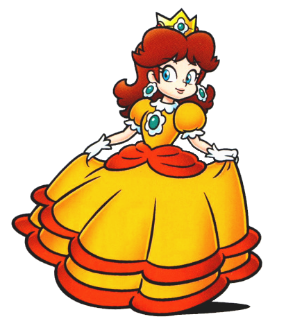
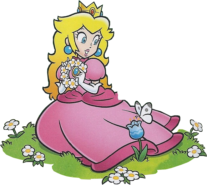
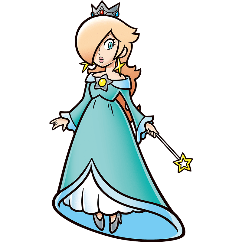
As for her looks, I agree she looks generally like an adult. However, in her 2D concept art she looks younger than Rosalina and Peach because of her shorter, rounder looking features. I also think her model in Ultra Smash looks younger as well.

Peach_2d_officil_3.png

Rosalina2Dalt.png

Daisy2Dalt.png


Daisy_iconart.png

368px-MH_Mar_3.png


369px-MH_Mar_2.png

366px-MH_Mar_1.png
 
A51_Trooper said:
Should the official website pictures of the DK Crew in Donkey Kong 64 seen here be uploaded on the wiki?
Do you mean the complete screencaps with the bios? Sure, it's fine to upload them to use in the game and character galleries, plus we could then easily link to the images if we wanted to reference any of the info seen in the bios.

We don't seem to have that artwork of Donkey Kong yet: that could be cropped and uploaded as a separate image for the "artwork" gallery sections.
 
I've been unable to find a way to save the bios as images and upload them. On a side note, I found even more info about the game, including the worlds, items and the story.
 
To me, it's pointless. The bios (the "valuable" portion) are already transcribed on the wiki, the pictures accomanying them are also already there in generally higher quality. The Donkey Kong artowkr can be cropped out if it's not already on the wiki.

(also I should've really checked if there was more stuff on that site beside the bios for the 5 Kongs, goddamn it)
 
Back