Mario pictures

I'm surprised nobody has posted about this.
d5bgn5z-f2b856d6-5d07-4abf-ab15-6fc2d23b821b.jpg

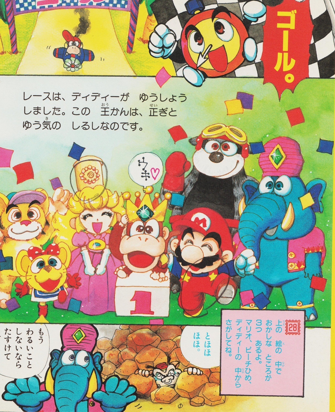
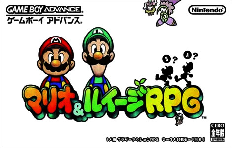
In the cover of the JPN version of Mario & Luigi: Superstar Saga, you can see Popple under the P.
 
It's to let the player know he's a jerk, which wild orcas often can be.
you don't have to make characters ugly to be a jerk, look at Starlow the floating ball thing

yknow with look at it frequently having posts that definitely do not look bad at all too...
I bet you're still reeling from the rake handed Toads and Peach's parasol hands though!
 
I think it's like a beak and Mario's going "BUH BAWK!?", I just can't help thinking that.
 
you don't have to make characters ugly to be a jerk, look at Starlow the floating ball thing

The difference with Starlow is that the devs were under the misguided belief people actually liked her.
 
9rs9warpap0oy2bgls0bx2808sjbzdzg.jpg

Fun fact time. In Super Mario Kart, Yoshi is obviously a playable character.
In the international version, Yoshi has his cheeks extended to match his modern look, as seen in the picture above.
Smk-Yoshi_jpn.png

However, in the japanese version, Yoshi's cheeks aren't even edited to match the international version, making him look a little awkward.
I'm still interested why they did this even to this day.

Even more fun facts. According to the Cutting Room Floor:
The Japanese version of Mario Kart: Super Circuit had online capabilities, which were done through connecting an adapter so that the GBA could hook up to a cell phone, presumably to allow ghost exchanging. The service was discontinued on December 14, 2002.
Sadly, I couldn't find a video of this, so you will just have to take my word for it.
 
Last edited:
i think they did this because yoshi simply looks better when he hs a more defined face. it's a better, more defined silhouette.
 
He often does

But this usually happens

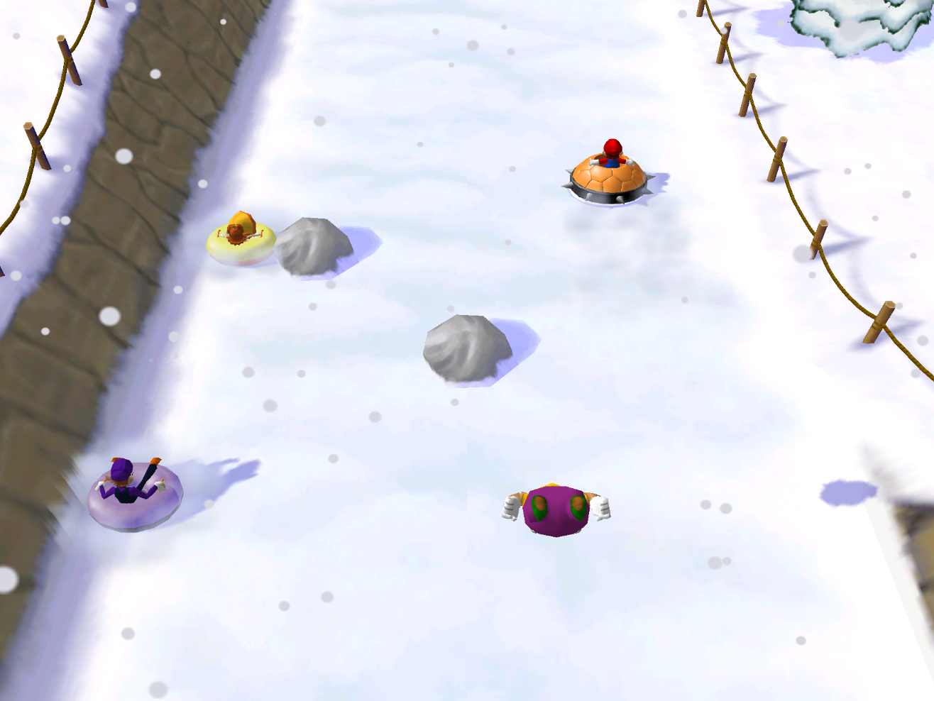
Mario_Party_5_Tube_it_or_Lose_it.png


Even 14 years later
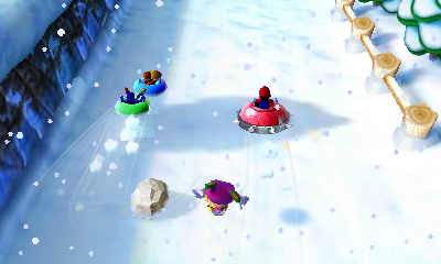
Top100TubeitOrLoseit.png
 
Back