Let's continue my (useless) insight into the development of Yoshi's design!
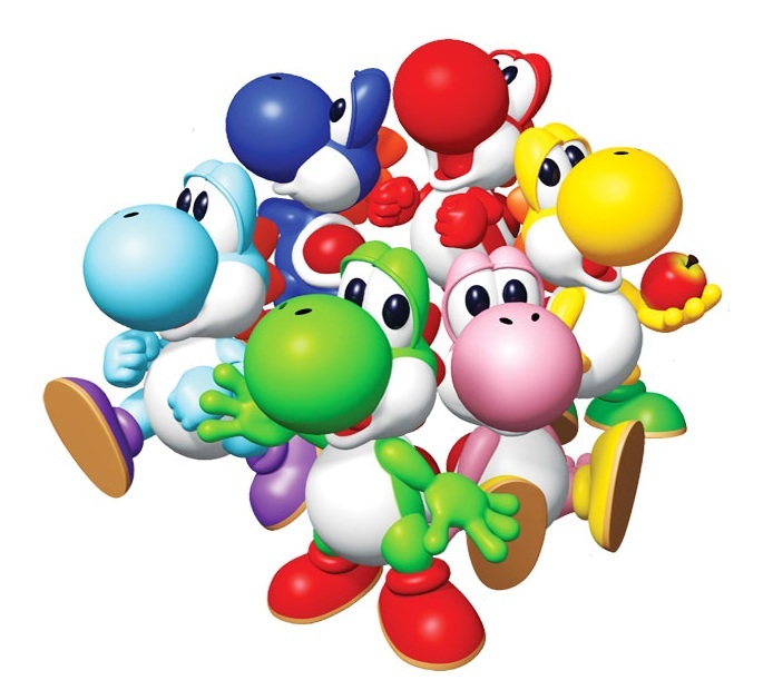
Although Yoshi's modern design can be seen in many early N64 games, including Mario Kart 64, it's not too far-fetched to say that Yoshi's modern design debuted in Yoshi's Story, his modern voice for sure did, and effectively that game featured basically all of the features of his modern design, in particular the shell and spike placement:
While watching the addition to the Yoshi gallery today, though, I noticed something.
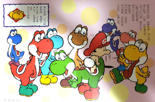
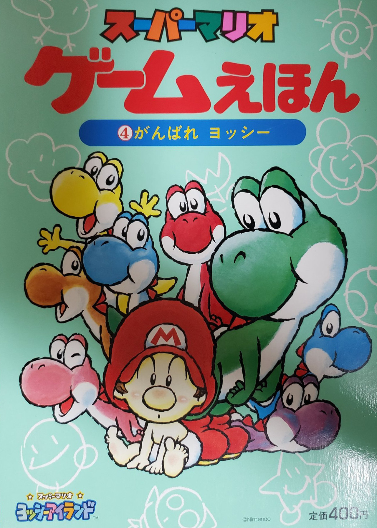
Formally, Yoshi's Island featured the "classic" Yoshi's design with just the modern hands to better show the egg throwing:
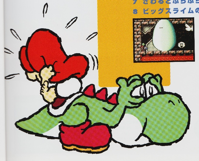
But the sprite? Let's have a look:

(I suggest to zoom in if you can't see it well, increasing the size of a pasted sprite is a bit of a bad habit as it leads to upscaling artifacts even for those who don't need to zoom)
A closer look reveals that those sprites already featured the modern shell, not only that but let's compare this to modern sprites of Yoshi (used in Paper Mario: Color Splash and Super Mario Run):
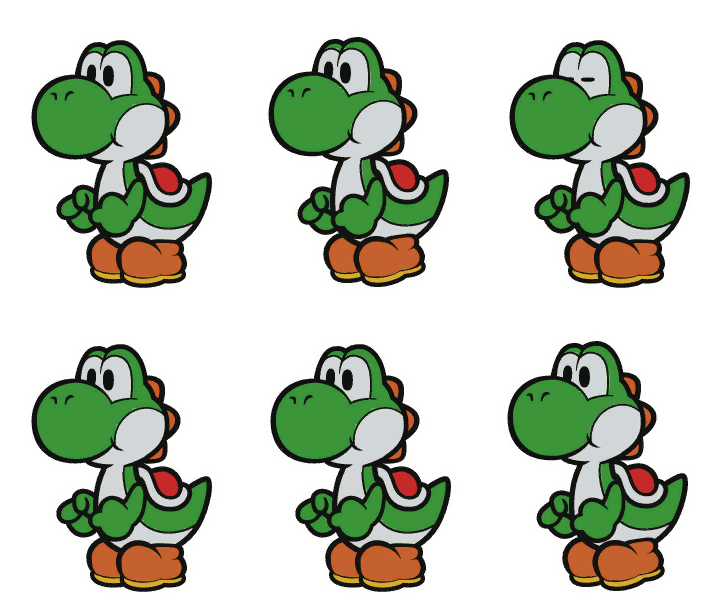

Basically, the sprite of Paper Mario: Color Splash is almost an upscale of the Yoshi's Island sprite. The main difference are an addition of a lowermost spike in Yoshi's Island and the white area not covering the whole cheek, this latter trait can also be seen in the Super Mario Run sprite that at this point only misses the additional spike (and features legs, with the lack of legs being the only "annoying" trait of these otherwise very good early sprites).
So yeah, while Yoshi's Story can still be considered the game that introduced modern Yoshi, it looks like many of its features were already being introduced in the sprites of Yoshi's Island, despite the artwork not using a much different Yoshi's design from that of classic Yoshi.
The shell is particularly intriguing, as it was the trait that gradually made Yoshi more like the turtle Tezuka wanted him to be from the start. Tezuka was one of the directors of Yoshi's Island, so it looks like things are starting to come to their place.
Although Yoshi's modern design can be seen in many early N64 games, including Mario Kart 64, it's not too far-fetched to say that Yoshi's modern design debuted in Yoshi's Story, his modern voice for sure did, and effectively that game featured basically all of the features of his modern design, in particular the shell and spike placement:

While watching the addition to the Yoshi gallery today, though, I noticed something.
Formally, Yoshi's Island featured the "classic" Yoshi's design with just the modern hands to better show the egg throwing:

But the sprite? Let's have a look:

(I suggest to zoom in if you can't see it well, increasing the size of a pasted sprite is a bit of a bad habit as it leads to upscaling artifacts even for those who don't need to zoom)
A closer look reveals that those sprites already featured the modern shell, not only that but let's compare this to modern sprites of Yoshi (used in Paper Mario: Color Splash and Super Mario Run):


Basically, the sprite of Paper Mario: Color Splash is almost an upscale of the Yoshi's Island sprite. The main difference are an addition of a lowermost spike in Yoshi's Island and the white area not covering the whole cheek, this latter trait can also be seen in the Super Mario Run sprite that at this point only misses the additional spike (and features legs, with the lack of legs being the only "annoying" trait of these otherwise very good early sprites).
So yeah, while Yoshi's Story can still be considered the game that introduced modern Yoshi, it looks like many of its features were already being introduced in the sprites of Yoshi's Island, despite the artwork not using a much different Yoshi's design from that of classic Yoshi.
The shell is particularly intriguing, as it was the trait that gradually made Yoshi more like the turtle Tezuka wanted him to be from the start. Tezuka was one of the directors of Yoshi's Island, so it looks like things are starting to come to their place.
Last edited:
