Navigation
Install the app
How to install the app on iOS
Follow along with the video below to see how to install our site as a web app on your home screen.
Note: This feature may not be available in some browsers.
More options
You are using an out of date browser. It may not display this or other websites correctly.
You should upgrade or use an alternative browser.
You should upgrade or use an alternative browser.
Look at it! Look at it! LOOK AT IT!
- Thread starter Lario
- Start date
- Pronouns
- she/her
- MarioWiki
- Mario
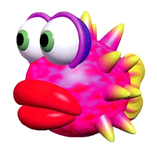
The eyes on that thing bother me so much. Wouldn't it be just easier to slap a texture on there? But again, Yoshi's Story was responsible for masterpieces like

- Pronouns
- she/her
- MarioWiki
- Mario
Or some Mario Party 6 host rejects
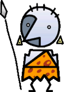
I hate the character design of this game.

I hate the character design of this game.
- Pronouns
- She/her
- MarioWiki
- Ray Trace
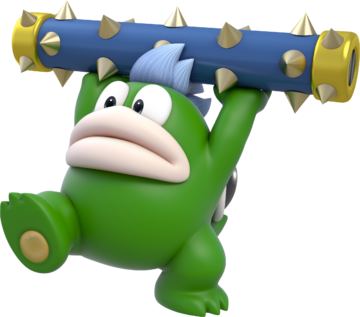
The art style of Super Paper Mario could have worked if the game was designed around it. If like, the main characters also fit the design, as well as the world. The inconsistency is the main downfall of its art style, as well as it's Mario when it shouldn't be.
Mintiously
Prince of LOUD.
- Pronouns
- They/them
Remember that one guy who got banned for advertising recolours?Striker Mario said:Or some Mario Party 6 host rejects

I hate the character design of this game.
- Pronouns
- she/her
- MarioWiki
- Mario
They both look incredibly ugly.
Mcmadness
The idiot who puts things in the wrong board.
Baby Luigi said:The art style of Super Paper Mario could have worked if the game was designed around it. If like, the main characters also fit the design, as well as the world. The inconsistency is the main downfall of its art style, as well as it's Mario when it shouldn't be.
As I've said many times. It's a completely different game with token Mario elements in it.
If it was super pixl tippi or something less uninspired it wouldn't be so jarring.
Course then nobody would give a shit because without Mario's name it's a forgetful mediocre rpg.
Starlight24
King Bowser
- Pronouns
- He/him
i have a weird soft spot for Yoshi Story 64.
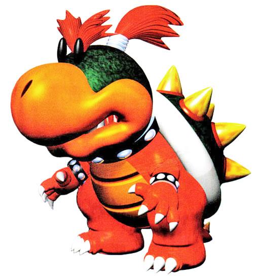
Everything was just so cute i want to cry. Even Baby Bowser at the end was barking like a dog when his speech bubble came in
''Caugh Caugh Caugh cow cow cow Caugh!''
i can't with this :P
Everything was just so cute i want to cry. Even Baby Bowser at the end was barking like a dog when his speech bubble came in
''Caugh Caugh Caugh cow cow cow Caugh!''
i can't with this :P
- Pronouns
- She/her
- MarioWiki
- Ray Trace
Mcmadness said:Baby Luigi said:The art style of Super Paper Mario could have worked if the game was designed around it. If like, the main characters also fit the design, as well as the world. The inconsistency is the main downfall of its art style, as well as it's Mario when it shouldn't be.
As I've said many times. It's a completely different game with token Mario elements in it.
If it was super pixl tippi or something less uninspired it wouldn't be so jarring.
Course then nobody would give a *bleep* because without Mario's name it's a forgetful mediocre rpg.
A lot of games share this problem: being games that get ruined because it contradicts their brand recognition
Metroid Prime: Federation Force
Animal Crossing: amiibo Festival
Star Fox Adventures
and so on.
The guy at Supper Mario Broth wasn't as clementBaby Luigi said:and there's these models, also from the same game
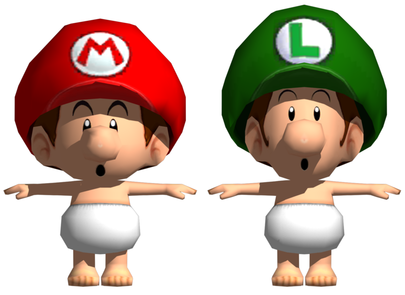
Looks high-res only because of the render settings I used.
I admit, these aren't my best model renders and their low-res textures are still fairly jarring, but tweaking around lights and stuff makes a huge difference.
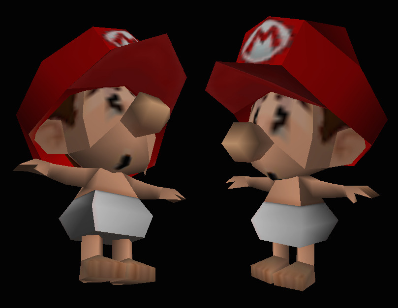
We're lucky that Yoshi's New Island is always here to keep this thread alive...
- Pronouns
- she/her
- MarioWiki
- Mario
Mario Kart 8 has nothing on these models
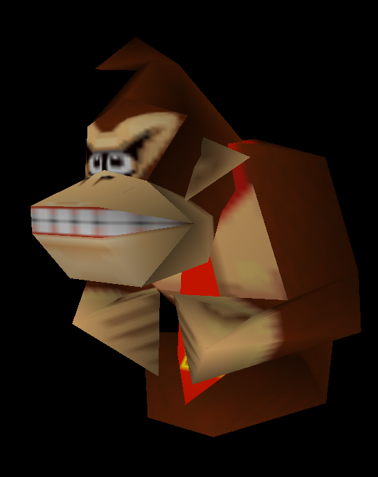

Mcmadness said:I believe that was the inspiration for one of his alt colours in smash.
If it's the one I'm thinking of that was apparently based on that one fake Bowser at the end of The Lost Levels.
I too think it is. Currently the Super Mario Wiki has many problems with the classification of images belonging to Super Mario Bros. and Super Mario Bros.: The Lost Levels, for obvious reasons of similarity of both games one to the other.Toa 95 said:If it's the one I'm thinking of that was apparently based on that one fake Bowser at the end of The Lost Levels.
The funniest thing is that now the Encyclopedia Super Mario Bros. doesn't even state that Blue Bowser is a fake Bowser, it just says he is a mystery and that his identity is unknown...
Mister Wu said:I too think it is. Currently the Super Mario Wiki has many problems with the classification of images belonging to Super Mario Bros. and Super Mario Bros.: The Lost Levels, for obvious reasons of similarity of both games one to the other.Toa 95 said:If it's the one I'm thinking of that was apparently based on that one fake Bowser at the end of The Lost Levels.
The funniest thing is that now the Encyclopedia Super Mario Bros. doesn't even state that Blue Bowser is a fake Bowser, it just says he is a mystery and that his identity is unknown...
I was saying that an alternate costume in Super Smash Bros. is based on a fake Bowser, not saying that Bowser's original artwork is supposed to be that.
My bad, then (by the way, what is the source of this artwork? There are various different versions of it, with different colors).Toa 95 said:I was saying that an alternate costume in Super Smash Bros. is based on a fake Bowser, not saying that Bowser's original artwork is supposed to be that.
