Paper Mario TTYD vs Paper Mario vs Super Paper Mario

TheCapeLuigi said:
Zae Eildus said:
spm will forever be bad to me though.

its not even really just the story, the gameplay was so dull and everything was so poorly designed, i know im just beating a dead horse here, but theres no amount of logic thats gonna make that game look good.

The only actual poor design flaws I noticed were the uninspired level designs and the fact that one of the mine carts in Floro Caverns somehow spins underneath the track to dodge large stalagmites.

If you found the gameplay dull, though, I can't really comment on that. You can't change how somebody feels about a game or how they experienced it. Whether they had fun or not is their call, not other people's.

alot of character designs were pretty sad, as most of it look like squares with little to no other details, a lot of new npcs were just so boring to look at, they just seem insanely half-assed.
 
Zae Eildus said:
alot of character designs were pretty sad, as most of it look like squares with little to no other details, a lot of new npcs were just so boring to look at, they just seem insanely half-assed.

I think the reason many characters appeared as cubes was to sort of mimic the pixel-look of the old Super Mario Bros. games (which SPM was heavily based upon) while putting a twist on it as well. In terms of the other geometric shapes that appear on their bodies, I have no idea why they did that. Perhaps they were trying to come up with something that looked like it was outside of this dimension, and just thought that fit the category?

Also, I'm pretty sure if you tried to switch Bleck and his minions to the TTYD art style, they'd look really weird.
 
i just id like to see more effort, compared to ttyd and pm64 the design just looked so half-assed in so many areas and some characters were outright ugly(like o'chunks i think his name was).
 
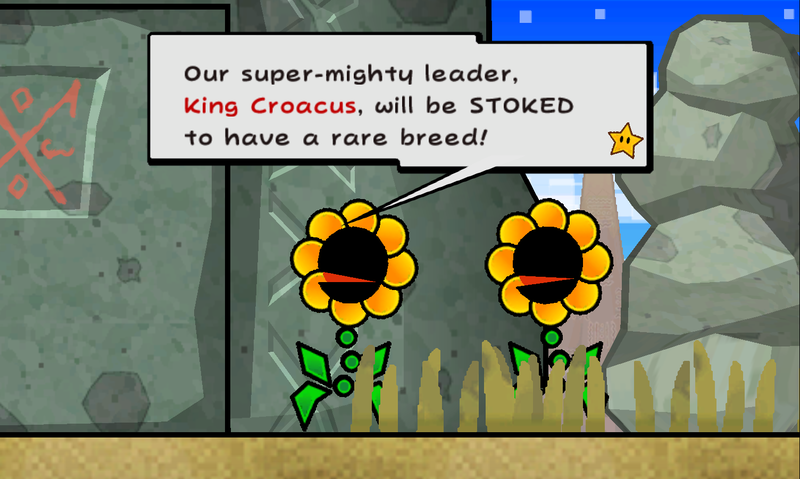
What am I looking at

Cragnon_1.png
800px-SPM_Floro_Sapiens.png
90_PoisonCherbilCard.PNG


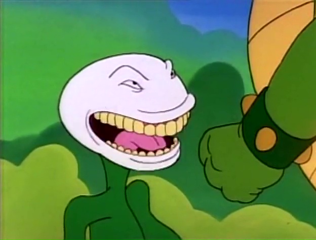
Super Paper Mario also has writing comparable to the Super Mario cartoons and that's saying something.
 
I saw the picture on the right and thought it looked like a green butt or something.
 
It's never stated directly, but yes, that's Super Paper Mario having "great character design" for you.
 
Striker Mario said:
It's never stated directly, but yes, that's Super Paper Mario having "great character design" for you.

flying butts aren't bad character design, they're just not in the right game

they would have been good wario enemies, for example
 
When I replayed TTYD, I feel that Chapters 2 to 4 was my least favorite playing through. I like the first chapter and the prologue, and everything after 4 is great, with 5 being my most favorite chapter.

For Chapter 2: Having to climb up multiple sections of the tree while you have to navigate multiple Punis in the area where they can disperse very easily. And the store is easy to miss since you need Flurrie to find it.

For Chapter 3: With the mandatory fights while having to fulfill a certain condition makes the fighting tedious for an RPG. Not to mention you're mostly confined to a building in perhaps the smallest area in the game, not much to explore I feel.

For Chapter 4: It should be obvious, making approximately five trips across the forest from the town to the steeple which gets autonomous.
 
Striker Mario said:
What am I looking at

Cragnon_1.png
800px-SPM_Floro_Sapiens.png
90_PoisonCherbilCard.PNG


Super Paper Mario also has writing comparable to the Super Mario cartoons and that's saying something.

Meh, I felt the Floro Sapiens were alright, but the cragnons could've looked far better.

and the green butt cannot be justified, that's literally the enemy I hate the most in that game, both for it's design, and the fact that it's just annoying.
 
TTYD for sure, then 64, then Super. I really wanna see this series get revived. Let's hope we can move on from Color Splash once its out.
 
NSY said:
Paper Mario stage was ruined for the terribly designed third section. The first two were fine.

You should get on it then, one of the best in the series.
 
Chiaki Nanami said:
2-1 is an okay-ish level, the rest of them are utter rubbish. 2-2 has you ... go through multiple rooms until the game softlocks just because Mimi tells you where to go, 2-3 is Grinding: The Level, and 2-4 is a maze that doesn't try to be a maze, and cannot be one since every room has a time limit. Chapter 2 is easily the worst chapter of the game, stop denying this.


Chapter two is probably the most memorable chapter. 2-4 was annoying, I will admit, but 2-3 had an interesting idea and I honestly liked it. 2-2 is nothing special, and 2-1 is pretty much just an intro to the chapter, I guess.
 
Countbleck said:
Chapter two is probably the most memorable chapter. 2-4 was annoying, I will admit, but 2-3 had an interesting idea and I honestly liked it. 2-2 is nothing special, and 2-1 is pretty much just an intro to the chapter, I guess.
you say c2 is memorable but then say 3/4 of its levels were bad or not very noteworthy
???
 
Well, we can say that it was notable for actually making who Mimi is and 2-3 I guess. It was also memorable because of Mimi's transformation, this one's surprising.
 
It's memorable for how terrible it was.
 
2-3 was the worst part of SPM chapter 2. It's my favorite game of all time, but I can't defend the poor design of this level.

As for how I rank the first 3, SPM>TTYD>PM. They're all good though.
 
idk i wouldve said what ftg just said if you asked me like, 3-4 years ago

nowadays its more like the other way around, maybe with a slightly lean towards ttyd over pm64 idk.
 
Now that I've actually played all three I can rank them: PM > PMTTYD > SPM

Most of SPM's chapters all had one good part then three bad ones from what I remember.

1-1, 2-1, 3-1, 4-4, and I've forgotten the rest. They were probably all bad or something.
 
You know, for some reason I always fing the third part of any chapter the most interesting.
 
Back