Badposter rates every country flag

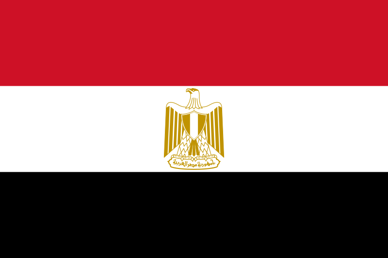
Flag of Egypt
800px-Flag_of_Egypt.svg.png

Ratio: 2:3 (not interesting)
Adopted: 4 October, 1984.
Part 1
Rule 1: I think the eagle is a little too complex.
Rule 2: We've already seen Pan-African and Pan-Slavic colors, so it's time for me to write about Pan-Arab colors.
Basically, there are two set of Pan-Arab colors: the most used set uses red, black, green and white. These colors were first used in the 1916 Arab Revolt against the Ottoman Empire and each color represented an Arab dynasty: black represented the Abbasids, white the Ummayads, green the Fatimids and red the Hashemites.
The other set uses red, white and black and is derived from the Arab Liberation Flag, which was used in the 1952 Egyptian Revolution which overthrew the country's monarchy. The red represents the period before the monarchy and the British occupation of Egypt, the white symbolizes the fact that the Revolution was bloodless and the black represents the end of oppresion of Egypt by both the monarchy and foreign imperialism.
The golden eagle at the middle also originated with the Revolution (though the most current version is from 1984) and is known as the Eagle of Saladin.
Rule 3: Red, white, black and yellow. I honestly don't like the Pan-Arab colors that much, but I do like the yellow. I like this flag's colors.
Rule 4: The text on the flag says "Arab Republic of Egypt". I don't think you should put a country's name on a flag. Flags should be distinctive enough to make naming the country unneccesary. Also, the eagle is complex imo.
Rule 5: But if the eagle were removed this flag would be identical to Yemen's. Honestly, I think Pan-Arabs look too much like each other, though I think the yellow eagle makes this flag distinctive.
Part 2
Khedivate of Egypt (1867-1881)
Flag_of_Muhammad_Ali.svg
Looks too much like Turkey's imo.
Khedivate of Egypt (1881-1914) and Sultanate of Egypt (1914-1922)
Flag_of_Egypt_%281882-1922%29.svg
Three crescents and three stars. Pretty interesting, and not that bad.
Kingdom of Egypt (1922-1953)
Flag_of_Egypt_%281922%E2%80%931958%29.svg
Not a bad flag, but Egypt is no longer a kingdom, and besides
Wikipedia said:
The three stars symbolised the three component territories of the Kingdom, namely Egypt, Nubia, and Sudan,[4] whilst the green signifies the agricultural nature of the country
Sudan is no longer part of Egypt, and Nubia is partially in Sudan.
Republic of Egypt (1953–1958)
Flag_of_Egypt_%281952-1958%29.svg
That's a pretty big eagle (also, what is it holding?)
United Arab Republic (1958-1972) (The United Arab Republic was a federation formed by Egypt and Syria formed in 1958. Even though Syria left the federation after a coup d'état in 1961, Egypt kept the name until 1971)
Flag_of_United_Arab_Republic.svg
This flag is identical to Syria's flag, which I will write about in the future.
1972-1984 (In 1971, a referendum to unite Egypt, Syria and Libya in a federation passed (though it was probably fraudulent, since the country in which the referendum was closest was Syria, in which federation got 96.4%. Federation “got” 99.9% in Egypt. If you're rigging a vote, at least make it plausible!). Due to disagreements over the merger, the federation never got off the ground, and ended in 1977)
Flag_of_Egypt_%281972-1984%29.svg
I prefer the current eagle. It has a better shade of yellow.
Part 3
Honestly, I like this flag, even if the eagle is complex. The yellow makes it different from other Pan-Arabs
 
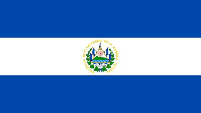
Flag of El Salvador
State ensign
640px-Flag_of_El_Salvador.svg.png

Ratio: 189:335 (pretty odd ratio)
Adopted: 27 May 1912
Civil ensign (note: has a 3:5 ratio)
Civil_Flag_of_El_Salvador.svg
Part 1
Rule 1: A child could not draw the state ensign (I'm pretty sure you know why) , but they could draw the civil ensign.
Rule 2: This flag uses the symbolism of most Central American countries , which I have already explained:
Me writing about Costa Rica's flag said:
First, some history. From 1823 to 1838, Costa Rica was part of the Federal Republic of Central America along with Guatemala, Honduras, Nicaragua, El Salvador and Los Altos (which was annexed quickly by Guatemala and Mexico). The Federal Republic's flag was influenced by Argentina's flag and had two blue stripes (representing the Pacific and Atlantic Oceans), and a white stripe between them (representing the land between them). The blue and white of this flag, and of every country that was a member of the Federal Republic's flag, comes from this
And for the coat of arms, I'm not copypasting it because Wikipedia has a pretty long description of it. Instead, I'm linking it. The Salvadorean coat of arms has a lot of details.
Rule 3: Blue and white and a lot of other colors in the coat of arms. Blue and white is a rather nice color combination, and I like the shade of blue on the flag. But the coat of arms make the state ensign have too many colors.
Rule 4: The civil ensign is rather simple. The state ensign, on the other hand, is rather complex, and has two instances of text. The first is in yellow and around the coat of arms and says REPUBLICA DE EL SALVADOR EN LA AMERICA CENTRAL (Republic of El Salvador in Central America). I repeat, flags should be distinctive enough so that it's unneccesary to put the country's name on them. The second instance is above the wreath and is pretty dang tiny, and has the words DIOS UNION LIBERTAD (God Union Liberty). That text was so tiny I didn't even realize it existed until I read about it on Wikipedia. Not good.
Rule 5: This flag is actually more distinctive without the coat of arms. There is no emblemless blue and white horizontal (or vertical) triband. On the other hand, the state ensign could be confused with Nicaragua's flag.
Part 2:
(Note: I don't count the flags from the period El Salvador was part of the Federal Republic of Central America, which lasted until 1841)
1841-1842, 1844-1865
Civil_Flag_of_El_Salvador.png
This flag has a civil ensign
1842-1844
Flag_of_the_United_Provinces_of_Central_America.svg
I actually think this flag is worse than the current flag, because i think it has a worse shade of blue and that its coat of arms is just as bad.
1865-1912 (El Salvador actually had 5 different flags during this period, the only difference being the number of stars in the canton. A new star was added with the creation of a new province (like the United States does with its states). The first flag of this style (May-June, 1865) had nine flags, and the last (which is the one I'm showing and was used from 1877 to 1912) had 14)
Flag_of_El_Salvador_%281875-1877%29.svg
I like this flag. It's simple and related (it was influenced by that of the US) but distinctive (the numbers of stars and stripes and ways the colors are arranged are the different)
Part 3
The state ensign is terrible, but the civil ensign is okay.
 
Flag of Equatorial Guinea
800px-Flag_of_Equatorial_Guinea.svg.png

Ratio: 2:3 (not interesting)
Adopted: 21 August, 1979
Part 1
Rule 1: Well... I think a child could (assuming they knew the Latin script), though I'm not 100% sure. But I don't think the coat of arms is too complex.
Rule 2: Green represents the country's jungles and agriculture. Blue represents the sea (fuck me), which connects the country's islands and its mainland (the country's capital, Malabo, is actually on the island of Bioko, though most Equatorial Guineans live on the mainland), white represents peace (the country hasn't really had war, but it has been ruled by two brutal dictators: Francisco Macías Nguema (who killed two thirds of the country's original legislature, had one third of the Equatorila Guinean population flee the country and changed the national motto to "There is no other God than Macías Nguema", and his nephew, Teodoro Obiang Nguema (who executed Francisco Macías), who, while not quite as bad as his an uncle is still a bloody dictator who has a cult of personality, uses the country's oil wealth to enrich himself and whose security forces are guilty of murder, kidnapping and torture. Fuck them both). Red represents the blood shed during the country's independence (though its independence wasn't that bloody. But Equatorial Guinean history is still bloody)
I'm gonna do what I commonly do with the symbolism of coat of arms: copypaste it from Wikipedia.
The arms consists of a silver shield with a silk-cotton tree, which was derived from the arms of Rio Muni. Above the shield is an arc of 6 six-pointed yellow stars, that represent Rio Muni and the offshore islands. Beneath the shield is a silver scroll with the national motto, Unidad, Paz, Justicia ("Unity, Peace, Justice").
Rule 3: Red, white, green and blue (I don't count the colors in coats of arms) . Even though I don't like the blue wedge, it al least makes the flag distinctive compared to Hungary's or North Rhine-Westphalia's
Rule 4: This flag has text which translates to "Unity, Peace, Justice" (the text is in Spanish. Equatorial Guine is the only country in Africa where the main language is Spanish, which is spoken by 67.6% of the country's population). Also, while the country's coat of arms isn't complex, the tree is pretty ugly.
Rule 5: Even without the coat of arms, the flag is pretty distinctive, since the blue wedge makes this flag different from other green white and red tricolors.
Part 2
1968-1973
Flag_of_Equatorial_Guinea_%28without_coat_of_arms%29.svg
Better than the current.
1973-1979
Flag_of_Equatorial_Guinea_1973-1979.svg
That chicken looks bad, and so does the coat of arms.
Part 3
Looks much better without the coat of arms.
 
The index is growing long, so I spoiler tagged it.
Flag of Eritrea
800px-Flag_of_Eritrea.svg.png

Ratio: 1:2 (not an unusual ratio)
Adopted: 23 May, 1993 (Ertitrean independence) (ratio changed from 2:3 to 1:2 in 1995)
Part 1
Rule 1: A child could draw the flag from memory, though they wouldn't draw the wreath perfectly. But if you've read my writeups you already know my opinion on recognizability and perfection. (and if you haven't I'll tell you I think the former is more important)
Rule 2: The green represents the country's agriculture and livestock, the blue represents the sea (Eritrean independence landlocked Ethiopia) and red represents the blood shed during Eritrean independence (Eritrea became independent from Ethiopia in a bloody war. Eritrea is one of the few current countries to become independent from another African country, along with Namibia (which became independent from South Africa), South Sudan (which became independent from Sudan) and partially Sudan (ruled by both Egypt and the UK)
The wreath come Eritrea's 1952-1962 flag (from when it was in a federation with Ethiopia). Then, it represented peace. In the 1952-1962 flag, and from 1993 to 1995 the wreath had 28 leaves. In 1995 this was changed to 30 for the number of years Eritrea's independence war lasted (the war began in 1961 and ended in 1991)
This flag is pretty similar to that of the Eritrean People's Liberation Front, which led Eritrean independence (and whose succesor, the Eritrean People's Liberation Front, is the only legal political party in Eritrea. Eritrea is dead last in Reporter Without Borders' Press Freedom Index, ranking even worse than North Korea). The only differences between Eritrea's flag and the ELPF's is that the ELPF's flag has a star instead of a wreath and a 2:3 ratio.
Rule 3: Green, red, blue and yellow. This flag doesn't have amazing colors, but they're not bad either.
Rule 4: I think the wreath is too complex, but that's just my opinion-
Rule 5: This flag is diatinctive even without the wreath.
Part 2
1952-1962 (when Eritrea was part of the Ethiopian-Eritrean Federation)
Flag_of_Eritrea_%281952-1961%29.svg
The light blue comes from the UN's flag (Eritrea was federeated with Ethiopia with an UN Resolution). I actually don't really like that shade of blue.
1993-1995 (2:3 ratio, 28 leaves)
Flag_of_Eritrea_%281993-1995%29.svg
I actually prefer this to the current flag. The triangle looks less stretched.
Part 3
I don't like the wreath, but other than that the flag's okay.
 
Flag of Estonia
640px-Flag_of_Estonia.svg.png

Ratio: 7:11 (somewhat unusual, but it's no 189:335)
Adopted: 21 November 1918 (re-adopted 7 August 1990, a year before its independence from the Soviet Union.
Part 1
Rule 1: Emblemless tricolors are simple.
Rule 2: The blue represents freedom and truth... and also the sea and sky (I wonder how many flags have this symbolism), black represents soil and lost independence, and the white represents the promise and pursuit of a brighter future.
This flag also looks like an Estonian forest.
Rule 3: Blue, black and white. Pretty good colors.
Rule 4: This flag has neither text nor emblems. Not much to say when this happens.
Rule 5: This flag is pretty distinctive. The only national flag with the same colors is Botswana's flag (also a great flag), which isn't a triband.
Rule 2:
Estonian SSR (1953-1990)
Flag_of_the_Estonian_Soviet_Socialist_Republic.svg
The Soviet occupation of Estonia was bad, and this flag is worse than the current.
Part 3
This is a very good flag. It's one of my favorites.
 
Flag of Ethiopia
800px-Flag_of_Ethiopia.svg.png

Aspect Ratio: 1:2 (normal)
Adopted: The colors have been around since. The current emblem was adopted on 31 October, 1996.
Part 1
Rule 1: Well, I'm pretty bad at drawing, but I could draw the star. I think a child could draw this from memory.
Rule 2: Green represents Ethiopia's land, yellow represents peace (Ethiopia has been in some wars, but right now it's at peace) and red symbolizes strength.
As for the emblem, blue represents peace (this is redundant, since yellow also represents peace. But at least it doesn't represent the sky (it can't represent the sea, since Ethiopia is landlocked)), the star represents diversity (Ethiopia's pretty diverse. Its most spoken language, Omoro, is only spoken by one third of the population) and unity, and the rays symbolize prosperity.
Ethiopia, along with Liberia, was the only country to not be colonized in the Scramble for Africa (though it was annexed by Italy from 1936 to 1941), so many African countries were inspired by this flag's colors when designing their flag. Thus all Pan-African flags come from Ethiopia's.
Part 3: Red, yellow, green nd blue. Ethiopia was the first country to use the Pan-African colors, which aren't really bad. I just think they're overused, though I can't blame Ethiopia for this since it's the first country to use them.
Part 4: The flag has an emblem, but it's a simple one.
Part 5: The Pan-African copypasta:
Me said:
Honestly, the only flags with Pan-African colors I can distinguish are that of Ethiopia, Ghana (due to the World Cup), the Republic of the Congo, São Tomé and Principe, Burkina Faso and Zimbabwe. I think I'm gonna copypaste this in the future.
Part 2
Ethiopian Empire (1897-1974)
Flag_of_Ethiopia_%281897-1936%3B_1941-1974%29.svg
That lion is pretty complex imo.
Derg (1975-1987), Transitionial Government of Ethiopia (1991-1996) (actually different flags, but the only difference is the ratio. The flag I'm showing is the Transitional Government's)
https://upload.wikimedia.org/wikipedia/commons/7/7c/Flag_of_Ethiopia_%281991-1996%29.svg[img][/spoiler]
Look too much like Bolivia's flag imo.
People's Democratic Republic of Ethiopia (1987-1991)
[spoiler][img]https://upload.wikimedia.org/wikipedia/commons/8/8a/Flag_of_Ethiopia_%281987%E2%80%931991%29.svg
This flag has a pretty complex coat of arms. Also:
Estimates of the number of deaths for which he was responsible range from 500,000 to over 2,000,000
Fuck Mengitsu Halie Mariam.
6 February-31 October, 1996
Flag_of_Ethiopia_%281996%29.svg
I prefer the current shade of blue.
Rule 3
There are good Pan-Africans and bad Pan-Africans. This one is the former.
 
Flag of the Federated States of Micronesia (Wikipedia's list of sovereign states puts Micronesia here. And it's only a part of the Micronesian region)
Flag_of_the_Federated_States_of_Micronesia.svg

Ratio: 10:19 (an odd ratio)
Adopted: 30 November 1978 (when it was part of the Pacific Trust Territory, administered by the US)
Part 1
Rule 1: It's a simple flag.
Rule 2: The blue represents the Pacific Ocean (I didn't realize how common this symbolism was when I started this topic) and the stars represent the country's states: Chuuk, Kosrae, Pohnpei and Yap. The way the stars are arranged are not the way they're arranged IRL; the islands are really arranged east to west.
Rule 3: Blue and white. Not a bad combination.
Rule 4: If you want to know whether I think stars are simple or complicated, it's the former.
Rule 5: This flag, like Somalia's, has white stars on a blue background. However, Somalia's flag has one big star, while this flag has four smaller stars, so I think the flag is distinctive.
Part 2
Trust Territory of the Pacific Islands (1965-1978) (UN Trust Territory formed by the current states of the FSM (except for Kosrae, which was part of Pohnpei) plus Palau, the Marshall Islands and the Northern Mariana Islands)
Flag_of_the_Trust_Territory_of_the_Pacific_Islands.svg
I like that shade of blue.
Part 3
I think it's OK.
 
Flag of Fiji
800px-Flag_of_Fiji.svg.png

Ratio: 1:2 (normal)
Adopted: 10 October 1970 (Fijian independence)
Part 1
Rule 1: The coat of arms is too complex for a child to draw from memory.
Rule 2: The blue represents the Pacific Ocean (two flags with this symbolism in a row!) and the Union Jack represents the country's ties with the UK, which colonized from 1874 to 1970.
The coat of arms' symbolism:
The images depicted on the shield represent agricultural activities on the islands, and the historical associations with the United Kingdom. At the top of the shield, a British lion holds a cocoa pod between its paws. The upper left is sugar cane, upper right is a coconut palm, the lower left a dove of peace, and the lower right a bunch of bananas.
Rule 3: Red, white and blue (two different shades). I like the sky blue. Makes it different from other British colonial flags.
Rule 4: The coat of arms is rather complex, though at least there's no text.
Rule 5: There are many flags with the Union Jack in their canton. But I think the sky blue makes this flag distinctive.
Part 2
Kingdom of Fiji (1871-1874)
800px-Flag_of_the_United_Kingdom_of_Fiji_1871-1874.svg.png
Don't really like the crown, but otherwise I think this flag is superior to the current.
British Fiji (1908-1924)
Flag_of_Fiji_1908-1924.svg
This flag has a complex coat of arms and a shade of blue that makes it undistinctive. A bad flag.
Fiji's 1924-1970 flag is pretty similar to the 1908-1924 one, except for the fact that the white circle is removed and the coat of arms is bigger.
Part 3
I like the sky blue, but dislike the rest of the flag. However, this will be irrelevant soon because...
In 2013, Prime Minister Frank Bainimarama announced plans of replacing the flag with a new design that would not include the Union Jack. Following a three-month-long public vote, the new flag is expected to be announced on 1 July 2016.
I'll write about the flag when it's revealed.
Oh, by the, there's an interesting interview with the maker of the flag on flagspot
 
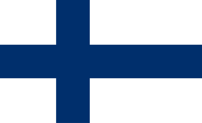
Flag of Finland
800px-Flag_of_Finland.svg.png
(civil ensign)
State ensign
800px-Flag_of_Finland_%28state%29.svg.png
Ratio: 11:18 (an odd ratio, which is close to the golden ratio)
Adopted: 29 May 1918(slightly less than six months after Finnish independence)
Part 1
Rule 1: It's easy to draw, like most Nordic flags imo (though the state ensign has a complex coat of arms that a child couldn't draw from memory)
Rule 2: The Christian cross represents Christianity and it's also used because Finland is a Nordic country. The blue represents the sky (I do not like tha symbolism) and the country's many lakes (look at a satellite image of the country and you'll see the country has a lot of lakes) and the white represents the land in winter (I know without looking it up that Finland is a cold country. Most people know Nordic countries are cold)
Rule 3: White and blue. A combination I like.
Rule 4: Christian crossed are simple.
Rule 5:
My Denmark writeup said:
Something nice about Nordic flags is that they all have different colors that make them distinctive.
Part 2
Temporal flag (1917-1918)
800px-Flag_of_Finland_1918_%28state%29.svg.png
This flag has a complex coat of arms and and (personal opinion) worse colors than the current. But it's not like it was ever meant to be permanent.
Rule 3
I love Nordic flags (though not the state ensign, it has a complex coat of arms. However, the superior civil ensign is used more)
 
Hobbes said:
I actually like that state ensign a lot.
Well, I thing I like about it is how the coat of arms is square. And the lion...
KoopartolBB said:
Have you done nepal's flag yet?

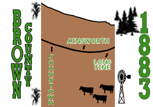
also let's not forget Brown County's flag:
brown-county-nebraska1.gif
I'll do Nepal's flag in the future. And Brown Country isn't a country flag, though it's bad (even the worst country flag isn't as bad as Brown County's)
Flag of France
800px-Flag_of_France.svg.png

Ratio: 2:3
Adopted: 15 February 1794 (has been France's flag continously since July 1830)
Part 1
Rule 1: It's a simple tricolor.
Rule 2: During the Storming of the Bastille (which began the French Revolution) the Paris militia wore a red and blue cockade on their hat. The reason for this is because red and blue are the colors of Paris, where the Revolution. In Paris' flag, blue represents Saint Martin and red represents Saint Denis.
Shortly thereafter the white was added to the cockade. Lafayette says white was an "ancient French color", which was added to make the cockade represent all of France, while some say it represents the monarchy (this is what the official French government website says)
There are also other interpretations about the meaning of the French flag:
Wikipedia said:
Blue and red are associated with the Virgin Mary, the patroness of France, and were the colours of the oriflamme. The colours of the French flag may also represent the three main estates of the Ancien Régime (the clergy: white, the nobility: red and the third estate: blue). Blue, as the symbol of class, comes first and red, representing the nobility, comes last. Both extreme colours are situated on each side of white referring to a superior order
The three colours are occasionally taken to represent the three elements of the revolutionary motto, liberté (freedom: blue), égalité (equality: white), fraternité (brotherhood: red); this symbolism was referenced in Krzysztof Kieślowski's three colours film trilogy, for example.
Whatever the case, on 24 October 1790 a red, white and blue vertical tricolor was adopted as France's flag. On 15 February 1794 the colors were reversed for some reason.
After the 1814 Bourbon Restoration the old, pre-Revolution flag was restored. This flag was readopted after the July Revolution in 1830 and has been France's flag since.
Though there was an attempt to replace it:
Following the overthrow of Napoleon III, voters elected a royalist majority to the National Assembly of the new Third Republic. This parliament then offered the throne to the Bourbon pretender, Henri, comte de Chambord. However, he insisted that he would accept the throne only on the condition that the tricolour be replaced by the white flag. As the tricolour had become a cherished national symbol, this demand proved impossible to accommodate. Plans to restore the monarchy were adjourned and ultimately dropped, and France has remained a republic, with the tricolour flag, ever since.
Rule 3: Blue, white and red. This may be my bias showing, but I really love how the colors look on this flag. I don't even love the Dutch's flag's colors this much, and it's this flag flipped sideways!
Rule 4: An emblemless tricolors. There's no text or emblems on this flag.
Rule 5: There's actually no other vertical red, white and blue tricolor (that I was able to find on on Wikipedia's list of flags by color combination.). And besides, France is a very well known country, so its flag is also well known. Due to this, I think France has a distinctive flag.
Part 2
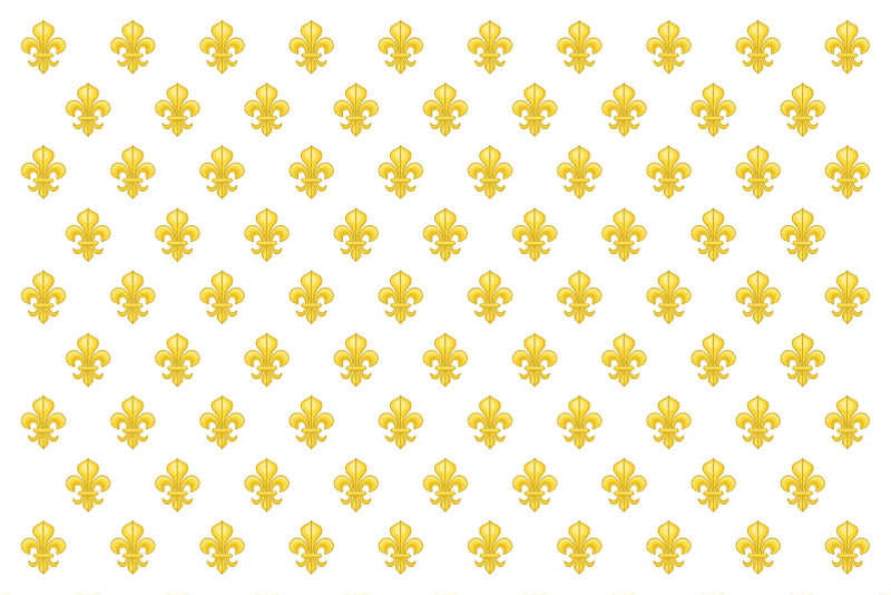
Kingdom of France (12th century-13th century)
Flag_of_France_%28XII-XIII%29.svg
There are 27 fleurs-de-lis on this flag. Don't put 27 fleurs-de-lis on a flag.
Kingdom of France (1365-1790)
Pavillon_royal_de_la_France.svg
I don't actually dislike the flag. However, the fleur-de-lis is a monarchist symbol, so republican France shouldn't go back to it.
Kingdom of France (1365-1790, 1814-1830) (Apparently France used two flags at the same time from 1365 to 1790? I don't know much about French flag history)
800px-Pavillon_royal_de_France.svg.png
If I'm counting correctly, there are 50 fleurs-de-lis on this flag. FIFTY.
Kingdom of France (1814-1830) (apparently there's a dispute on the flag used by France in the 1814-1830 period)
800px-Flag_of_the_Kingdom_of_France_%281814-1830%29.svg.png
It's literally a plain white flag. The jokes write themeselves.
Part 3
I think most tricolors are somewhat boring, including this one. However, the flag's simple, distinctive, has good colors (imo) and has history. I don't think France should have any other flag.
 
Chiaki Nanami said:
1814-1830
White_Flag.jpg
le_surrender_joke
https://en.wikipedia.org/wiki/White_flag said:
Adopted 29 July 1899 (Hague Convention I)
Please stop. France kicked ass throughout its entire history until WWII, when they tactfully surrendered to keep Paris intact. Stop this bad meme.
I do know the French military is good (it beat five coalitions in a row). So I apologize to France, which has been good (in militarily, not nessecarily morally) in most wars, except for the Franco-Prussian War, WWII and the First Indochina War.
Flag of Gabon
Flag_of_Gabon.svg

Ratio: 3:4 (an unusual ratio)
Adopted: August 9, 1960 (just eight daysbefore Gabonese independence)
Part 1
Rule 1: It's a simple tricolor.
Rule 2: The green represent Gabon's forest and natural resources (the Gabonese economy was once mostly based on logging. Then oil in was discovered in Gabon). The yellow represents the Equator and the blue represent the sea (you may already know how I feel about the symbolism of blue)
Rule 3: Green, yellow and blue. I actually really like the flag's colors.
Rule 4: It's a simple tricolor lacking emblems or text.
Rule 5: The only other flags with Gabon's color combination (on Wikipedia's list of flags by color combination) are Rwanda's and St. Vincent and the Grenadines', both of which have symbols which distinguish them and a different arrangment (Rwanda's flag has a bigger blue stripe than the other flags and a sun, and St. Vincent's flag is vertical and has diamonds). Due to this, I think Gabon's flag is distinctive.
Part 2
1959-1960
File:Flag_of_Gabon_1959-1960.svg
The French flag and the Union Jack are good flags. They are, however, not good when put in the canton of other flags.
I'd like the flag if the French flag were removed.
Rule 3
It's distinctive, and I really like its colors.
 
Flag of the Gambia
Flag_of_The_Gambia.svg

Ratio: 2:3 (normal)
Adopted: 18 February 1965 (Gambian independence)
Part 1
Rule 1: It's not a tricolor, but it's close enough, and it's a simple flag.
Rule 2: The red represents the Sun (fun fact: the Sun is white) and the savanna, the green represent the forest and the agriculture of the Gambia (this symbolism for green is actually pretty common, like red symbolizing bloodshed or blue symbolizing sea and sky), the white stripes represent unity and peace (The Gambia hasn't had many mayor wars, though it has a repressive dictatorship, whose dictator, Yahya Jammeh said he would "cut off the head" of every homosexual in the country. Fuck him). The blue represents the Gambia River, which the country is named after and which dominates country; The Gambia is just the River and its banks. Look at this map and see what I mean.
Rule 3: Red, white, blue and green. I like these colors, but not as much as Gabon's.
Rule 4: It's a flag with no text or coat of arms.
Rule 5: This flag is pretty similar to Karelia's, which has the same colors in the same arrangment. However, Karelia's flag has no white, a lighter shade of blue and equally-sized stripes (the blue stripe in the Gambia's flag is smaller than the red and green stripes), so I think the Gambia's flag is distinctive (except for being almost identical to the flag of the small Spanish town of Oso de la Vega. The town, however, has less than a thousand people, so it's no big deal)
Part 2
Gambia Colony and Protectorate
800px-Flag_of_The_Gambia_%281889-1965%29.svg.png
In my opinion, the only good flag with the Union Jack on it is the Union Jack itself.
Part 3
I like this flag, and how it symbolizes the Gambia being the banks of a river.
 
Flag of Georgia
320px-Flag_of_Georgia_%28U.S._state%29.svg.png

wait no wrong georgia
Flag of Georgia
800px-Flag_of_Georgia.svg.png

Ratio: 2:3 (normal)
Adopted: 24 January 2004
Rule 1
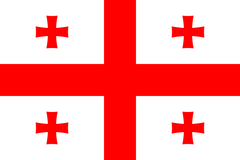
Part 1: A child can.
Part 2: This flag's cross come from a 14th century map, which had a red Jerusalem cross as the flag of Tbilisi. This flag was adopted after the 2003 Rose Revolution because the 1991-2004 flag was associated with
Wikipedia said:
with the chaotic and violent period around the collapse of the Soviet Union
In the Rose Revolution, the flag was a symbol of opposition to Eduard Shevardnadze's government, in which there was a lot of corruption.
Rule 3: Red and white. I honestly don't like that color combination that much, but it's not actually a bad combination.
Rule 4: The crosses are simple.
Rule 5: This flag, like England's, has a red cross on a white background, but unlike England's flag, this flag has four other crosses that make the flag distinctive.
Rule 2
Kartli-Kakheti (1762-1800)
Flag_of_Kingdom_of_Kartli-Kakheti.svg
A good flag. It's pretty similar to Cornwall's, but that flag is from the 19th century.
Democractic Republic of Georgia (1918-1921), Georgia (1991-2004)
800px-Flag_of_Georgia_%281990-2004%29.svg.png
I don't like the flag's colors.
Georgian SSR (1921-1937)
Flag_of_Georgian_SSR_%281921-1922%29.svg
Most SSR flags were boring imo. Also, text on flags is bad.
Georgian SSR (1937-1951)
File:Flag_of_Georgian_SSR_(1937-1951).svg
I find the Georgian alphabet interesting, but not this flag.
Georgian SSR (1951-1991)
Flag_of_Georgian_SSR.svg
In 1949 the UN demanded the USSR changed the flags of its SSRs, since they looked too much like each other, so the Soviet Union mostly gave its SSR flags with blue or green stripes (and for the Estonian and Latvian SSRs, waves). The canton makes the flag distinctive but also pretty ugly.
Rule 3
A good flag, though I don't think it's as good as Kartli-Kakheti's (but I'm not saying Georgia should change its flag, since Kartli-Kakheti's flag looks extremely similar to Cornwall's)
.
Tomorrow's my birthday, so I won't update that day (like all break days, I'll post a bad flag, which I think is worse than River Gee County's)
 
Heh speaking of that State flag. Would you consider doing one for each of the 50 state flags after you're done with Countries?
 
Considering every US state flag is shit save Texas and maybe three or four others, I don't think he'd be willing to put himself through that.
 
Magikrazy said:
Considering every US state flag is *bleep* save Texas and maybe three or four others, I don't think he'd be willing to put himself through that.
Most US flags are indeed bad. But not as bad as the flag of Bérriz, Spain.
KrQWRQF.gif

A bad flag for badposter's birthday.
 
Flag of Germany
800px-Flag_of_Germany.svg.png

Ratio: 3:5 (somewhat unusual, but it's not a rare ratio)
Adopted: 9 March 1848 (Frankfurt Parliament, dissolved in 1849) August 11, 1919 (Weimar Constitution adopted), 23 May 1949 (Basic Law for the Federal Republic of Germany adopted)
Part 1
Rule 1: This flag is a tricolor with no emblems. It's simple.
Rule 2: There was resistance to the French occupation of Germany during the Napoleonic Wars. One of the groups resisting the occupation, the Lützow Free Corps (volunteers of the Prussian army) wore black uniforms whitmgold button and red facings. The black represented servitude, the red the bloody battles and the gold represented the light of the freedom. However, as Wikipedia states:
Wikipedia said:
The colour choice had pragmatic origins, even though black-red-gold were the former colours used by the Holy Roman Empire.[20] Members of the corps were required to supply their own clothing: in order to present a uniform appearance it was easiest to dye all clothes black. Gold-coloured buttons were widely available, and pennons used by the lancers in the unit were red and black
After the Napoleonic Wars the German Confederation (which had no flag) veterans of the Lützow Free Corps founded the Urburschenschaft (I did not type Urburschenschaft. I copypasted the word), a student fraternity in Jena, which adopted a flag with three equal horizontal bands of red, black, and red, with gold trim and a golden oak branch across the black band, following the colours of the uniforms of the Free Corps (everything after “a flag” I copypasted). The Urburschenschaft's students came from different German states, so pro-German-unification sentiment began to form in it and other student organizations. In 1817 hundreds of German students calling for German unifiication called for a free and unified German nation and flying a gold, red and black flag. In response, Austria banned student organizations in 1819.
In 1832 30000 people demostrated in Hambach for freedom, civil rights and German unification, and flew black, red and gold flags, including one with the text Deutschlands Wiedergebut (Germany's rebirth).
In 1848 the Frankfurt Parliament was established as a democratic parliament for Germany and adopted a black, red and gold flags. The parliament didn't last long, being dissolved shortly after Frederick William IV, the King of Prussia, refused the crown of Emperor.
Then the German Confederation was dissolved (1866), the German Empire was founded (1871) and lost WWI, the Weimar Republic was established (1918), the Nazis took power (1933) and lost WWII, Germany was split into four occupation zones (1945), West Germany (the Federal Republic of Germany) and East Germany (the German Democratic Republic) were established (1949) and finally East Germany was dissolved, reunifying Germany (1990)
Rule 3: Black, red and gold. Good colors imo.
Rule 4: This flag has no text or emblem, though there is a variant flag of Germany with a coat of arms
Rule 5: This flag is somewhat similar to Belgium's flag. However, this flag has a different color arrangment fom Belgium's flag, is horizontal instead of vertical and has gold instead of yellow.
Part 2
North German Confederation (1866-1871), German Empire (1871-1918), Weimar Republic (1918-1919), Nazi Germany (1933-1935, along with the swastika flag)
800px-Flag_of_the_German_Empire.svg.png
I think this flag is boring and the current is better.
Nazi Germany (1933-1945)
I'm not putting this flag up. You probably already know what it looks like anyway.
Well, I don't actually think the flag is bad design wise. But Germany shouldn't go back to this flag for very obvious reason. To state the obvious, Hitler and the Nazis were very bad and the Holocaust was a very evil act.
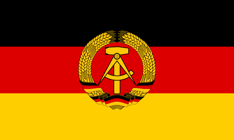
East Germany (1959-1990) (before then, West and East Germany had identical flags)
800px-Flag_of_East_Germany.svg.png
I'm okay with simple and complex coat of arms, but not with coats of arms on flags
Part 3
It's a tricolor with good colors. It's also distinctive. I like this flag.
 
Flag of Ghana
800px-Flag_of_Ghana.svg.png

Ratio: 2:3 (normal)
Adopted: 6 March 1957 (Ghanaian independence), readopted 28 February 1966 (Kwame Nkumrah overthrown)
Part 1
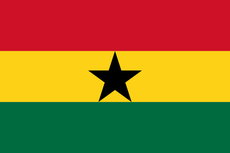
Rule 1: It's a tricolor with a simple emblem. A child could draw this flag from memory.
Rule 2: The red represents the blood of those who died for Ghanaian independence (there were five Anglo-Ashanti wars, but the Ashanti lost the wars, and Ghana gained its independence peacefully), the gold represents the country's mineral wealth (the country was once known as the Gold Coast, and many European countries, such as the Portugal, Netherlands, the UK, Denmark, Sweden and Prussia built forts there), the green represents the country's forests and natural wealth (pretty generic symbolism imo) and the black star represents African emancipation and originates from the flag of the Black Star Line, a ship line incorporated by the Jamaican Pan-Africanist Marcus Garvey, which existed from 1919 to 1921.
Rule 3: Red, yellow, green and black. The Pan-african colors look good with black imo.
Rule 4: The black star is a simple emblem.
Rule 5: This flag is actually the second Pan-African flag to be adopted, after Ethiopia's. I think the black star makes the flag distinctive.
Part 2
British Gold Coast (1877-1957)
800px-Flag_of_the_Gold_Coast.svg.png
Compare this flag with that of British Gambia.
1962-1966
180px-Flag_of_Ghana_%281964-1966%29.svg.png
I think the current flag is better.
Part 3
Most flags I've wrote about recently have been good, including this one
 
Flag of Greece
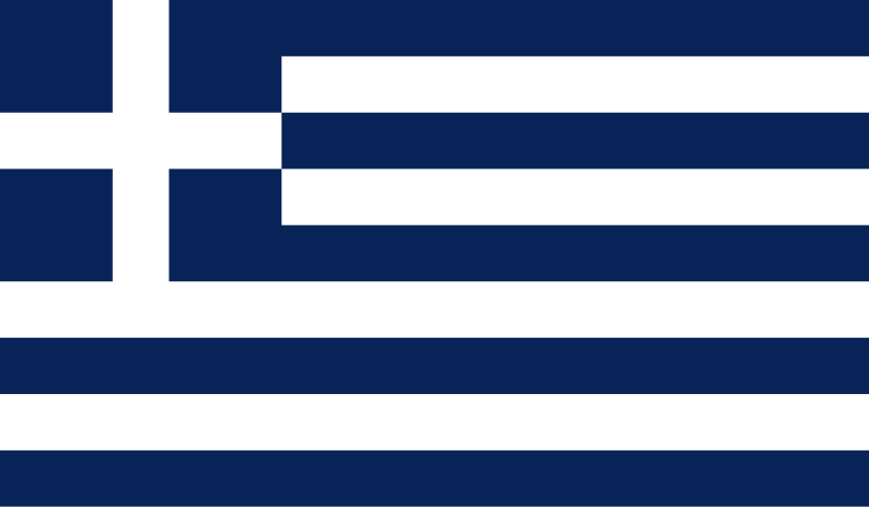
800px-Flag_of_Greece.svg.png

Ratio: 2:3 (a normal and unteresting ratio)
Adopted: 15 March 1822 as naval ensign, 22 December 1978 as national flag.
Part 1
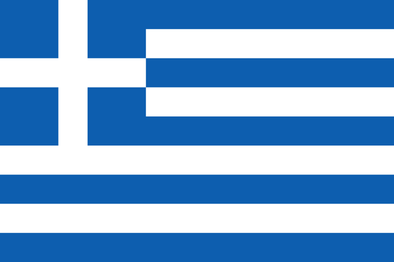
Rule 1: I think an issue flags with many stripes is that it may be hard to memorize the exact number of stripes a flag has. But that's not a big issue, and recognizability is more important than perfection anyway.
Rule 2: The flag originated during the Greek War of Independence. Its symbolism is unkown, but the nine stripes are thought to represent the nine syllables of the phrase "Ελευθερία ή Θάνατος" (Eleftheria i thanatos, liberty or death), the blue stripes representing Ελευθερία and the white stripes ή Θάνατος. The cross is thought to represent Eastern Orthodox christhianity, Greece's main religion.
This is just one interpretation of the meaning of this flag. There are other, but I won't write about them. Instead I'll tell about the flag's history.
During the Greek War of Independence a state ensign (which was a white cross on a blue background) a civil ensign (which wasn't used much and was abolished in 1829) were adopted by the first First National Assembly at Epidaurus.
In 1832 Greece became a monarchy with the Bavarian prince Otto of the House of Wittelsbach.In 1833 he royal coat of arms of Greece, which was based on the ancestral Bavarian was added to the national and naval flags.
Otto proved unpopular, and in 1862 he was overthrown. The royal coat of arms was removed from the Greek flags.
In 1863 the Danish prince George, of the House of Schleswig-Holstein-Sonderburg-Glücksburg, was elected King of Greece. A crown was added to the Greek flags.
In 1924 the Greek monarchy was abolished by referendum, and the crowns in the flags were removed, but after a military coup by Georgios Kondylis and a rigged referendum in 1935 the monarchy and the crowns were restored.
In 1967 a military junta took power in Greece. The king, Constantine II attemped a counter-coup, but he failed and fled Greece. While Greece was officialy a monarchy from 1967 to 1973, the real power was held by the junta, and Greece's flags had no crowns. In 1969 the naval ensign (with a very dark blue) was adopted as the national flag, and in 1970 its ratio was changed to 7:12.
In 1973 the monarchy was abolished and in 1974 the military junta fell. In 1975 the old national flag was readopted, but in 1978 the naval ensign was adopted as Greece's flag. The old national flag is no longer used.
Rule 3: Blue and white. Good colors.
Rule 4: The cross is pretty simple.
Rule 5: I don't know of the existence of a flag which looks too much like this one. I think this flag is distinctive.
Part 2
1822-1833, 1862-1863, 1924-1935, 1967-1969, 1975-1978
800px-Flag_of_Greece_%281822-1978%29.svg.png
I don't know if this flag is better than the current, but I do think this is a good flag.
1833-1858
800px-State_Flag_of_Greece_%281833-1858%29.svg.png
I don't like that blue. And Greece shouldn't go back to this flag, since it's no longer a monarchy.
1858-1862
800px-State_Flag_of_Greece_%281858-1862%29.svg.png
1863-1924, 1935-1967
800px-State_Flag_of_Greece_%281863-1924_and_1935-1970%29.svg.png
The flag looks much better without the crown imo. And since Greece is a republic, it shouldn't use this flag.
1970-1975
800px-Flag_of_Greece_%281970-1975%29.svg.png
That blue is actually pretty nice. The current blue is also good though.
Part 3
The streak of good flags is continued.
 
Flag of Grenada
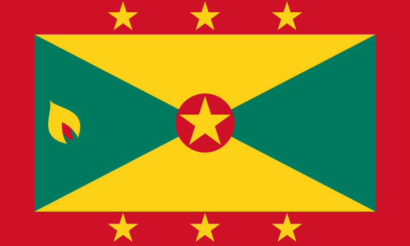
800px-Flag_of_Grenada.svg.png
(this is the state flag, the civil ensign has a 1:2 ratio but is otherwise identical)
Ratio: 3:5 (It's more unusual than 2:3 or 1:2, but it's not that rare)
Adopted: 7 February 1974 (Grenadian independence)
Part 1
Rule 1: I think a child could draw it from memory, but I think this is up for debate, considering the amount of elements on the flag.
Rule 2: The red symbolizes courage and vitality, the gold wisdom and warmth and the green vegetation and agriculture (the green has pretty generic symbolism imo). The stars on the border represe.n Grenada's six parishes and the star in the center represents the constituency of Carriacou and Petite Martinique.
This flag has a nutmeg because that is Grenada's main crop (however, its main export is fish, and its economy is mostly tourist based)
Rule 3: Green, red and yellow. This flag manages to have many elements while only using three colors (interestingly, the Pan-African colors. I don't know if that's why the colors were chosen, but if this flag were a Pan-African it'd make sense, since Grenada's population mostl descends from African slaves). I do think the border is ugly.
Part 4: Nutmegs are simple emblems. By the way, Grenada is also known as the Island of spice for its nutmegs.}
Part 5: This flag has a pretty distinctive. This is also the only flag with nutmegs I know.
Part 2
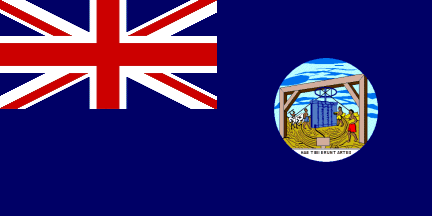
British Grenada (1875-1903)
Flag_of_Grenada_1875-1903.gif
Most British colonial flags are bad imo
British Grenada (1903-1967)
Flag_of_Grenada_1903-1967.gif
Same as above.
1967-1974 (During this period Grenada had internal autonomy, but foreign affairs and defense were controlled by the UK)
800px-Flag_of_Grenada_1967.svg.png
I'd like this flag more if it didn't have the emblem.
Part 3
I'd like this flag more if it didn't have the border. This breaks the streak of flags I like, though I wouldn't say this flag is terrible.
 
Back