Power Master & Stuff

https://www.marioboards.com/threads/37837/page-9#post-2104899

  • Option 1 - One file game, gets deleted at game over

    Votes: 0 0.0%
  • Option 2 - All files get deleted at game over, very very challenging

    Votes: 2 14.3%
  • Option 3 - Sentries just send you back to the start of Limbo to try again

    Votes: 10 71.4%
  • help i cant change question

    Votes: 2 14.3%
  • aaaaaaaaaaaaaaaaaaaaaaaaaaa

    Votes: 0 0.0%

  • Total voters
    14
Re: Alex95's Power Master Thread (Help Wanted)

So, I'm a bit conflicted here. The side-view battlers are difficult to implement, but they open up a wider array of animations. Thing is, I'm a terrible artist, at least in that sense. I can tell I'm getting better with the tilesets and portraits, but the full body sprites are hard to draw.

Here's some comparisons: the original Power Master 1 used front-view battlers (upgraded to show a character graphic). The enemy will be positioned directly in front of you, but you don't show up. Instead, a face graphic will appear (which I will reposition), but animations will not play out on your characters.
bTDNjhD.png


For side-view, the enemy will be placed off to the side and the characters will be positioned off to the right. Animations will play out on both sides. I think my character graphics need some work, and I feel like I'd get a lot of criticism from players because of it. They are hard to work with and I'm not an animator...
irWDOdS.png


What do you guys think? Added a poll, but feel free to express yourself here as well.

*Backgrounds and enemy are provided by the RPG Maker MV engine. They won't be in the final game.
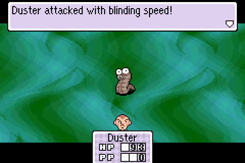
 
Re: Alex95's Power Master Thread (Input Needed About Battlers)

If you wish to maintain the side view but want an easier time animating, I would recommend making the sprites larger. While it may make the initial sprite harder to make, it makes animating the characters easier overall as you have more to work with.

If you want to scrap the side view but still maintain animations, you could look to Mother 3 for inspiration:
2-1.png

You could have the character headshot sprites pop up whenever they attack, and perhaps have a short three-frame animation for different kinds of attack.
 
Re: Alex95's Power Master Thread (Input Needed About Battlers)

Perhaps I may have worded it wrong. The player's attack animations will play out, but the enemy's will not. For example, if the player uses a lightning attack, a lightning bolt will strike the enemy. But if the enemy uses the same attack, the screen will simply shake and the player character's health is reduced. I am totally fine with this, but I know some players may find it a little lackluster.
 
Re: Alex95's Power Master Thread (Input Needed About Battlers)

Cut the fat and only have the front-view animations. It's good enough for Undertale
 
Re: Alex95's Power Master Thread (Input Needed About Battlers)

Friendly reminder that I would like some more votes on the battlers.

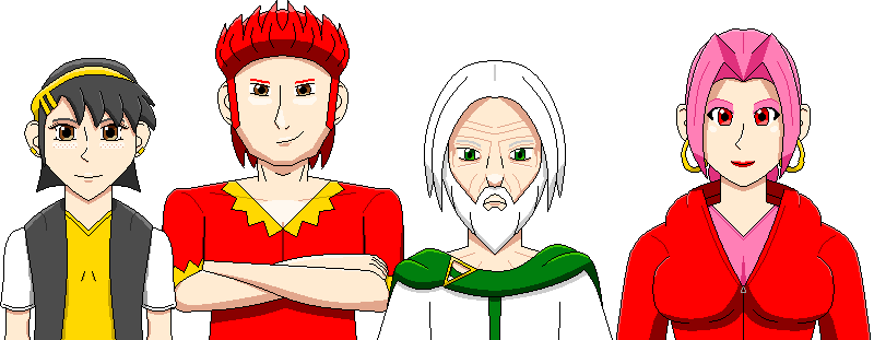
In the mean time, here's some more characters I've been working on:
characters_examples_by_powermaster64-db46un0.png


From left to right, it's Alice, Matt, Fora, and Pam. All will be NPCs in the upcoming demo, though Alice and Matt will be fully playable in the full game. I think they look pretty good, even Matt who looks incredibly (but intentionally) weird.

Alice will take on the role of the sister of the Digger from Uora, which will change depending on the player's choices at the start of the game.
Matt is who I call a "Failing Flirter". A philanderer who shows off his muscles to impress women, but will always be serious when needed.
Fora is the Guardian of, um, Fora and is the player's grandfather. He wears green, but the other Guardians will have a different color scheme.
Pam is the shopkeeper and will man the shop in every town except Mora, where she trades places with the innkeeper, Violet.
 
Re: Alex95's Power Master Thread (Input Needed About Battlers)

Fora looks great, Matt looks wrong but I can't put my finger on why. I think he needs more shadow on his forehead. And some shadow around the bottom of the forehead where it meets the nose and is aligned with the eyebrows to give it more shape. A tiny shadow around the sideburns as well.
 
Re: Alex95's Power Master Thread (Input Needed About Battlers)

Ah, I see what you mean. His mullet doesn't have an appropriate shadow underneath. Added the shadows. This look better?

latest


Also, reduced the size of Pam's breasts because they seemed way too large and disproportionate to me.
 
Re: Alex95's Power Master Thread (Input Needed About Battlers)

I updated the Power Master Wiki with a revised look I like. The grass background seems a little harsh, contrast-wise, but I currently don't have anything good to swap it with. Anyway, give it a looksee and what do you think?

http://power-master.wikia.com/wiki/Power_Master_Wikia

As for the topic of battlers, I'm thinking I'll keep it to front-view battlers. But I don't need to start adjusting the mechanics of battle yet, so I'll keep the poll up a little longer. (At the moment, combined with a few other polls I have elsewhere, it's 50-50.)
 
Re: Alex95's Power Master Thread (Input Needed About Battlers)

Alright, so I've decided to stick with front-view battles, meaning the player does not get a battler sprite. This appears to be the majority vote anyway, and it'll make the battle aspects easier on myself.

I've been working rather slowly lately, which is not a good thing because I want to get this done. Just a few more portraits, a tileset, and three enemies and the game will be ready for a demo release. At this pace, I'm not sure if I'll have the game ready by the end of 2017...

Question: How do I remove the poll...?
 
Re: Alex95's Power Master Thread (Input Needed About Battlers)

As far as I know, only mods can do that. You can ask one to remove it if you want or just leave it
 
Re: Alex95's Power Master Thread

A Monster appears! This is a common enemy you'll find throughout Moneo in both Power Masters 1 & 2. There are many variations of this creature, but this is the most basic one, formed out of dirt and mud. Based the outline on the sprite made for the original PM1 (which was created by my brother) and designed it based on how I do things.

latest
 
Re: Alex95's Power Master Thread

I've been quiet for a while, working on trying to get the inside of the houses to look right, as well as getting some mechanics to work properly. Here's what the inside of your house looks like; much bigger and roomier than in the original game! What should I decorate it with (because I have no idea)?

18194078_1513449012033224_3712198162036820903_n.png
 
Re: Alex95's Power Master Thread

It depends upon the characteristics of the person living inside, but some plants and such would be nice
 
Re: Alex95's Power Master Thread

If the house has a table, it could possibly have a kitchen (that was the first thing that I came up with).
You could also add something on the walls, like paintings, but both of these may not fit the theme.

Just add what you think suits the main character.
 
Re: Alex95's Power Master Thread

It does have a kitchen, yeah. It's just not shown (it's in the upper right corner of the house).

I could add some planets, maybe paintings. Perhaps I could take a look at the tilesets RPG Maker provides and get some inspiration.
 
Re: Alex95's Power Master Thread

Enemies will now appear on the field! In the original game, enemies would be randomly encountered, and you couldn't tell what enemy you would end up fighting. In Power Master 1 MV and Power Master 2, enemies will move around the field and a battle will begin either when you make contact with one or if they make contact with you. This will make it much easier to find the enemy you want to fight, or you can avoid them entirely!

18403497_1520431128001679_8544372783702972190_n.png
 
Re: Alex95's Power Master Thread

Okay, that's amazing. Hats off to you.
 
Re: Alex95's Power Master Thread

Cards return with an overhaul! Originally, you would be given a picture of the enemy followed by some text boxes. Now, it gives you all that information and more all at once! I'm not sure if I can actually make them useful in the game, but for now, they're just cool to look at :)

latest
 
Re: Alex95's Power Master Thread

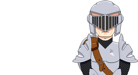
boss1_1_by_powermaster64-db9cdje.png


The first boss of the game, Silver Knight, is finally finished! ...Mostly. This is his portrait, and his character sprite sheet is finished, though his battler sprite isn't complete yet. I'll post that later. ;)
 
Re: Alex95's Power Master Thread

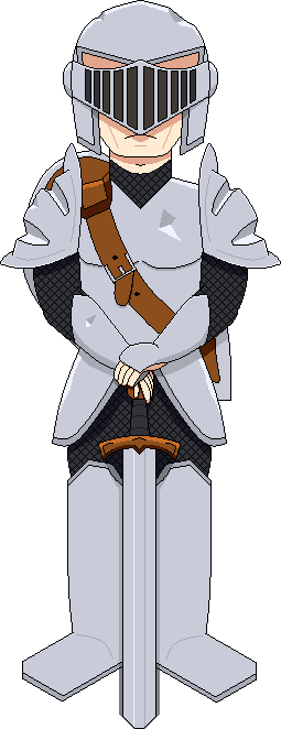
silver_knight_by_powermaster64-db9ifb7.png


And here is the full artwork (spritework?) of Silver Knight! I think this turned out rather well, I might end up making the other characters' artwork like this :D

The actual battler sprite of the Silver Knight is a bit smaller so it can fit on the screen.
 
Alex95's Could Have Been/Upcoming Game 'Shroom Thread

Everyone seems to be doing this, so why not.

¡Hola! ¡Soy Alex95! Don't worry, I'm not going to start talking in Spanish, mainly because that's about the extent of my knowledge. I write the "Could Have Been" section in the Critic Corner and the "Upcoming Game" section in the Pipe Plaza. This is a thread were you guys can, I don't know, suggest stuff and whatever.

How am I doing? What game do you want me to dissect next? An upcoming game you want to know more about? Discuss! All the sections I've written can also be found on my MarioWiki profile (User:Alex95).

At the time of this writing, I have something planned for the Wario theme next month for the Could Have Been section, but I'll still take suggestions for future segments :) Keep in mind Could Have Been sections have to be Mario-related.
 
Re: Alex95's Could Have Been/Upcoming Game 'Shroom Thread

Both your sections are very well-written. I think they cover everything important about their subject quite well. As for suggestions, Super Mario Bros. 3 might be a good one for Could Have Been.
 
Re: Alex95's Could Have Been/Upcoming Game 'Shroom Thread

I'd love to see Paper Mario featured on Could Have Been.
 
Back