Lakituthequick's occasional art

Just a teensy nitpick: my overall buttons should be white, and the overalls should be browner, but I don't have any complaints beside those. Sorry. ^^'
 
Princess Mario said:
Just a teensy nitpick: my overall buttons should be white, and the overalls should be browner, but I don't have any complaints beside those. Sorry. ^^'
I followed exactly the colour scheme of the SSB reference you linked to plus your note on the eye colour. Glad you liked it though!

Alex95 said:
You say you don't draw well, but I really like this simplified look. Great job with this, can't wait to see what you do next year (if anything)!
Thanks! As mentioned, I don't plan to do this next year, but I do have some plans for the next time!
 
I really wish I just sent you my model file instead, she's fully rigged and all. Judging from my artwork, I knew exactly where you got the picture from: the body was from the artwork I provided you and the head came from my signature.
 
Oopsie then. I should've did a better job at that sort of reference image thing.
 
not just you, i can't see your image either.
 
I'm wondering if it's possible to make the censor not apply to URLs since it does screw up with embedding and linking and whatnot.
 
These look amazing dude.

Have absolutely no complaints about mine, I would maybe say that I would've preferred you did me in a different pose, but seen your method of drawing these, I really can't say anything like that.

The simplicity of it all is pretty much what makes it this great... why did you say you couldn't draw well?
 
I think these are all pretty good! ...Except maybe for Alex95. He looks weird, which I think is because his chin is too round and undefined and his hair isn't quite right. Here's the normal picture for comparison:

Stephan.png


That being said, he's an original character with a capital O, so I can see why it would be hard to draw him perfectly. And hey, the man himself likes it, so who am I to contradict that? :P

In any case, these are quite nice drawings, and I love mine, so nice work.
thumbup.gif
 
They're really cool! Sadly, some users don't have an OC, so they weren't featured here.
 
Lucario said:
These look amazing dude.

Have absolutely no complaints about mine, I would maybe say that I would've preferred you did me in a different pose, but seen your method of drawing these, I really can't say anything like that.

The simplicity of it all is pretty much what makes it this great... why did you say you couldn't draw well?
Thanks! I went for that pose because it was recognisable, not necessarily because of the method as you are one of those I used posed models for.
I say I can't draw because I can't, I traced (existing) images for these.

Czario said:
I think these are all pretty good! ...Except maybe for Alex95. He looks weird, which I think is because his chin is too round and undefined and his hair isn't quite right. Here's the normal picture for comparison:

Stephan.png


That being said, he's an original character with a capital O, so I can see why it would be hard to draw him perfectly. And hey, the man himself likes it, so who am I to contradict that? :P

In any case, these are quite nice drawings, and I love mine, so nice work.
thumbup.gif
I see what you mean and partly agree with what you say, but to be fair, his Stephan character is drawn in a variety of different ways. One more variant doesn't matter all that much.

Thanks though!

Toadgamer said:
They're really cool! Sadly, some users don't have an OC, so they weren't featured here.
I don't know what you mean? Everyone that signed up ended up in this game.


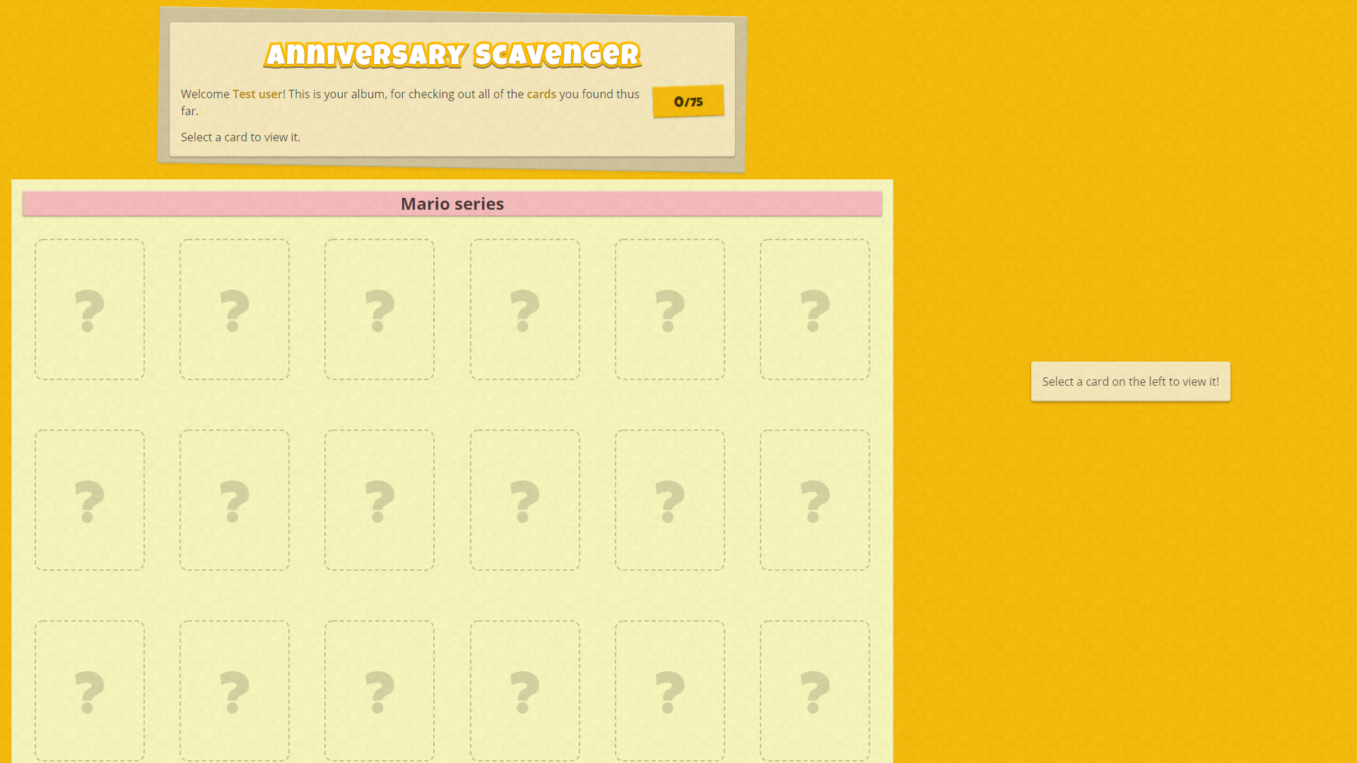
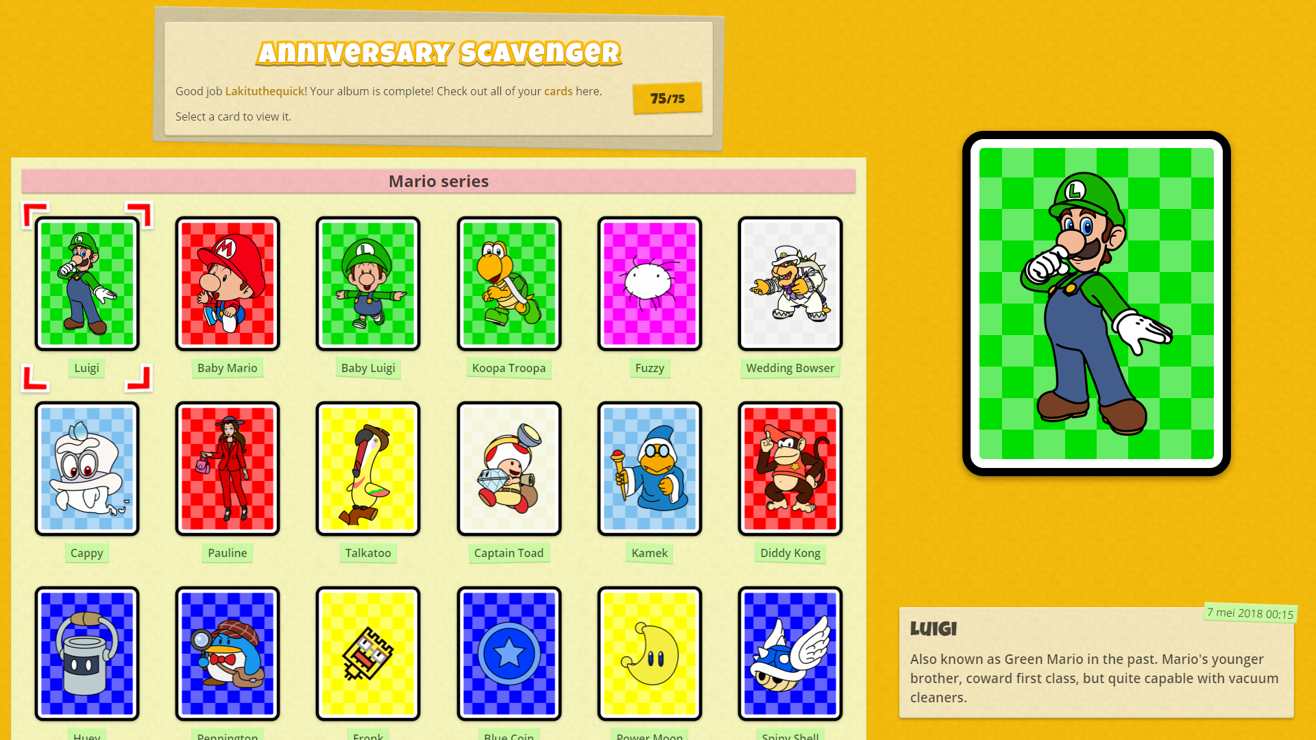
I realised that people that haven't played haven't seen the album, and people that have can't access it anymore. Thus, have a few screenshots.
A detail I like is that the name tags under the cards don't all look identical if you look at them closely.
And for those curious of what font family I used for the logo and a few headers, its name is "Luckiest Guy".

When you started out with an empty album:
screenEmpty.png


After completing it, with one card selected:
screenFilled.png


On small screens (e.g. phones):
screenPhone.png
 
I have to say the amount of effort you put into this was incredible. All the artwork looks great and the fact that you made models just to use as reference is insane. You nailed my OC very well too of course. Spectacular work!
 
It's Thursday my gentlepeople. That means that it is five days ago that The 'Shroom released this month. You know what that means!

This month's maze is the icon of the best fighter of Super Smash Bros. Ultimate, Piranha Plant! Here is the base figure:

piranhaplanticon.svg


Check out the maze I made it into right here (The_%27Shroom:Issue_140/Fun_Stuff#It.27s_aMAZEing)!
 
Merry Smashmas! Or something.

This month's maze is based upon Master Hand! Here is the base figure:

masterhand.svg


Check out the maze I made him into right here (The_%27Shroom:Issue_141/Fun_Stuff#It.27s_aMAZEing)!


Also in this issue is The Holiday 'Shroomfinity Scavenger (The_%27Shroom:Issue_141/The_Holiday_%27Shroomfinity_Scavenger) organised by yours truly and featuring art by The Pyro Guy.

I'll be honest, I wasn't able to complete all elements in the album as I wanted to because I didn't have (or took) the time to do so. Originally you'd be able to view fighters and spirits individually, as well as re-view the hints. Also some fancy transitions between pages and splashes. Alas.
But I did experiment with a Javascript framework to make it, so I did learn a couple things in the process. Maybe I'll revisit the album in the near future, but now that the paper is out, the pressure is gone and I'll likely just celebrate Christmas and leave it as it is now.
 
Ah, that probably explains why sometimes I'd get old hints instead of the one I was supposed to get, and sometimes in place of character unlock screens too (though I still unlock the character)
It didn't hinder me too much though, usually I kept refreshing and it gave me the hint I needed. I completed it yesterday, I really do enjoy these scavenger hunts :D
 
Fawful Claus said:
Ah, that probably explains why sometimes I'd get old hints instead of the one I was supposed to get, and sometimes in place of character unlock screens too (though I still unlock the character)
Ah, I think I know why that happens. Will try to get that fixed.
 
Happy new month! And year!

My birthday is this month! Been happening about 22 times now, and all were in January for some reason. Either way, that means that it is soon time for cake, thus a maze on a cake!

cake.svg


Check out the maze I made this sweet into right here (The_%27Shroom:Issue_142/Fun_Stuff#It.27s_aMAZEing)!


Also be sure to check out out the results of The Holiday 'Shroomfinity Scavenger (The_%27Shroom:Issue_142/The_Holiday_%27Shroomfinity_Scavenger) while you're at it!
This also features a big table with all the locations of the fighters and spirits in last month's edition. Fun fact: this table is actually not coded like a table, but in a more advanced way that makes sure it actually looks good on screens of all sizes, and wraps the columns around to do that.
 
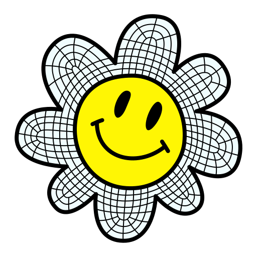
New month, new maze, new art! This time we have the Smiley Flower from the Yoshi's Island series.

smileyflower.svg


Check out the maze I this into right here (The_%27Shroom:Issue_143/Fun_Stuff#It.27s_aMAZEing)!

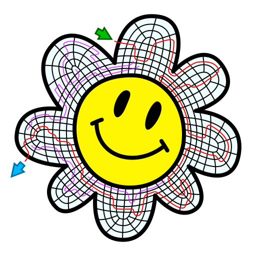
This time I used a different method for creating the maze as I described in May 2018 with the Parabeetle, to see if that is another efficient or quality way to make them.
After making the base figure, I drew a grid of lines on top of it to be the near finals walls:

smileyflower-grid.png


These walls were then painfully intersected and split to be individually editable. Haven't found an easy way to do that yet.

Then I plotted out the real and main distraction paths on top of that:

smileyflower-paths.png


After that I just removed all walls that were in the way and plotted out the remaining pathways.

I feel that this resulted in a more natural maze with more effective dead ends, as it's easier to plot the dead end this way, although for a first time it took a bit more time to complete. Maybe that'll improve in the future. Time will tell!
 
A new month with a new edition of The 'Shroom. This month features a purple Pikmin, to celebrate Reggie Fils-Aimé's famous quote alluding one.

purplepikmin.svg


Check out the maze I this fellow into at this page (The_%27Shroom:Issue_144/Fun_Stuff#It.27s_aMAZEing)!
 
Back