Lakituthequick's occasional art

Welcome to page 2 of this thread!

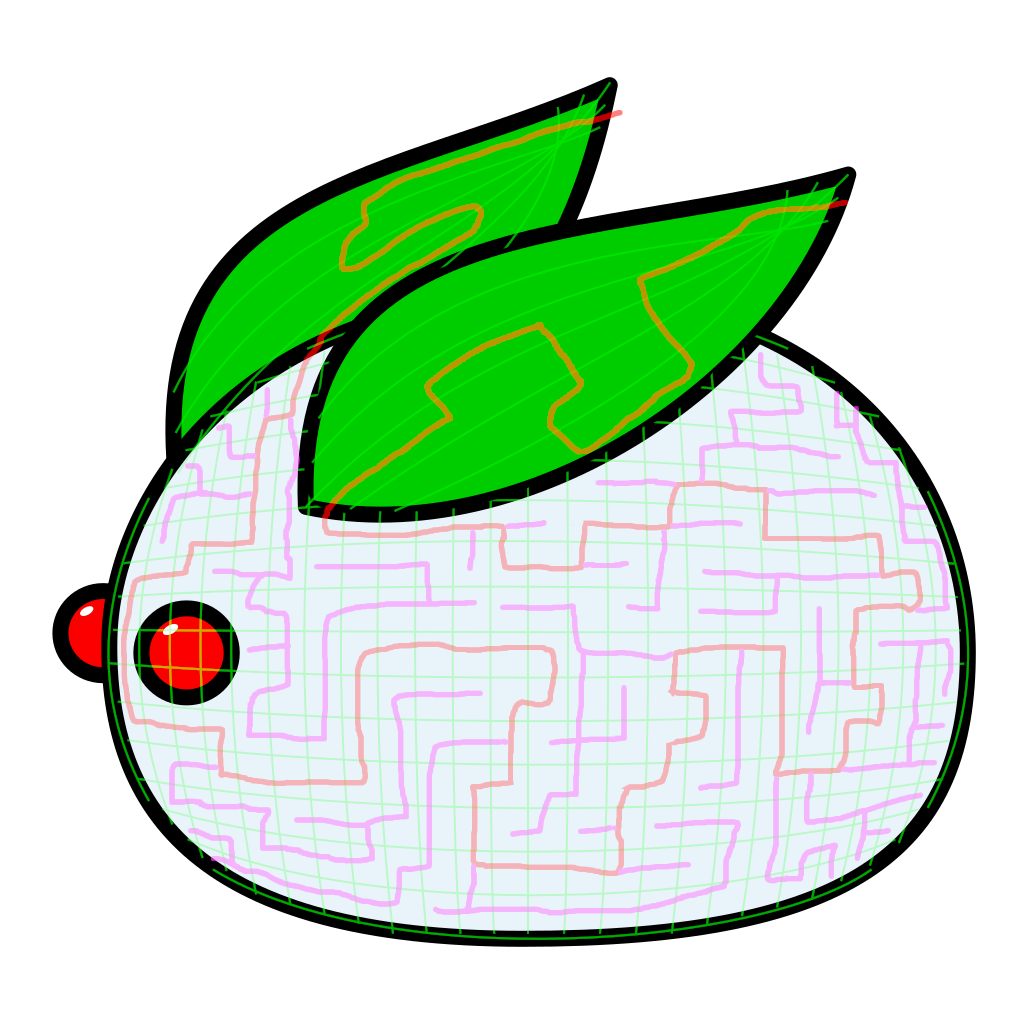
This month's It's aMAZEing features a Snow Bunny! The idea came up when it was literally snowing outside last week, despite it being about 22°C outside no more than three days earlier. It is also 26°C out today, so it was a weird day.
Anyway, bunny!

snowbunny.svg


Check out the maze I this fellow into right here (The_%27Shroom:Issue_145/Fun_Stuff#It.27s_aMAZEing)!


This month also marks the start of a new season of Anniversary Announcements! Check it out here (The_%27Shroom:Issue_145/Pipe_Plaza#Anniversary_Announcements)!
No new things this year, and while Committee Interviews is not in this edition, it will appear in a few months! This is to let the newcomers adjust a bit before I bombard them with questions they can't yet answer. This is also why I interviewed veterans earlier than newer people last year.
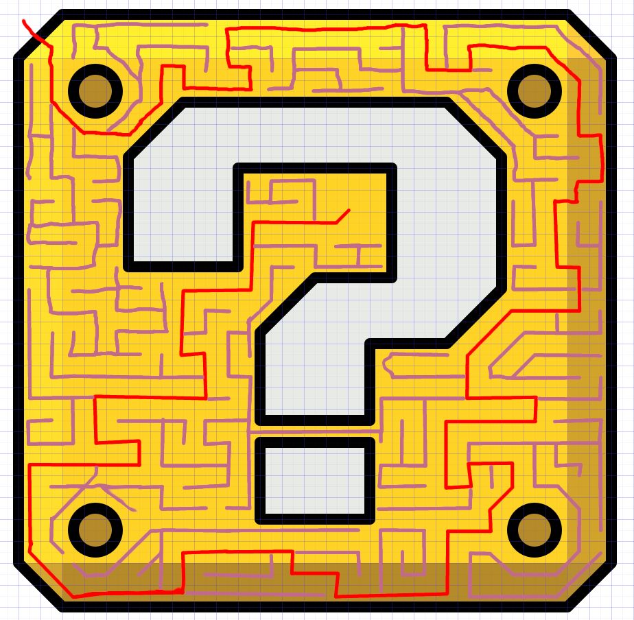
 
Yet another new month with a maze! This month we have a ? block, with the base figure below.

questionblock.svg


Check out the maze right here (The_%27Shroom:Issue_146/Fun_Stuff#It.27s_aMAZEing)!

Time for more behind the scenes stuff for this one! First of all, this drawing is lined out to a grid of 16×16 pixels, offset 8 pixels, with a few lines also on this 8 pixel grid. The maze itself is also mostly set to the larger grid, diagonal lines offset here and there too. This makes it very easy to make an even and pixel perfect maze.

Then there is the technique of setting out the paths. I used a new technique I first used last month, and only works if the entire area is already divided into little boxes. How nice, this thing is set on a grid, thus it has little boxes!

What I did is set out the right path through the boxes with red, and springing off those with a different colour all the side paths until no box is untouched.

questionblock-draft.png


The next thing that happens is just putting walls on all grid lines without a path. This technique also allows for easy setting out of dead ends, since it's easy to draw those a long distance before terminating them.

For reference, this is the grid and lines thing from last month's Snow Bunny:
snowbunny-draft.png

Didn't do the same thing with the ears, as that was too small of an area to make it worth, also considering the weird shape.
 
You probably noticed how It's aMAZEing didn't appear in Fun Stuff this month. This is because life hit pretty hard along the way. I'll spare you the details.

Fortunately though, I was able to squeeze in Anniversary Announcements near release, go read that here (The_%27Shroom:Issue_147/Pipe_Plaza#Anniversary_Announcements)!
 
And we're back with another maze! This month we have the continuation of a thing going since 2017, namely a ball, with this time the dodgeball from Mario Sports Mix. Here is the figure:

dodgeball.svg


Check out the maze itself right here (The_%27Shroom:Issue_148/Fun_Stuff#It.27s_aMAZEing)!


In other news, we have new Committee Interviews in Anniversary Announcements, in which I traditionally use sprites for the people saying stuff! I interviewed Hooded Pitohui and BBQ Turtle, but for the purposes of this thread only the latter's sprite is of interest, as for HP's I only modified the source slightly to fit the style better.
BBQ Turtle is a modification of a custom Daisy sprite found on the Spriters Resource. Of note here are is her hair, which is in a different style than Daisy's is, as well as the crown. Recoloured and modified to fit BBQ's hairdo and we have this:

ShroomAA-bbq.png
BBQ Turtle

Read the article and interviews here! (The_%27Shroom:Issue_148/Pipe_Plaza#Anniversary_Announcements)
 
I never posted a behind the scenes for Steamed Hams: The Presentation from last year's awards. Let's get those posted before we have new awards to get behind the scenes of.

The main story

With the main story I mean the connecting drawings in between the winning presentations. I wanted to stay true to the original Simpsons skit in style, which meant that I drew everything on paper.
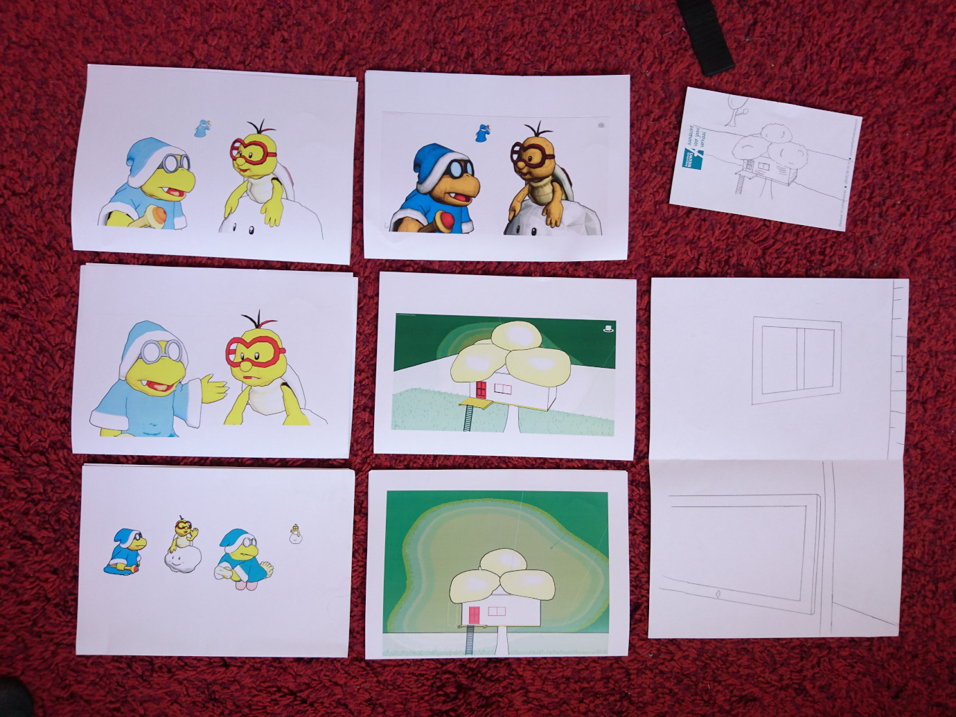
Because I still can't just draw anything, I posed a bunch of 3D models and printed outlined versions of these.
You see that the two top left images are the same, but one was too dark to properly use, so all other ones are brightened before printing.

bts-drawingrefs.jpg


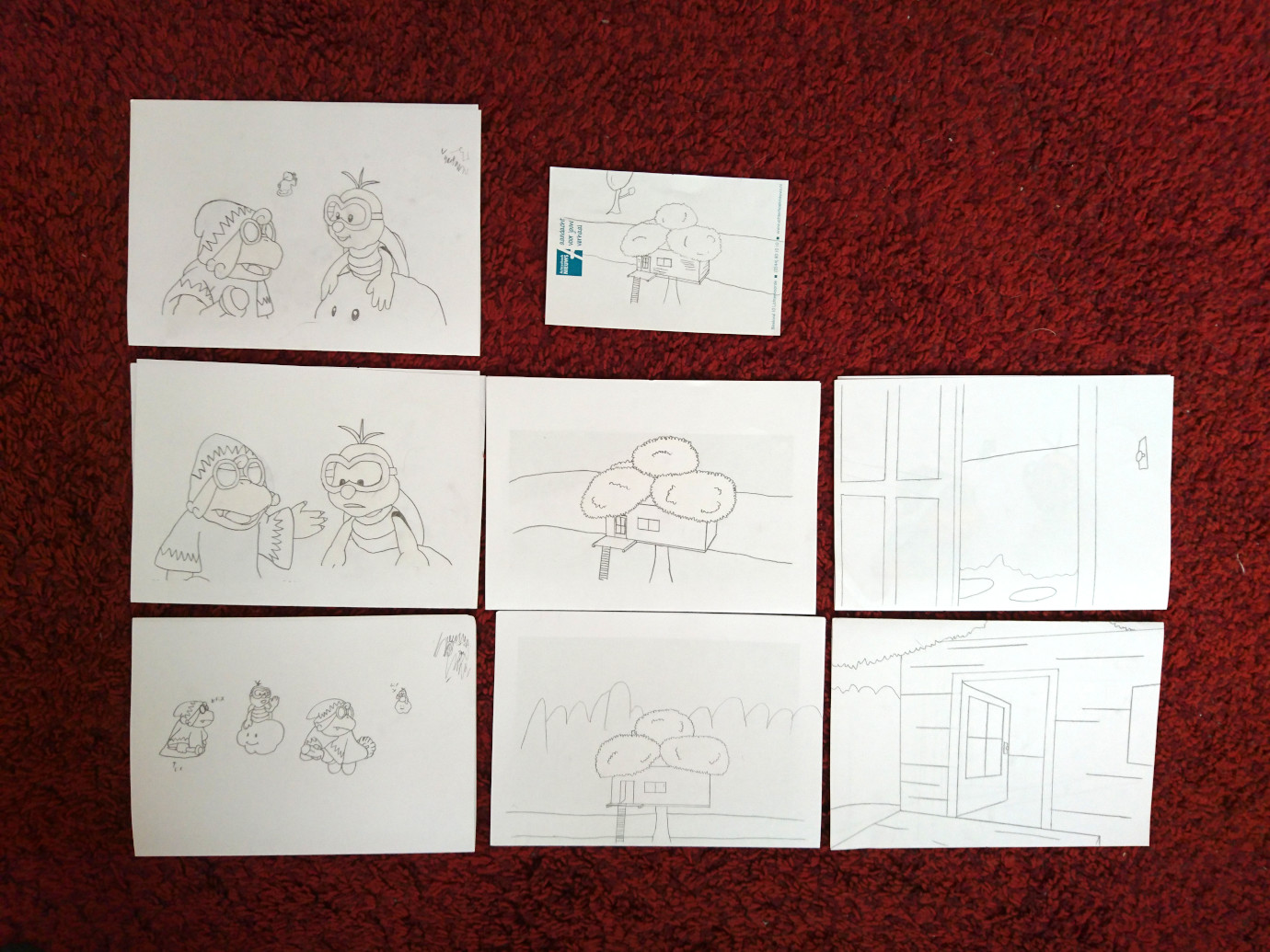
Then, using a drawing table with a light (although the actual light was broken, I used my phone's flash light instead), I traced the outlines with a pencil.
The backgrounds from inside the house I didn't trace from anything, I just used a ruler to draw the lines in logical places.

bts-drawingres.jpg


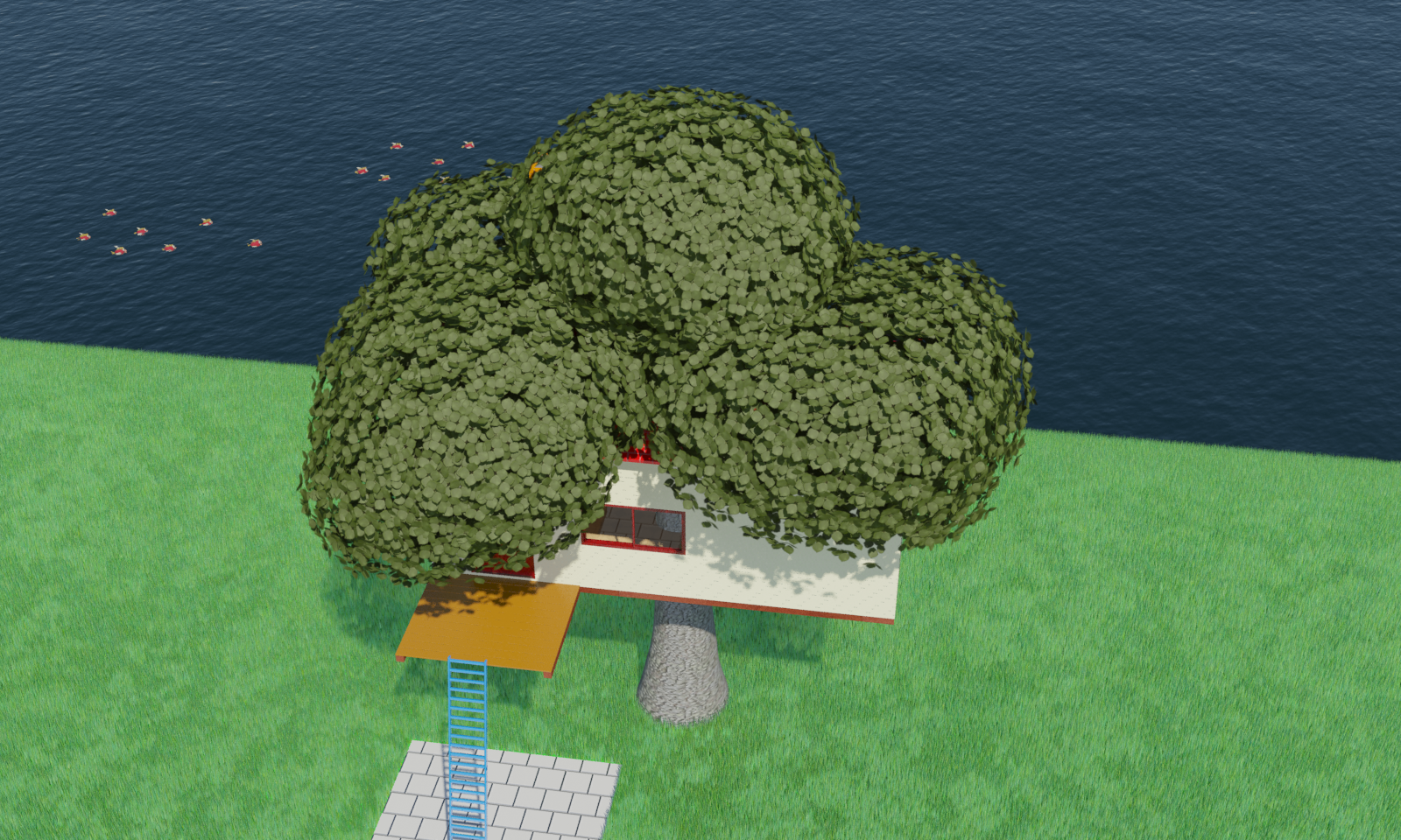
You may remember my treehouse from my presentation in 2016 (gosh that's three years ago now). I never did a BTS from that one, but here is the full render of the opening shot from there for orientation:

bts-treehouse.png


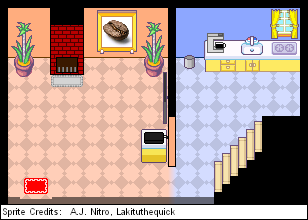
It, in turn, was based on this background I made for no apparent reason another year earlier.

LTQhouseF0.png


Anyway, I then scanned the drawings, thresholded them and coloured them digitally. I blurred everything slightly, backgrounds moreso, to give a bit of a loss of quality by VHS effect, as well as a slight subtraction of contrast, although both effects are fairly subtle.

For the mugshots I used the more traditional method of creating vector drawings for each "speaking" role. For the mother role, I actually asked my mom what she would be represented as, and made a small drawing while discussing it, and then made the mugshot of that. I didn't just make any random mom Lakitu for that! It's a neat touch that makes it just a little more personalised.

bts-mugshots.svg


The sprite comic

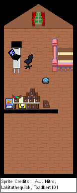
While I had a background of the 'ground' floor, I didn't have one of the first floor/attic. I had visions of that as well when I made the ground floor background, so I could make something suitable.
I did only make the portion visible for the comic though.

bts-LTQhouseF1.png


The banner

Not much going on here other than that I had to emulate Anton's style for this. Luckily he has a lot of drawings of himself in Dear Anton and other productions, and Dragon Problem features him in a style that already fits fairly well, so that was not too much of an issue.
I made the banner in Inkscape like the other vector drawings, then added a filter to it to slightly distord the lines for a more sketchy effect, which is another property of Anton's banners.


The Japan World Cup video

I just edited the pacing and added a slight echo to my voice recording, otherwise nothing spectacular here.


The Paper Mario segment

I can't tell much about the scene without duplicating what I already said in the behind the scenes of my original in 2017. I basically just edited the scene to resemble my treehouse.
I re-installed my laptop in the meantime, so I don't have 3DS Max installed anymore anyway. I'm also moving on to Blender going forward, so re-installing Max just for this post is not worth it.

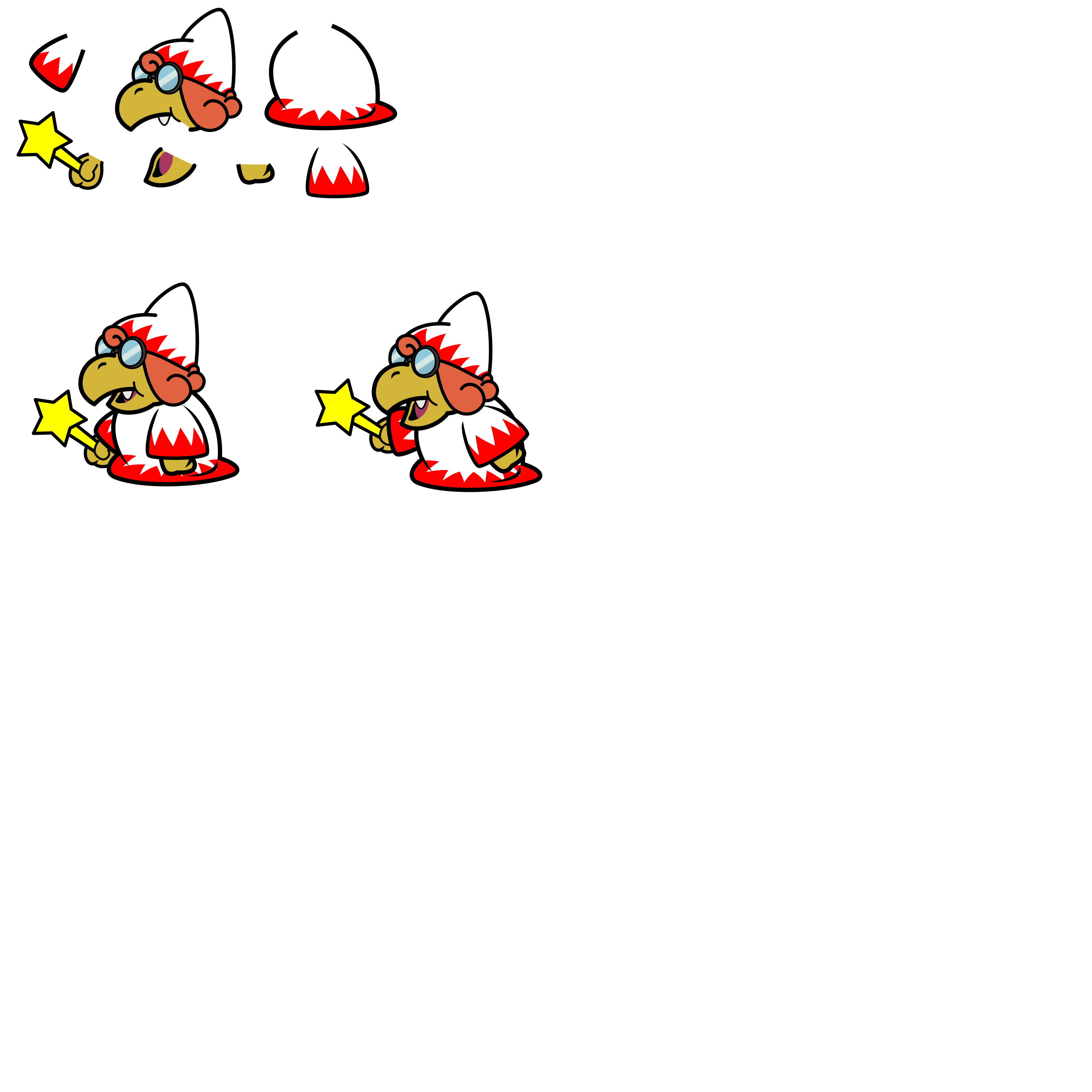
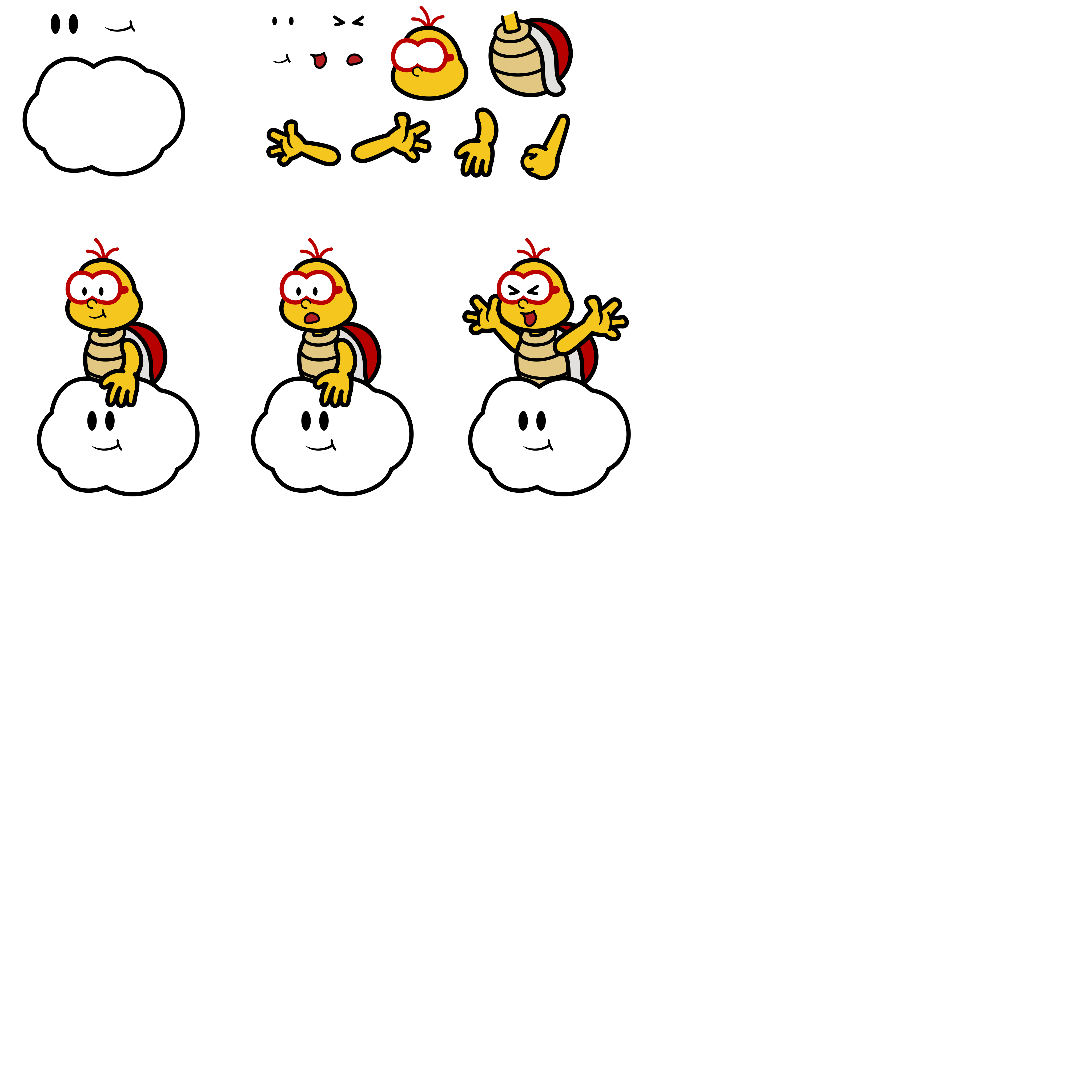
I can however tell more about the sprites I made of Anton and me. I wanted to make higher quality sprites with more freedom of movement, so I made the sprites from scratch, or well, traced them from existing spritesheets. For this I made the body parts separate from each other, so it is easy to make new sprites.

As you can see I took a bit more freedom for mine. I don't particularly like the way Lakitu is sitting in his cloud in the original games, and instead prefer him sitting upright, so I did that. I would have expected them to upgrade Lakitu just like they improved on Dry Bones back in Sticker Star, but oh well.

Not pictured: the white outline. I added that separately before importing it into 3DS Max.

bts-Anton.png
bts-LTQ.png


I think that was about all of it. Bit late, but better late than never! Hope you enjoyed!
 
Welcome to another month of "oh shit I need to get a maze in by tomorrow while also working on three presentations I need something simple"! The result of that is of course a Megavitamin!

megavitamin.svg


View the maze for this pill here!


Also, awards happened! I made three presentations:
C8 Best 'Shroom Section Design, a website with the top two laid out with design elements from them
M2 Favourite Mario Kart Game, an infographic with some features the top three games brought to the series
M14 Favourite Species, a modified version of the Chrome dino game revealing the results as the points go up

More in depth behind the scenes for these are to come later. For now I'm very happy with the fact that I did more than one presentation again this year.
 
The 150th edition of The 'Shroom released last week, and I did special stuff in it!

Let's start off with the usual, It's aMAZEing! Being a special issue, I needed a special thing for a maze, and the cake you get in Super Mario 64 and its DS remake seemed like a suitable thing for this. Especially if you consider that SM64DS has 150 Power Stars.
Then I could only make the figures to be the directors, which was an idea that came after colouring the berries after the sub-directors and their teams, also in line with the backgrounds representing the number of directors each team has had up to now.

Also, this image 1.5 times the usual dimensions to make everything not crammed. Anyways, figure!

largecake.svg


View the maze for the cake, go here!


Next usual, the Committee Interviews, which have sprites for MsRetroGeek and Roserade! Both of these are of course modified versions of existing Amy Rose and Roserade sprites. Besides the usual M&L-ifications, I added glasses to Geeky's. Roserade's was larger than this, so I downscaled it and tweaked that until it looked right.

ShroomAA-mrg.png
MsRetroGeek
ShroomAA-rose.png
Roserade

Read the section here!


Lastly, the special staff section, the Super Mario Odyssey Travel Guide! It should come to no surprise that I wrote the Cloud Kingdom part :lakitu:
 
Hello there, 'ts been a while.

Let's go over what has been out since September then!


In October we've had a pirate's map! This maze is unique in that it was entirely designed as a maze, and no mazeless version really exists. Well, yeah it does, but that's just a nearly empty piece of paper with a Shy Guy and Skull Gem on it.
... I guess I'll post that!
Do also read the article's text for this month, I put some extra flavour in it this time.

piratemap.svg


Unfortunately I had to skip November as well, but I am back this month with a theme fitting both the section (puzzles) and the paper (Donkey Kong)! Off course, it is the Puzzle Piece from the DKC series! Here is the figure on its own!

puzzlepiece.svg


You can find it filled in with maze right about here!

Have a nice Christmas and I'll see you in the next year!
 
And we're back with a new month, year and decade! Also the end of an era with MCD leaving Fake News, so some writers did something to this occasion, including me! Here is a stereotypical British item, the monocle!

monocle.svg


You can view the maze reflected into it at this link!
 
Wew, almost forgot to post May's maze art!

Last month's maze features an Origami Fire Flower, as seen in the upcoming Paper Mario: The Origami King.
If you consider the timing of the announcement in relation to the release of the paper, yeah, I started a bit late.

origamifireflower.svg


You can burn yourself out to the maze here!
 
Welcome to June! This month's maze is all inspired by Awards Killing Game 4 which is happening right now! I unfortunately was eliminated by virtue of carrying a small strip of metal on me, which I'm bummed about, but a good kill sits in the details! Better luck next time.

...Oh yeah, the maze features this figure, which is the Neo Bowser Skyscraper logo, the facility in which this Killing Game takes place.

neobowserskyscraperlogo.svg


You can find the maze here!
 
Welp, July, month on the Mario Sports Mix sportsballs. No fancy Dr. Mario mazes this time, as I've already had two of these in the last year plus I didn't want to break the July streak. This year only ice hockey remained, which uses a coin as puck.

coin.svg


You can find the maze here!
 
Welcome to August, where I had absolutely no time to make a maze so I made one anyway. This month I took the Party Pad from Super Mario Party, and honestly that's only because it was simple and had a rectangular window to put a maze in.

partypad.svg


Maze here.


Coming "soon": some behind the scenes stuff on the presentations I did this year.
 
Whoops, I forgot to mention the sprite I did of Zange for this month's Anniversary Announcements! For this one I took BBQ Turtle's sprite of last year and further edited it to create Zange out of it.

ShroomAA-zange.png
Zange

Read the interview with Zange in this month's AA!
 
Last edited:
I completely neglected to post my September 'Shroom stuff here until now, whoops.

September's maze features the Strollin' Stu, in celebration of Super Mario 3D All-Stars.

strollin-stu.svg


As always, you can find the maze here. This also happens to be my second-to-last maze, next Saturday will be my last maze unfortunately.


Also in September was the last edition of Anniversary Announcements of the season. It featured interviews with YoshiFlutterJump and Power Flotzo. YFJ doesn't really have a character for himself within the community, so we agreed on simply Yoshi, but I did modify the original sprite with a more modern colour scheme. Power Flotzo on the other hand has a completely original character, so I made an original sprite for him.

ShroomAA-pf.png
Power Flotzo.

Interviews can be read in September's AA.
 
Welcome to this spooky month of October, in which I have done absolutely nothing spooky for The 'Shroom, which is quite a spooky thing to do.

That said, this month was my 35th and last It's aMAZEing. I've unfortunately grown out of the section in honestly, and making them became more a chore than a pleasure, so I felt it better to stop now. 35 is quite a nice number though, also considering SMB's anniversary and all, so I went with the number for this last maze.

35.svg


The maze can be found here. Thanks for three years!


In other news, I have started a new section this month, Site Seeing! In this section I'll be showing off some of Nintendo's various topical websites.
This month's first edition features the North-American Super Mario website.
It's a bi-monthly section, meaning I'll be back in December. Only so many websites, best to not run out within a year.
 
*dusts off thread*

Hello! If you haven't seen it yet, Anniversary Announcements is back! No big changes this year, I mostly just changed the commas into bullets in the tables because of the nominees with commas in their names (and it distinguishes better anyway). Give it a read!
 
Back