Navigation
Install the app
How to install the app on iOS
Follow along with the video below to see how to install our site as a web app on your home screen.
Note: This feature may not be available in some browsers.
More options
You are using an out of date browser. It may not display this or other websites correctly.
You should upgrade or use an alternative browser.
You should upgrade or use an alternative browser.
Sonic the Hedgehog Movie
- Thread starter Moldomré
- Start date
Ten
watch fop a new wish or you're... straight ahaha
- Pronouns
- He/It
- MarioWiki
- Crazy Mr. L Fanguy
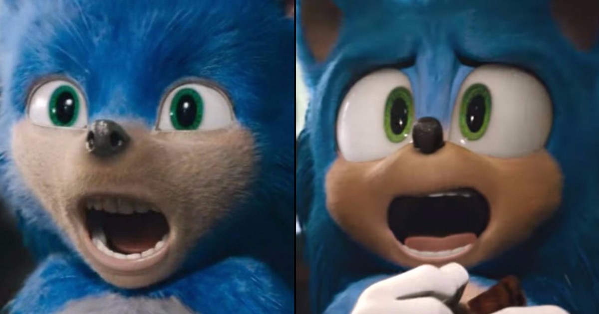
A nice compare-contrast.
- Pronouns
- She/her
- MarioWiki
- Ray Trace
It's like night and day. During that terrible "meow?" scene, that new design is far more expressive in his shock while the old one just looks like he wants to devour your soul.
Ten
watch fop a new wish or you're... straight ahaha
- Pronouns
- He/It
- MarioWiki
- Crazy Mr. L Fanguy
I also think new Sonic is taller.
Cocoa
Celestial Guide
- Pronouns
- She/They
- MarioWiki
- Cosmic Cowboy
The new Sonic looks much more expressive.
Video Game Movie or not, I still wanna see it.
Video Game Movie or not, I still wanna see it.
Ten
watch fop a new wish or you're... straight ahaha
- Pronouns
- He/It
- MarioWiki
- Crazy Mr. L Fanguy
s a m e
- Pronouns
- she/her
- MarioWiki
- Mario
It's really good they have a redesign but it probably caused artists A LOT of misery. People are saying the old design is part of some media stunt. I say, no, that's conspiratorial thinking and in real life, pulling off that stunt would've been WAY too costly. The real life is that executives are talentless hacks that exert full control over the product, and artists ranging from concept artists, modelers, animators, effect artists, post production, etc all have to follow what executives want.
If you have 20 minutes to spare, it's worth looking at this video
If you have 20 minutes to spare, it's worth looking at this video
Cocoa
Celestial Guide
- Pronouns
- She/They
- MarioWiki
- Cosmic Cowboy
I just want to say that I always knew that Jim Carrey's eggman would actually be Dr. Robotnik since Jim Carrey is not shaped like an egg.
(Although I am disappointed that he isn't played by Alfred Coleman)
(Although I am disappointed that he isn't played by Alfred Coleman)
Last edited:
Ten
watch fop a new wish or you're... straight ahaha
- Pronouns
- He/It
- MarioWiki
- Crazy Mr. L Fanguy
I dunno why but I wanna add Dr. Robotnik to my list of baes,
Specific Neptune
how're you doin'
- Pronouns
- Any
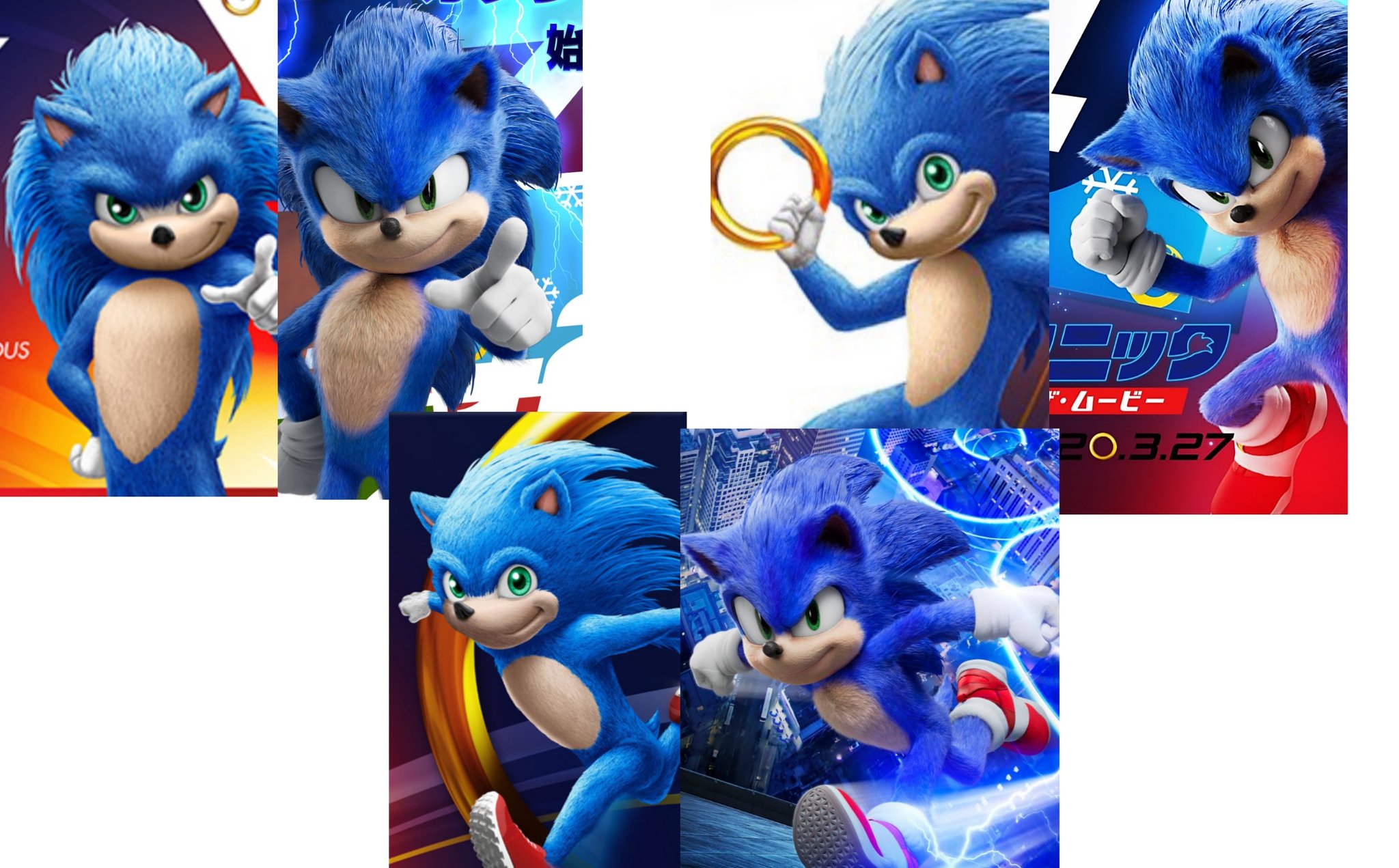
Detective Pikachu would like a word with youThe difference between this trailer and the last one is like night and day.
I still don't think it will be a good movie because of video game movies always being shit but, at least they actually listened to people.
Cocoa
Celestial Guide
- Pronouns
- She/They
- MarioWiki
- Cosmic Cowboy
Can we take a moment to appropriate the fact that James Marsden got to slap the legendary Jim Carrey.
Specific Neptune
how're you doin'
- Pronouns
- Any
Hyperbole.

Ten
watch fop a new wish or you're... straight ahaha
- Pronouns
- He/It
- MarioWiki
- Crazy Mr. L Fanguy
I have a very strong urge to nibble on Sonic's fluffy ears.
Wth is wrong with me? I haven't even talked about my opinion on the design!
I think it looks fantastic, definitely an improvement. Might be an unpopulated opinion, but I thimk this is my new favourite sonic design. He just looks so cute and fluffy I almost wanna hug him. Like, even if the movie was ass, I'd enjoy it because of how amazing this design is.
Also trailer is much better. They used actual sonic my instead of frickin gangstas paradise.
- Pronouns
- She/her
- MarioWiki
- Ray Trace
Some tidbits on the process of designing the Sonic
I am not surprised Paramount pushed for the first design, knowing that it was going to be hated by Sonic fans (you know, the demographic that'll see a Sonic movie to begin with), but thinking that'll appeal to the general audience anyway, thinking that this first horrendous twisted abomination of a classic, recognizable character will be somehow more appealing than his traditional design that has stood the lengths of time that Sega had perfected.
How many times has this "realistic redesign" been abject failures when it comes to adaptations of a cartoon property? Did they not learn from the disaster that is the Super Mario Bros. movie? Did they not learn from the success of Detective Pikachu? What about the Marvel movies?
Artistically bankrupt fuckheads. It's this arrogance that these people think they know better than the artists that gets to me. That they think we want this horrible, angular, squinty-eyed abomination of a Sonic.
The animator notes that it was Paramount that pushed for the first design, which it was confident in. While it knew it would be controversial, it thought it would be generally accepted, and that it was a good fit for the live-action elements of the movie. Again, Paramount knew there would be backlash, but it didn't anticipate the backlash being big enough to warrant making any changes.
I am not surprised Paramount pushed for the first design, knowing that it was going to be hated by Sonic fans (you know, the demographic that'll see a Sonic movie to begin with), but thinking that'll appeal to the general audience anyway, thinking that this first horrendous twisted abomination of a classic, recognizable character will be somehow more appealing than his traditional design that has stood the lengths of time that Sega had perfected.
How many times has this "realistic redesign" been abject failures when it comes to adaptations of a cartoon property? Did they not learn from the disaster that is the Super Mario Bros. movie? Did they not learn from the success of Detective Pikachu? What about the Marvel movies?
Artistically bankrupt fuckheads. It's this arrogance that these people think they know better than the artists that gets to me. That they think we want this horrible, angular, squinty-eyed abomination of a Sonic.
10000 Needles
Koopa Troopa
Sonic fans (you know, the demographic that'll see a Sonic movie to begin with)
The thing is, Sonic fans are going to see it no matter how good or bad any part of it is. It doesn't really matter a whole lot what they think. It's the people who aren't already fans that need to be sold. But yeah they really shit the bed either way.
- Pronouns
- She/her
I still don't like that Sonic has two eyes. In the games, he always has had only one eye, with two pupils. I don't care that much, however, as it still looks like him. It's just a silly pet peeve of mine.
Thank you for reading.
Thank you for reading.
- Pronouns
- She/her
- MarioWiki
- Ray Trace

Report: Sonic Movie Redesign VFX Studio Shuts Down After 'Extreme Hours' to Wrap it Up - PlayStation LifeStyle
MPC Vancouver, the VFX studio behind the recent Sonic movie redesign, has closed its doors for good. The studio reportedly worked "extreme hours" on the project before it was unceremoniously shut down.
Fuck capitalism
- Pronouns
- she/her
- MarioWiki
- Mario
Of course the disgustingly overpaid higher-up talentless hacks that were responsible for all those decisions keep their jobs.
- Pronouns
- She/her
- MarioWiki
- Ray Trace
MASSIVE SPOILERS. POST CREDITS SCENE.
 old.reddit.com
Part of the Sonic Movie post credits credit: Mimi’s Toy Corner
Posted in r/SonicTheMovie by u/FoxyAndSonic967 • 43 points and 45 comments
Tails appears in this and he actually doesn't look bad!
