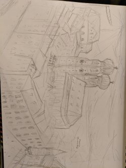
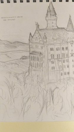
Art Critique Thread. submit art that you'd like to have critiqued.

Pronouns
He/Him
MarioWiki
CaptainOdyssey
I hope it's okay to start this thread. Post your art here, and I and anyone else who volunteers here will critique it for you.

Rules for critiquers:
1. Don't insult or discourage anyone who posts their art here.
2. Talk about specific details of the art, don't just say that the art is good.

Rules for submitters:
1. Ask about at least one specific area of the art you submit that you want advice on, such as color, line-work, or character design to help point critiquers in the right direction.
2. Keep the art that you submit to a PG rating. As a guideline, don't submit art that would break forum rules or be considered too inappropriate to appear in a Mario game.
 
Last edited:
Hi! Can someone give me some tips on my art?
(sorry for it being so humongous)
IMG_1566.jpeg

for something I want critique on, something about character design and style and stuff (also it's a mega gardevoir gijinka (pokemon) and the whites of the eyes being non existent is a stylistic choice)
 
Character Design: This character seems seems to be a human version of the Pokémon Gardevoir, with some design aspects from both the standard and mega evolution forms, you did a good job at making that design idea come across.

Line-art: You seem to be using a basic round brush with no pressure sensitivity for your line-art, which makes it come across as a little bit flat, there are also areas where lines overlap in a way that could be cleaned up. The simple brush could work for making a graphic style, but you want to make sure your line-art is on it's own layer so you can do some clean up. A lot of that could be because of the technology you are using as well.
Thanks! I don't really like pressure sensitivity because my art ends up looking super uneven. I'll try to clean up the overlaps a bit!
 
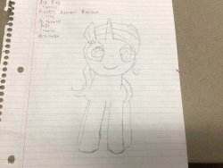
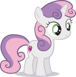
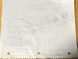
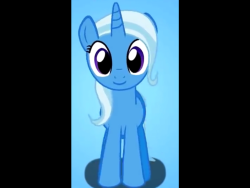
Yesterday and today I made freehand sketches of Trixie Lulamoon and Sweetie Belle from My Little Pony: Friendship Is Magic. Below are the reference images I used and my freehand sketches. I did not trace over the images.

Trixie Lulamoon:
IMG_4738.pngIMG_5378.jpeg

Sweetie Belle:
IMG_3659.pngIMG_5388.jpeg
 
It seems that your goal is to copy the image using your own hand to the best of your ability. That's a pretty good way to start learning to draw.

Proportion: My advice right now would be to start with some proportion guidelines before going into making the details. While searching for an example of drawing guidelines I actually found out that there's a whole subreddit specifically for drawing my little pony characters, and I found a tutorial that goes over making guidelines for that kind of character. Here's a link.
 
Back