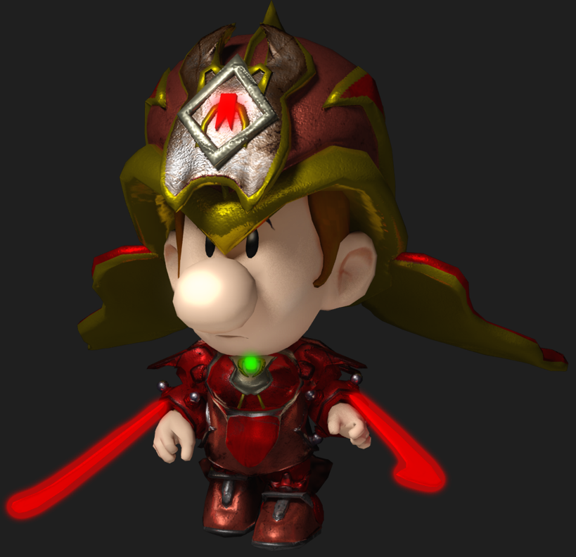
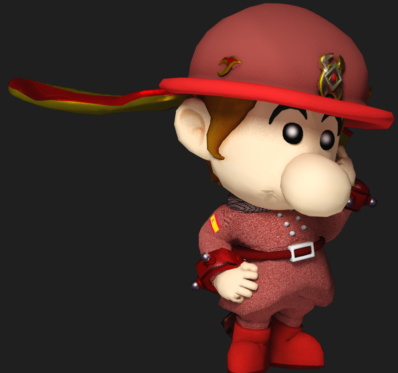
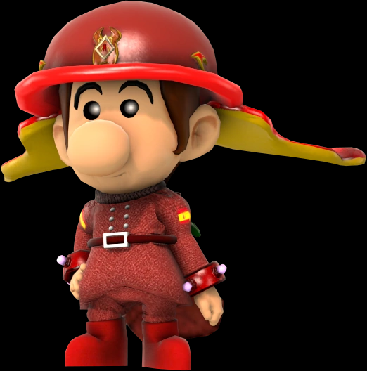
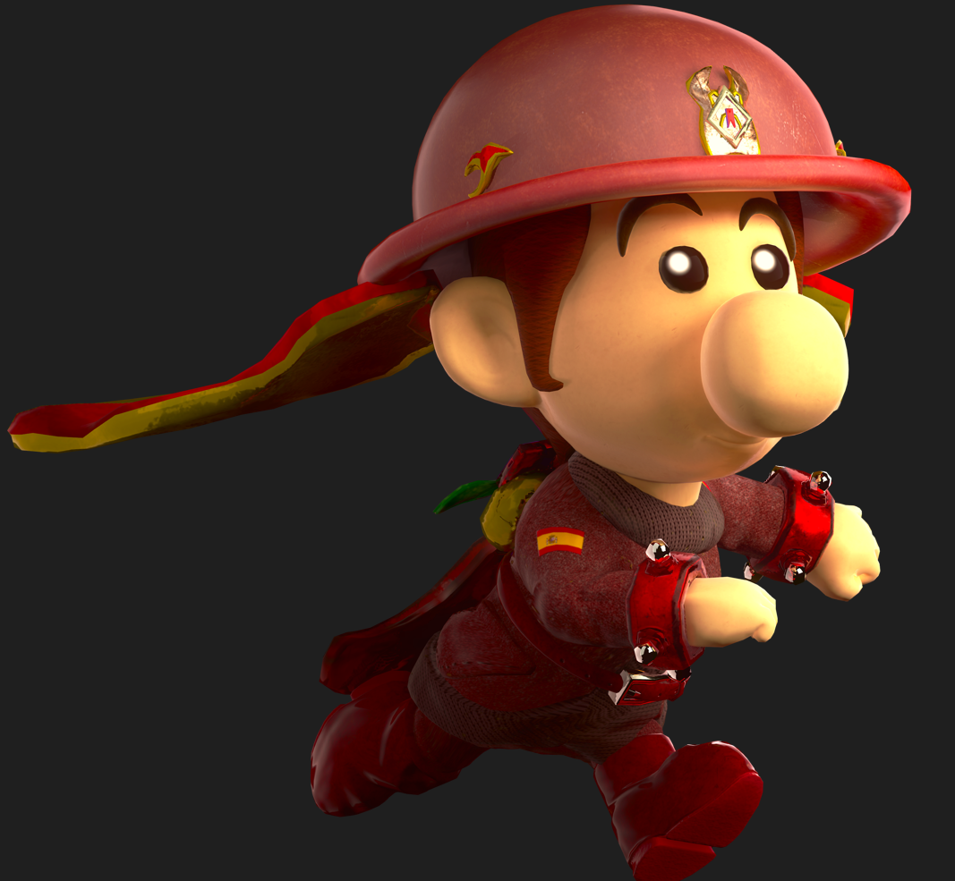
Okay so the third-in-command isn't the only one who's allowed to have a pretty render and a history of all renders I ever made. Here's someone less stupid than Ray Trace, Redshift! He usually acts as the "straight" person to keep Ray Trace in check, and for a good reason: he's more powerful than Ray Trace is being the Lieutenant Commander of the Protectors. While Ray Trace commands people to respect him, Redshift is far more humble than he is and respects people. While Ray Trace is likes attention, Redshift is more reserved.
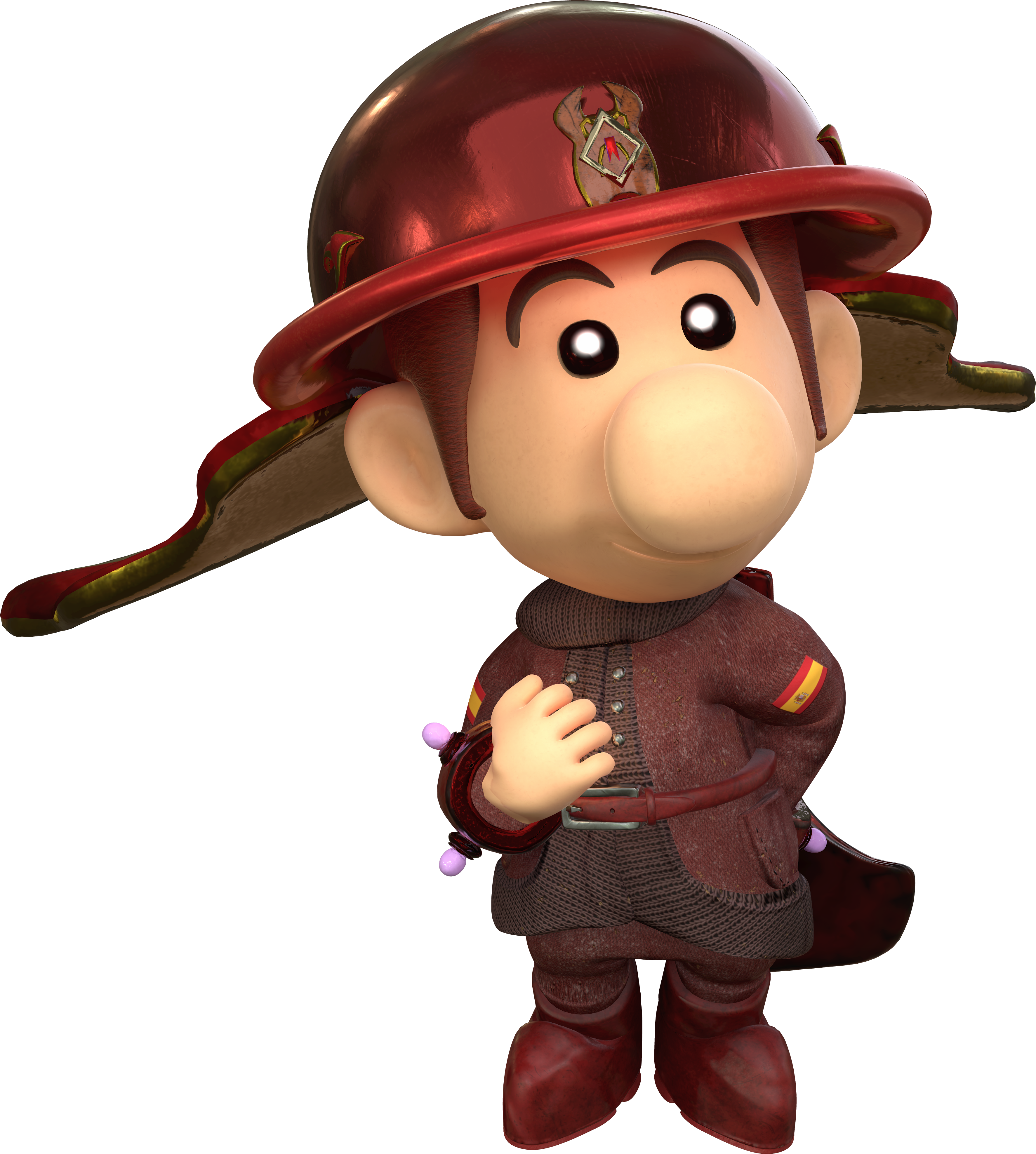
RedshiftRojo.png

Anyway, I had too much fun rendering Ray Trace and using what I knew to churn out better and better renders, so I really want to render the rest of the main cast of the Protectors. Wanted to make Redshift first because he's really a sweetheart, but when I first conceived him, he wasn't really that sweet.

Recolor Roots Similar To Luigi! Except Red...
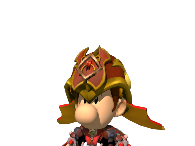
RedBlackBabyLuigi.png

September ‎1, ‎2016 was when I made a recolor for a Dark Light in Super Smash Bros. Brawl (this was done entirely with Spore Galactic Adventures, and that's all he existed as. Back then, he didn't even have a name. He literally was supposed to be a recolor of Dark Light. And this facial expression would become the basis of his personality, being serious, committed, loyal, and just overall has a lot of integrity to boot.

He Got Luigified A Bit And His Armor Got Refined.
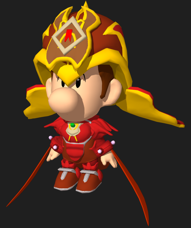
1660533707679.png

Eventually, Super Smash Bros. for Wii U came around which prompted me to return him and the other two recolors, Blue and White. This was made in April ‎13, ‎2017. His pose is a little stiff because like Ray Trace, I intended to crop only the face portion of him for use as a battle portrait. The prior render and this render as well as earlier depictions of him look like he's hot headed and ready to twist your arm off or beat you up in a battle. Of course, the texture work is very very limited and bad, using only solid colors and his armor then got a much needed facelift thanks to Substance Painter...but not an actual facelift with an original modeled face until later.

When We Mean "Refined", We Actually Do Mean Lots of Wear and Tear
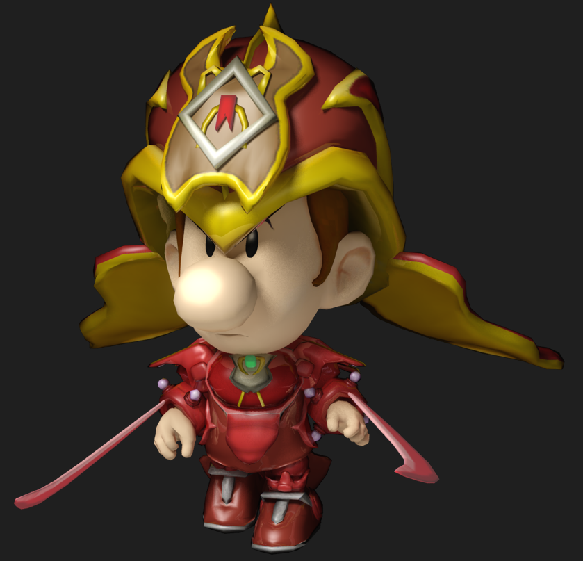
1660534417622.png
1660534298020.png

Here I actually posed his body and I intended to make him look serious and threatening, walking towards you with his swords out, facial expression focused and meaning business. The first picture was rendered in 3ds Max's mental ray in July ‎3, ‎2017 while the latter got the Substance Painter treatment for textures and redone, rendered in November ‎16, ‎2017. Textures mean a whole bunch, they can bring characters to life easily, and with a program generating proper maps like Painter does, you can truly make good looking things with little input, I strongly recommend using as it helps speed up work flow compared to relying on other image programs to get your textures.

Anyway, around this point, I actually drew the Protectors, but I figured, they shouldn't be recolors of Dark Light indefinitely, they're extremely hard to distinguish without any color. While Ray Trace did get a new outfit, Redshift and the others went straight to redesign territory, without that awkward immediate stage so I did this.

Taller, more elegant, and getting fat.
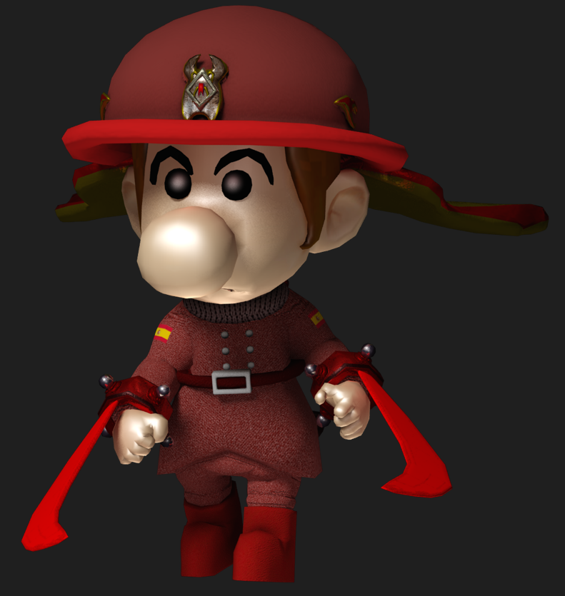
1660534730594.png
1660629495441.png
1660535071517.png

This was rendered in 3ds Max in ‎April ‎27, ‎2018 for use in Super Smash Bros. for Wii U to replace the earlier Redshift, the next was rendered in Source Filmmaker, May ‎14, ‎2019. He uses the same pose as the prior Redshifts, the intimidating walk but he pretty much gets an overhaul to his design. His head and hair is heavily edited from Baby Luigi's, the old armor parts persisted like the rest of the Protectors, his eyes are distinctly round from the others as well as getting thicker eyebrows, and his body was newly modeled from my recently acquired modeling skill. I remember liking this render back then but now, his face is too pale (lack of subsurface scattering is the reason), the pose is a bit too stiff (the legs especially) and the camera should perhaps be a little bit more dynamic. The SFM Redshift was him being less intimidating, I toned down that serious attitude by a lot; he's still a no-nonsense character but he's gotten very soft and gentle over the years.

A Neat Wardrobe Change And A Neat Program Change
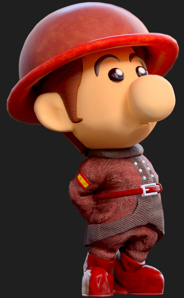
1660536133208.png
1660536157778.png

The first image was rendered in ‎March ‎7, ‎2020, the second in February ‎29, ‎2020. Like Ray Trace, I was increasingly unsatisfied with the Redshift model so I just redone it (the coat like others lacks detail, and it doesn't have the little frill thing from the coat I inspired from came from as well as the textures needing more work, the boots need more detail) and I eventually fully modeled his head, which is still in use today. Of course, the head may change in the future, the ears still lack the necessary ridges and that rings true for the other Protectors as well. These were two early Marmoset Toolbag renders, as I was still gawking at how much I love the output, but these could definitely use improvement. The lighting is sunsetty for some reason, the poly count lets you see jaggies, and the texture resolution is too low, and the running Redshift's lighting on his body is too dark. Still don't hate how the poses look today, however. Which leads into the next one...

Killing Peter Griffin and Homer Simpson in a Nintendo Game Changed Everything
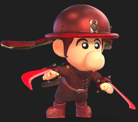
1660536466934.png

Smash is always the catalyst for these renders huh? Well I render things when I have a drive, in ‎December ‎14, ‎2020 that is, and this is one of them where I'm required to render a high res picture to replace appropriate portraits with. This is the first time I've tried out 4k textures and upping the polycount up in a program, and rendering Redshift once again to be this super serious guy, because he's in a combat environment of course! I'm still quite satisfied with how he looks currently, maybe his blades can glow a bit more but I really wouldn't change much about this. In fact, this render gave me inspiration to render the other Protectors in a similar quality and then, they came too.

By the way, I did make a trunks variant of Redshift but because Smash Ultimate doesn't have any space, I can't put him in. I also didn't render him yet, but maybe some point in the distant future, when more characters are made and everyone gets a trunks outfit.
 
Last edited:
Time to talk about my third render! This is focused on Ultra Violet, Vi for short, the surly and disagreeable member of the Protectors. While he has loyalties to the Commander, he doesn't really enjoy listening to other Protectors who tell him what to do. While he is sneering and cynical for most of the time as well as having a befuddled backstory (this explains why he's considerably more grungy in appearance than the other Protectors), he does have a heart of gold and he's the type of guy who'd find an abandoned animal on the street and nurse it back to full health.

In fact I made two renders for him this time. I did the first one last night, but I wanted to make another render where he is less proactive, less smug, and more standing there to be in line with the first two cast members, so here you go.

Oh, fun fact about Ultra Violet's renders: his textures use so much detail that his file size is considerably larger than the others, and I can't upload him here in his original size, so here are shrunk down variants instead.

UltraViolet_MarioParty2_smaller.png
UltraViolet_MarioParty1_smaller.png

Just like Ray Trace, he was created later than Redshift, Kontrast, and Bluminescence are. So he has less renders than they do, but that doesn't mean I didn't take a crack at rendering him as a Dark Light recolor.

Name's Ultra Violet. But don't worry about learning it, 'cause I ain't sticking around long.
1660605359801.png
1660605386959.png

This was the first time I ever rendered Ultra Violet, in ‎July ‎5, ‎2017 and November ‎16, ‎2017 respectively. Because Nick from Left 4 Dead 2 was a direct inspiration for him, his personality pretty much mirrors him, which explains why he's snide, cynical, and distrustful of anyone else, and the renders mirror this with his rather disgusted facial expression. He uses simple purple colors, both the reddish purple and a bluer purple, though the reddish purple would become his primary color scheme. Oh, also, because he's a Dark Light recolor, his features are identical but more unique things to his design won't come until his redesign. The second image is after I installed Substance Painter and modified the textures I made for the rest of the Protectors. Fun fact about the Protectors: their little armor they currently wear nactually has different types of wear and tear rather than being pure recolors, and it's dependent on their personality. In order to render them properly, you need their own map files rather than use another Protector's. For Ultra Violet here, he has a more corrosive-looking armor, as his element is poison and it reflects his surly personality.

I normally go solo-but under the circumstances, I'm thinkin' we stick together.
1660605842047.png
1660629377791.png
1660605891422.png

Shortly after he established as a main character of the Protectors, he and everyone else received redesigns. For his design, I decided to go with simple perpendicular slits for eyes and eyebrows and I think it communicates his personality very well. Hence he needed a remodel. The left image is rendered in May ‎18, ‎2018 in 3ds Max, and he was the last Protector to get a redesign. One thing that I changed in his transition to the more recent render on the right, rendered in ‎May ‎16, ‎2019 (nearly a year later wow), is his hair color: it used to be brown but I changed it to black to better match Nick. Anyway, his suit is directly inspired from Nick, and that's why his clothes uses a lighter lavender purple color scheme than a darker, more saturated purple, though his helmet retains the reddish purple color scheme he got going on. In addition, his cape and his swords received tweaks to their design to distinguish him from the others: Ultra Violet's sword is more hooked and his cape is pointier, his bracelets are thinner than the others, and his wings point more down compared to the others where their wings are more parallel to the floor. I also included rings to his fingers because Nick wore them.

I think the little guy's onto something. Let's give it a shot.
1660606552562.png

Ultra Violet hasn't had much since I made his render though that doesn't mean he's been completely neglected, as I've done plenty of Gmod screenshots with him and I've drawn him with the others, sometimes he, Kontrast, and Bluminescence star in their own little misadventures as the bottom three Protectors. Soon, Super Smash Bros. Ultimate came around which led me to make a render of him specifically for the game. He got a revamp and a remodel meanwhile and received a major upgrade in his textures, but changing the rendering program to Toolbag heavily improved his presentation and gave him the appropriate grungy look I was looking for, especially in his face which is considerably more worn down than the others. His face is fully modeled, edited from a template I use for the Protectors (originated with Dark Light or Redshift I believe) which would persist into Kontrast and Bluminescence. His grunge, despite being brittle and worn down, I feel is very pleasing to look at when done correctly, and sometimes I just take my time staring at his detail in the program itself. Here in this render, I didn't upper count the poly in some of his pieces which I now regularly do in 3ds Max before I export them for rendering in Toolbag, and it heavily helps improve the presentation.
 
Last edited:
This is actually really cool! I love seeing how the designs for the Protectors changed.
 
Next up is Bluminescence in his rotund glory! Not only is he super cute, but he's extremely friendly and outgoing to boot, a stark contrast to Ultra Violet and...err Kontrast. While he is formally called Corporal Bluminescence, he is completely fine with anyone casually calling him "Blue". He isn't the best fighter of the group, but who needs fighting when you can make friends instead?

Fun fact about him regarding him in the boards, he's @Magolor04726 's favorite Protector. Who doesn't like his lovely personality?
BluminescenceMarioParty.png

This is the time I ever rendered him with a closed mouth as I wanted more variety in the facial expressions he makes and the relax tool of vertices really helps making smiles look better. He can't be energetic and cheery all the time, can he?

One Of The Original Four
BlueBlackBabyLuigi.png

Bluminescence was one of the original four Protectors: Dark Light, Redshift, him, and Kontrast, made in that order precisely. Back then, as with them, he didn't have a name but he served to be a blue variant of Dark Light. I made unique renders for all the recolors because I wanted them to have a bit more flair than just recolors, and it was extremely easy to recolor in Spore Galactic Adventures anyhow. This pic was made in September ‎1, ‎2016, it was a simple bust render of Baby Luigi in that armor because at the time, I was focused on making the battle portrait which was more important to me than say the character select one as I see it more. This facial expression proved to be the groundwork of his personality later on, and today he still likes opening his mouth to express happiness and joy like Mario characters do. It's a complete opposite perception to being blue is, isn't it?

Even Happier With More Tools
1660627639230.png

Bluminescence then followed the same story as Redshift: the armor got fully modeled that would later prove to be Dark Light's regular model, and thus the pose was made in ‎March ‎31, ‎2017. Fun fact about this iteration: this was actually made before Redshift, and Bluminescence was put in the game before he was, mostly because he was supposed to have the French dub of Nick's voice from Left 4 Dead 2, as French is more familiar to me than Spanish. At the time, it still felt Redshift was more of a second-in-command than he was; in fact, one of my earliest depictions of him showed him to be some rival of Dark Light; Dark Light's water weakness came from dreams and he was the color blue, fitting for a water type. However, this sort of trait didn't stick around, and what we got instead was Ray Trace being made and put over him because I decided that Ray Trace was more of a fitting third-in-command than he was in terms of combat prowess, but that doesn't mean Bluminescence doesn't pull his weight around...figuratively speaking of course.

A Better Rendering, Texture, And Pose System Makes A Guy Happy!
1660627968254.png
1660627931194.png

Cue ‎July ‎3, ‎2017, and I've upgraded this variant of Bluminescence by simply using a better rendering output than the base 3ds Max one, which I believe was called mental ray (it's currently depreciated). This really helps bring out the shininess of the armor than the prior renderer, plus I've gotten a far better pose for him, which sticks true to his cheerful nature especially him running and greeting at people. The next image was rendered in ‎November ‎16, ‎2017, after making improved textures with Substance Painter. His armor has less wear and tear than the other Protectors, in that I wanted to say that he has seen less combat situations than the rest of the Protectors.

Look! Check out my new outfit guys! Isn't it just great?
1660628281093.png
1660628332601.png
1660628349789.png

This was around the time Blue got his makeover with the rest of the cast, in January ‎2, ‎2019. The next image, I rendered this in a group shot in ‎October ‎6, ‎2018, so it technically came after this image. And finally, the third image was a Source Filmmaker image rendered in ‎May ‎16, ‎2019. The first two images look pale because the lack of subsurface scattering meant lighting up tan surfaces causes your model to give off this pale look rather than in real life where if a light shines in your skin, it reflects some reddish light because of your blood cells. There wasn't really a same effect in SFM I suppose since it's not really a render software. Anyway Bluminescence got fattened up, his face got fatter and his nose got smaller, which distinguishes him from the rest of the cast. Funnily enough, the decision to make him fat was my sister's decision, and I think it's a great one at that, as I think he's a positive depiction of overweight people and he just looks even cuddlier as a result. These models still use the the regular Baby Luigi face by the way, as I felt I wasn't advanced enough back then to use that really old Baby Luigi head (was one of my first models after all). This Bluminescence model seen quite some use after while until the next overhaul.

Prepping up for Smash! This will be a fun time!
1660628841996.png

Super Smash Bros. Ultimate came, and Bluminescence was the last character to join, where he was there alongside Blueshift. He was made in ‎March ‎9, ‎2022, but his model was available before his time in Smash. His head got an overhaul, being an edit from another Protector head. He was given fully black eyes to distinguish him from the other Protectors who have white highlights on their eyes and his nose is even shrunken further. His hair style is slightly different from the others and a lighter shade of brown, while his body got overhauled and features a better modeled vest, the little X on his belly, and shoes that actually have padding. In addition, the rings around his shoes changed color to better reflect my drawing of him (also having pure black eyes as well). Anyway, I still like how this render looks but this was before I upped poly counts of models and how to average vertices (Toolbag's upping verts function isn't the best).

Maybe one day I'll model that feather...
 
Ok actually though, where could I get a plushie of this guy?

And I've now made a goal to do a "fanart" drawing or whatever of Bluminescene by the end of the year (will probably be one of those black and white sketches I typically do).
 
Unfortunately, I don't have a plushie of him nor Kontrast yet as they're pretty expensive. Some day though!

And yes, please draw Blu, ping me while you're at it, I would love to see it!
 
This is Kontrast, the smallest and the lowest-ranked Protector. But just because he's small in both stature and ranking doesn't necessarily mean he doesn't pack a punch; look at those arms of his! While he can be friendly unlike Ultra Violet, he has a short temper and he tends to complain about everything at times, especially venting about how his Commander is way too bossy for his liking. It doesn't help that he tends to be forgetful and clumsy in handling tasks, and he's pretty much the official "butt monkey" of the Protectors. In fact, mentioning about a very specific, particular endearing nickname is the surest way to set him off...

This is the second time I ever rendered Kontrast with a smiling facial expression. A hotheaded little guy can experience happiness every now and then, right?

KontrastMarioParty.png

MY NAME IS NOT "KONNY"!
WhiteBlackBabyLuigi.png

This image of Kontrast was rendered all the way back in ‎September ‎1, ‎2016. The main reason I chose a white coloration for him was primarily because he, Redshift, and Bluminescence's recolors corresponded with how Baby Luigi is over Luigi, and he came with Mr. L and recolors. The last of the Mr. L recolor just so happened to be white, which ended up as Kontrast's color scheme. Plus, it happened to be a good counterpart to Dark Light's black color scheme. As with the other two, Spore provided an extremely easy way to recolor him, as I just moved a slider into a different spot to auto recolor. Anyway, back then, he didn't really have a distinct personality for his render, just standing there, so he really was just a simple Dark Light recolor.

I'M NOT CALLED "KONNY" FOR THE LOVE OF-
1660699023642.png

Super Smash Bros. for Wii U eventually came out and became moddable, so I decided to return him and the other Dark Light recolors for use in Super Smash Bros. for Wii U and rendered this image in ‎April ‎14, ‎2017. This was when I decided that this iteration should receive the German voice, while the Russian and specific English variant of them didn't come out until later. Fun fact, it was his funny voice clips he made that was when I decided that he was a hot-headed little butt-monkey, and thus I'd often drawn him clashing hard with the joking Ray Trace. This costume here is an upgrade over the prior one, being fully modeled by myself rather than just ripped from Spore consisting of a mish mash of assets. And yes, the posing is minimalistic, he's literally just A-posing purely for battle portrait reasons.

I'd appreciate it if you stop calling me "Konny" this INSTANT.
1660699561606.png
1660699692295.png

When I rendered better with a dedicated renderer that came with 3ds Max, I also bothered to pose his body. This image was rendered in July ‎4, ‎2017 while the second one was rendered in ‎November ‎16, ‎2017. The shininess really helps bring out the model, though it would be the texture work that would surely bring out further qualities in the model, in which me learning substance absolutely helped with that. However, when I applied the same textures but upgraded, it gave him a silver, metallic look instead, which wasn't quite what I was going for; he wasn't going to compete against Ray Trace as the valuable elements after all. I was still new to this, so I didn't know how to render the armor sets as white rather than metallic silver.

"Konny" is not my name you-
1660699952195.png
1660700050851.png
1660700069766.png

Practically all Protectors got an overhaul around this time period and Kontrast is no different. Because this was intended to be based off his existing pose, he was rendered in in a similar way, though he's pretty much still just standing there a bit awkwardly, like if he's an entry in Sporepedia or some bestiary or something. This image was rendered in May ‎2, ‎2018, though the next images would also be rendered in 3ds Max and Source Filmmaker, ‎October ‎6, ‎2018 and May ‎16, ‎2019 respectively. The latter two renders are the first times Kontrast has demonstrated some sort of personality, though the former of the two images actually showcase Kontrast's personality of being a bit aggressive while the latter shows his seldom cheerful moments.

Call me "Konny" one more time and I-
1660700280942.png

Cue Super Smash Bros. Ultimate arriving and me rendering this image in ‎January ‎17, ‎2022, with the immense aid of Toolbag, but prior to that, he did get a giant model overhaul that included many physical features specific to Kontrast. Believe it or not, it was my sister's idea to make him have buff arms so that aspect of his design stuck ever since, and I liked it quite a bit. Looks like he has been doing a lot of top work, and it fits his hotheaded personality! He also uses simple dotted eyes that are merged closer together than normal, and a different style of eyebrows. Plus, his belt is more rendered (heavens knows what kind of gun he'd like to use judging from his armor belt) while the lack of detail on his older helmet had always bothered me (and I somehow missed detailing it) so I gave it appropriate grunge for him. I also decreased the size of his model even further to make him look even shorter, though it is difficult to tell without comparison images next to each other. I'm still mostly satisfied with this render but again, upping the texture resolution and poly counts seems to improve the presentation of the model by a lot, even if it seems incremental at points.
 
What use is the Protectors without a Commander leading them? Last but not least, here is the most powerful Protector, Dark Light. She is the complete manager of the group, as well as their mentor, and any comments, complaints, and death threats need to be directed at her. While many people her height are completely terrified of her, such as Toads and other diminutives, every other species thinks she is just the cutest and prettiest wallflower no matter how loud she shouts at them. What else is there to say about the Commander? Oh, she's a cop and she absolutely cannot stand rap music and ripped jeans.

This render is her doing her patented expression of disapproval.

DarkLightMarioParty.png

Being the first ever member of the Protectors, Dark Light has had a more varied history than them. Technically, she first appeared as a Black and Gray recolored Baby Luigi all the way back in 2010, though she didn't truly become her own character until 2011 in Spore where I first gave her the armor parts. I've wrote more about her history here if you like to check it out, but I'd want to keep focus on the renders Dark Light has got rather than her overall history.

Prehistory
1660722918319.png

I can't really pinpoint the date for this render as I don't know where it's stored in my computer, but likely in 2015, that's when I initially extracted the Spore parts from my Baby Luigi model and I've already settled on a particular armor configuration. What I did here was basically combine Baby Luigi's model with the armor parts, and I thought it looked pretty freaking cool, even though the body is just a mishmash of random parts to cover up the body and Baby Luigi wasn't exactly posed here. This would additionally become the basis of a model import into Super Smash Bros. Brawl.

The Stone Age
1660723514221.png
1660723926884.png

This was when the Commander finally got her own armor, this was modeled in ‎June ‎3, ‎2017. Her body was designed to be more cohesive and streamlined, her shoes were designed after Baby Luigi's shoes, but given a sci-fi touch to them and her blades became purple to more signify that they are toxic crystals, while the cape being composed of two Spore parts merged into one. This base model survived today and is still being used for Dark Light, however I may be looking into a redesign of her body since this model has been a first I've ever done and with new skills, I could take another crack at it. This was rendered with the most basic 3ds Max renderer, and the textures were simply colored in using Photoshop, as I'm not aware of Substance Painter back in the day.

By the way, the third image, I rendered that while I was in a 3D modeling class, using Maya in 2017. I thought it was pretty dang cool at the time! Though I currently see a lot of flaws such as shadows being too intense, camera not using FOV, and simplistic textures.

The Iron Age
1660723817868.png
1660723854989.png
1660724867650.png

Enter July ‎2, ‎2017 and September ‎10, ‎2017, and you got a better rendering engine to render the Commander of the Protectors in, both with mental ray. The first image used the same textures as above, and you could see how much of a difference this made, while the next had superior textures thanks to the likes of me just learned Substance Painter and being impressed by the drastically increased quality it offered. She still uses the template Baby Luigi head, and still quite for some bit until later. But for now, she would remain in use and was a reliable stand-in for her. The last image of her was rendered in ‎May ‎16, ‎2019, a bit later than the other images, but since not much changed between then and the time I rendered this, I decided to include it here. This is probably the only render I ever did of her smiling.

Driving a Kart Intermission
1660724323226.png

Admittedly, Dark Light herself doesn't have any major changes and I used the same rendering engine as I did for the prior two renders, but hey, Mario Kart 8 was the new hot thing and the karts finally got ripped, so why not make a scene out of it, rendered in October ‎15, ‎2017? The Badwagon still remains one of my favorite bodies in the game alongside the GLA tires, so I had to make Dark Light drive it. I originally intended this pic to be her reacting to a bomb but you can also interpret it as her throwing the bomb I guess.

The Dark Age
1660724603059.png

GTA V came around and I made Dark Light for the game. She had a police officer voice, and then I played LSPD and I was like, you know what? I need to dress up the Commander for the occasion, so I highly modified a cop's uniform for Dark Light and the result was fitting in better with the world. I did keep her appliances on her uniform such as the wings and cape just to distinguish her from Baby Luigi wearing a uniform but as she eventually got her own facial design on the line, she may lose the parts in order to comply with the uniform police officers are required to wear (plus I just think it may look better as a vanilla cop). So this was the first time a Protector received an alt outfit, though Dark Light as a cop became pretty integral to her identity and thus I'm required to make and model a cop variant of her whenever possible. The render was made in May ‎16, ‎2019 by the way.

The Light Age
1660725042336.png

This was when the disgruntled Commander got her own model and when I first started to learn about Marmoset Toolbag, so I quickly put this render together as one of the first attempts to use the program. I modeled the cop outfit from scratch and added Mario iconography to it such as the Super Star on the hat, her name tag with Mario font, and a badge that had the New Donk City logo on it. The only thing I didn't model was the gun and the holster but I wasn't really in the mood to model a gun, so I just kept the base GTA model. In terms of physical appearance, Dark Light got a makeover from Baby Luigi to distinguish her. She has narrower eyebrows that are lower than Baby Luigi's, her face is narrower and less pudgy, her hair is a slightly different style, and her body is leaner and slimmer plus a bit more feminine. And the eyes are a more distinct shape, the whites of the eyes are circles instead of ellipses, and the white circle has a harder edge.

The Dark Light Age
1660725342643.png
1660725359420.png

The first image was Dark Light first rendered with her typical armor in Toolbag in ‎October ‎14, ‎2019, while the second one is a spoof of the Luigi's Mansion 3 style, rendered in ‎October ‎11, ‎2019. Though I think the first image could introduce some more light so you can see her better, I still enjoy how the second image turned out to be, pretty true to the style with the high grain and the types of lights employed and even today I wouldn't do much overhauls to the image to improve its quality.

The Ultimate Age
1660725572309.png

And finally, I put this iteration of Dark Light into Super Smash Bros. Ultimate, and I think this render is a marked improvement over the first ever Dark Cop render I made in Toolbag. She was rendered in ‎December ‎26, ‎2020, to fit into the large size of the CSPs in Super Smash Bros. Ultimate, and she works beautifully in-game. Funnily enough, she doesn't have her armored variant yet, but I should really get around to putting her traditional armor in the game. Maybe that's my next project. There's not really much I could say, I like how she looks here! Maybe her ears should be modeled instead like Ray Trace's but that's about the only physical change I'd introduce to her. Oh, and her hair could have more detail to it too I guess, maybe one day I'll figure out how to render the furry-looking hair you see in Mario's model from Odyssey.
 
Enjoy this tier list composed of deep Mario cuts regarding what kind of Mario characters Ray Trace would date.

1665978102458.png
 
I like how there's seven variants of Yoshi before the original. (Also Black Yoshi in that pale green tier.)

Also, I don't believe I'm familiar with the third and fourth characters (I assume they're OC's) in the "Wouldn't" tier list.
 
So, who's the Baby Luigi that looks like a scientist? I've never seen him before!
 
I've drawn the Preservers for SRB2 Kart. Well, just one sprite of them, but I got the general look of how they would look in the game.

1666066655711.png


I'm going to work on Aqua and Chroma Key tomorrow, but here's the line-up of the Protectors for comparison.

1666066963829.png


I like how there's seven variants of Yoshi before the original. (Also Black Yoshi in that pale green tier.)

Also, I don't believe I'm familiar with the third and fourth characters (I assume they're OC's) in the "Wouldn't" tier list.

This is also based off personal headcanon so that's why there are variations in the Yoshi variations.

Some of these OCs are my sister's characters. For example, red skinned Mario, blue skinned Luigi, pink Mario, and green Mario belong to my sister. Also the crow wearing a sunhat too.

You could tell which one are my OCs, though. Basically if they look like Baby Luigi, they're mine. Which ones are you unfamiliar with? Could you describe them?

So, who's the Baby Luigi that looks like a scientist? I've never seen him before!

She's a doctor! That's Spectrum, I've introduced her all the way in Post 34,160 in the Car Wash thread. She's the first blonde diminutive I've ever made, plus this time around I designed her after Baby Mario than Baby Luigi. I also wanted a bright yellow Protector, since Ray Trace's primary colors is dark yellow and brown.
 
Some of these OCs are my sister's characters. For example, red skinned Mario, blue skinned Luigi, pink Mario, and green Mario belong to my sister. Also the crow wearing a sunhat too.

You could tell which one are my OCs, though. Basically if they look like Baby Luigi, they're mine. Which ones are you unfamiliar with? Could you describe them?
Oh yeah, I'm loosely familiar with those people.

Well, the six protectors plus Phognik and the lady in the bottom tier (don't remember her name). I assume the rest are Preservers but I don't recognize them.
 
Yeh, basically, the Preservers are this whack rival group of the Protectors, made up of ex-Protectors. Main villains of my universe, pretty much. But just because they're antagonists doesn't mean they're all bad! Except for the lady on the bottom tier, you remember her? She's the one that wanted to defeat Azcron. She's the leader of the Preservers and she's evil.

Anyway here are the Protectors.

1666222117940.png
 
Yeah! I remember her. She seems cool (I mean, you know, despite the evil factor).
 
So I drew this lately on the Sunday where I do have some free time.

RayTheMailMan.png


You could say I'm....a bit obsessed about my job. Have to. I work there six days a week, 8-5 (except Sundays where I work 7:30 to around like 2 instead).

Several questions I'll clear up.

1. Ray Trace cannot read English and isn't particularly good at reading in general but that doesn't mean he can't decipher addresses. Names and warning cards are a different beast, THAT he needs some Russian assistance. Yes, the scanners have a Russian language version that makes his job easier.
2. He's Russian yes, but that doesn't mean he's not living in the US over Russia.
3. Yes, he's a lefty.
4. Yes, he's still a Protector. This is a side gig because he's the fastest mail carrier around. So he says.
 
Lefty as in left handed or lefty as in politics? Because if it's left handed, Ray's holding his object in the right hand.
 
In mail carrying, your dominant hand is the one that puts mail in the boxes, not the one carrying the flats (aka papers bigger than your typical mail such as newspapers and magazines) in your arm while your hand carries mail, leaving your other arm free. I carry flats and mail with my left and have my free right hand be the one that puts mail in boxes.
 
I've recently remodeled Dark Light and I really like how she turned out, here's a render of her. Old model is on the right/bottom for a direct comparison picture.

DarkLightMarioParty2.png
28867
 
Yeah that's one of the things I like about rendering her the most: she IS the shiniest Protector thanks to her armor and her metallic materials, always making her pleasing to look at. Sorry Ray Trace.
 
DedMorayz.png

Well holiday season is coming up better draw something on my sick day before I'll be subject to potential 12 hour days.

This is Ray Trace dressed up as Ded Moroz, who is practically the Russian Santa Claus. He's known to be taller and holding a staff. I used stock art as a background because I can't be arsed to draw backgrounds.
 
Ah, yes, Ray Moroz. Sounds about right.
What does he deliver to the good boys and girls? (Also I'm curious as to what his delivery route is... even the fastsest, bestest, most handsomest Protector is going to have trouble delivering to everyone's homes in one night.)
 
Back