Navigation
Install the app
How to install the app on iOS
Follow along with the video below to see how to install our site as a web app on your home screen.
Note: This feature may not be available in some browsers.
More options
You are using an out of date browser. It may not display this or other websites correctly.
You should upgrade or use an alternative browser.
You should upgrade or use an alternative browser.
BabyLuigiOnFire's Chicken Scratch
- Thread starter Xiahou Ba
- Start date
- Pronouns
- He/him
That's a really good model!
- Pronouns
- She/her
- MarioWiki
- Ray Trace
- Thread starter
- #130
Chroma Key would be my next one but yeah, Blueshift was lots of fun to make! She did kitbash a lot of parts from her brother, but I also made some few tweaks to her to further distinguish herself from him. By the way, those earrings weren't present in the original drawing of her.
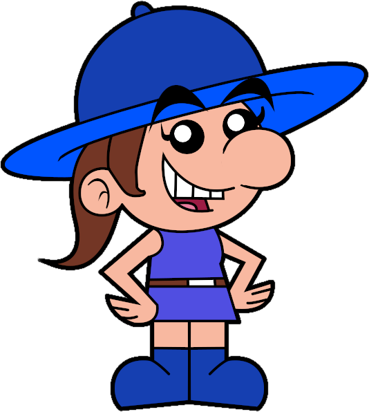
Decided to add them to her because I thought it fit her character, distinguishes her more from Redshift, and I think made her more cute.

Decided to add them to her because I thought it fit her character, distinguishes her more from Redshift, and I think made her more cute.
I think I remember seeing them on her in one of your doodle pages you posted when you had jury duty or sumthinChroma Key would be my next one but yeah, Blueshift was lots of fun to make! She did kitbash a lot of parts from her brother, but I also made some few tweaks to her to further distinguish herself from him. By the way, those earrings weren't present in the original drawing of her.

Decided to add them to her because I thought it fit her character, distinguishes her more from Redshift, and I think made her more cute.
Yeah they really look good, pretty small but I think it really adds a good amount to the design
- Pronouns
- She/her
- MarioWiki
- Ray Trace
- Thread starter
- #132
I think I remember seeing them on her in one of your doodle pages you posted when you had jury duty or sumthin
Yeah they really look good, pretty small but I think it really adds a good amount to the design
I drew those sketches of her after that FOP-styled drawing. In fact, the FOP-style drawing of her was the first time I ever drew her.
- Pronouns
- He/him
I just noticed Pleima in the photo, really adorable!
Cocoa
Celestial Guide
- Pronouns
- She/They
- MarioWiki
- Cosmic Cowboy
Does this mean that Blueshift will start killing Warios?
- Pronouns
- She/her
- MarioWiki
- Ray Trace
- Thread starter
- #138
I made this, because I wanted to familiarize myself with Inkscape (still a bit new to it, but the learning curve isn't too bad, the most challenging aspect of it was learning how to taper edges), plus Mario Party Superstars gave me inspiration to draw him in this style. Here's the SVG version of my current avatar.
 drive.google.com
Rasterized PNG for a bigger preview:


RayTraceMario.svg
 drive.google.com
Rasterized PNG for a bigger preview:
- Pronouns
- She/her
- MarioWiki
- Ray Trace
- Thread starter
- #140
Now that I don't work at Micro Center anymore, I have much more time to draw! I've done Redshift, as now, it's customary I theme myself after him every time January hits.
 drive.google.com
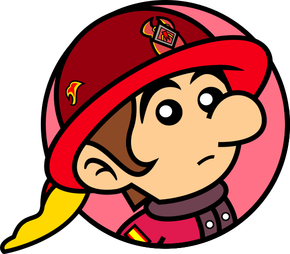
RedshiftMario.svg
 drive.google.com
Cocoa
Celestial Guide
- Pronouns
- She/They
- MarioWiki
- Cosmic Cowboy
*sniff* They grow up so fast...
- Pronouns
- She/her
- MarioWiki
- Ray Trace
- Thread starter
- #146
anyway webp does render properly on smf im pleased

gif sucks and is an outdated 90's format. it works for sprites, but not for more complex images like video game scenes and 3d animations because it's bloated as hell and it doesn't render translucency properly
to compare, a webp i have is 6.79 MB while a gif of the same dimensions is 21.3 MB. gif is a bandwidth hog so it also loads slower than webp.

anyway, here is a lot of Sims 4 animations I've outputted from 3ds max. god i love the sims 4. the animations are so top notch and filled to the brim with life and personality, it's one of the reasons i fell in love with my sims. i've extracted the animations from the sims 4, imported in 3ds max, and just rendered their animations in all their glory. one thing i learned was how to retarget animations, so i could theoretically import sims 4 animations onto, say, a new donker despite having different bone names and slightly different proportions. the main issue i come across for that method is the very different pivot points however, that causes the rotations to get all misaligned and it's something i need to fix. if i do get a new donker making a sims 4 animation i will be sure to post it! this also opens the gates of setting mario characters do sims 4 animations too so that's exciting!
which leads to the animated image of my new signature...

this is Recaredo Rojo aka Redshift as a Sim. he loves the outdoors and fishing and....well he is generally a great guy! obviously he's one of my favorite sims and i love how he has a similar look across the sims games i made him in. anyway, i picked this animation to portray him because it's one of my favorite animations in the game. basically, it's the reaction he makes when he receives a mean gift (practically an empty box), and i just absolutely adore all of the emotion conveyed with this animation, from the posture, to how he holds the object and callously tosses it down, and especially the disappointed facial expression (that half-smile just conveys that he really did wanted a good gift). i picked a yoshi doll from...idk what game (i love how it coincidentally looks maxis match to boot) because anyone who knows me knows i dislike yoshi, so this is practically my reaction to anything yoshi-related, whether it's the yoshi tour, getting kangaroo yoshi in mario kart tour, unlocking the yoshi bike first or getting yoshi as the first doctor in dr. mario world. but what i like about this is that i can replace yoshi with, say, the box for paper mario sticker star or a nintendo direct presentation and it would still hit home lol.
gif sucks and is an outdated 90's format. it works for sprites, but not for more complex images like video game scenes and 3d animations because it's bloated as hell and it doesn't render translucency properly
to compare, a webp i have is 6.79 MB while a gif of the same dimensions is 21.3 MB. gif is a bandwidth hog so it also loads slower than webp.
anyway, here is a lot of Sims 4 animations I've outputted from 3ds max. god i love the sims 4. the animations are so top notch and filled to the brim with life and personality, it's one of the reasons i fell in love with my sims. i've extracted the animations from the sims 4, imported in 3ds max, and just rendered their animations in all their glory. one thing i learned was how to retarget animations, so i could theoretically import sims 4 animations onto, say, a new donker despite having different bone names and slightly different proportions. the main issue i come across for that method is the very different pivot points however, that causes the rotations to get all misaligned and it's something i need to fix. if i do get a new donker making a sims 4 animation i will be sure to post it! this also opens the gates of setting mario characters do sims 4 animations too so that's exciting!
which leads to the animated image of my new signature...
this is Recaredo Rojo aka Redshift as a Sim. he loves the outdoors and fishing and....well he is generally a great guy! obviously he's one of my favorite sims and i love how he has a similar look across the sims games i made him in. anyway, i picked this animation to portray him because it's one of my favorite animations in the game. basically, it's the reaction he makes when he receives a mean gift (practically an empty box), and i just absolutely adore all of the emotion conveyed with this animation, from the posture, to how he holds the object and callously tosses it down, and especially the disappointed facial expression (that half-smile just conveys that he really did wanted a good gift). i picked a yoshi doll from...idk what game (i love how it coincidentally looks maxis match to boot) because anyone who knows me knows i dislike yoshi, so this is practically my reaction to anything yoshi-related, whether it's the yoshi tour, getting kangaroo yoshi in mario kart tour, unlocking the yoshi bike first or getting yoshi as the first doctor in dr. mario world. but what i like about this is that i can replace yoshi with, say, the box for paper mario sticker star or a nintendo direct presentation and it would still hit home lol.
- Pronouns
- He/him
poor yoshi 


all he wanted was to be your pal
all he wanted was to be your pal
- Pronouns
- She/her
- MarioWiki
- Ray Trace
- Thread starter
- #149
Pride Month is coming up very fast and quick, so I had to whip up an image in celebration of LGBT+ folks, and last year I was themed after Dark Light this year will be no different.
As you may know, Dark "Darcy" Light is the Commander of the Protectors. She's very tough and doesn't deal with nonsense, being completely serious, especially being in law enforcement. However, one thing about her is that she has physical traits mixed in her that are commonly associated with guys despite being labeled as a girl at birth (she looks like Baby Luigi for starters), hence it's easy for people to mistake her as a guy from first glance, while also having a deep female voice to come out of her (causing her to be reluctant to talk to anyone in her youth). What doesn't help is that she has several personality traits stereotypically associated with masculinity such as favoring logic and practicality over emotion and creativity. The thing is, she doesn't WANT to be associated with masculinity all the time, and it hurts when people accidentally refer to her as a "he", quite easily so. So, she'd turn to some of the people she knows for some help with femininity and doing activities generally considered feminine, in which Peach, Rosalina, and Toadette were glad to support her. And the most feminizing activity to think of? Classic tea party of course! Extra points on frills, flowers, cursive font, and hyper pinkness!
Dark Light of course feels awkward and embarrassed in this situation. She's very tough and doesn't deal with nonsense, being completely serious, especially being in law enforcement. This activity isn't tough and battling anyone. It's a sweet activity where girls hang out and drink this delightful beverage, maybe with a bit of sugar on the side. However, it's her supportive friends that make the best out of this situation, having complete faith in Dark Light and her femininity. And deep down inside, Dark Light is glad someone can look at her and see a sweet-mannered lady inside her rather than this cold hard brutal Commander people generally know her as. She's not THAT scary after all.
Expect them to go shopping and get a manicure at a spa next! Maybe Dark Light can try on a dress next!
Happy Pride Month guys, celebrate queer folks, whether they're gay, bi, trans, ace, intersex, etc doesn't matter, they're all to be loved and supported no matter who they are.
- Pronouns
- She/her
- MarioWiki
- Ray Trace
- Thread starter
- #150
So I decided to render this out of the blue. I was inspired by Marza Animation Planet's rendering for Mario characters such as in Super Mario Party and I was like, hey, what if Ray Trace was playable in a Mario game and he had stock artwork to be abused like in every Mario sort of promotional thing ever so whatever. And then, he gets like, 4 pieces of artwork all to himself while every other Protector gets only one.
Really, this dumb comic relief character would be the star of some spin-off at this rate.
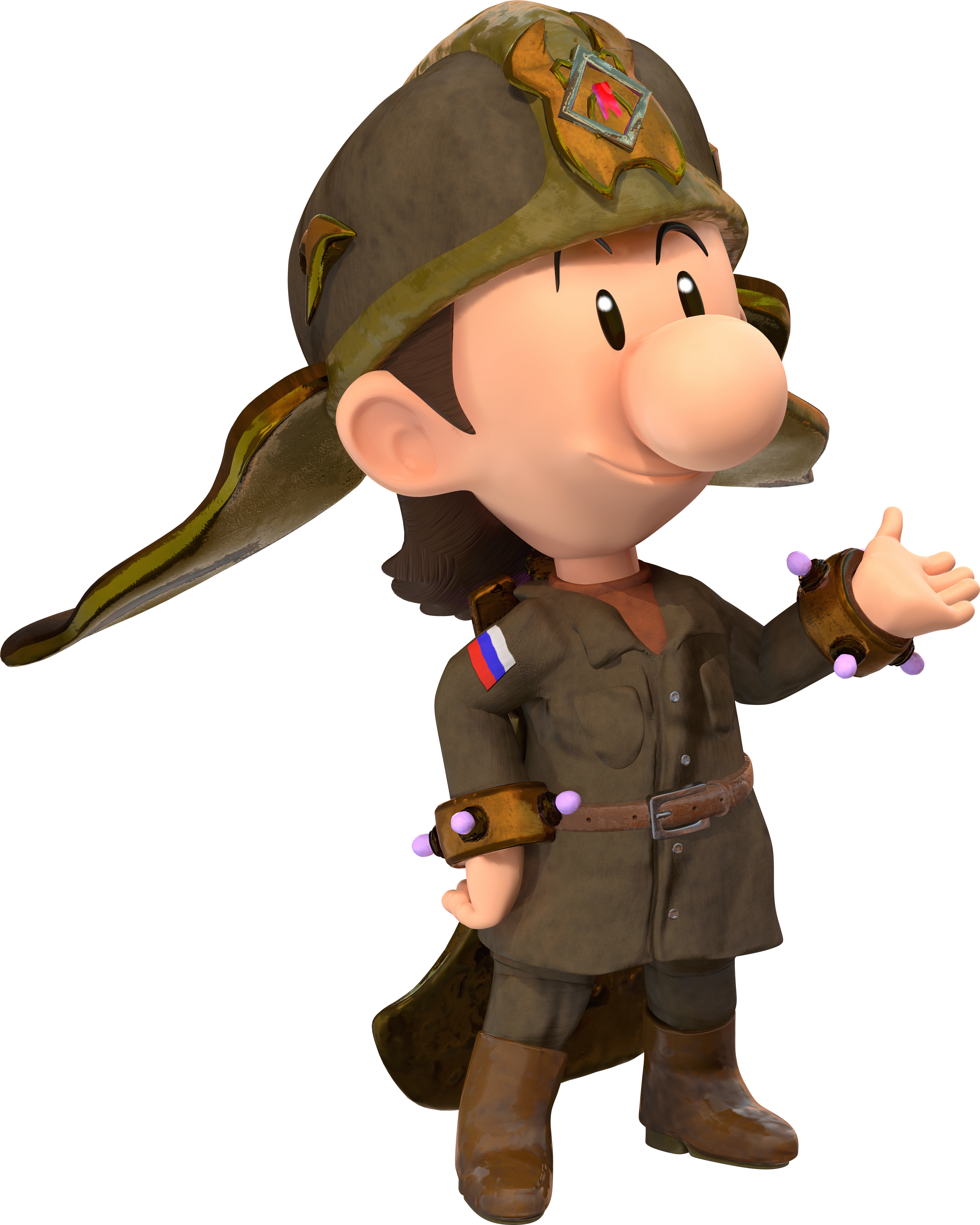
(I will make the rest of them Protectors too, make them stock art as possible and reusable for any sort of Mario game!)
I really think I came very far in terms of Ray Trace renders, really. If you want an evolution of them, I'll provide it.
The World Was Dark And Bad Until He Was Made
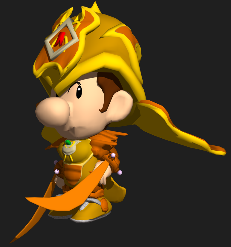
This is my very first time I ever rendered him in any capacity. This was rendered in 3ds Max all the way in Saturday, April 15, 2017. Yes, this was the era of when he was a recolored Dark Light, but it's this render that really set his smug, self-assured personality that stuck with him, and that smirk (or grin) I would make him usually do later on. I did use a custom Baby Luigi face for this model, this is generally my first character model I ever made, and this is without knowledge of texturing programs such as Substance Painter so that's why the textures look very minimalist since I just drew it in Photoshop. The posing here is very stiff and awkward, this comes from not rotating the spine and shoulder bones and the legs aren't even posed. Truth be told, I did render this only for a battle portrait for Super Smash Bros. for Wii U so that's why the body is very underdeveloped.
He Gets a Gussy Up
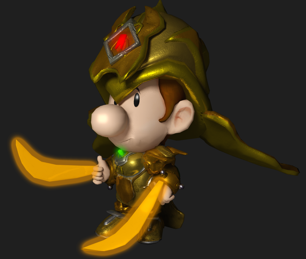
Rendered in September 18, 2017, this is pretty much my first experiment with Substance Painter, though I reverted his head back to the ripped Baby Luigi head from Mario Super Sluggers. This was still rendered in 3ds Max, and I kept the same general feel I was going for in the first rendered image (this was an update for Super Smash Bros. Ultimate). And yes I posed the body again here. I don't think the pose in of itself is too bad but I still think the spine needs to be better rotated and the head posed a little bit more in a general direction, to unstiffen the model up more. The light effect for his blades isn't good either, you're better off applying an illumination glow effect for the blades and either having a self-illumination parameter or putting global lights where the blades are itself without shadows applied. One thing I should do is change Ray's blade color to yellow rather than orange, Yellow is his signature color, Orange is supposed to be Crepuscular Beam's color, a character who I made later who is kinda an inverse of Ray's color scheme.
He Finally Buys His Own Clothes
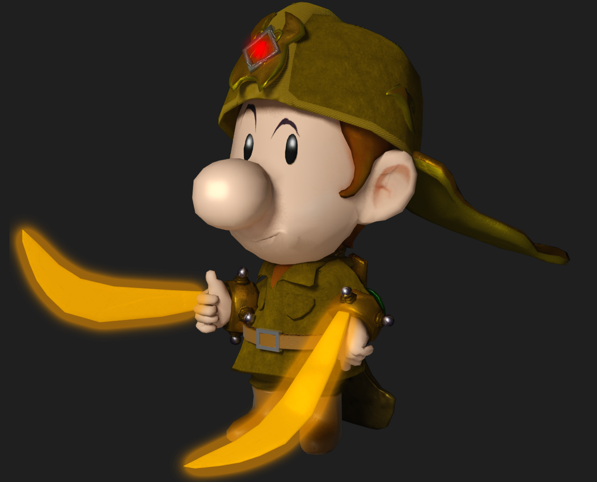
This is the first iteration of Ray's clothes that make him more distinct than just being a Dark Light recolor. The texture work is still very simplistic and nowadays, this guy literally just looks like Baby Luigi in army gear rather than Ray Trace, because the body proportions and face proportions don't match. This is the exact pose as the first one by the way.
Plastic Surgery Does Wonders
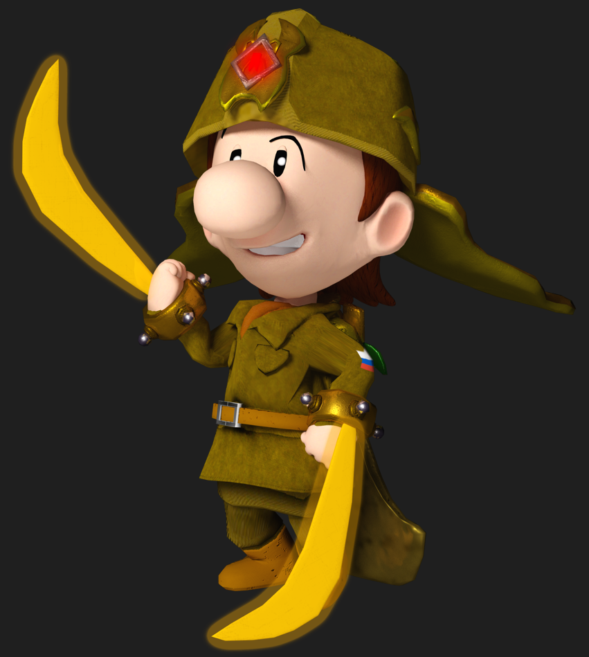
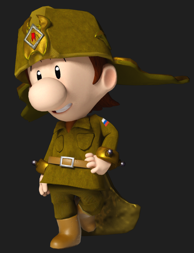
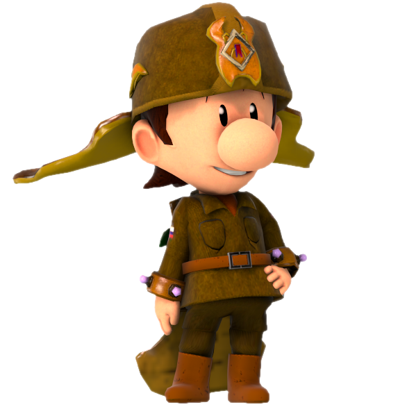
These three renders is the first time Ray got his own physical alteration to make him more distinct, and the first time I ever modeled his head. The first one was made in June 29, 2018, the second in January 18, 2019, and the third in May 1, 2019. I lumped all these together because they look quite similar to each other, except the third one was done in Source Filmmaker. Anyway, I did a makeover of his head not too long ago because I wasn't satisfied with how it looked (namely, his head has a very very sharp taper in his temple region and his ears were underdeveloped and not attached properly). The body was retaken from the model but altered, but I also eventually redid his body because there wasn't a line running through the coat and I had to re uv map it anyway.
BTW, I'm probably never going to render his eye like in the first picture again, it looks incredibly off for him to look down. If I ever need to make his eyes move down, it's going to be a lot more subtle than this. In the next model, the hands are the the only things that persisted but they already look perfectly fine so there's not much need to redo them.
An Amazing Worker Blames His Tools For How Handsome He Gets
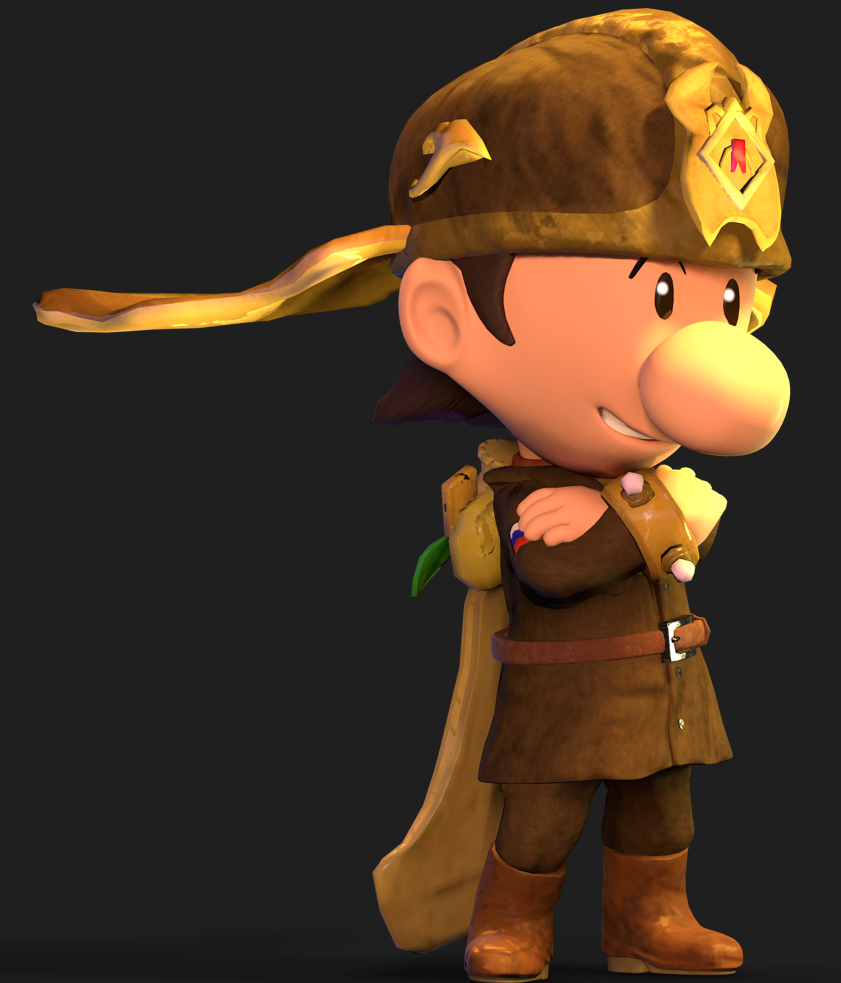
This one of my first Marmoset Toolbag renders, rendered in October 20, 2019 and I think is a major upgrade from using Max. This was the time I redone his clothes too, and I'm still using this model today. I do think it could use with a few more improvements, especially to the stitching but overall most issues I have with my current model is the rig. Was experimenting with lighting here and I wanted an updated render so I did this. Some parts of the render don't look that great, namely the weird normals on his hat adornments, and he's still using that old head. Also, model here isn't high poly and the textures are lower res, but fortunately I addressed this in a future render.
Higher Res Textures And Swim Trunks Make a Difference (and more plastic surgery)
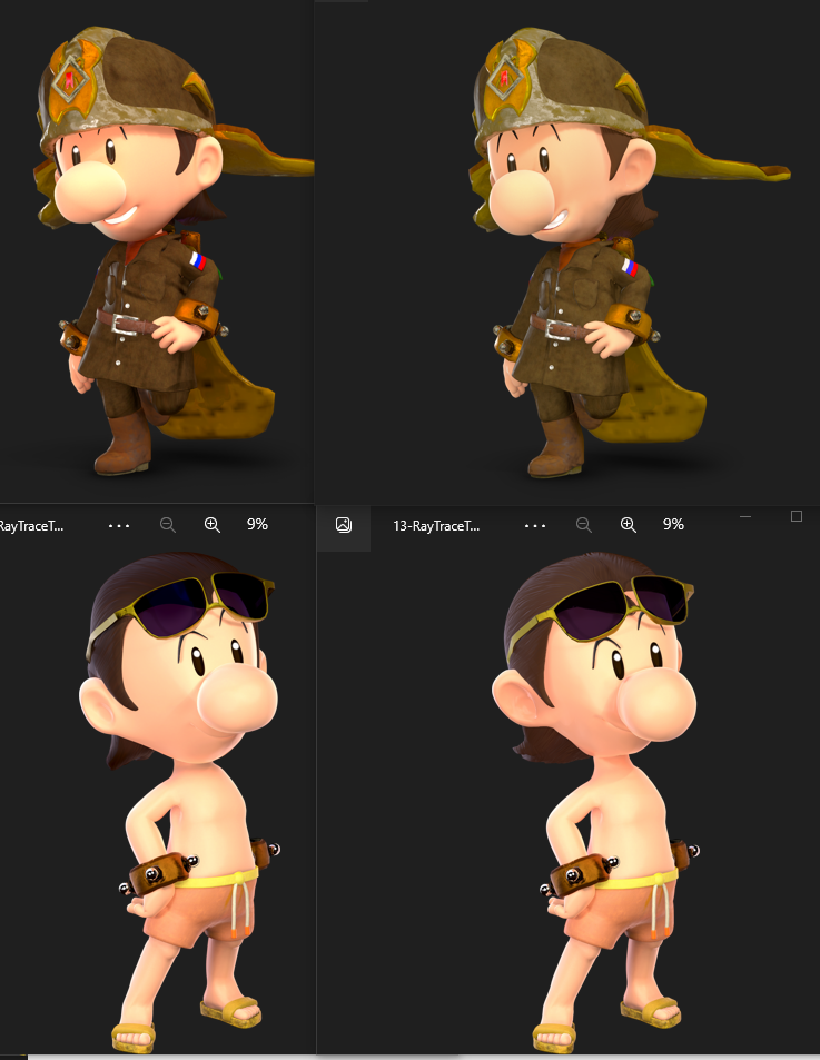
So I made Smash Ultimate-styled renders and I modeled him in his trunks. This was around the time where higher res textures make a huge difference (my newest renders use 4k sized textures) plus I actually got around to remodel his face in the latter phases. The upper left Ray was rendered in September 25, 2020, bottom left trunks Trace in December 21, 2020, and both right Rays in March 2, 2022. The head I'm super satisfied with, the ears look organically embedded now and his temple looks less severely tapered, the hair was sorta redone, and around this time was when I discovered the magic of relaxing vertices in 3ds Max under the poly editor, smoothing out the edits made to the mouth so his smile doesn't look wonky.
Anyway Ray Trace is great. I'm probably going to do further improvements in the future, the hair is a sticking point for me as I don't know quite yet how to render it properly, and even the official Mario renders have an inconsistent style for hair.
Really, this dumb comic relief character would be the star of some spin-off at this rate.
(I will make the rest of them Protectors too, make them stock art as possible and reusable for any sort of Mario game!)
I really think I came very far in terms of Ray Trace renders, really. If you want an evolution of them, I'll provide it.
The World Was Dark And Bad Until He Was Made
This is my very first time I ever rendered him in any capacity. This was rendered in 3ds Max all the way in Saturday, April 15, 2017. Yes, this was the era of when he was a recolored Dark Light, but it's this render that really set his smug, self-assured personality that stuck with him, and that smirk (or grin) I would make him usually do later on. I did use a custom Baby Luigi face for this model, this is generally my first character model I ever made, and this is without knowledge of texturing programs such as Substance Painter so that's why the textures look very minimalist since I just drew it in Photoshop. The posing here is very stiff and awkward, this comes from not rotating the spine and shoulder bones and the legs aren't even posed. Truth be told, I did render this only for a battle portrait for Super Smash Bros. for Wii U so that's why the body is very underdeveloped.
He Gets a Gussy Up
Rendered in September 18, 2017, this is pretty much my first experiment with Substance Painter, though I reverted his head back to the ripped Baby Luigi head from Mario Super Sluggers. This was still rendered in 3ds Max, and I kept the same general feel I was going for in the first rendered image (this was an update for Super Smash Bros. Ultimate). And yes I posed the body again here. I don't think the pose in of itself is too bad but I still think the spine needs to be better rotated and the head posed a little bit more in a general direction, to unstiffen the model up more. The light effect for his blades isn't good either, you're better off applying an illumination glow effect for the blades and either having a self-illumination parameter or putting global lights where the blades are itself without shadows applied. One thing I should do is change Ray's blade color to yellow rather than orange, Yellow is his signature color, Orange is supposed to be Crepuscular Beam's color, a character who I made later who is kinda an inverse of Ray's color scheme.
He Finally Buys His Own Clothes
This is the first iteration of Ray's clothes that make him more distinct than just being a Dark Light recolor. The texture work is still very simplistic and nowadays, this guy literally just looks like Baby Luigi in army gear rather than Ray Trace, because the body proportions and face proportions don't match. This is the exact pose as the first one by the way.
Plastic Surgery Does Wonders
These three renders is the first time Ray got his own physical alteration to make him more distinct, and the first time I ever modeled his head. The first one was made in June 29, 2018, the second in January 18, 2019, and the third in May 1, 2019. I lumped all these together because they look quite similar to each other, except the third one was done in Source Filmmaker. Anyway, I did a makeover of his head not too long ago because I wasn't satisfied with how it looked (namely, his head has a very very sharp taper in his temple region and his ears were underdeveloped and not attached properly). The body was retaken from the model but altered, but I also eventually redid his body because there wasn't a line running through the coat and I had to re uv map it anyway.
BTW, I'm probably never going to render his eye like in the first picture again, it looks incredibly off for him to look down. If I ever need to make his eyes move down, it's going to be a lot more subtle than this. In the next model, the hands are the the only things that persisted but they already look perfectly fine so there's not much need to redo them.
An Amazing Worker Blames His Tools For How Handsome He Gets
This one of my first Marmoset Toolbag renders, rendered in October 20, 2019 and I think is a major upgrade from using Max. This was the time I redone his clothes too, and I'm still using this model today. I do think it could use with a few more improvements, especially to the stitching but overall most issues I have with my current model is the rig. Was experimenting with lighting here and I wanted an updated render so I did this. Some parts of the render don't look that great, namely the weird normals on his hat adornments, and he's still using that old head. Also, model here isn't high poly and the textures are lower res, but fortunately I addressed this in a future render.
Higher Res Textures And Swim Trunks Make a Difference (and more plastic surgery)
So I made Smash Ultimate-styled renders and I modeled him in his trunks. This was around the time where higher res textures make a huge difference (my newest renders use 4k sized textures) plus I actually got around to remodel his face in the latter phases. The upper left Ray was rendered in September 25, 2020, bottom left trunks Trace in December 21, 2020, and both right Rays in March 2, 2022. The head I'm super satisfied with, the ears look organically embedded now and his temple looks less severely tapered, the hair was sorta redone, and around this time was when I discovered the magic of relaxing vertices in 3ds Max under the poly editor, smoothing out the edits made to the mouth so his smile doesn't look wonky.
Anyway Ray Trace is great. I'm probably going to do further improvements in the future, the hair is a sticking point for me as I don't know quite yet how to render it properly, and even the official Mario renders have an inconsistent style for hair.
Last edited:
