Navigation
Install the app
How to install the app on iOS
Follow along with the video below to see how to install our site as a web app on your home screen.
Note: This feature may not be available in some browsers.
More options
You are using an out of date browser. It may not display this or other websites correctly.
You should upgrade or use an alternative browser.
You should upgrade or use an alternative browser.
BabyLuigiOnFire's Chicken Scratch
- Thread starter Xiahou Ba
- Start date
- Pronouns
- She/her
- MarioWiki
- Ray Trace
- Thread starter
- #78
What do you mean by poses and stuff?
I guess I'll explain the programs I use, to cover all your needs and possibly answer your question.
Maya: Modeling
UVLayout: UV unwrapping
Substance Painter: Textures
3DS Max: Rigging, general purpose 3D program for me, such as when it comes to exporting .smds for Source and all that jazz, occasionally use it for rendering in mental ray
Garry's Mod: Sandbox game that you can also use to pose ragdolls in scenery.
Source Filmmaker: Source animation tool also can be used for modeling and posing.
GIMP: Image edits, if needed.
Blender: I used it for light video editing in my latest SFM video. It's also a model program but I don't know how to use it.
Hopefully I think that's it. Unfortunately, stuff like UVLayout isn't free and comes with a limited trial version that I have to constantly download and Maya/3DS Max come with student versions. I'm also going to warn you that it's a bit daunting at first, sorta like your first experience with Photoshop or any program really powerful and versatile, which Maya and 3DS Max are.
- Pronouns
- she/her
- MarioWiki
- Mario
Maya 2018 offers a very good UV unwrap feature too, I've used that myself.
- Pronouns
- She/her
- MarioWiki
- Ray Trace
- Thread starter
- #80
I should probably learn how to use it. I'm very used to the UVLayout way of unwrapping things in that you pretty much visually tear a model apart and lay their skin out flat.

I've done George Jones/White Lightning/Simón de Bolivar's request of making Baby Luigi shake hands with Captain Falcon. Quite an unusual pair. One of them is a highly confident, quite powerful and muscular adult man who has super hero vibes and probably saves the day or something. The other is a meek little shy baby boy who has just started to learn how to walk and cries at his own shadow. But if there's anything that can instill confidence in Baby Luigi, who else other than the tall mighty captain pilot to give him a personal little handshake? I bet it's any little young boy's dream to come face to face with a comic book superhero and give them a little shake on the wrist, to say they too will grow up to be a superhero themselves some day. And Baby Luigi's gonna become an unlikely hero too!
This scene uses some Team Fortress 2 map that I don't remember the name of as the background and uses a total of 3 extra lights (basic 3 point lighting system) alongside with map lighting and visuals. No particle effects spam, and a slight color correction effects filter applied. Captain Falcon's model uses his Smash Ultimate model (yes it's ripped already, can't you believe it?) and is compatible with the auto-IK rigger, making him a breeze to pose (though his left arm gave some trouble as the joints needed to bend in just the right ways). Of course the Baby Luigi model is my own port of the Super Sluggers one as it's the best Baby Luigi model available. Unless you think I can whip up a better one, because I did whip up a customized Donut Steel Baby Luigi in the form of my Russian guy. Of course, I made Baby Luigi stand on something because compared to the good captain, Baby Luigi is a very little guy and he needed a little bit of support to at least match the eye height of the crouching Captain Falcon.
I like the Source Filmmaker light system more than the Garry's Mod one. It just looks more smooth and all than the jagged lights employed by Garry's Mod and anti-aliasing is taken more advantage of here. In addition, the image output is far large than the Garry's Mod one unless you use the poster function (and I don't quite recall that, need to look it up again).
- Pronouns
- She/her
- MarioWiki
- Ray Trace
- Thread starter
- #81
Hey there! This request was a long time coming but I finally did it!

Luigi64DD requested for his OC to be done, so I went right ahead and did it, all of the following process in just a span of 4 hours of 3DS Max horsepower. He has notified me that an N64 era-styled Luigi may not exist in 3D format and only as artwork but luckily here, Super Smash Bros. Melee was the saving grace, providing a Luigi very similar in the style Luigi64DD was hoping for. So, I downloaded the model off The Models Resource and retouched much of the model (especially the single texture variant of the model, had pretty bad uv editing so I tried fixing it), such as combining meshes together and welding their vertices, as well as averaging the normals of the faces. I've recolored the model to match the reference images provided for me, as well as written the text on his hat with the Word Art tool in a Word processor program (because GIMP lacks blending tools required to make a good texture for font).
Because the model was in .obj format, I actually had to make bones and rig the entire thing myself. That was when I realized the model isn't even symmetrical so I couldn't use the mirror weights functionality and had to rig both parts myself. As usual, I had a hard time with fingers to get to look right but I think you won't notice the imperfections in this image. The rest wasn't too bad to rig too I guess, except the mouth which was annoying like usual. This Luigi uses the Valve naming scheme, and his hat is also rigged to...give that bounciness when he runs I suppose? The Valve naming scheme is so he can have a working IK rig to use for Source Filmmaker.
I've exported this Luigi as two smds and then ran it through a compiler. Since I was developing only for Source Filmmaker, I didn't need to make a collision model and joint constraints required for ragdoll creation and didn't write those in my .qc file. I also didn't make a .vta flex file, relying on the single mouth bone to pose for the scene. The .qc file was relatively simple, much simpler than my usual gmod fare due to the lack of ragdoll physics and the flexes. The same applies to his textures, which are also very basic .vmts since I don't think anything further is required.
This was posed on an empty black map. I've wanted to pose in N64 Kongo Jungle, but alas I had no resources for that stage so it was omitted in favor of Temple. Temple actually isn't a map, it's a series of props, one for the stage and one for the skybox. This scene uses a total of 6 very large bright lights, as the props are large and require a lot of lights to fully light up the stage, as well as trying to imitate the lighting effects in my other pictures. I've used minimal post-processing and engine post effects such as vignette and very little bloom, as well as applying a small distance blur to focus on the image. And of course, there's geese everywhere, as Luigi64DD is the goose man himself. I've extracted the geese from the Canada Goose pack from Garry's Mod, and put it in Source Filmmaker, and it works perfectly: in addition, I just threw in all the possible skins you can have for the geese, which is five total! They're not flying around, but perching next to Luigi64DD is good enough because they're close friends with him anyway (save for the one time Luigi64DD ate geese for Thanksgiving). The only other thing missing in this scene is a can or bottle of A&W root beer, which I sadly cannot find in either workshops.
Czario
Rightful ruler of the kingdom of Russia!
- MarioWiki
- Luigi 64DD
Very nice! Now let's tally your bonus points. You had a model that is sufficiently similar to N64 artwork Luigi, so that gives you bonus points. You also featured geese in the image, which gives you Super Duper Extra Bonus points. So adding it all together, your total comes up to Whopping Super Duper Extra Funky Nifty Fabulous Deluxe With Queso Sauce, A Small Milkshake, And 25% Off Your Next Purchase Bonus Points. In other words, I'm rather satisfied with this image. You captured a great image of me commiserating with my brethren. Thank you very much!
- MarioWiki
- White Lightning
Can you do Richter throwing his cross at Daisy while Baby Luigi has a milkshake in his hand?
Moldomré
Dry Bowser
Apologies for adding on to the requests, but consider having Pink Yoshi pointing at the SMW Yoshi (as seen in your sister's GMod pic) like this meme:

Cocoa
Celestial Guide
- Pronouns
- She/They
- MarioWiki
- Cosmic Cowboy
While you're at it, Can you do Me pointing at LGM? We are both trying to play Luigi in my roleplay.
- MarioWiki
- White Lightning
Since I'm a fan of Godzilla, can you do one with Godzilla using his signature attack on Wario?
- Pronouns
- She/her
- MarioWiki
- Ray Trace
- Thread starter
- #92
I haven't gotten around to doing any of the requests yet, and I'm currently in the middle of a project right now. I do have Maya and Substance Painter installed in my computer so I may make Lord Bowser's character soon. You've already made a request earlier so I would like to do that first before you suggest any more for me.
- MarioWiki
- White Lightning
Sounds good. Do my new request after you have my other one done. It will work out fine for the both of us.
- MarioWiki
- White Lightning
I'll say that it looks excellent. Five stars out of five stars.
Cocoa
Celestial Guide
- Pronouns
- She/They
- MarioWiki
- Cosmic Cowboy
Okay now we have to have Melee Luigi as a cop now
- Pronouns
- She/her
- MarioWiki
- Ray Trace
- Thread starter
- #97

After a dormant period of me sitting on my ass doing literally everything else except the things I said I'll do, I'm finally doing it. What motivates me to actually work on things was the spectacular Awards Ceremony, the presentations and many pieces of artwork were inspirational and I figured I should work on things again for the community. Oh and there's a demanding presence of a particular, orange, toxic bird who threatened me to write something involving Shrooms and strategies...which I have no clue what this has got to do with my current project but I felt like throwing out there anyway.
BabyLuigiOnFire may have put the projects off while kickstarting other projects thanks to her wandering attention, but BabyLuigiOnFire does not forget. This project was always lingering in the back of his mind the entire time, and it's about time she addressed that. So without further ado, here's the progress she has made so far on LB's (@Raymond) OC.
Can you imagine? This started out as a single cube!
The mouth is spectacularly difficult and tricky to model, but I am extremely lucky there are plenty of references for Bowser out there; the one used in this image is from Super Mario Odyssey who thankfully comes out...er..."nude" in the loosest sense. I *could* use live surface (I can sense my sister looming over my shoulder in a distant corner, screaming at me, USE LIVE SURFACE AND QUAD DRAW....OH AND YOU SHOULD LEARN ZBRUSH AND HOW TO SCULPT....and the worst part is, she is absolutely correct) but it's much funner that I approximate it to the model coordinates manually (my sister would groan in the distance at that remark). I guess. The teeth and tongue are considerably easier on the other hand. BTW, teeth and tongue are all separate elements: every time you encounter a separate element, you almost always model those separately since too many edgeloops causes bumps and creases in your model in undesirable areas.
The nostrils aren't modeled yet. Might be a bit tricky to do. I could either go for the modeled route or the bumpmap one. The Odyssey does have it modeled, however.
Here's the head with eye sockets...and an eyeball inserted in.
Oh by the way I lied about the mouth being tricky to model. The eyebrows are the most difficult thing I did.
Oh BabyLuigiOnFire, you think eyebrow is tough to model? Wait until you get to hair!
Actually, that wasn't too bad. So, here's the head I did.
And this is what it looks like without the smoothing preview applied
Anyway, I have an unfortunate announcement to make. REQUESTS ARE NOW CLOSED UNTIL I'M DONE MAKING SPUNKY ELLBEE GUZMA BOWSER. That unfortunately means all requests made past LB's request. If you want to re-request anything, then by all means. Do so. UNFORTUNATELY, I have further plans for LB rather than just model him. I'm going to port his model as a ragdoll in Garry's Mod, which opens up a lot of utility possibilities for anything involving the Source Engine (which involves turning him into a player model, NPC, Source Filmmaker, or hell, even making him a Left 4 Dead 2 survivor). Which means, I'm going to rig him, give him facial expressions, ragdoll physics etc. SO. Look forward to that. I may even whip up a Toolbag render for him. So don't expect me to make anything in this time period.
- Pronouns
- She/her
- MarioWiki
- Ray Trace
- Thread starter
- #98
Behind the Scenes Stuff
Oh yeah, before I continue, I've received friendly chat comments on my presentations yesterday!!!!!!!!!!
First up is my Fail Awards presentation.
Next up, is my Favorite Battle Course Presentation. Received a lot of kind comments from the chat party!
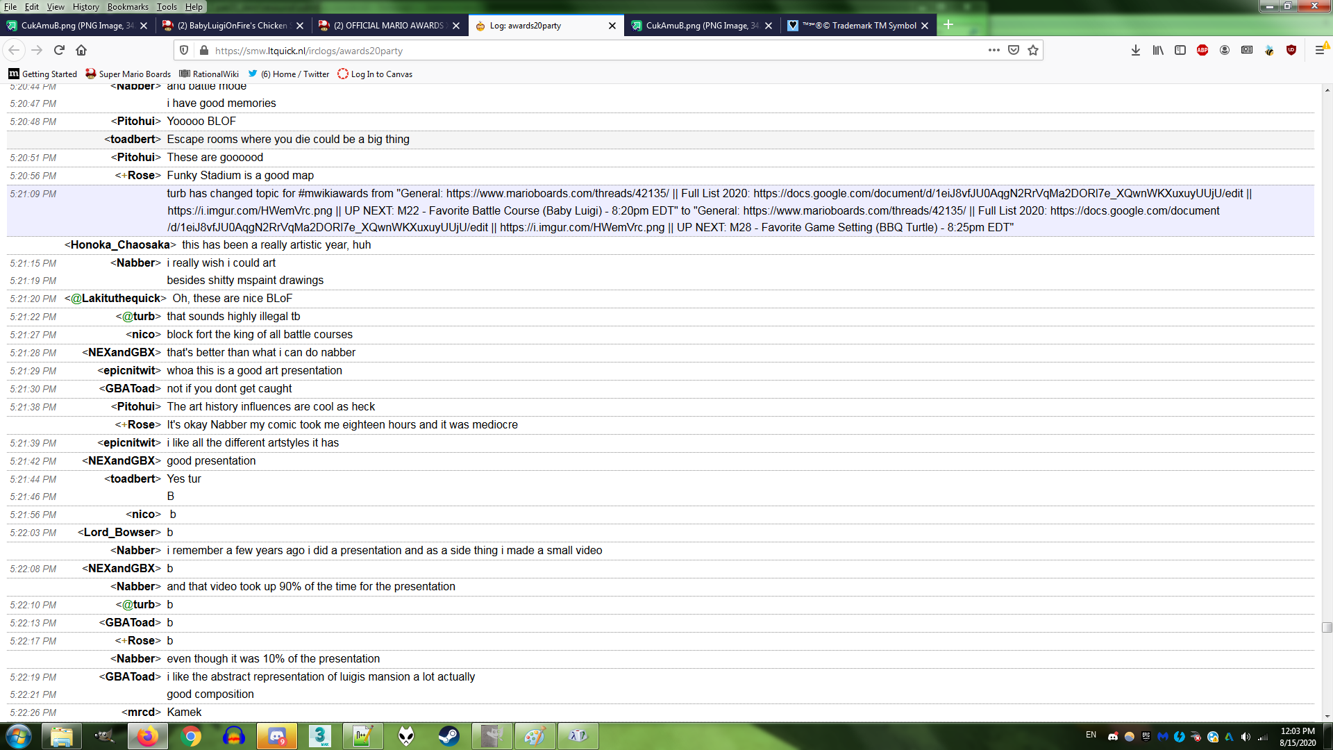
Oh yeah, before I continue, I've received friendly chat comments on my presentations yesterday!!!!!!!!!!
First up is my Fail Awards presentation.
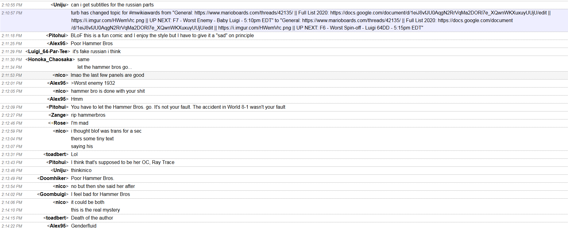
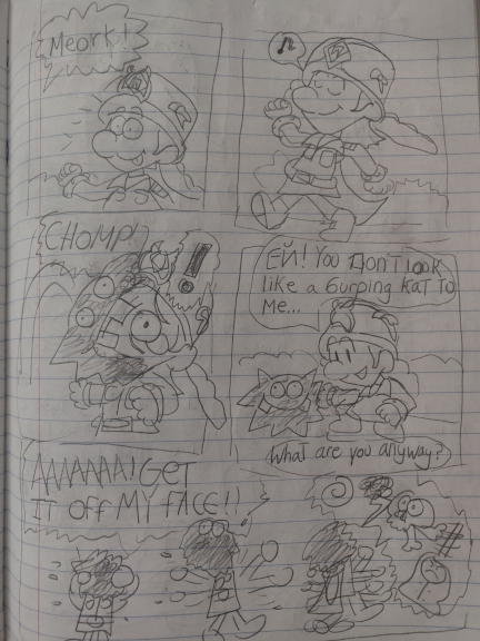
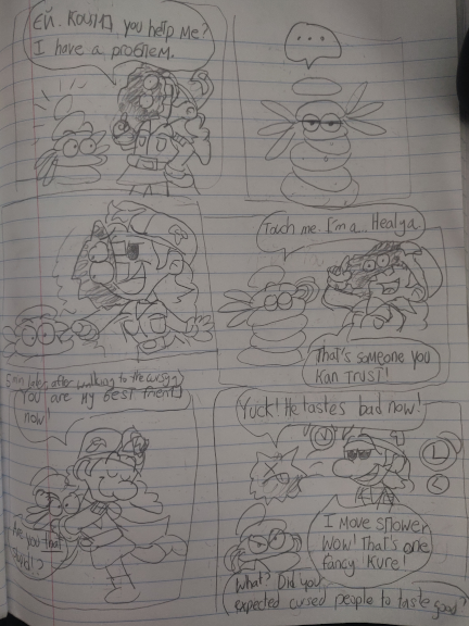
- Some of Ray Trace's text is actually Russian (I actually mispelled "Эй" and it was far too late for me to correct it before I realized it but shhhh no Real Russians are here to correct me this time) but Luigi64DD is correct: it's faux Cyrillic. Unlike your typical brand of faux Cyrillic, however, the Cyrillic here is chosen not only for their similarity, but their similar sounds to their Latin versions. Some Cyrillic I did refrain from using was "Н" for "N" since it looked too much like an H and "П" didn't look too much like a "P" and too much like an "N". I didn't use the typical faux Cyrillic that you see in r/fauxcyrillic because it hurts my eyes and brain and no self-respecting russophile who actually knows the Cyrillic alphabet will do that. Asterix dialogue was my inspiration for mixing up the alphabet, where foreign characters often spoke with different sort of flair (like the Goths who used a Germanic script) and I could hear Ray Trace's exaggerated Russian accent better when I did it lmao.
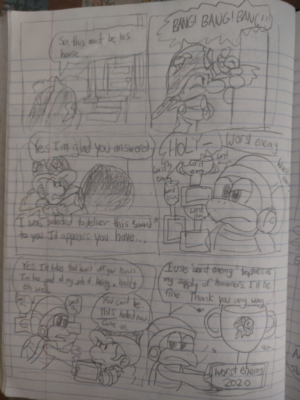
- That tiny text says "BabyLuigiOnFire can't draw backgrounds to save his life." and "BabyLuigiOnFire CAN draw worst enemy trophies to save her life however." and it does refer to myself rather than my OC Alex95 was correct. I'm indeed genderfluid, and I fluctuate between the two genders. Right now, I'm in a more male mood, but to accommodate that, I usually use both male and female pronouns to refer to myself so both parts are satisfied should I ever go back and read as a different gender.
- That art style I used? Well, it's actually just a quick sketch from my notebook. I had a rock (aka a mouse) to draw with and GIMP and I still suck at using wacom and is uncomfortable using it, so I quickly drew it using a lot of the smooth functionality in GIMP. Here are the original rough sketches.
- Several things I did. For one, the orientation is wonky. It's correct for the Hammer Bro presentation (it was the first one I drew, actually), but the rest, it reads from right to left. I had told myself to draw from left to right for the first one but I somehow forgot for the next ones before I realized what I had done. I'm a lefty, and drawing things from right to left is more comfortable for me (and I get less graphite markings on my hand) so it was instinctual to do so. Luckily, image editing saved the day here and fixed the comic's orientation.
- I drew the Hammer Bro's helmet wrong that I fixed in the presentation. I should have really researched his helmet before I jumped in, but at least I double-checked to make sure.
- Some of the dialogue is different here than in the final one. It felt clunky at points to me, and so I re-edited it to make it sound a bit better.
Next up, is my Favorite Battle Course Presentation. Received a lot of kind comments from the chat party!
- I've already detailed a lot of the backstory behind this one but there's one thing I have to let out of my chest: I've actually started this one a bit too late, and the time it took to paint Funky Stadium took longer than I anticipated. I was extremely stressed out about not making the deadline, I put off on making this for a few days, and I was close to asking for help. I was about to make all of them have the same art style (and I was about to use a screenshot for Luigi's Mansion for 8 Deluxe but I realized how extremely complicated it was and besides, GCN Luigi's Mansion imo had a better, more nostalgic vibe to it that I prefer), but time was running short, and so I had to heavily improvise. So, that was when I had the idea to mix up the artstyles used: I already made Funky Stadium more representative than accurate, so what if I broke the stages down into representative forms even further? And I thought it would make the presentation more interesting and it turned out that it was a great idea. My twin actually saw these before anyone else, and she liked my Luigi's Mansion one the best, as she liked how it was broken down into shapes yet still recognizable as a course and thought it was the most interesting out of the three. Still, I liked all of my pieces, and I was glad I was able to pull through. The main reason I even did two presentations to begin with was to challenge myself, come up with two separate ideas, and do it all within a time limit.
a bit late but i am very hyped about the model 
- Pronouns
- She/her
- MarioWiki
- Ray Trace
- Thread starter
- #100
LB MODEL UPDATE #1
Okay, the shell is officially The Hardest Thing I Ever Modeled.
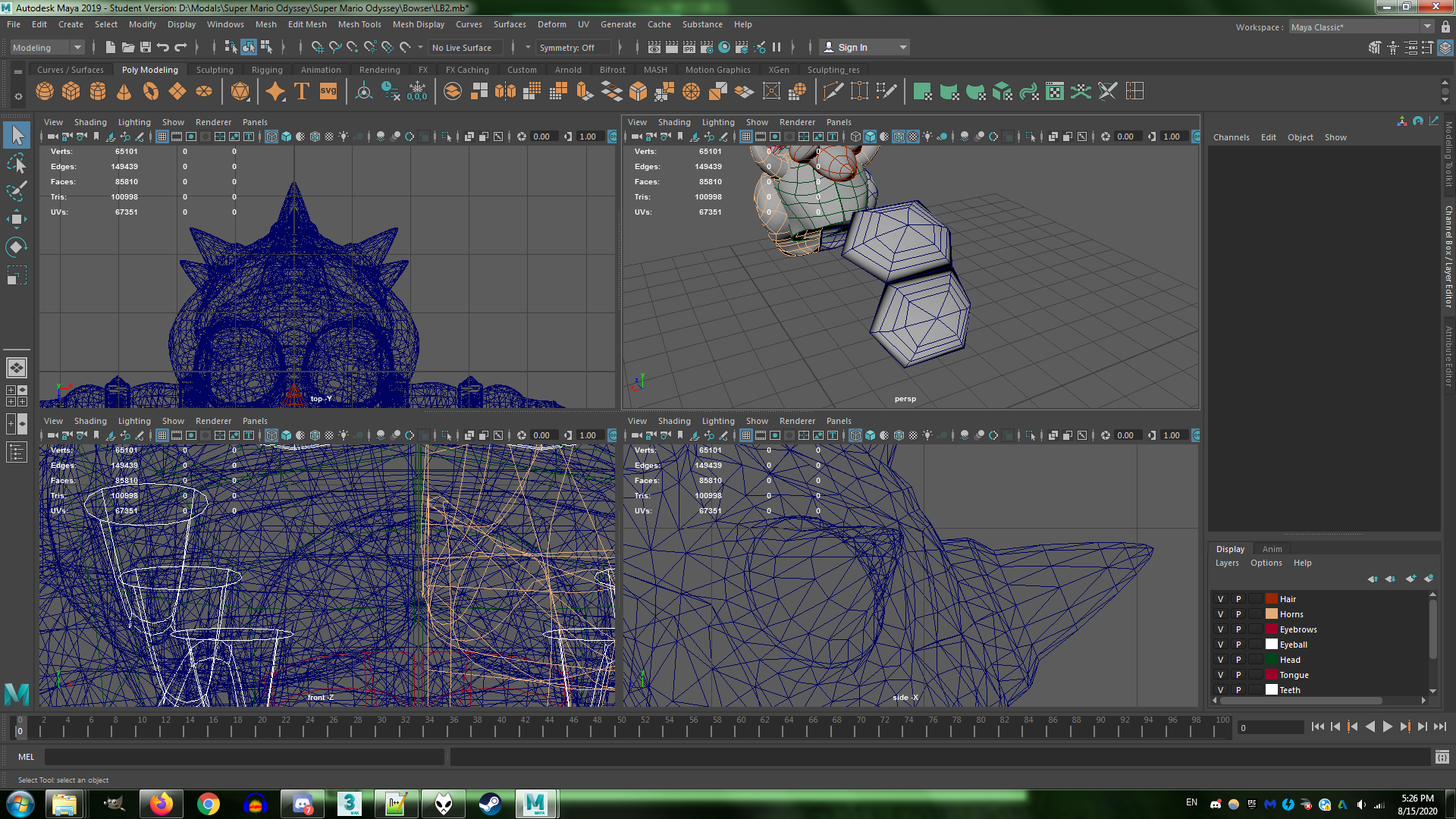
I didn't know how to approach the dome part at first since it looked intricate and complicated so I just settled with creating tiny individual, raised hexagons. For every bit of the shell. That I will eventually merge together. I had to ask for my sister for advice and she was like GO SCULPT SOMETHING IN ZBRUSH YOU STUPID BABY LUIGI FAN (well she wasn't THAT rude, she did offer help but you get my point).
I also had Maya crash on me at least once during the operation.
Blegh.
Make sure save often, kids. Create backups too. Even auto-save can be unreliable at points, though it had saved my skin there.
Thank goodness for the symmetry option.
Here's my progress. The time span looks like a long time since I took breaks in between.
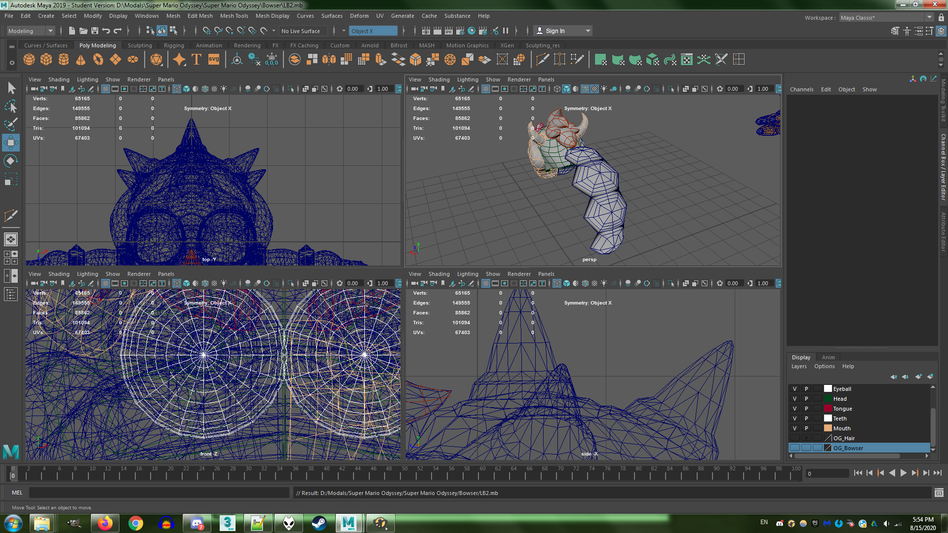
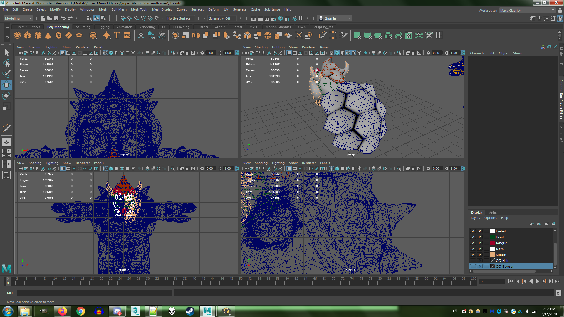
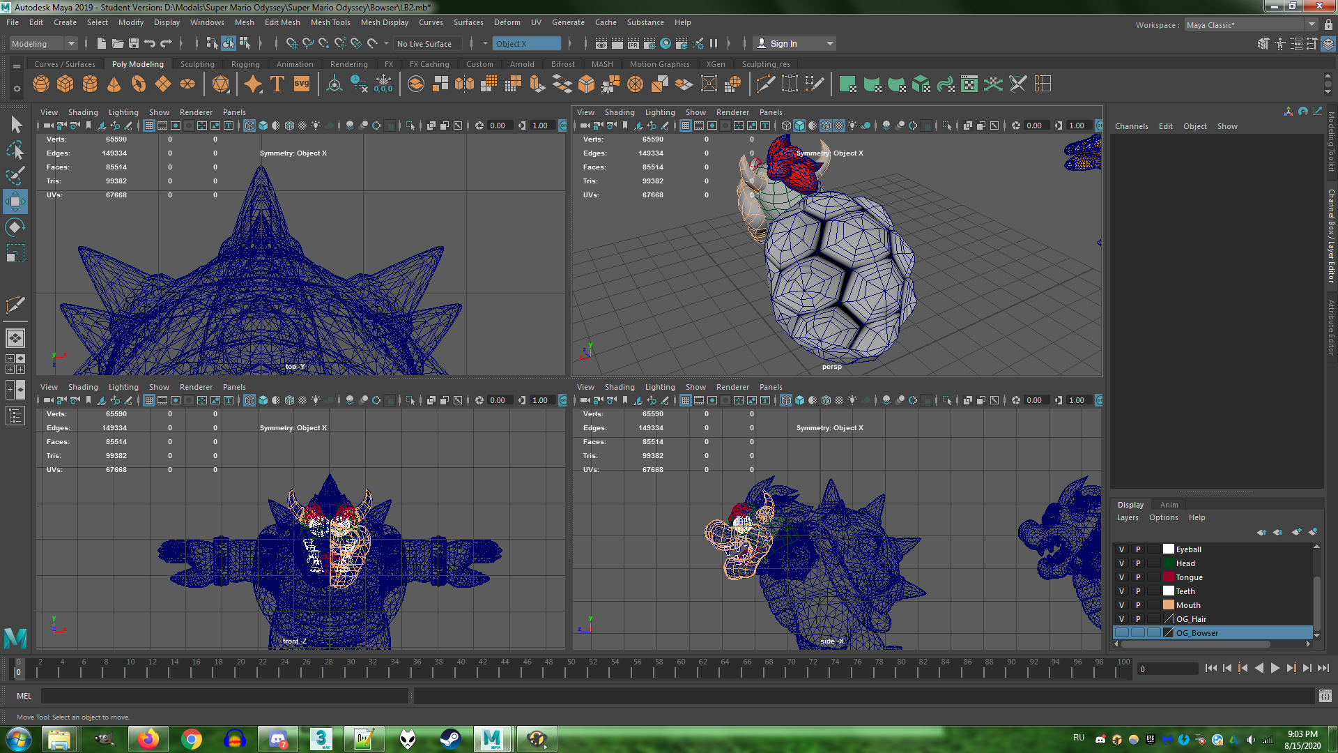
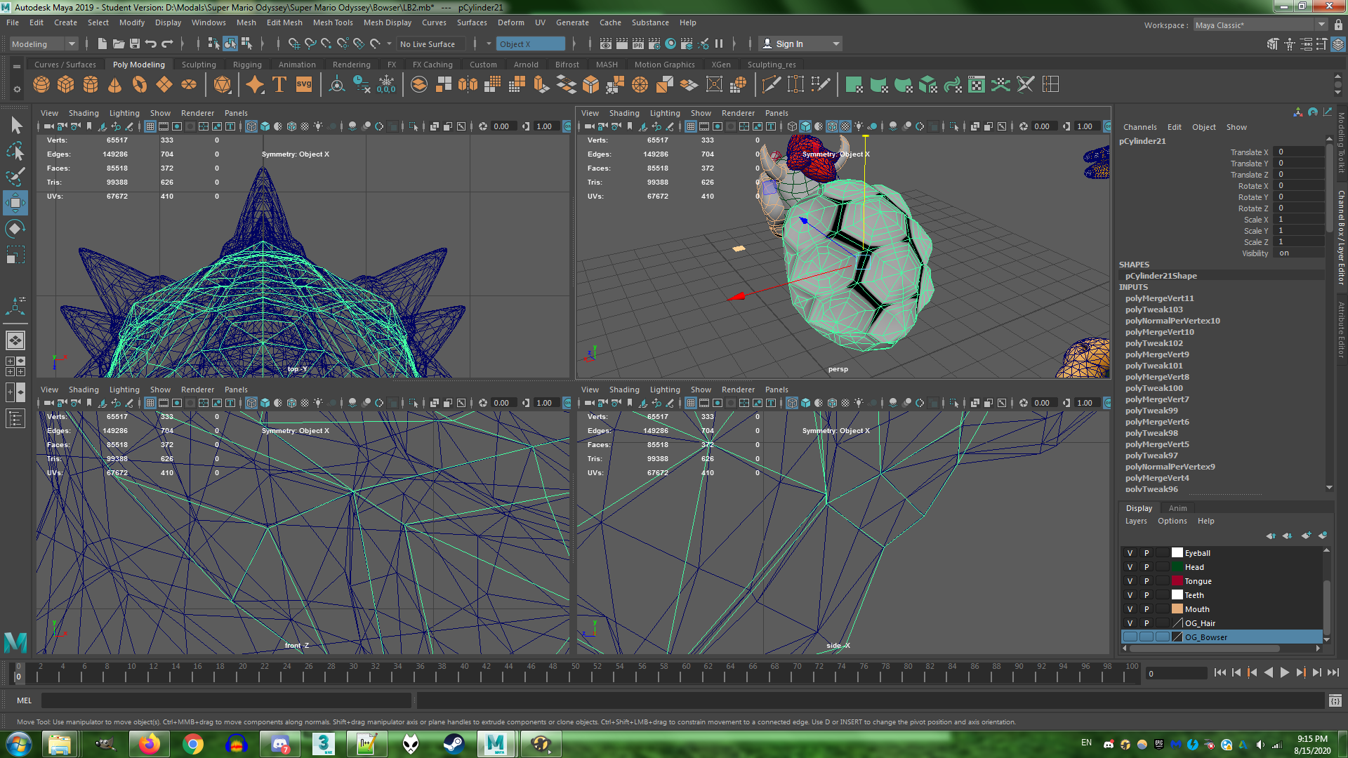
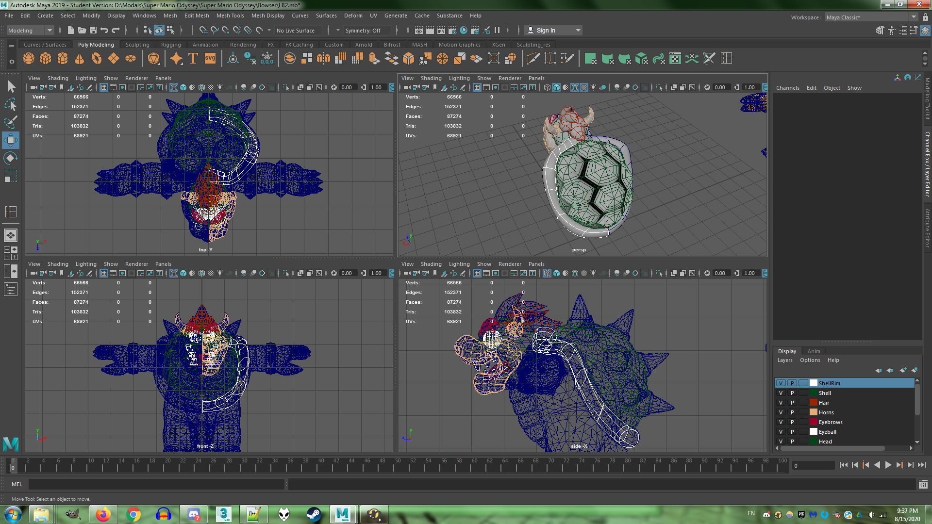
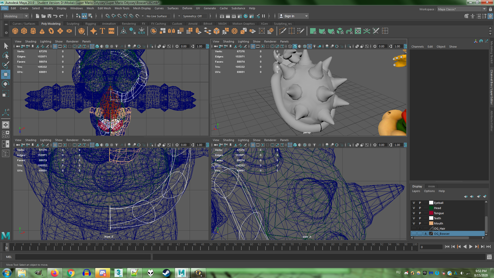

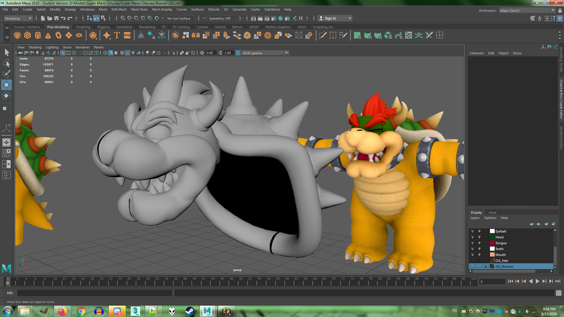
Well I still got ways to go...
Okay, the shell is officially The Hardest Thing I Ever Modeled.
I didn't know how to approach the dome part at first since it looked intricate and complicated so I just settled with creating tiny individual, raised hexagons. For every bit of the shell. That I will eventually merge together. I had to ask for my sister for advice and she was like GO SCULPT SOMETHING IN ZBRUSH YOU STUPID BABY LUIGI FAN (well she wasn't THAT rude, she did offer help but you get my point).
I also had Maya crash on me at least once during the operation.
Blegh.
Make sure save often, kids. Create backups too. Even auto-save can be unreliable at points, though it had saved my skin there.
Thank goodness for the symmetry option.
Here's my progress. The time span looks like a long time since I took breaks in between.

Well I still got ways to go...


