Look at it! Look at it! LOOK AT IT!

Doc von Schmeltwick said:
Didn't like that one, huh?

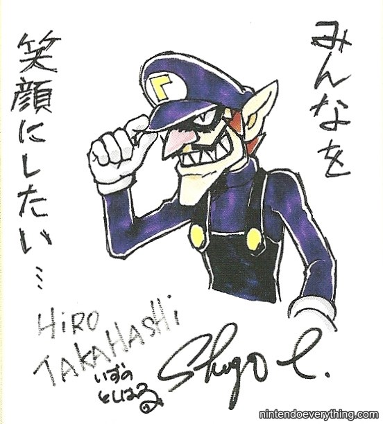
How about DEMON WALUIGI?
Waluigi_New_Year.jpg

I am grateful that one of the developers does Waluigi for the New Year's drawings, since he's underrepresented as a Mario character. Sure the developer is from Camelot (developer of Mario Tennis), but it counts for something.

Thank you for reading.
 
Czario said:
I think that Waluigi drawing doesn't belong in this thread. It's a rather good drawing imo.

It doesn't. The thread is primarily based around bootlegs and official things.

Any fan art goes in the fan art thread.
 
Yo said:
Mecha Koopa's putting on his, "I didn't do it" face.
Like it dirtied Bowser's welcome mat and it's doing that innocent puppy face.
 
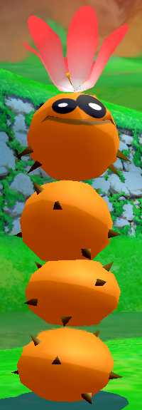
Eh, the Pokey's just an example of the weirdness of Sunshine's enemy designs. The Pokey heads had neckbeard spikes.
Pokey_Head_SMS.png

PokeySproutSMS.png

Sunshine_Pokey_Head_Model.png


But of course, the one true worst Pokey design is one made entirely of hatred, fear-mongering, and evil.


I, of course, mean this monstrosity:

Pokey_64.png
 
Doc von Schmeltwick said:
Eh, the Pokey's just an example of the weirdness of Sunshine's enemy designs. The Pokey heads had neckbeard spikes.
They also spurt blood when you push them into a wall. For whatever reason.
 
Princess Mario said:
Doc von Schmeltwick said:
Eh, the Pokey's just an example of the weirdness of Sunshine's enemy designs. The Pokey heads had neckbeard spikes.
They also spurt blood when you push them into a wall. For whatever reason.
Blood? They're bonbons covered in spikes.
 
Petey_Piranha.png


The more I look at this, the more I see how shoddily-executed it is. The two "normal" Piranhas are literally a copypasted version of the exact same image, with one having one of their goop-saliva thingies poorly erased (you can still see the lower base of it). Meanwhile, the area where they are coming out of the goop is clearly just lazily-edited to add little rings for "ripples." The bubbling of the goop comes off as beveled doodles over it.

Ultimately, very lazy artwork. Maybe not idealogically cringeworthy (aside from being a giant plant in a dotted speedo), but still pretty poor given that the rest of the artwork renders look pretty good. But that's the price for looking up close, I suppose.
 
God, since when did this artwork exist?

It looks ... HORRIBLE!

Then again, so does most of all things here.
 
Doc von Schmeltwick said:
Ultimately, very lazy artwork. Maybe not idealogically cringeworthy (aside from being a giant plant in a dotted speedo), but still pretty poor given that the rest of the artwork renders look pretty good. But that's the price for looking up close, I suppose.
The inside-mouth texture looks like crap.
 
It looks like the first time they ever rendered particle effects with a 3d program

in which they can't and just used photoshop instead
 
Doc von Schmeltwick said:
Princess Mario said:
The inside-mouth texture looks like crap.

Figuratively or literally? :P
Well, maybe both but I was thinking more of how really low-res the texture looks. Like, it looks bloated. Compare that to the rest of the textures.
 
Princess Mario said:
Doc von Schmeltwick said:
Princess Mario said:
The inside-mouth texture looks like crap.

Figuratively or literally? :P
Well, maybe both but I was thinking more of how really low-res the texture looks. Like, it looks bloated. Compare that to the rest of the textures.

Yeah, it's a low-res texture mapped over more area than it probably should be. But they probably saw no reason to since no one was going to see it until the press kit was dumped.
 
Back