Doc von Schmeltwick
Multi-hat Koopa cutie
- MarioWiki
- Doc von Schmeltwick
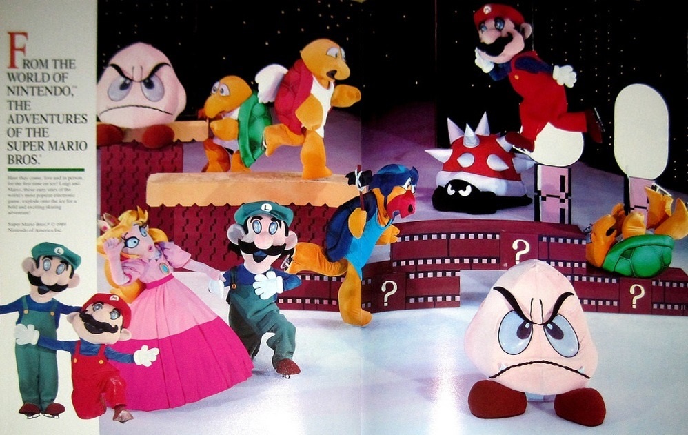
I hope this wasn't already posted XD
Follow along with the video below to see how to install our site as a web app on your home screen.
Note: This feature may not be available in some browsers.

It's the ice show, but I've never seen that .gif.ThatGuy62 said:Is that the ice show where the GIF where Mario destroys that one koopa with a fireball comes from?
I didn't even notice the blue teeth until you mentioned it.Doc von Schmeltwick said:It's the ice show, but I've never seen that .gif.ThatGuy62 said:Is that the ice show where the GIF where Mario destroys that one koopa with a fireball comes from?
I'm mostly concerned with Luigi's eyes, and why his teeth are blue.
ThatGuy62 said:I didn't even notice the blue teeth until you mentioned it.Doc von Schmeltwick said:It's the ice show, but I've never seen that .gif.ThatGuy62 said:Is that the ice show where the GIF where Mario destroys that one koopa with a fireball comes from?
I'm mostly concerned with Luigi's eyes, and why his teeth are blue.
This is Fortran-tier, sheesh.


Doc von Schmeltwick said:In Yoshi's New Island, very few of the models have the oil paint/pastel quality to their textures; "Mr. Pipe" is a notable exception. Most of that was done through heavy abuse of in-game visual filters/shaders/stuff like that.
Now aside from that, this exists.
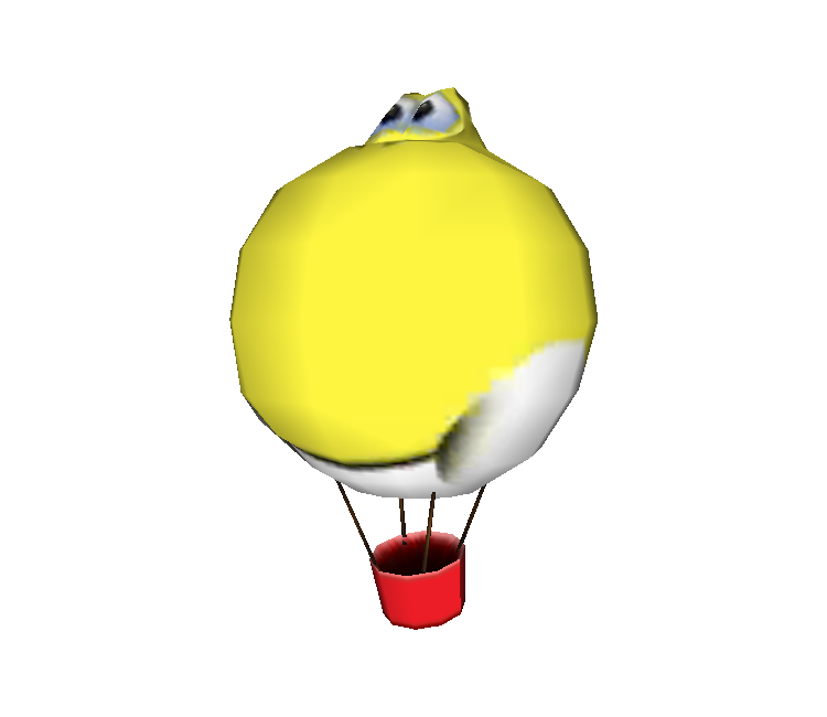
Y̴̕̕ơ̢͝S̴̢̧̕͜h̕͜͏͟I̛͢!͜!̨̕͠!̵́̀͠
Rin Nelek said:Doc von Schmeltwick said:In Yoshi's New Island, very few of the models have the oil paint/pastel quality to their textures; "Mr. Pipe" is a notable exception. Most of that was done through heavy abuse of in-game visual filters/shaders/stuff like that.
Now aside from that, this exists.

Y̴̕̕ơ̢͝S̴̢̧̕͜h̕͜͏͟I̛͢!͜!̨̕͠!̵́̀͠
Those poor folks in Super Mario Odyssey must be scared to death by this monstrosity.
Doc von Schmeltwick said:
Princess Mario said:

Doc von Schmeltwick said:(On a side note, check out Bowser's sprite sheet: https://www.spriters-resource.com/resources/sheets/83/85804.png)

Shy Guy on Wheels said:Doc von Schmeltwick said:(On a side note, check out Bowser's sprite sheet: https://www.spriters-resource.com/resources/sheets/83/85804.png)
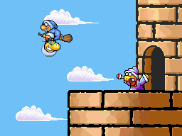
In hindsight, it's kinda odd how Past!Kamek did nothing to chase after Future!Kamek.Doc von Schmeltwick said:Artoon was pretty lazy graphically for Yoshi's Island DS. Almost all the sprites were from SMW2, YTT, or YT&G, just with different shading (and in the case of the middle, being drawn all over, this was the case with Bowser). Anyways, this also happened:

Now aside from space-time implications of stealing from yourself unknowingly, look how lazily-smoothed that SMW2 Kamek's enlarged sprite is. The angles are really jagged and unnatural-looking, come off as really lumpy, and don't even remotely resemble the style in which they were only slightly edited from. It looks like something I'd have edited in the 5th or 6th grade before I understood how to make curves with pixels.
Anyways, for comparison, here's the SMA3 rendition of that sprite:


Unfortunately, the end of Artoon's tenure as the creator of Yoshi platformers did not end the laziness of the franchise, as seen by YNI.....the Good-Feel ones look pretty good, at least.
(On a side note, check out Bowser's sprite sheet: https://www.spriters-resource.com/resources/sheets/83/85804.png)

