Navigation
Install the app
How to install the app on iOS
Follow along with the video below to see how to install our site as a web app on your home screen.
Note: This feature may not be available in some browsers.
More options
You are using an out of date browser. It may not display this or other websites correctly.
You should upgrade or use an alternative browser.
You should upgrade or use an alternative browser.
Look at it! Look at it! LOOK AT IT!
- Thread starter Lario
- Start date
E. C. Koopa
Owner of the Dr. Laura Game.
- Pronouns
- Any/all
Thanks, I hate it.
Doc von Schmeltwick
Multi-hat Koopa cutie
- MarioWiki
- Doc von Schmeltwick
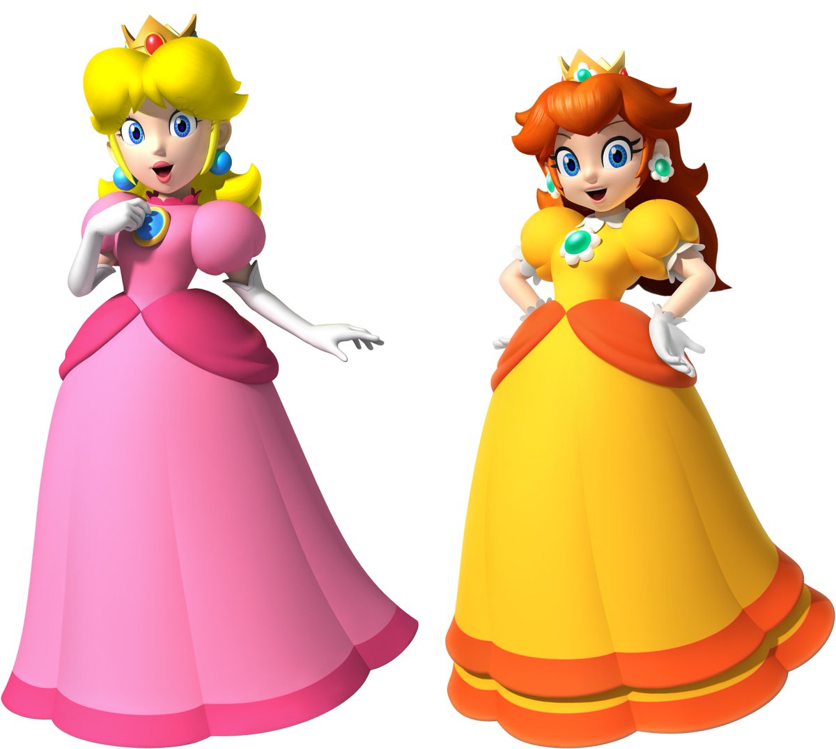
Daisy-faced Peach is still pretty cute, though Peach-faced Daisy isn't looking right.
I think the artworks weren't on the same scale.
I think the artworks weren't on the same scale.
- Pronouns
- she/her
- MarioWiki
- Mario
It's more of an issue with the photo shop job. The hair looks way too small on them. Otherwise, I don't really see the problem? It looks like they had some hair styling.
J-Yoshi64
Always remembering Walkazo
That's what I said when I saw it!Business Koopa said:Thanks, I hate it.
- Pronouns
- she/her
- MarioWiki
- Mario
- Pronouns
- she/her
- MarioWiki
- Mario
- Pronouns
- she/her
- MarioWiki
- Mario
Because I don't really see a huge problem with this? Sure, the color palette is off, but I'd be forgiving on this one because of the limited space they had to work off from.
Doc von Schmeltwick
Multi-hat Koopa cutie
- MarioWiki
- Doc von Schmeltwick
Wait, is there someone that isn't me who hates the magenta sunburned Mario sprites? Finally?
- Pronouns
- she/her
- MarioWiki
- Mario
Not a huge fan either, but SMB3 Mario and SMB Mario are much uglier
Doc von Schmeltwick
Multi-hat Koopa cutie
- MarioWiki
- Doc von Schmeltwick
SMAS SMB3 Mario is damn near my lifeblood.
- Pronouns
- she/her
- MarioWiki
- Mario
Your lifeblood is ugly and pixelated?
zel
probably quit [see about for info]
- Pronouns
- she/her
the smw sprite is probably one of my favorites but people have different opinions! its fine
now that we discuss awful sprites apparently;


and of course oyu cant forget the sprites from the arcade game ports


theres so many of them and theyre all so good
now that we discuss awful sprites apparently;

and of course oyu cant forget the sprites from the arcade game ports

theres so many of them and theyre all so good
Doc von Schmeltwick
Multi-hat Koopa cutie
- MarioWiki
- Doc von Schmeltwick
Mario Party X said:Your lifeblood is ugly and pixelated?
No, I said SMAS SMB3, not PC Mario is Missing. Can't you read?
SMAS SMB3 is the second best spriting style the franchise has, with the best being the original BIS.
SMW and MLSS's styles can go jump in a woodchipper for all I care. Not only are they ugly, but they're overused. When I was young and playing flash games, if one of them didn't use the SMW Mario sprites, it was already worth a look for uniqueness. And I hear nowadays that situation exists with the MLSS sprites, which when I played only the real groundbreakers (like Super Mario Sunshine 64, the predecessor to the more famous Super Mario 63, which also had them) used.
Moldomré
Dry Bowser
Isabelle said:SMB3 has amazing sprites if you ask me. In fact, I only think SMB's sprites could be better.
Idk SMB3 sprites just look really good. And for some reason I prefer the 8-bit variant of those sprites.
SMB3 sprites are amazing...
...for its time. I personally think the sprites get better every game (not counting things like Mario is Missing! and Hotel Mario).
Doc von Schmeltwick said:Mario Party X said:Your lifeblood is ugly and pixelated?
No, I said SMAS SMB3, not PC Mario is Missing. Can't you read?
Don't you think you might be overreacting a little bit? It's just sprites.
- Pronouns
- she/her
- MarioWiki
- Mario
Well, I am insulting this person's lifeblood so I guess it's very personal. World and Superstar Saga sprites are eh, and to me, nothing tops Dream Team sprites.
SENTIENT BOOGERZelenPixel said:the smw sprite is probably one of my favorites but people have different opinions! its fine
now that we discuss awful sprites apparently;


and of course oyu cant forget the sprites from the arcade game ports


theres so many of them and theyre all so good
Doc von Schmeltwick
Multi-hat Koopa cutie
- MarioWiki
- Doc von Schmeltwick
Prerenders that are officially repetitively used work in the 90s (see the original DKC trilogy).
Not so much today, especially when fake. Granted, Bowser's rigged Sunshine model was used for ages.
Also that blue DK sprite with the red barrel wasn't even from a port, it was practically its own thing.
Regardless, I want to stop and talk about how fabulous Bowser is.

Not so much today, especially when fake. Granted, Bowser's rigged Sunshine model was used for ages.
Also that blue DK sprite with the red barrel wasn't even from a port, it was practically its own thing.
Regardless, I want to stop and talk about how fabulous Bowser is.

ohh nooooo they reused the SMB3 Bowser again :P
Doc von Schmeltwick
Multi-hat Koopa cutie
- MarioWiki
- Doc von Schmeltwick
ThatGuy62
Boo
I get that they wanted Ozma to be a special boss in the next Sports Mix/Hoops 3-on-3 sequel, but Bahamut and Behemoth didn't need such drastic redesigns...Doc von Schmeltwick said:


