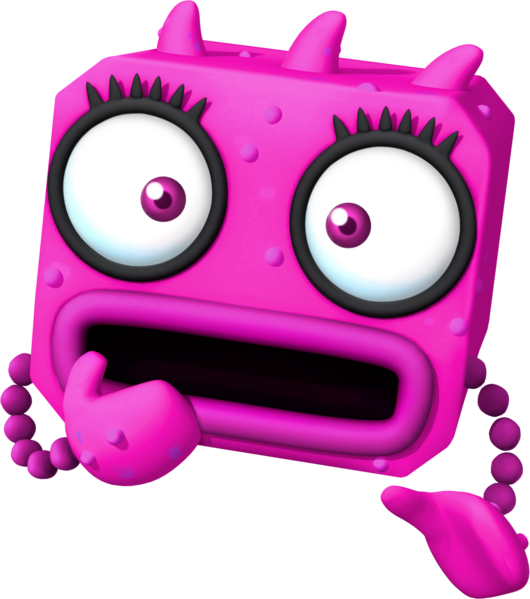
Look at it! Look at it! LOOK AT IT!

What the hell is with the virus designs for the Dr. Luigi game??

611px-Virus_Artwork_-_Dr._Luigi.png


530px-Red_Virus_Artwork_-_Dr._Luigi.png


621px-Yellow_Virus_Artwork_-_Dr._Luigi.png
 
Always amused me how they'd use the Dic Zelda design for various promotional stuff at the time.
 
yea mario and luigi look mostly fine (even a lil cute) but. Yoshi
peach feels like a shrek parody i dont even know how she does but she does
 
SPM_Blarfle_Sprite.png

"Oh well at least they're unique and not Toads"

You know what else is unique and not Toad? A pile of barf being its own character.

This design is just awful, there's no indication of the bare minimum of thought put into it. "It's an alien". Yeah, no, that's not an excuse for trotting out this crap that has nothing to do with Paper or Mario or being Super. You can do better with "weird alien from Paper Mario", especially when the rest of the game is already geometrical and weird. You can love Super Paper Mario, but c'mon you know they can do better than that.
 
Last edited:
It's a wildly deformed Pianta whose skirt mutated into an extra eyeball.

it's a Blobule aka idgaf about character design how am i getting paid
 
Back