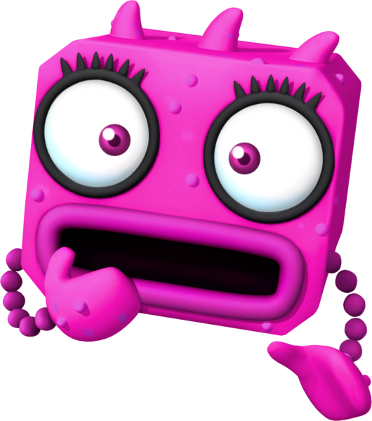
Look at it! Look at it! LOOK AT IT!

Less of an eyesore THAN the shitty abstract geometrics that make up the rest of the cast, but given the entire species here is on-screen for a combined total of "less than a minute," not much is lost other than intelligence. Also that bellybutton thing isn't an eye, it's the mouth.
 
As I said in another thread, it looks like a piece from an abstract painting made by Kadinsky or a sculpture made by Alexander Calder came to life and I hate it.
 
So it's not some secret SPM character I didn't know existed.

58Yp5rtEtH-RKXz9OKmuk4qoSJnbGQwYjHO3SaFSwodqaKQrjbd_wnR3BIPoCQNf6BKMfPeC-8rQZJwVeHod11SrpjrHzu6f_pQcW6u0kZf4Ku0kFZ7DAOJts-N-fGm4Al453OJuJRqJMTIcsVpX1tlX8hUoTLxPGP0bMu-Z3cOLRw
Okay well at least that has actual thought put into it. They kinda gave up at the extra smaller heads though, because making anything more complicated that a trapezoid prism was too hard. What the hell do those prisms have to do with flowers?

Less of an eyesore THAN the shitty abstract geometrics that make up the rest of the cast, but given the entire species here is on-screen for a combined total of "less than a minute," not much is lost other than intelligence. Also that bellybutton thing isn't an eye, it's the mouth.
Perhaps but some have been shared already. This one hasn't been shared and I already hate it especially for not being shared.

As I said in another thread, it looks like a piece from an abstract painting made by Kadinsky or a sculpture made by Alexander Calder came to life and I hate it.
More like a bootleg of those coming to life because those had way more thought put into them.
 
I hate how those heads don't look like flowers but rather some lazy ass trapezoid shit. I also can't tell what their expressions mean. It feels so unfinished.

The best part is that thing had this big ass lore with all the detailed linage of kings in those paintings, and then he just appears for like two seconds.
 
All three expressions indicate "Kill me goddamn it" so I think they succeeded there.

And I'm not sure why I need to care about the lore of anything in a Mario game.
 
Oh yeah well I always liked that backstory because Wario gets beaten up in the process while Mario's just all happy and ambivalent.
 
Oh yeah well I always liked that backstory because Wario gets beaten up in the process while Mario's just all happy and ambivalent.

Mario the selfish self centered idiot fucking up Wario's childhood. He even laughed at him when dressing as sheriff. He's the only reason for Wario's psychological torment and also why he is the way he is now. Wario is a reflection of Mario's child self not caring for him. Side with Wario on this one. #helpWario.
 
Hell no the childhood thing is played for complete comedy. Who wouldn't laugh at Wario being dressed at a sheriff? All the other scenes have Mario being completely oblivious to what's happening though, but I don't blame the Piranha Plants.
 
You're laughing. A man is getting laughed at for playing sheriff once in his life and you're laughing.
 
He should practice better hygiene first maybe.
 
Her mother was most likely making him wash his teeth before this tragedy happened and Wario descended into ptsd. He then also got his ass chomped by a plant and called for help, but Mario was being egotistic picking those turnips and so Wario left with a bitten off asscheek that day. Wario was being kind and you can't deny that this time.
 
So why has "Yoshi commits tax fraud" taken off but this one, which is equally as funny and as devoid of a punchline, didn't?
 
What the hell is with the virus designs for the Dr. Luigi game??

611px-Virus_Artwork_-_Dr._Luigi.png


530px-Red_Virus_Artwork_-_Dr._Luigi.png


621px-Yellow_Virus_Artwork_-_Dr._Luigi.png
It might be due to playing Dr. Mario World a lot, but even the new viruses from that game, including their versions of light-blue and pink viruses, look better than those.

Thank you for reading.
 
Their design reminds me of those annoying new bad guys from Sonic Lost World. Eggman was right on calling them Eggman wannabes.
 
It might be due to playing Dr. Mario World a lot, but even the new viruses from that game, including their versions of light-blue and pink viruses, look better than those.

Thank you for reading.
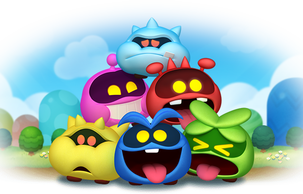
No I fully agree that the Dr. Mario World viruses fit perfectly with the designs of the original three viruses. They still have the cute and simple yet mischievous with the dark eyes and glowing pupils and with a few head features.

DrMarioWorld_-_Viruses.png


However the Dr. Luigi viruses go way too far into "weird" and they still retain some basic features of the original virus, but they lost the simple glowing eyes in favor of excessively large white eyes as well as spindly arms.

Their design reminds me of those annoying new bad guys from Sonic Lost World. Eggman was right on calling them Eggman wannabes.
Hm I'm not sure which ones you're referring to.
 
Oh.... they kind of suck, I agree. They're like technocolor Koopalings without the nostalgia status or corny family history that the Koopalings do.
 
At least they're being utilized fairly well in the Metal Virus arc in the IDW comics, but not to go off on a tangent.
 
I cannot lie when I say I find Sonic's comebacks to what they say funny. Actually that game's best part is the dialogue. Other than that, it's a lesser Mario Galaxy, but not horrible.

Look I only play all of this junk for Eggman, the ultimate moustached video game character. He surpasses Mario... for now.
 
Back