Navigation
Install the app
How to install the app on iOS
Follow along with the video below to see how to install our site as a web app on your home screen.
Note: This feature may not be available in some browsers.
More options
You are using an out of date browser. It may not display this or other websites correctly.
You should upgrade or use an alternative browser.
You should upgrade or use an alternative browser.
Things you didn't notice before in Mario games
- Thread starter Princess Céline
- Start date
Green Arrow
Oh, irony! You cunning mistress...
- Pronouns
- She/her
- MarioWiki
- MiracleDinner
i've definitely seen the koopalings retreat into their shell and do the spinny thing (in nsmbw) and bowser jr. in smm1, and bowser in nsmbu (havent played but watched ceaves challenge videos on it)Koopa Troopas wear their shells while Bowser, Bowser Jr, and the Koopalings have their shells on their backs and still can go inside the shell with no problems.
i dont get how that suddenly means theyre attached to their shells tho, koopa troopas usually retreat into their shells when jumped on, and in 3d world they lose their shells and can be separated without being hurt, so that shows theyre not dependent on them, but want them, but i dont see how we know its any different from bowser, bowser jr, and the koopalings
- Pronouns
- she/her
- MarioWiki
- Mario
Guess I'll get @Mister Wu here to passionately yammer on about this!Koopa Troopas wear their shells while Bowser, Bowser Jr, and the Koopalings have their shells on their backs and still can go inside the shell with no problems.
As surprising a it sounds, the shell is basically what differentiates the species of Bowser from the other Koopas:i've definitely seen the koopalings retreat into their shell and do the spinny thing (in nsmbw) and bowser jr. in smm1, and bowser in nsmbu (havent played but watched ceaves challenge videos on it)
i dont get how that suddenly means theyre attached to their shells tho, koopa troopas usually retreat into their shells when jumped on, and in 3d world they lose their shells and can be separated without being hurt, so that shows theyre not dependent on them, but want them, but i dont see how we know its any different from bowser, bowser jr, and the koopalings
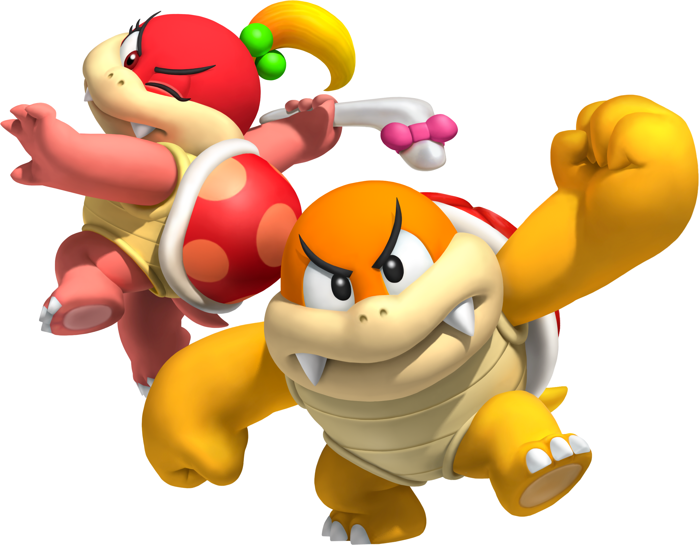
These are Boom Boom and Pom Pom, the most similar to Bowser and his species. You can clearly see how the plastron (front part of the shell) is fully attached to the carapace (the back of the shell) even when they are not spinning in their shells.
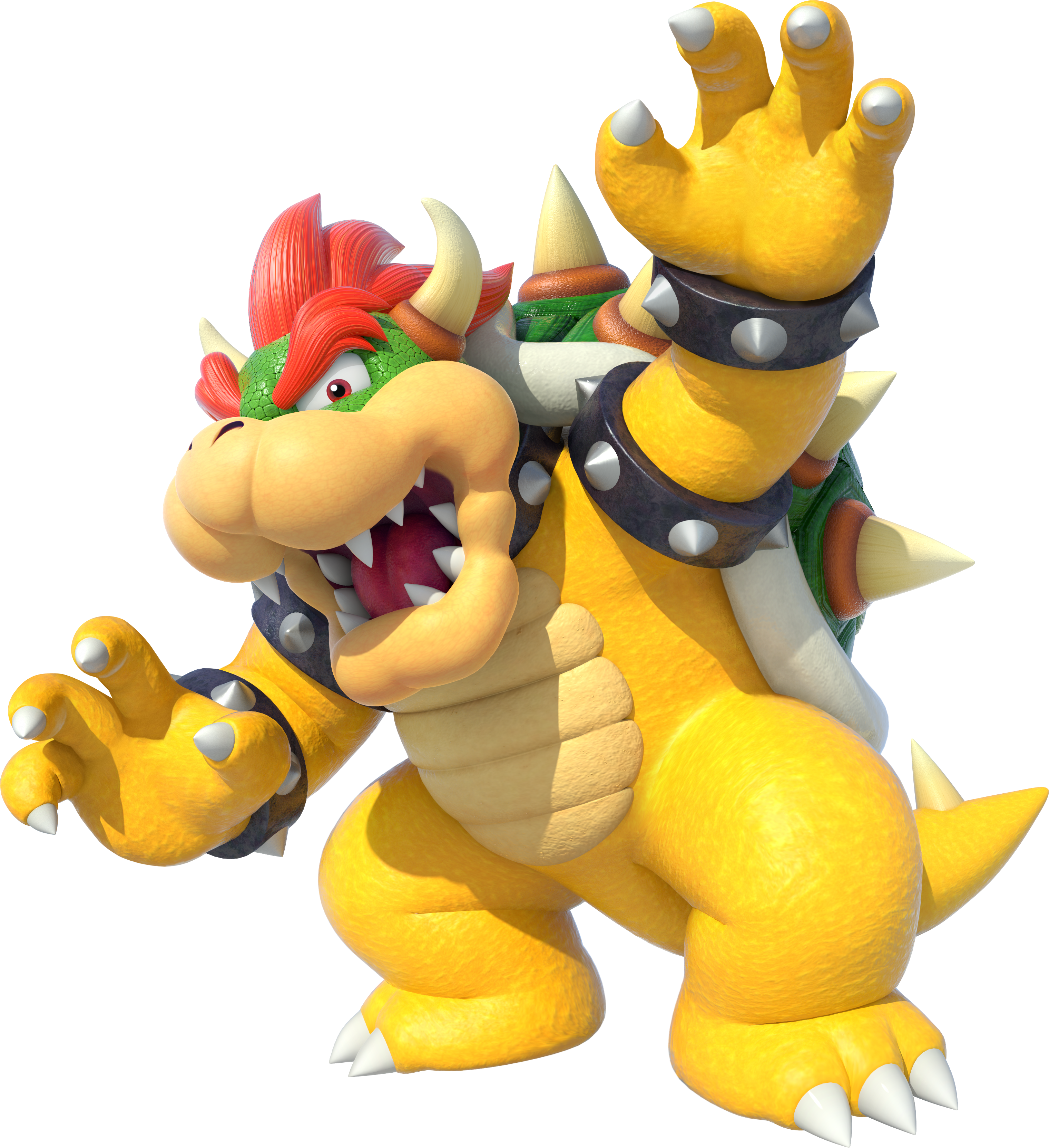
This is Bowser. You can clearly see that what seems to be his plastron is detached from the carapace, only when he spins in his shell he seems to have it connected:

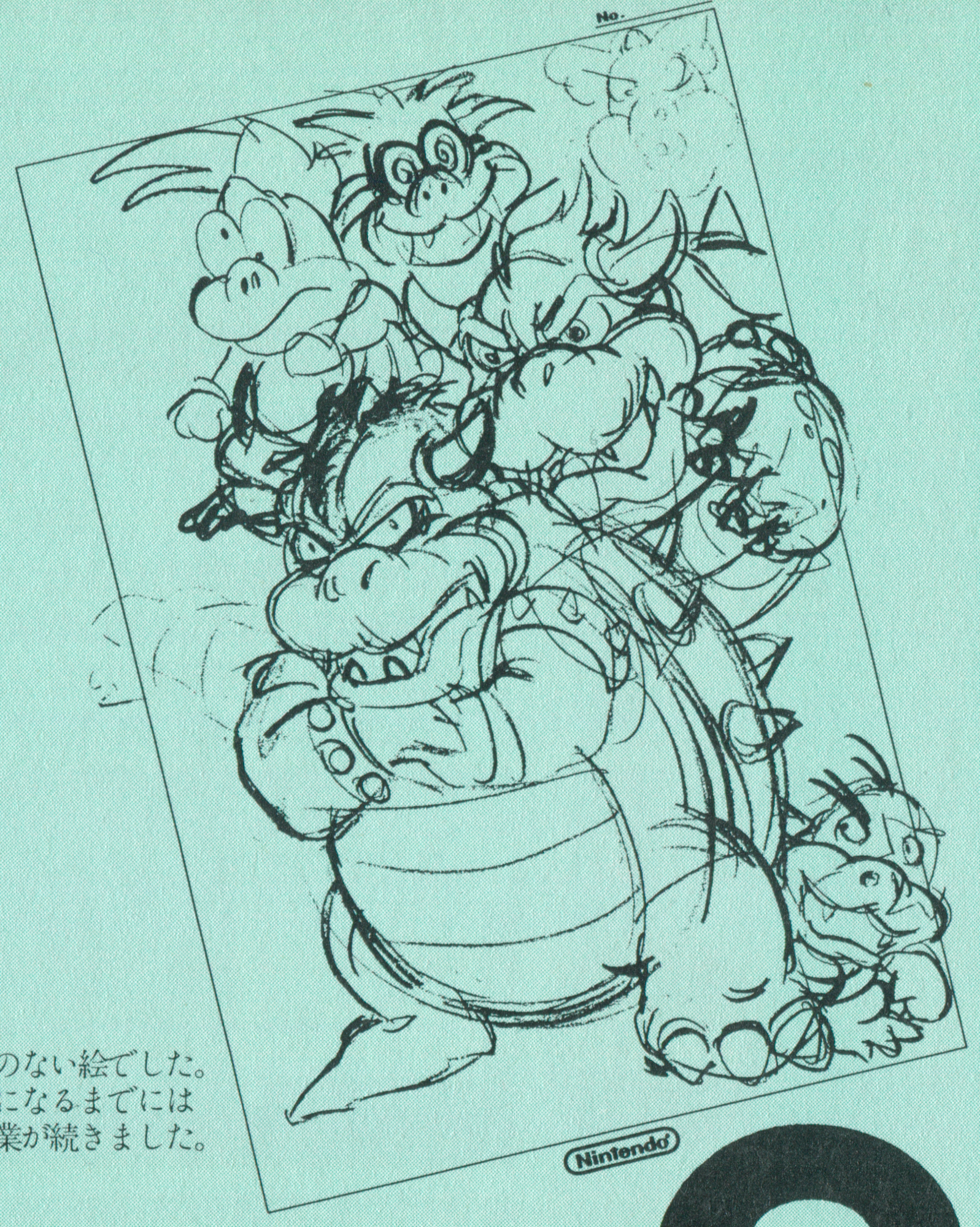
As an aside, this trait of Bowser and his species stems from the very first sketches of Bowser's "current" (as in sketched around 1985-1986) design done by Yoichi Kotabe and Takashi Tezuka:
This means that the Koopalings all have this trait
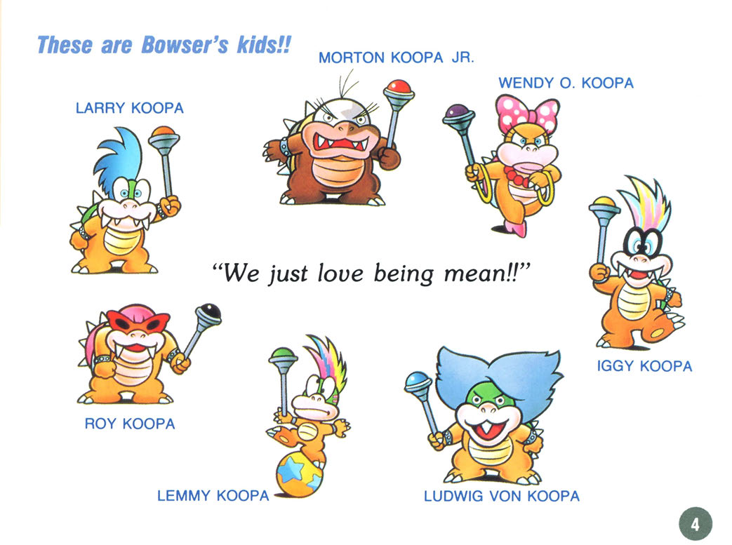
and Bowser Jr. too
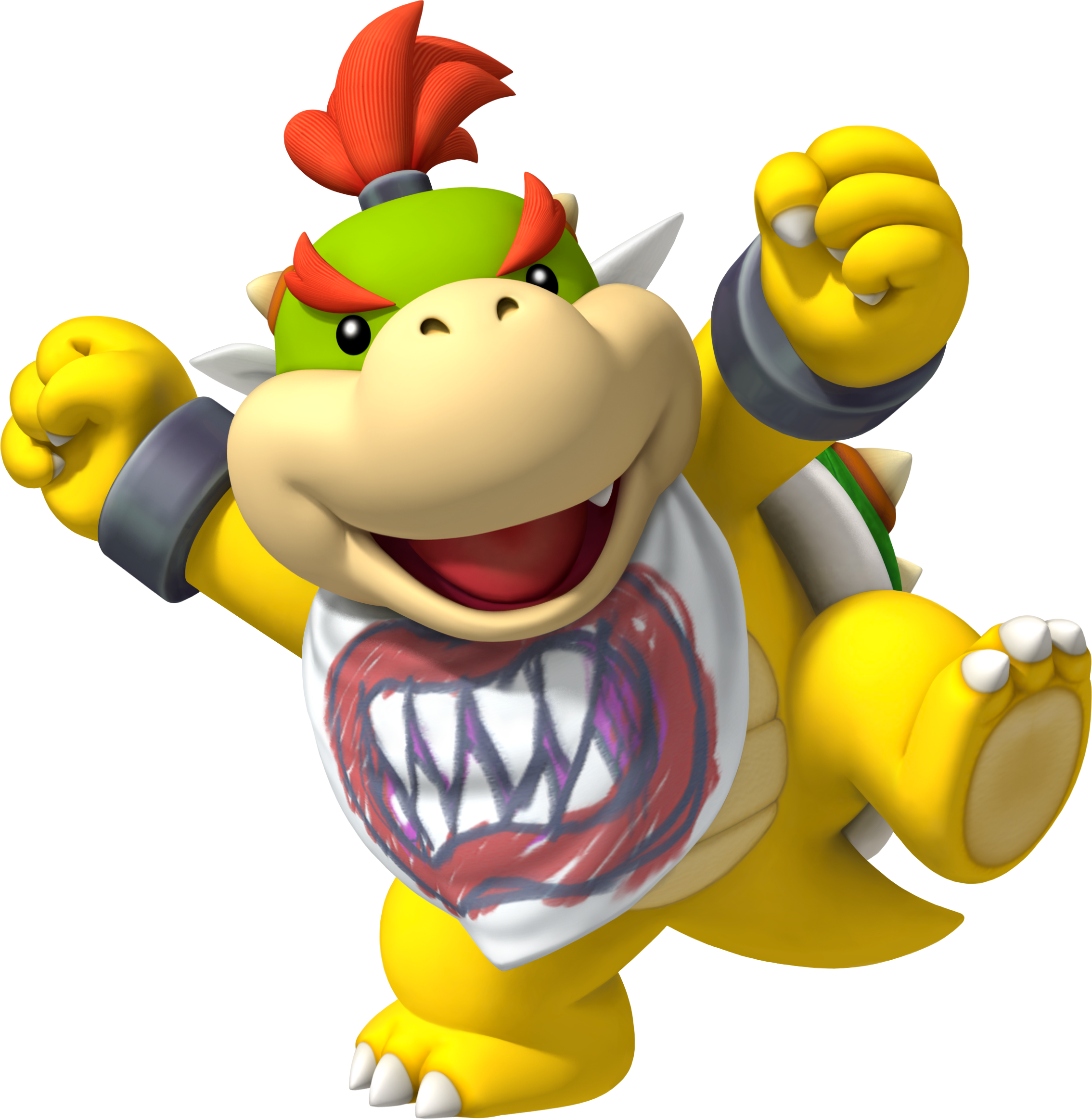
and even the Mario Party Koopa Kids!

Well, I'm not sure about the semantic here, but The Software Toolworks would like to have a word about that:Koopa Troopas wear their shells while Bowser, Bowser Jr, and the Koopalings have their shells on their backs and still can go inside the shell with no problems.
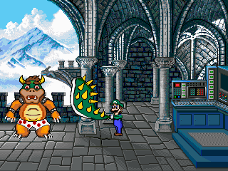
Incidentally, not even the supreme power of The Software Toolowrks was able to detach the plastron, so there's that.
J-Yoshi64
Always remembering Walkazo
This is what I look to, too, when distinguishing Bowser's subspecies with other Koopa Troopas, and why their shells wouldn't come off. Or at least they wouldn't come off in the same manner as other Koopas' shells. Makes you wonder where those boxer shorts came from in Mario is Missing! when only the carapace came off...(everything you said)
Mags
Me and my pencil
- Pronouns
- He/him
- MarioWiki
- Magolor04726
I noticed a while ago, all the Mario Party DS games involve things that the characters can only do while tiny: running along a circuit board, gliding down a banister on a leaf, it's a clever touch.
J-Yoshi64
Always remembering Walkazo
There are a few ambiguous ones.
Peek-a-Boo, Double Vision, Goomba Wrangler, Hot Shots, Raft Riot, and Trace Cadets, namely.
There are some others that could also be done while big, but the surrounding environment makes it clear that they're tiny.
Whomp-a-thon, Toppling Terror, (both have giant flowers near the characters) and Tidal Fools (giant seashells underfoot).
- Pronouns
- she/her
- MarioWiki
- Mario
For some reason, in Mario Kart 7, Lakitu and Shy Guy use clearly different sprites for the results screen (Lakitu's mouth is open; Shy Guy is seen at a different angle and different lighting that makes it look kinda amateur?).
- Pronouns
- She/her
- MarioWiki
- Ray Trace
Here are some lovely playful fax for you guys

You see this picture? You think these are sprites? They're not. They're 3D models!
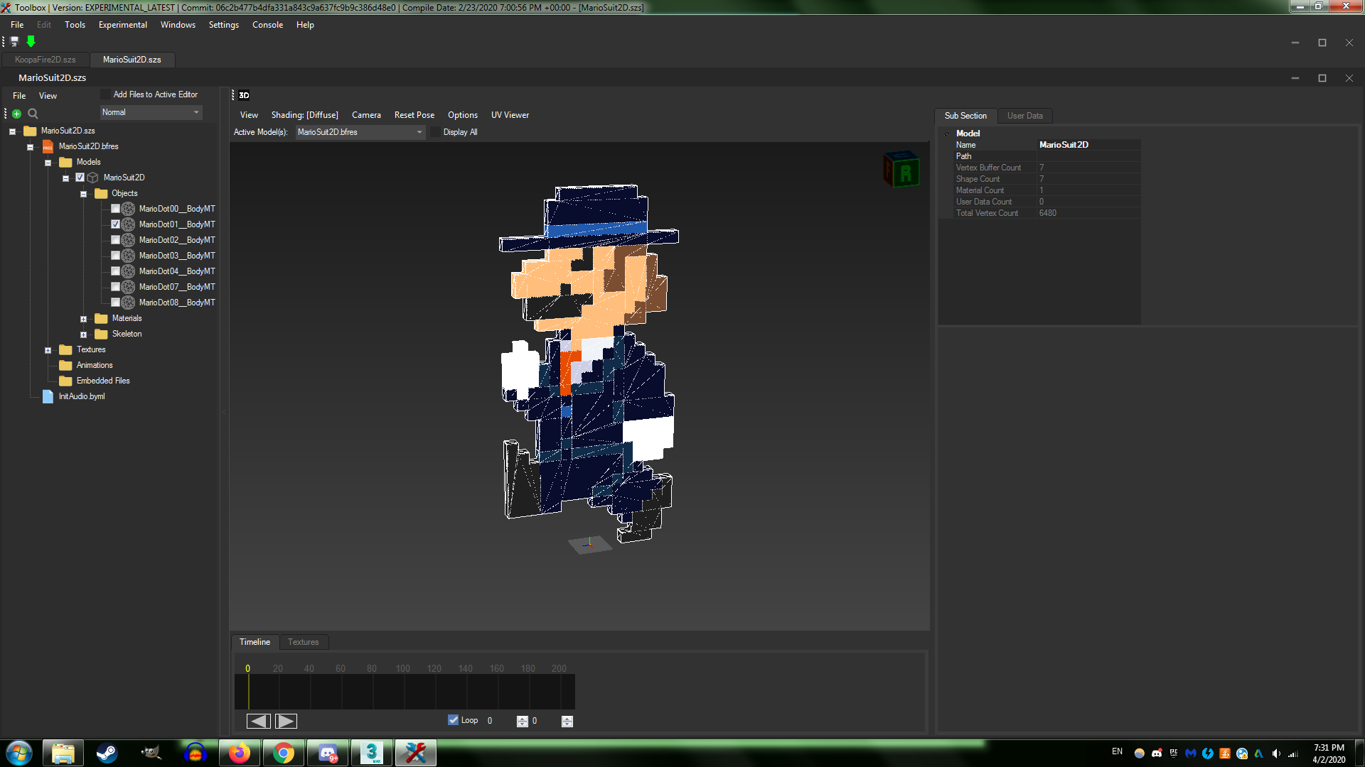
And you see this map from Mario Kart Wii?
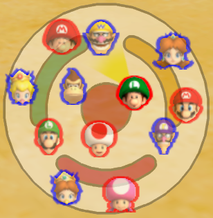
It's also a 3D model as well!

You see this picture? You think these are sprites? They're not. They're 3D models!
And you see this map from Mario Kart Wii?

It's also a 3D model as well!
Reminds me of Shovel Knight. The game is made fully in 3D despite having 8-bit graphics. This was done to emulate better depth perception and also because the backgrounds move differently, and apparently making the game 2D would make all the effects used more complicated to program.
Koopa con Carne
call me Hot Lips, 'cause i'm a one-shot wonder
- MarioWiki
- Koopa con Carne
Waluigi's knees are always bent and it looks painful.

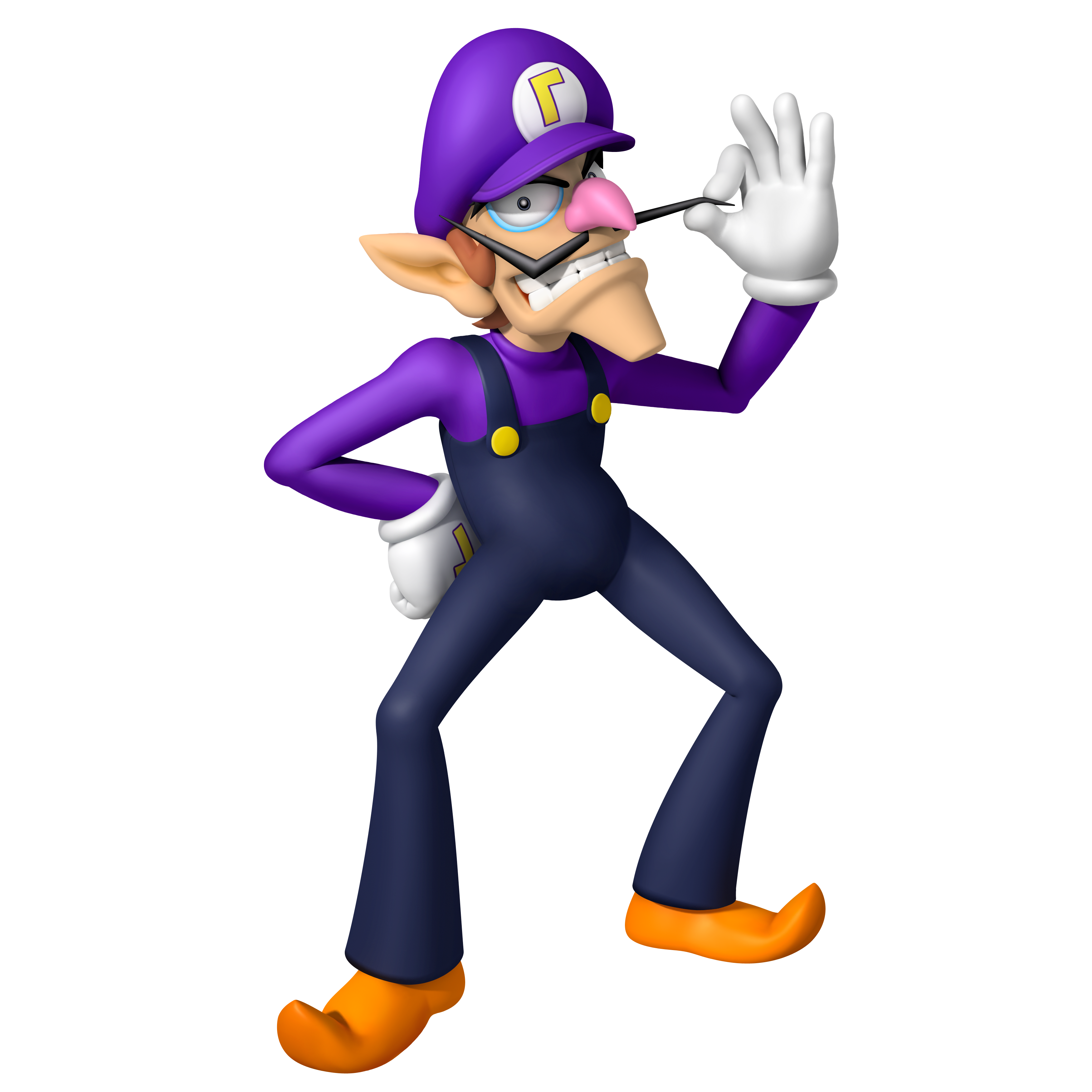
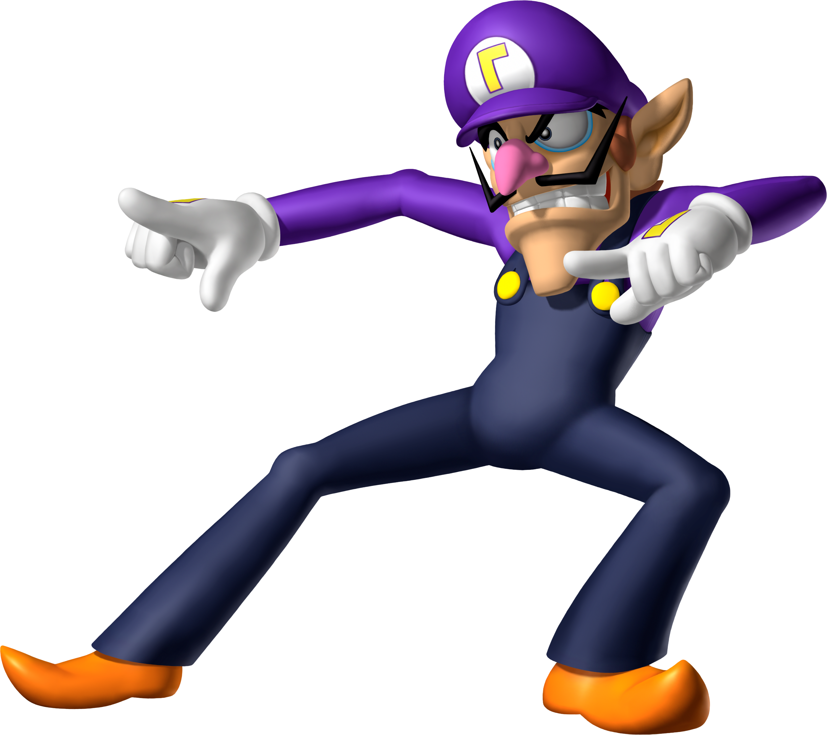
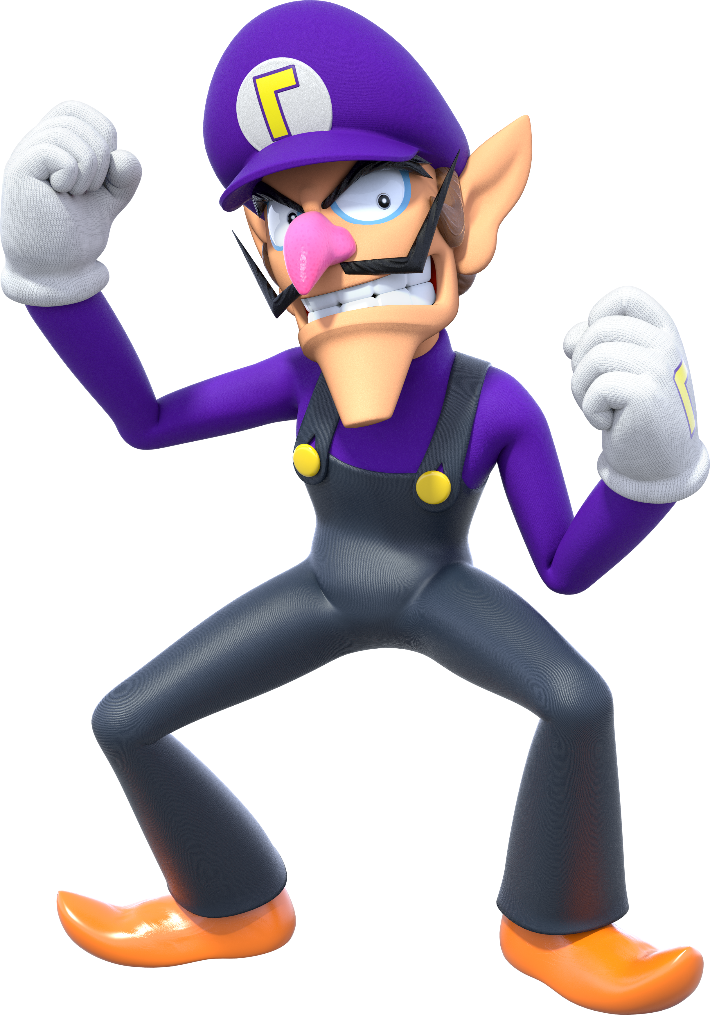


- Pronouns
- she/her
- MarioWiki
- Mario
The wheels on the cars in Diddy Kong Racing are sprites. Same with the fan on the back of the hovercraft. Didn't know this until I started ROM hacking the game.
Green Arrow
Oh, irony! You cunning mistress...
- Pronouns
- She/her
- MarioWiki
- MiracleDinner
wait so just to check that means theyre 2d things that get rendered in rather than 3d models rightThe wheels on the cars in Diddy Kong Racing are sprites. Same with the fan on the back of the hovercraft. Didn't know this until I started ROM hacking the game.
like how in the original superstar saga cacklettas soul looks like this
and in the remake it looks like this:
- Pronouns
- She/They
- MarioWiki
- Fawfulthegreat64
I've looked at the files of SSS+BM and Cackletta's Soul is actually a combo of 3D and sprites. The head and hands are models, everything else is sprites.
- Pronouns
- she/her
- MarioWiki
- Mario
Yes. Those things are 2D, just always facing the camera so you don't see it's actually just a simple plane, but is prerendered to give the illusion of turning around. Like Mario Kart 64 characters, but just the fans, propellers, and tires.wait so just to check that means theyre 2d things that get rendered in rather than 3d models right
- Pronouns
- She/her
- MarioWiki
- Ray Trace
Characters in Diddy Kong Racing are vertex animated as well rather than bone-animated. Vertex animation today is very rare (most characters and objects are animated with bones), except in cases of facial expressions like Source uses.
So today I played some Paper Mario again after I put it down for a while, still my first playthrough, and I just finished chapter 3, the one with Tubba Blubba or whatever his name is. I was just talking about how I liked it so far, exceptions being Dry Dry Desert with these annoying as hell bandits, and the prologue because they decided to lock action commands behind an item you get a bit later, but so far it's been a pleasant experience.
So anyway, as I was talking with my siblings about it, the conversation devolved into us just trying to rate the SPM chapters, and it just made me realize how blind I was to a lot of the game's more... questionable design choices. We haven't finished everything, last chapter we talked about was 3-4, but an example of bad design I picked up is that so many levels rely on "puzzles" that once deciphered in one playthrough, trivialize your next run of that chapter, examples being 1-3 with th red palm tree, 2-2 and 2-3 for obvious reasons, and even 3-1 with the red pipes. I am honestly astonished by the fact that I have not noticed this and it goes to show how one can be blinded by bias. Last time I played the game I'm pretty sure it was pretty good in my book. Guess I'll have to play it again fully to reform an opinion on it but I definitely know my opinion will change once I do.
So anyway, as I was talking with my siblings about it, the conversation devolved into us just trying to rate the SPM chapters, and it just made me realize how blind I was to a lot of the game's more... questionable design choices. We haven't finished everything, last chapter we talked about was 3-4, but an example of bad design I picked up is that so many levels rely on "puzzles" that once deciphered in one playthrough, trivialize your next run of that chapter, examples being 1-3 with th red palm tree, 2-2 and 2-3 for obvious reasons, and even 3-1 with the red pipes. I am honestly astonished by the fact that I have not noticed this and it goes to show how one can be blinded by bias. Last time I played the game I'm pretty sure it was pretty good in my book. Guess I'll have to play it again fully to reform an opinion on it but I definitely know my opinion will change once I do.
- Pronouns
- She/her
- MarioWiki
- Ray Trace
Is that why the animation in DKR is so awkward looking
Probably yeah. Animating by vertice is a lot messier and cumbersome than using bones, because bones use pivot points for vertices to make things easier.
So today I played some Paper Mario again after I put it down for a while, still my first playthrough, and I just finished chapter 3, the one with Tubba Blubba or whatever his name is. I was just talking about how I liked it so far, exceptions being Dry Dry Desert with these annoying as hell bandits, and the prologue because they decided to lock action commands behind an item you get a bit later, but so far it's been a pleasant experience.
So anyway, as I was talking with my siblings about it, the conversation devolved into us just trying to rate the SPM chapters, and it just made me realize how blind I was to a lot of the game's more... questionable design choices. We haven't finished everything, last chapter we talked about was 3-4, but an example of bad design I picked up is that so many levels rely on "puzzles" that once deciphered in one playthrough, trivialize your next run of that chapter, examples being 1-3 with th red palm tree, 2-2 and 2-3 for obvious reasons, and even 3-1 with the red pipes. I am honestly astonished by the fact that I have not noticed this and it goes to show how one can be blinded by bias. Last time I played the game I'm pretty sure it was pretty good in my book. Guess I'll have to play it again fully to reform an opinion on it but I definitely know my opinion will change once I do.
Wait until you get to the Cragnon chapter, it gets worse.
Green Arrow
Oh, irony! You cunning mistress...
- Pronouns
- She/her
- MarioWiki
- MiracleDinner
its only really the block puzzle that is the problem, everything else is good if you ask meWait until you get to the Cragnon chapter, it gets worse.
Green Arrow
Oh, irony! You cunning mistress...
- Pronouns
- She/her
- MarioWiki
- MiracleDinner
?Mine cart.